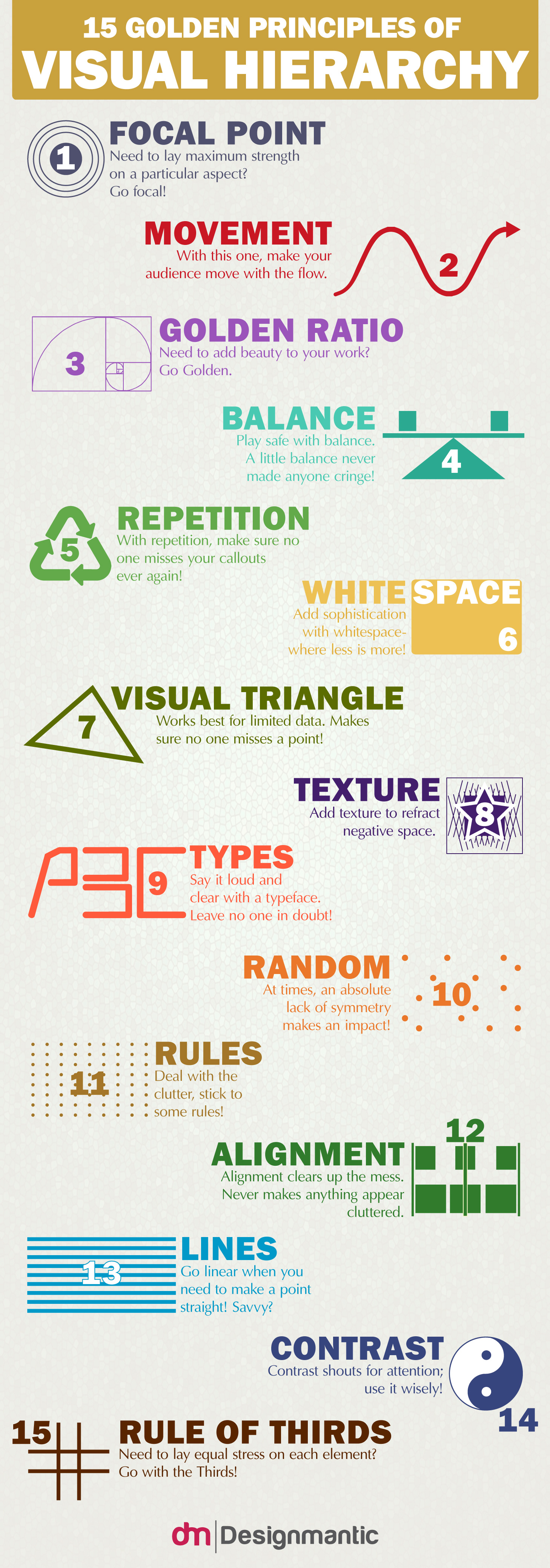
We took another trip to Designmantic.com and found this – one of the best infographics we've seen that gives graphic and web designers 15 simple principles of visual heirarchy – so we had to share it with you!
Designmantic created the 10 commandments of typography, UI, and colour theory that you may have seen on our pages, and now they've designed this graphic to help you implement visual hierarchy in your data and reduce the noise.
Like this? Try these…
- Tips for using grids in logo design
- The biggest logo designs of 2015 so far
- The best tools for data visualization

LATEST ARTICLES
