15 fantastic data visualisations
Brian Suda, software developer, informatician and author of A Practical Guide to Designing with Data, presents some of the best and most beautiful visualisations on the web that are based on time, geography, sound data and more
The ability to create beautiful infographics and visualisations is easier now than ever. Much like the explosion of easy to use fonts created a design monster, misunderstood use of data does the same for visualisations. Having a source of quality design is key for inspiring the next generation of infographics.
Visualisations, infographics and interactive data have brought us many hours of delight, but are they actually useful? With companies like visual.ly churning out infographics with the click of a button it's easier now than ever for anyone to make and share their creative data. The problem is that we are in awash of turn-key, simple, pedestrian and regurgitated design. This is a list of interesting data visualisations which have some sort of actual meaning, but more importantly are also beautifully designed.
Time
Time is a common aspect of many data visualisations. Getting your head around how to represent time visually while also representing other data can be a daunting task. These are a few examples of time-based visualisations which make use of multiple variables at once in a unique way.
Article continues below1. The Insanely Great History of Apple
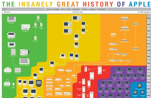
2011 certainly was the year of Apple, but their past is a long and interesting trail. This infographic by Pop Chart Lab shows all of their various products and the evolution over from that first Apple IIe to the modern day iPhone. The poster shows a great wealth of information via tiny icons for all the different devices as well as using the old Apple colours to vividly show connectedness of the product lines. This is the same style tree diagram you see for organisation charts, family trees and other hierarchies, but the thoughtfulness of the design keeps it from being boring.
2. Yearlight Calendar
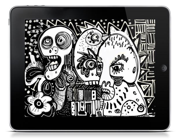
This calendar, designed by Bradley Pitts and programmed by Timothy Gardner, puts a spin on the regular day-by-day boxes calendar. By showing the different phases of sunlight for a given spot on the globe, this calendar shows us the progression of the seasons, the phases of the moon and the shortest/longest days of the year. Sure it's not going to be useful as a birthday reminder or planning your vacation, but that was never its intention. This visualisation has taken several different variables and beautifully plotted them in an easily understandable poster specifically for your location.
3. Charting the Beatles
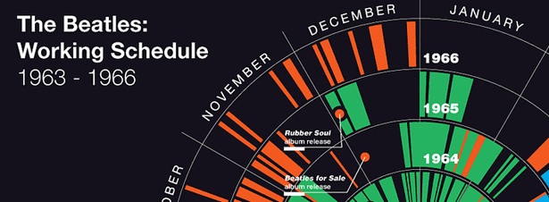
The Beatles have been one of the most popular bands of all times. It shouldn't surprise anyone that a large amount of data about the band is so readily available. "Charting the Beatles", by designer Michael Deal who works at the Google Creative Lab, is a great visualisation for several reasons. It tracks over the years: song releases, tour dates and filming dates of the fab four. With just a quick glance you can see how busy they were in spurts of different activities each year. Sometimes they were touring, then took large blocks of time off to make films, and even get a glimpse at their productivity before the break-up.
4. Bus O'Clock
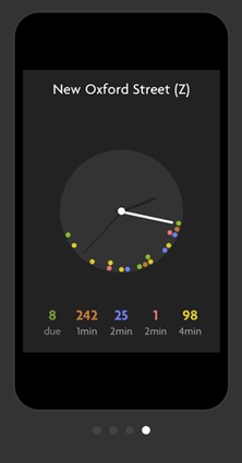
Bus O'Clock by design studio Sennep might seem really benign, but it helps with the every day task of determining when the next bus will arrive. It focuses on one simple feature, rather than a table of numbers and values, it shows a clock with a dot for each bus arrival. It's a simple addition, but seeing it represented as clock-faces that we are used too, has a large impact. As a customer, I'm less interested in the time-table of numbers and instead want some sort of information relative to my location and the current time. Saying the bus will arrive in two minutes is much nicer than saying 10:34. This is also an example of a utilitarian visualisation, one you use daily, much like a clock-face visualises time and we don't consider that a infographic, these sorts of charts and graphs will blend seemlessly into our daily lives. That is the true success of design, when we forget that it needed to be.
Sign up to Creative Bloq's daily newsletter, which brings you the latest news and inspiration from the worlds of art, design and technology.
5. Pie of Time
As readers get more and more used to seeing and understanding visualisations, they become more and more interactive. Readers learn that they can click, drag and further manipulate the data in a way that paper couldn't afford. The team at Stamen have begun to create a few interesting little visualisations that are starting to double as UI Widgets. The Pie of Time is an example of both a visualisation tool, showing you the time of day on a clock style interface, but at the same time it is a GUI control that can be manipulated to further interact with the data. It's quite an achievement when you can reduce your design down to the bare minimum and at the same time use the interaction controls as both a tool for manipulation and conveying information.
Geography
There are plenty of ways to represent geographic data. Maps are the immediately obvious choice, but when working with large amounts of data or data over time, things can get tricky. These are a few examples and tools which can inspire you.
6. Travel visualisation
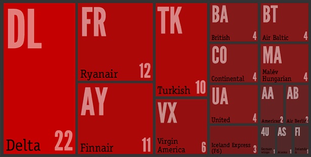
Mining TripIt data, Cemre Gngr was able to create some interesting visualisations. Including some tree maps for countries and airports, but also a visualisation of air travel over time and frequency. Using several off-the-shelf tools and customising the output, these are a new twist on some old visualisations. Here is an excellent example of both geographic data, but also a time and frequency element. The number of flights at a given location also have to be represented. As part of the research, these visualisations are moving beyond just a 2D, interactive screen and into the physical 3D world, but more on that later. Read about Gngr's project on the TripIt blog.
7. Facebook Connectivity Map
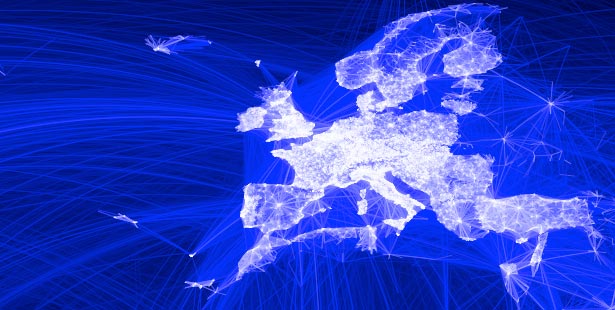
There is no denying the ubiquity of Facebook, but many people wondered how "interconnected" we really are. This Facebook Connectivity Map, by Paul Butler, an intern on Facebook’s data infrastructure engineering team, shows each connection between members within the popular social networking site. With millions of people and millions more connections, representing this data creates an incredibly dense visualisation. Rather than getting specific, the map shows more broad trends. The story the author has decided to tell doesn't allow you to find your personal connections, but instead it gives you a sense of where you fit into the bigger picture as well as answer the question of how "interconnected" we really are.
8. Color Brewer
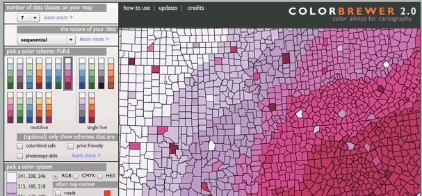
Choropleths are geographic maps where each region is coloured based on some range of variable data. This could be an absolute value, such as political parties, or a range such as spending or education level. The Color Brewer website, by Cynthia Brewer, Mark Harrower and The Pennsylvania State University, helps find distinct colours for your mapping projects. Creating visualisations is as much about telling the right story without misleading your reader as it is about designing something visually appealing.
Physical Instantiations
Most visualisations are static 2D charts and graphs. Ever since William Playfair invented charts as a visual way of representing data, we have been making metal plates and stamping out images. Recently, with the advent of computers and the explosion of the internet, we have seem more and more interactive 2D visualisations. The next logical step is to move into 3D. We've started to see more data rendered into physical objects, something to take away from a computer screen, to sit, study and compare.
9. Festively Rendered Snowman from Tweets
This team (a collaboration between RIG London, Andy Huntington and Inition) produced one-off 3D printed snowmen based on data from your Twitter profile. Using the number of years on Twitter, follower and following numbers, they produce a physical snowman ornament. These are one of a kind objects which represent your data. At a quick glance, you could probably find any outliers as well as spot your own data in a abomination of snowmen.

10. Waveform Jewellery
As physical instantiations of data goes, you'd never think to make jewellery out of it, but that is what David Bizer did. He converted a waveform pattern from a sound file into a series of disks, which are then strung together to form a bracelet. Sadly, it doesn't seem that there is any way to order the designs today, but as a concept it's pretty interesting to think about re-using visualisations in new ways beyond representing data and more as a personalised art piece.
In the round
Circular visualisations are not always the strongest chart type. They tend to distort time and space at larger circumferences, in a square layout their roundness is not taking full advantage of the space, and comparing radial points at far distances makes it difficult to estimate values. That said, there are some good examples of visualisations in the round. Besides the Pie of Time and the Bus O'clock, here are a few others.
11. Hive plots
Hive plots are an interesting new visualisation tool focusing on network diagrams, created by Martin Krzywinksi at the Genome Sciences Center in Vancouver. As we have seen with social networking data, each person or node, can be connected to plenty of other people. Each of these connections is an edge and is represented as a line connecting the two. We've seen these "hairball" diagrams where everything is a big fuzz of colour with some dots representing people scattered throughout. Hive plots are an interesting new answer to better visualising and comparing the data.
12. worldshapin
Spider graphs, sometimes called radar graphs, are rarely as well done as the ones for worldshapin by Carlo Zapponi and vasundhara parakh. This site looks at different countries and their attributes such as; education, health, population and so on. By plotting this on a spider graph in the round, you can easily compare how "well-balanced" are countries. With nice transparencies and soft edges, you are worried less about the exact values and more about the intercomparison.
13. Proof
Proof is a web app for whisky tasting sessions, created by marketing agency Zeus Jones. Much like the worldshapin, it too makes use of a nice spider graph with soft-edges and a friendly, comparable interface. It's interactive, allowing the taster to pull at the points of the spider graph, readjusting the values to better describe their tasting experience.
Sound
When you think about visualisations and infographics, audio does not immediately jump to mind, but there are several examples of sound-based data rich representations. Using sound can really help the listener better understand timing than a table of numbers or other visual representation.
14. Fractions of a Second: An Olympic Musical
For the winter Olympics in 2010, the New York Times created an audio representation of the closeness of races such as Alpine skiing and speedskating. As a table, you might see fractions of a second separate first place and second. Maybe third place was a few hundredths of a second behind that. It seems impressive as numbers, but when you play a series of beeps representing the skiers only a few hundredths of a second apart you get a much better understanding of how close these athletes are to each other.
15. J.S. Bach - Cello Suite No. 1 - Prelude
This is a visualisation of a song, specifically Bach's Cello Suite. The visualisation, by Alexander Chen of the Google Creative Lab, is showing the timing of the audio as it passes over strings. The strings are stretched or shortened to represent the pitch. As the song is played, you can visually see the changes in the notes without using the standard musical notation. Exploring music and timing in this way is new territory for what was possible in static images. Adding sound, motion and interactivity open new areas to explore.
This year, we'll see more tools to build bespoke infographics rather than standard tools which create the finished product. As data science becomes a defined role in more organisations, the ability and tools to create data visualisations will become more abundant and easier, which in-turn creates more advanced and complex examples that will surface and surprise us.

The Creative Bloq team is made up of a group of art and design enthusiasts, and has changed and evolved since Creative Bloq began back in 2012. The current website team consists of eight full-time members of staff: Editor Georgia Coggan, Deputy Editor Rosie Hilder, Ecommerce Editor Beren Neale, Senior News Editor Daniel Piper, Editor, Digital Art and 3D Ian Dean, Tech Reviews Editor Erlingur Einarsson, Ecommerce Writer Beth Nicholls and Staff Writer Natalie Fear, as well as a roster of freelancers from around the world. The ImagineFX magazine team also pitch in, ensuring that content from leading digital art publication ImagineFX is represented on Creative Bloq.
