5 innovative startup logo designs from 2019
Smart logos that gave these brands the best start in life.
Sign up to Creative Bloq's daily newsletter, which brings you the latest news and inspiration from the worlds of art, design and technology.
You are now subscribed
Your newsletter sign-up was successful
Want to add more newsletters?
Designing a logo is a difficult process. But when it comes to the challenge of creating a mark for a startup company – a new brand that perhaps hasn't quite found its identity yet – the pressure is really on. All the examples in this post celebrate logos for up-and-coming brands.
The designers behind these projects have truly captured the spirit of their nascent brands, setting them all off on the right foot for future success and cementing their personality as they grow into public consciousness. Let's take a look at the best startup logo designs of the year so far...
Working on your own branding project? Take a look at our top tips for logo design.
Article continues below01. Orro
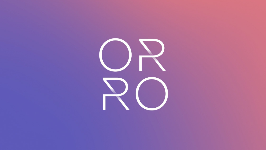
Launched in January 2019 and currently in beta testing stage, Orro is the latest in smart home technology. This responsive lighting system detects human presence and automatically adjusts to mimic natural lighting patterns, with the aim of working closely with the body’s circadian rhythm.
The name is inspired by the Spanish word for gold, 'oro', to suggest radiance and warmth. The logo needed to be suitably modern as to fit with a cutting-edge tech startup, but also capture the product's focus on keeping things natural and holistic.
Salt Lake City-based studio Enlisted came up with a clean, subtly futuristic wordmark that incorporates gentle gradients to suggest the gradual changes in light. The colour palette similarly focuses on warm hues typically found in natural light.
02. This
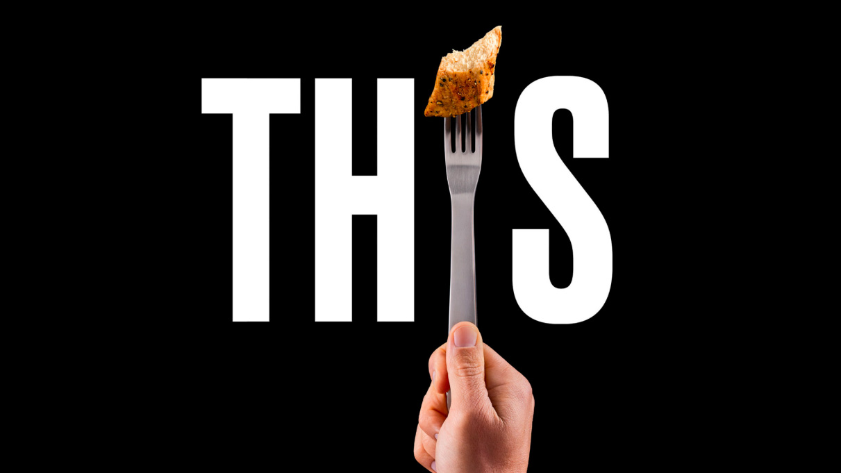
A high-profile project from branding masters Johnson Banks, THIS is a collection of plant-based meat alternatives. The brand was launched by two dedicated carnivores whose previous venture had been selling hamburgers, and as a result, the aim was to find a way to tempt people towards a plant-based diet, rather than making them feel guilty about eating meat.
Sign up to Creative Bloq's daily newsletter, which brings you the latest news and inspiration from the worlds of art, design and technology.
The branding needed to disrupt the market dominated by big players such as Quorn. "Many of our packaging design discussions concentrated on quite how to get the brand name as huge as possible to give the products maximum ‘shelf stand-out’," explains the agency on its website.
The sans-serif, all-caps wordmark is bold and very hard to ignore. In each logo iteration, the 'I' of the brand name is replaced by an example of a THIS product on a fork or skewer – an ingenious way of getting the delicious-looking products in front of as many eyes as possible. The food is shot 'naked' – with no garnishes or serving suggestions – in order to let it fully shine.
The colour scheme is also pared-back. Johnson Banks kept things monochrome, clearly separating the two product lines into ready-to-eat products (black) and ready-to-cook (white). The overall impression is that this is a product that can speak for itself, and doesn't need to hide behind fancy styling or smoke and mirrors.
03. Original Pattern Brewing Company
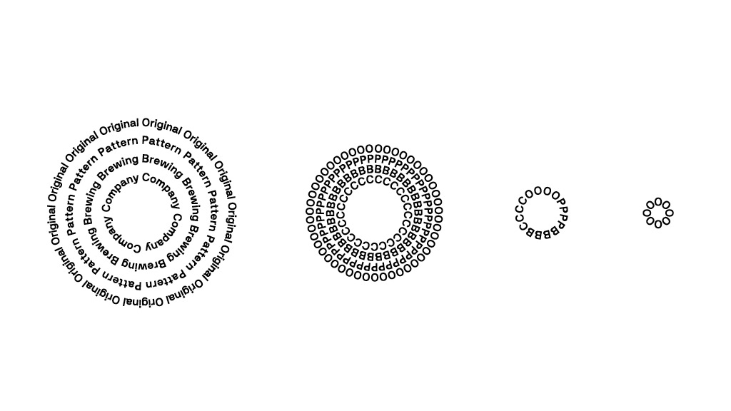
The craft beer industry is a veritable hotbed of creativity in branding and packaging at the moment, so standing out is a tricky prospect. San Francisco-based studio Play managed just that with its logo and brand identity for Californian startup Original Pattern Brewing Company.
The studio took its cues from the brand name to create an unusual, pattern-based logo that hints at a dedication to experimentation. "The logo and packaging system captures the brewing process: always moving, mixing and expanding,” Play creative director Casey Martin told Computer Arts magazine. “Shifting gestural patterns and typography run throughout the system, which easily adapts to its context and content."
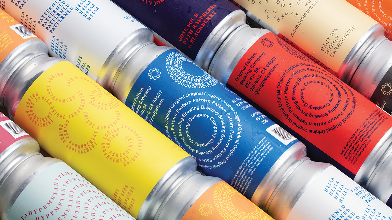
Common elements are combined in different ways to create fresh versions of the logo for each application. This fluid approach was specified in the brief, but it's still a risky strategy when you're trying to build a memorable brand from scratch. However, the recurring motif of the curving text unifies the brand and gives it a distinctive identity across the range of products and touchpoints.
04. Everleaf
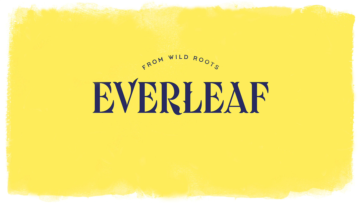
Everleaf is an alcohol-free spirit made from plants. London-based studio Magpie worked to create its perfect logo. The line is the brainchild of conservation biologist and bar owner Paul Mathew, who wanted to combine two passions: conservation of our natural environment and the pursuit of the perfect cocktail.
The typographic logo uses an unusual font with curved serifs that clearly mimic leaf edges. Flourishes such as the protrusions found on the 'L' recall nubbly twigs, further underlining the connection with nature. A bold, all-caps treatment and absence of ligatures ensure this logo stays confident and striking.
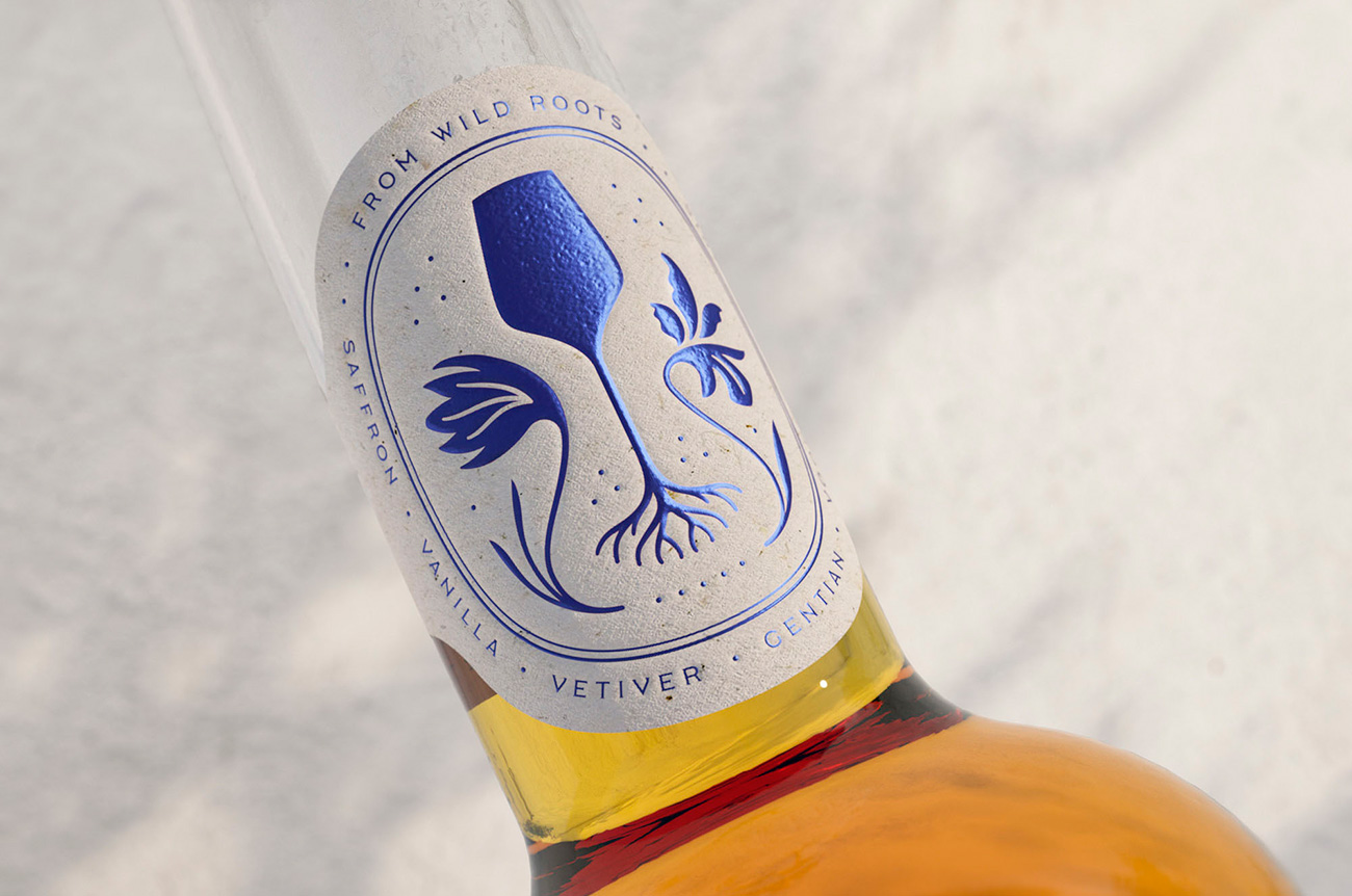
The mood needed to be upbeat and positive, with branding that uses 'sun prints' from the spirit's 18 constituent ingredients. Accompanying the logo itself is a clever 'founder's mark' that represents a Spritz glass. Magpie describe it as "an icon that represents our philosophy of serving pure botanical drinks that come 'from wild roots'."
05. OTO
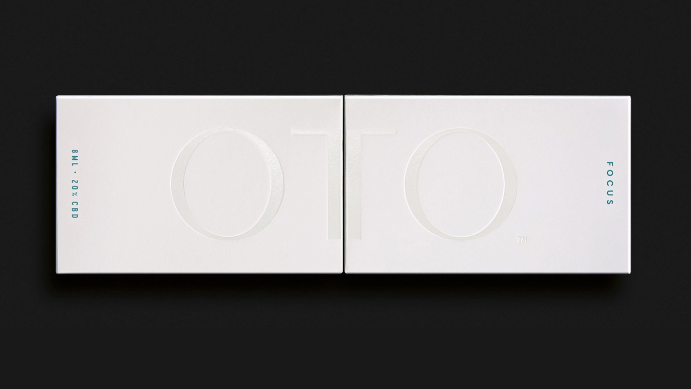
OTO is a range of CBD oils for the UK personal care market, and in creating its branding and logo Pearlfisher had to wrangle with the existing stigma around CBD and cannabis products. The aim was to position OTO as a premium, natural brand. A slick, all-caps, sans-serif logo keeps things classy and clean, smartly cutting off any 'hippie' associations from the off.
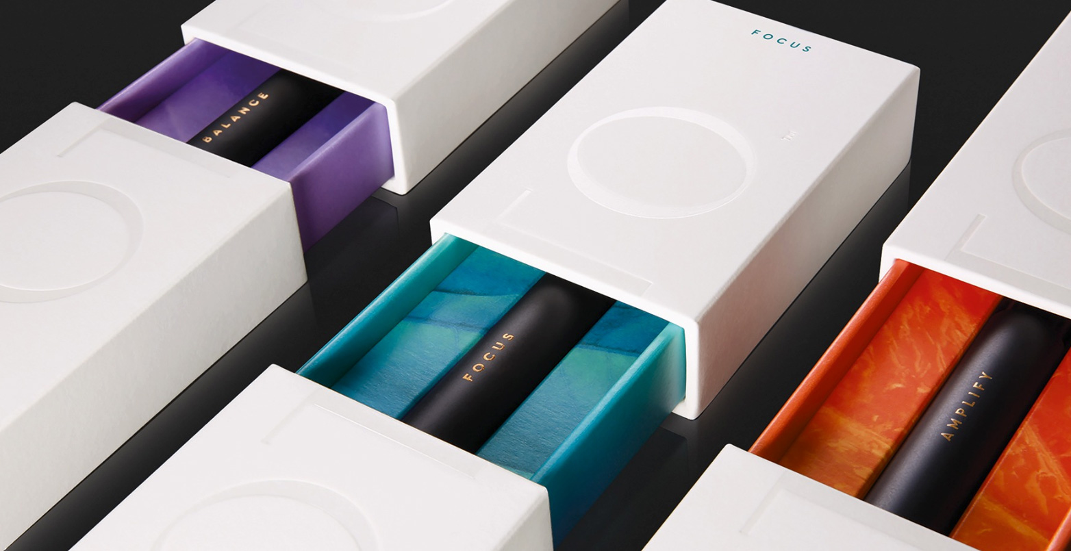
The brand slogan is 'Amplifty the silence', an idea captured through the use of engraving and spot varnish for the logo on the packaging. The logo also needed to hint at the product's function, as an antidote to anxiety and stress in busy modern lifestyles. This aspect is effectively conveyed through the contrast of a minimalist logo on a clean white boxes, against vibrant interiors and colourful macro photography.
Read more:

Ruth spent a couple of years as Deputy Editor of Creative Bloq, and has also either worked on or written for almost all of the site's former and current design print titles, from Computer Arts to ImagineFX. She now spends her days reviewing small appliances as the Homes Editor at TechRadar, but still occasionally writes about design on a freelance basis in her spare time.
