5 mesmerising uses of illustration in branding
These brands all use illustration to add something special.
Sign up to Creative Bloq's daily newsletter, which brings you the latest news and inspiration from the worlds of art, design and technology.
You are now subscribed
Your newsletter sign-up was successful
Want to add more newsletters?
Using a handcrafted element, such as bespoke typography or clever use of illustration, as a core part of a brand's visual identity is a trend that has been gaining momentum of late. The latter is enjoying a particular resurgence in food packaging design, but there are impressive and imaginative examples popping up in a range of different industries.
For a closer look at the trend for illustration in branding, and why it's becoming so popular, take a look at our feature on how to bring a brand to life with illustration. Or read on for five brands that have used illustration to add some magic to their identity scheme.
01. Robot food for Vocation Brewery
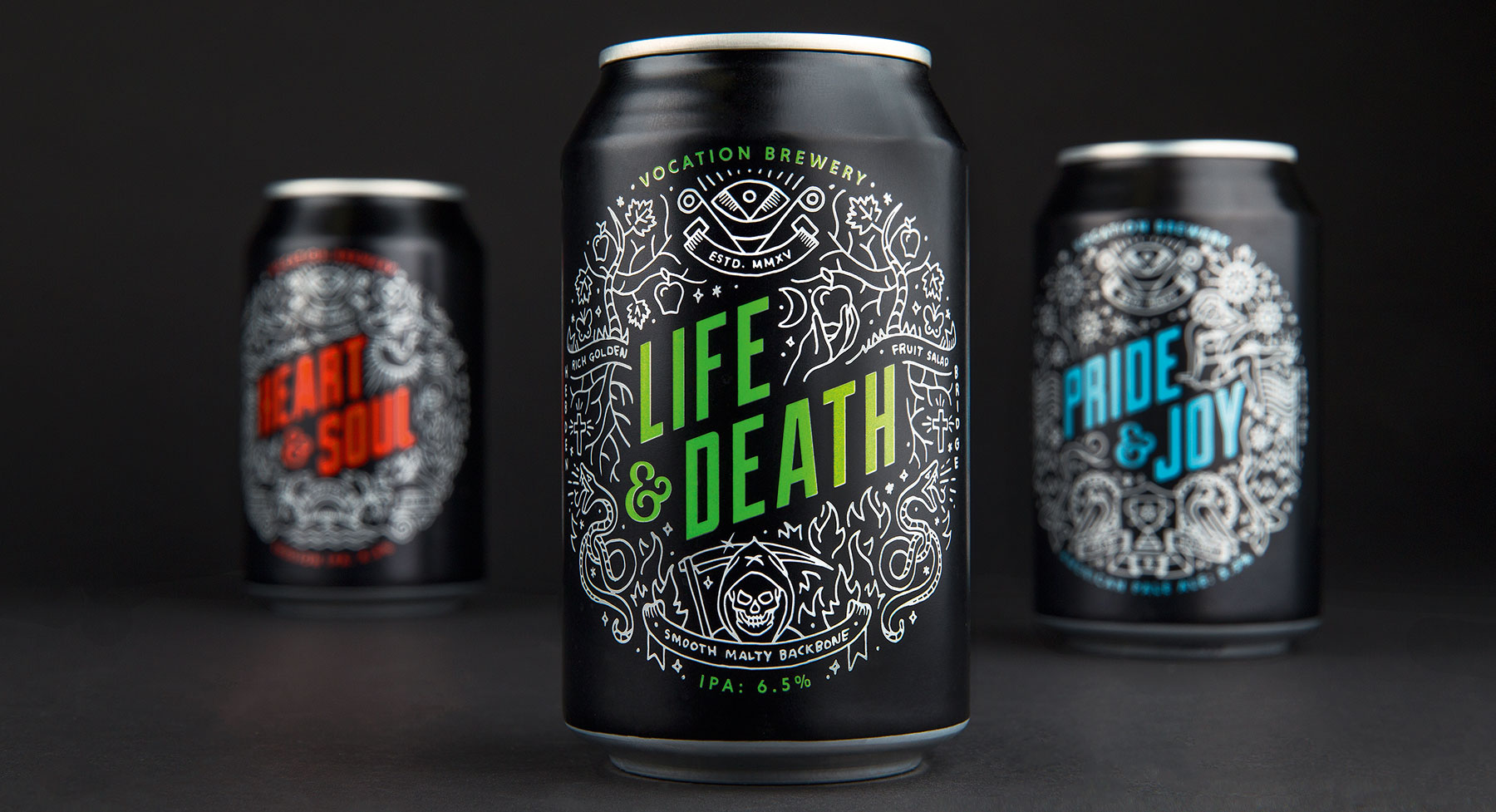
Leeds-based agency Robot Food created the naming, branding and packaging design for Vocation Brewery. According to design director Mike Johns, the project was "very much an open brief", and the approach looked to communicate something, "a bit gritty and new-school, in design terms."
Article continues belowThe solution was to use an intricate, tattoo-inspired illustration style created in-house with icons and graphics that subtly communicate the story of each brew. "We want to portray the tasting notes of each beer through the illustration, so the American Pale Ale is a celebration with fireworks, while Heart and Soul is more a heaven scene," says Johns. "We wanted to add elements and details that tell the story. The main thing about Vocation is getting across what each beer is about pictorially."
02. Together Design for Pearson
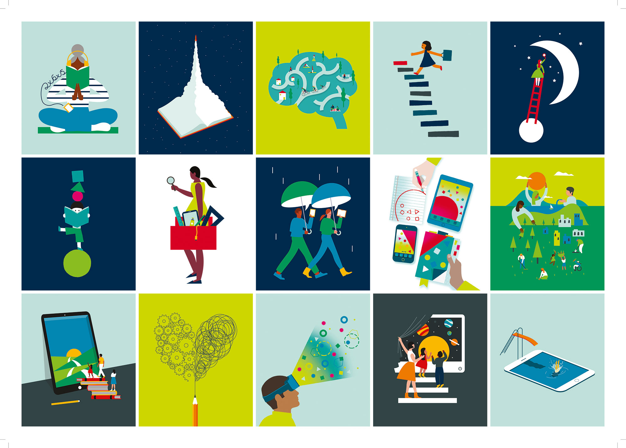
Together Design has worked with education brand Pearson for the last three years. As the lead agency for its global rebrand, Together Design "created hundreds of pages of guidance in many different languages," says creative director and founder Heidi Lightfoot. Illustration was a vital part of this new approach, enabling easy, direct communication across numerous languages and cultures for a company that has over 30,000 employees.
Together commissioned five illustrators located in different parts of the world including Singapore, the US, Australia and the UK to create hero illustrations "for communicating big themes", as well as producing designs in-house for infographics, pictograms and patterns, to create a comprehensive "kit of parts" visual asset library for Pearson's global operations.
"It was important to have different illustration artists around the world that the Pearson teams could commission directly," says Lightfoot. "So there may be imagery which is market- and product- specific, but it all ties in seamlessly with the global library that is accessible to all."
Sign up to Creative Bloq's daily newsletter, which brings you the latest news and inspiration from the worlds of art, design and technology.
03. Silas Amos for Red Red
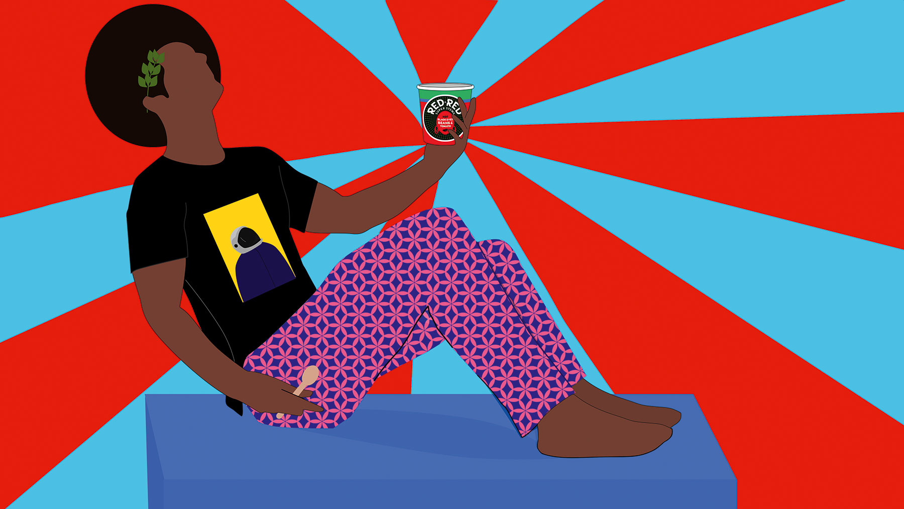
Without the budget for a conventional ad campaign, African-inspired stew-pot Red Red's approach was to create a ‘design campaign' orchestrated by creative strategist and designer Silas Amos and based around the idea of ‘a lunch less ordinary'.
Nigerian artist Dennis Osadebe was brought in for the punchy illustrations used across various brand touchpoints, creating slightly surreal characters that mix humour, nuance and subtle use of African patterns. Parent brand Unilever was looking for a key visual, an image that communicated the brand's essence while also showcasing the product.
"We gave Dennis the brief to do his work in the mildly surreal way he does, but then we let him loose," says Amos. "He came back with an astronaut lady, a Caesar character…"
Osadebe adds: "We knew exactly what the brand represented: it was then a case of finding how to best bring it to life, visually. This inspired me to work with the feeling that the brand gave me – a mixture of fun, vibrancy, innovation, timelessness and most importantly diversity, in the sense of merging of different cultures together."
05. Sid Lee for Blue Goose
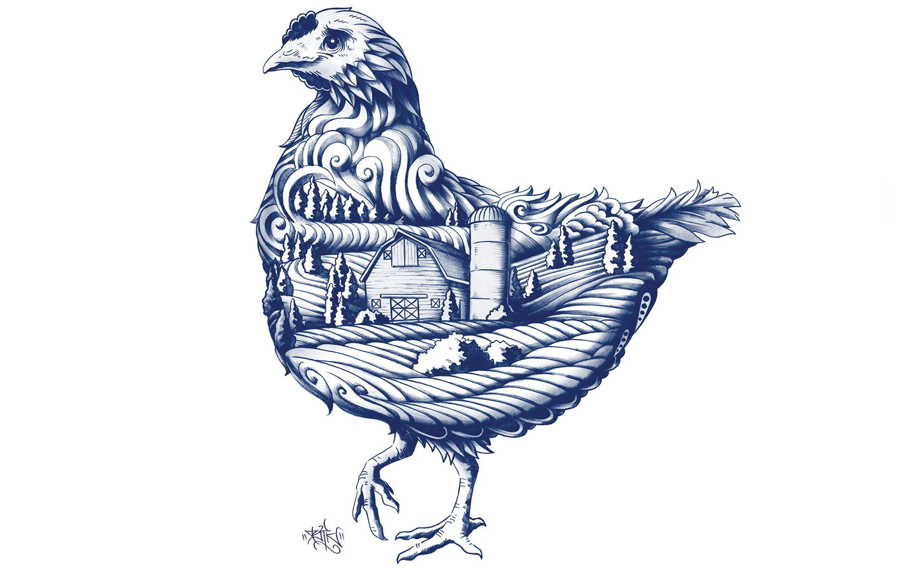
The Toronto studio of creative agency Sid Lee was briefed to create new packaging designs for Blue Goose, a range of meat and fish that prides itself on being ‘clean protein' – the brand's emphasis is on transparency and tracing the product back to its farming origin.
Agency executive creative director and partner Tom Koukodimos says that going down the illustration route and commissioning Ben Kwok was perfect, as it allowed the agency to capture a complex story in its simplest form and "do it in a way that's unique and ownable, and visually distinct".
The solution sets the brand apart from competitors, which often lean towards simple images showing potentially generic images of farms. "The illustration was meant to feel artisanal, but without leaning into artisanal visual shorthands," says Koukodimos. "It needed to be new and imaginative, and a little inventive. The style has a craft feel to it, but without getting into those dated cliches of craft."
05. Thirst Craft for Loch Lomond Brewery
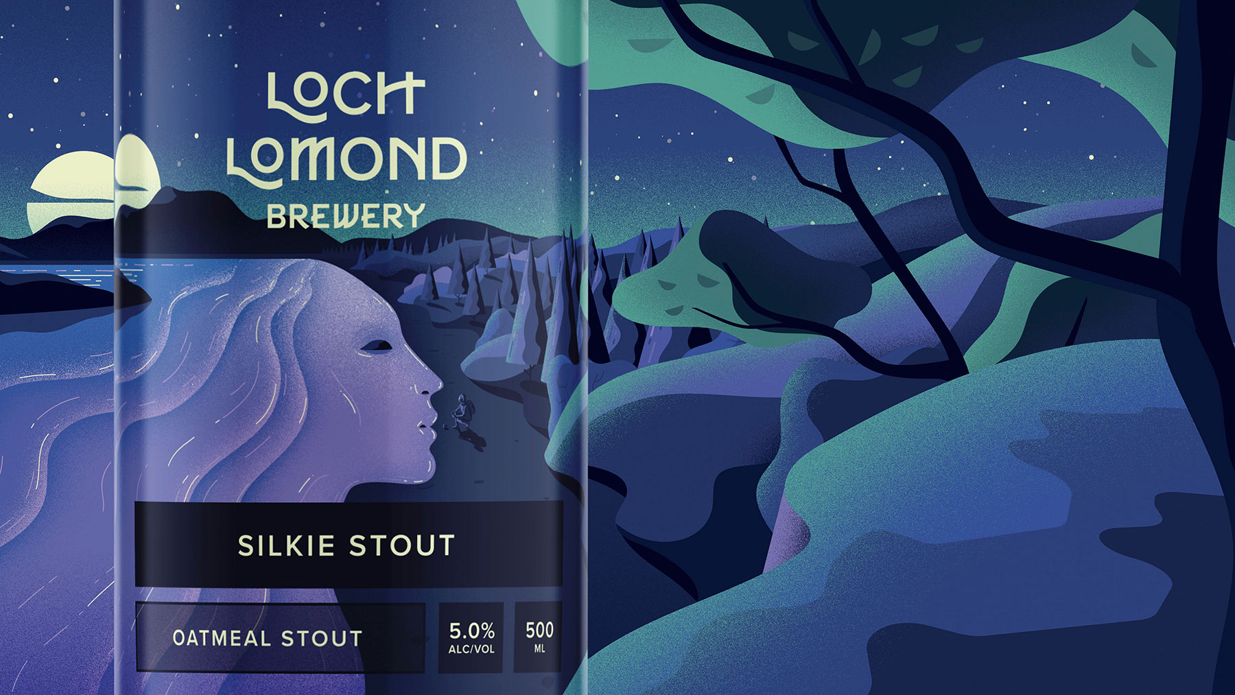
Glasgow-based agency Thirst Craft was brought in to create a new look for the relatively established beer Loch Lomond; and a key part of the brief was to refresh the look and feel without alienating existing customers.
"If we made them unrecognisable, they'd have a drop in sales," says creative director Matt Burns. "So we wanted to keep what was working well and where they have strong equity, and that was in landscape illustration and unusual colour palettes."
The agency brought in illustrator Jack Daly for the project. "The way he uses light and shadow is great," says Burns. "There's so much to explore there – he has a beautiful use of curves and colour. Also, it was great as he grew up [near Loch Lomand]. It's quite a subtle detail but we wanted to capture that sense of a whole day at the Loch."
This article was originally published in Computer Arts, the world's best-selling design magazine. Buy issue 279 or subscribe.
Read more:
Emily Gosling is a freelance art and design journalist currently writing for titles including Creative Review, Eye on Design, Creative Boom and People of Print. She’s previously worked at Elephant magazine, It’s Nice That and Design Week, and was editor of Type Notes magazine. Her book Creative Minds Don’t Think Alike was published by Ilex Press in 2018, and she also plays bass as one-quarter of the eight-titted beast, Superstation Twatville.
