How to use images effectively in digital ad campaigns
Pick the perfect assets to create engaging online ads.
Sign up to Creative Bloq's daily newsletter, which brings you the latest news and inspiration from the worlds of art, design and technology.
You are now subscribed
Your newsletter sign-up was successful
Want to add more newsletters?
When it comes to grabbing people's attention with digital advertising, both space and attention spans tend to be in short supply. Simplicity and clarity are absolutely crucial.
Our eyes are bombarded with content of all shapes and sizes – both welcome and unwelcome – and increasingly brands are turning to the highly personalised, targeted options offered by the likes of Google and Facebook. But carefully placed display ads aren't going away anytime soon.
If you're tasked with designing an online ad campaign for a brand, read on for our five top tips to nail the client's KPIs with engaging and effective digital ads that really work...
Article continues below01. Know your ad formats
First up, it's important to consider the format, or formats, you're working with. In the UK, one of the most popular ad sizes is the MPU – which, depending on who you ask, stands for mid-page unit or multi-purpose unit, and measures 300x250 pixels. These are called Med Rec, MREC or Medium Rectangle ads in the US.
Also very commonly seen are leaderboard ads, which measure 728x90 pixels, and usually sit prominently at the top of a web page – ensuring maximum visibility. Tall and thin skyscraper ads, which measure 160x600 pixels, are generally placed down the side of a page.
There are many other formats, including buttons, billboards, banners and more invasive ads such as pop-ups – which could come up against blockers at the user's end.
According to Google, wider ad sizes generally outperform their taller counterparts – partly because of their usual placement, but also because reading from left to right rather than vertically is more familiar and comfortable.
Sign up to Creative Bloq's daily newsletter, which brings you the latest news and inspiration from the worlds of art, design and technology.
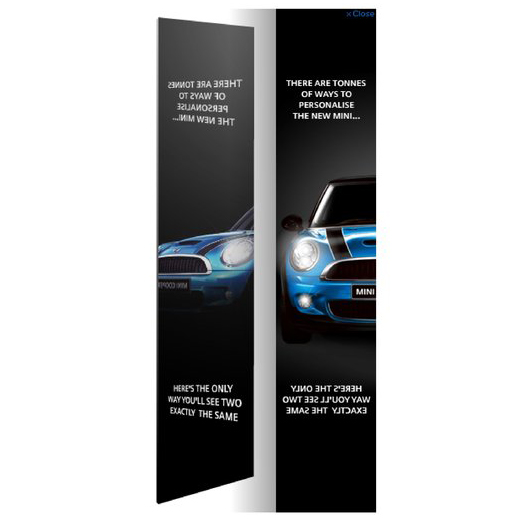
There are many ways to think creatively within the restrictions of any of these formats. Glue London's 2007 launch campaign for the new Mini is a great example: its smart use of a close-cropped image and mirrored text on a simple skyscraper ad helped win it a D&AD Graphite Pencil.
02. Pick a single message
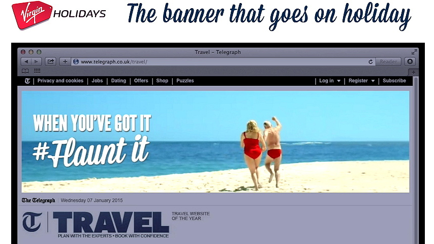
Another crucial rule of thumb when it comes to digital ad campaigns is to keep the message brutally simple. Packing in too much information makes an already cramped format look cluttered, messy and confusing.
Multiple layers of messaging can be added using animation or video, and this can be effective sometimes, but it's not always the best solution. Even if you do end up adding more dynamic features, start with an idea that works when pared back to a simple static ad. It'll help you to clarify the concept.
Pick the one thing that the ad needs to communicate. Is it general brand building, driving traffic, selling a particular product, or promoting an event, for instance? Sometimes, in defining this message, you may need to strip out elements of standard brand messaging – a complex logo or long tagline may need to be sacrificed here.
This is where distinctive brand voice, or other recognisable brand assets – colours, style of art direction, a typeface – could need to work hard to associate the ad with the brand through visual shorthand, rather than spelling it out.
03. Choose one killer image
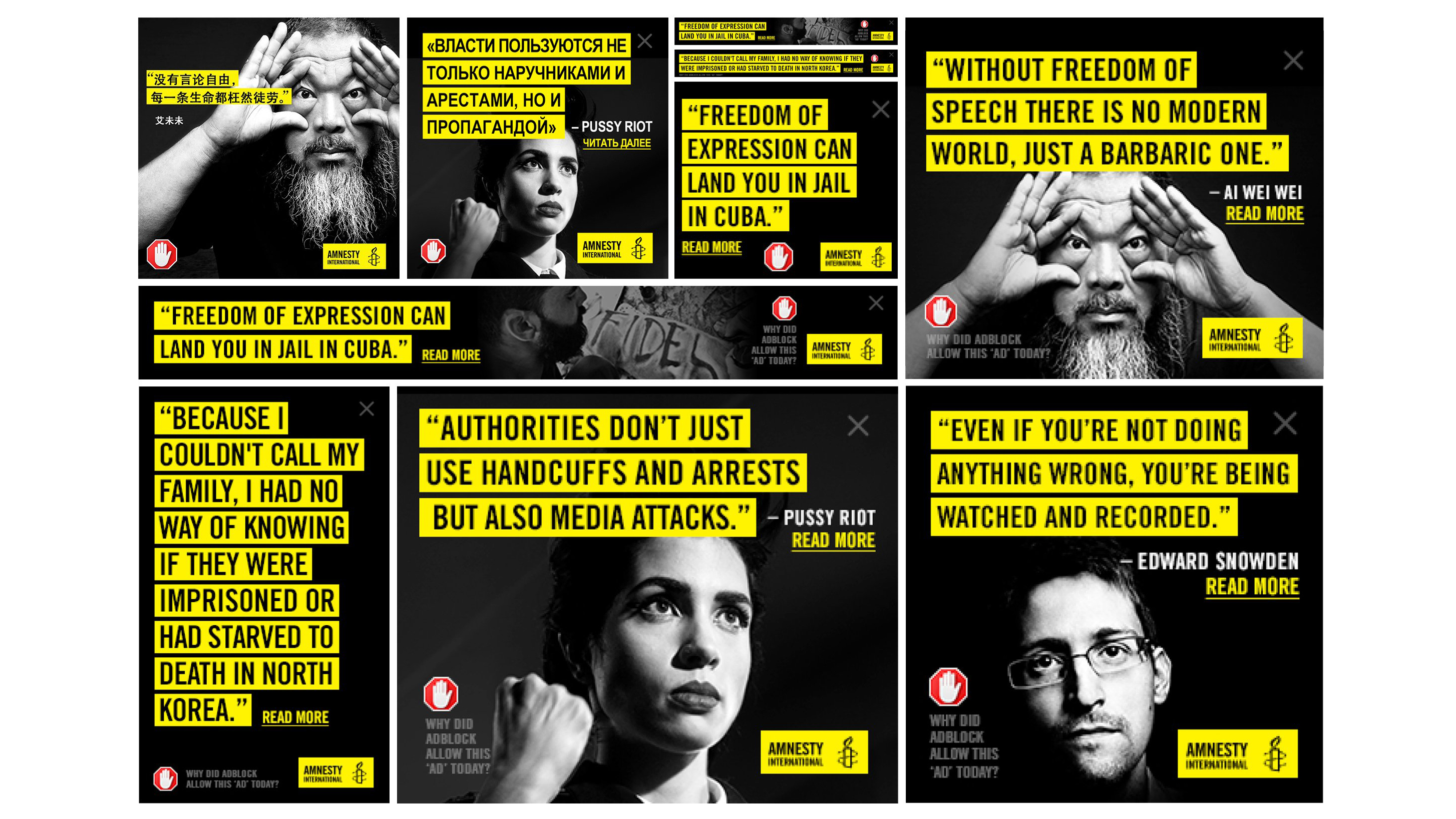
Don't try to pack each ad with images to get the point across. There's generally only a tiny space to work with, and it's much more effective to invest in a single killer shot that compels attention and draws people in.
As with the copy, images in digital ads should be sharp, clear, singular in message, and easy to understand at a glance. Faces work well as they are easy to relate to, establish eye contact and can convey emotion quickly.
When it comes to selling particular products, it's often more effective to zoom in close on a single item that represents the brand, rather than trying to show off a whole range of things. Avoid complicated patterns and backgrounds, as they distract attention.
One way to choose the right image quickly is to start with the single message you've picked for the ad to communicate in mind, and think what the clearest visual manifestation of that would be. Sometimes this might be a mood, or a more abstract concept, but if you're selling a specific thing don't be afraid to be literal.
Think about context, too. You want your ad to stand out, so if the website it's being placed on is awash with bright colours then a black-and-white photo, or a design that makes use of white space, could stand out much more.
04. Think about dynamic cropping
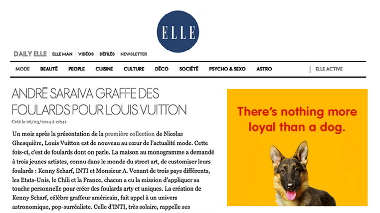
If you're designing a digital campaign that makes use of the same image across multiple ad formats, you'll need to consider cropping. Given the small canvas size, and often awkward shapes involved, tight crops and detail shots are often essential to achieve impact.
Cut-outs, set on flat colour backgrounds or white space, can be an effective way to create a versatile design framework that works in lots of different contexts. It also gives you a base on which to set the type, keeping the key message of the ad crisp and clear.
Don't feel you need to pack every inch of the space, just because it's available. On a cluttered page, often the eye is drawn to the lightest or brightest areas of the screen first, so white space definitely isn't wasted space – just make sure your client understands that too.
05. Emphasise the call to action
Of course, what all of this is ultimately about is encouraging people to click through to something. Once you've chosen your format, defined the right message for the campaign and conveyed it as clearly and effectively as possible through imagery, it helps to be clear about what people should do next.
You don't have much room to do this, so sometimes it's worth being very literal – such as the 'Read more' link in the Amnesty International example above. Direct instructions that explain what needs to happen next are more effective than a generic 'Click here'.
If you're promoting an event, for instance, 'Buy tickets' is a better choice as it communicates the end goal. If there's a particular offer, mention it in the call to action: 'Click here to save 50%' is much more compelling.
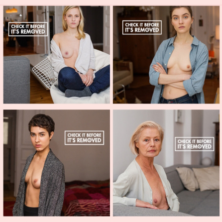
Sometimes, however, a compelling image can almost stand alone – with only a punchy tagline to establish the context. DDB Group's bold breast cancer awareness campaign for Pink Ribbon Germany was structured entirely around the fact that the images featured (artfully shot, entirely non-gratuitous) bare breasts, and the agency knew that Facebook and Instagram would soon begin deleting them.
'Check it before it's removed' was the inspired double-meaning tagline for the campaign, and a potentially life-changing call to action for women at risk of breast cancer. And as the posts were routinely removed, mainstream media attention grew.
Related articles:

Nick has worked with world-class agencies including Wolff Olins, Taxi Studio and Vault49 on brand storytelling, tone of voice and verbal strategy for global brands such as Virgin, TikTok, and Bite Back 2030. Nick launched the Brand Impact Awards in 2013 while editor of Computer Arts, and remains chair of judges. He's written for Creative Bloq on design and branding matters since the site's launch.
