Tips and tricks for Retina images in responsive web design
Christopher Schmitt explains how to keep users of both Retina and traditional screens happy, by delivering adaptive and flexible images to suit all resolutions
Sign up to Creative Bloq's daily newsletter, which brings you the latest news and inspiration from the worlds of art, design and technology.
You are now subscribed
Your newsletter sign-up was successful
Want to add more newsletters?
I’ve seen the future of websites and apps, and it's in 300ppi resolution. As of this writing, only the latest iPhone and iPad have these Retina displays, but they're coming in as fast as computer manufacturers can get them made.
Since we have come from a history of building at 72ppi or 96ppi resolutions, this schizophrenic resolution issue is one that will persist for years to come. For remedies, let’s think out of the box for the issue of delivering adaptive or flexible images without having to be concerned about their visitor’s resolution.
Background-size: 100%;
One way is to place images in the background of HTML elements and set background-size: auto;. As the container element expands, so does the image in the background. This is more of a niche solution suitable for small areas of a screen’s real estate.
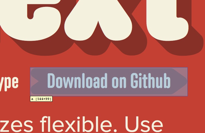
Article continues belowA solid example of this is on the arrow in the fittextjs.com website, which also happens to be a great tool in designing text for responsive layouts.

This problem still exists with image integrity. If the image expands to a space much larger than it was intended, pixellation and other image artifacts become readily visible.
Designing with text
One way to create adaptive imagery is with the everyday letters and numbers we use to read and write.
The ability to share information across the world is one challenge overcome by the internet. Another challenge is people from many countries communicating with each other with text. Different languages means different characters and it means a lot more than just the ABCs.
Sign up to Creative Bloq's daily newsletter, which brings you the latest news and inspiration from the worlds of art, design and technology.
To address this communication conundrum, we need a common set of characters we can draw from that can be shared and supported by different operating systems and applications.
That’s where Unicode comes in. It’s an industry standard for setting and sending characters for a lot of languages. And it includes icons.
The wonderful thing about well-crafted icons is that they are very efficient at communication: they don’t need a translation. A small picture representing a telephone, for example, breaks through so many language barriers.
To use Unicode icons with HTML5, make sure to set the character set in the head element:
<meta charset="utf-8">Then in the body element, you can simply copy and paste the Unicode directly from a reference web page like en.wikipedia.org/wiki/Unicode_symbols.
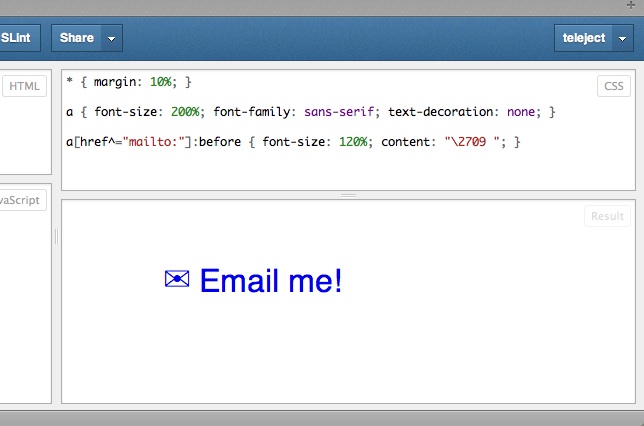
To go a step further, use CSS content generation with encoded Unicode characters as a way to enhance content:
a[href^="mailto:"]:before { content: "\2709"; }While Unicode characters are one way to go, it’s probably best to use them as supplemental visual element. Screen readers — browsers that read out the contents of a web page for people with a disability — probably won’t be able to read out Unicode characters.
In fact, some screen readers have been found to read the character as a question mark. So, web designer be aware.

Fonts as icons
With the use of Unicode as icons, we can also set the look and feel of them with CSS. But we can also go a step further and apply the same thought to fonts that contain only icons, sometimes referred to as dingbat fonts.
Since both Unicode icons and dingbats are set via text, it’s possible to have these visual aids expand and contract with the different devices by setting the height of the text to ems or percentages, too.
The main issue with using dingbat fonts is that they are still representations of characters. While visually, people might see an icon, site visitors with screen readers are going to hear random characters.
To work around the issue, use CSS content generation and data attribute to store the character as shown in pictos.cc/articles/using-icon-fonts/:
<style>[data-icon]:before { font-family: "icon-font”; content: attr(data-icon);} </style><a href="http://example.com/cloud/save/"> <span data-icon="C" aria-hidden="true"></span>Save to Cloud </a>With this issue this sets up extra hurdles for the screen reader to go through. If they can parse content generation, they might not be able to pull character from the attr() value.
This series of obfuscation is not an ideal technique, but one that seems to work for now. If anything, I hope this sets a challenge for screen reader developers to make a better tool.
Scalable Vector Graphics
Another way is to work with Scalable Vector Graphics (SVG). SVG has made great leaps in browser support. In fact, all modern browsers support inline SVG images natively.
If you want to create a SVG graphic, be aware that popular vector image tools such as Adobe Illustrator or Adobe Fireworks already allow for exporting to the format.
The problem with SVG isn’t with the image format: it’s with older versions of IE. As of version IE9, Microsoft has put in support for SVG.
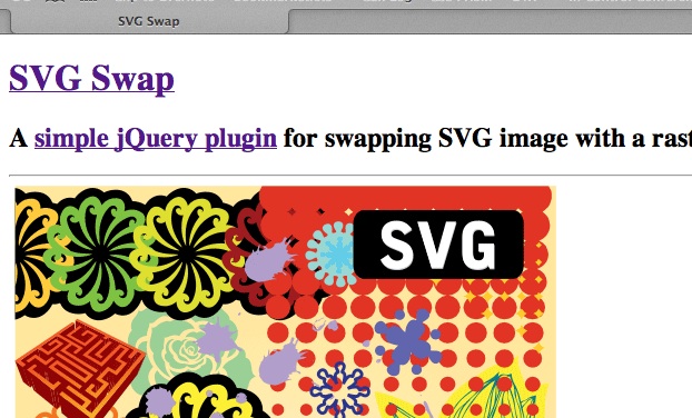
There are a couple of solutions to this problem. One is to use browser sniffing (of sorts). With older versions of IE, we can rely on the exquisite block of conditional comments found in HTML5 Boilerplate and use a simple jQuery Plugin called SVG Swap (see github.com/teleject/svg-swap). So, when an older version of IE appears, a PNG-8 or JPEG or GIF replacement image takes its place.

Another solution is to do feature detection. If you are using Modernizr on your site already, set Modernizr to test for inline SVG and deliver a polyfill via yepnope.
Different tricks for different scenarios
Lastly, let’s not forget about CSS3. With cutting edge properties like mask-image, text-fill-color, text-stroke-color and more, we’re steadily getting to a place where Photoshop is in the browser, waiting to render our graphics along with the rest of the page’s layout and design elements.
For inspiration in this area, check out Trent Walton’s headers to his blog posts like the one titled “In Flux”.
Coping with the future
These are handful of a ways to get around the need for raster images, and thus the need for multiple versions of the same image. Browser support (even though some still use vendor-prefixes) leads to great visual designs and, more importantly, deal with saving multiple files in multiple device resolutions.
It’s the responsive image solution for a problem that’s not going to get better any time soon.
Header graphic by Patrick Hoesly

The Creative Bloq team is made up of a group of art and design enthusiasts, and has changed and evolved since Creative Bloq began back in 2012. The current website team consists of eight full-time members of staff: Editor Georgia Coggan, Deputy Editor Rosie Hilder, Ecommerce Editor Beren Neale, Senior News Editor Daniel Piper, Editor, Digital Art and 3D Ian Dean, Tech Reviews Editor Erlingur Einarsson, Ecommerce Writer Beth Nicholls and Staff Writer Natalie Fear, as well as a roster of freelancers from around the world. The ImagineFX magazine team also pitch in, ensuring that content from leading digital art publication ImagineFX is represented on Creative Bloq.
