Build better web forms with JavaScript
Filling out forms online can be a frustrating experience. Chris Lienert demonstrates how to build robust, easy-to-use HTML5 web forms using open source library Quaid JS.
Web forms are the fundamental method of providing data interaction on the web. It's frustrating for a user to fill out a form and encounter bad or broken validation - so this tutorial shows you how to build a user-friendly HTML5 web form.
Quaid JS is the open source version of an in-house JavaScript validation library, which has been maintained and updated for over a decade. The current version harnesses the best of HTML5 forms and extends the built-in features with easy-to-implement validation rules and user-friendly behaviour.
Getting started
Put a few structural elements in place before getting started on the form. I usually start with a customised version of the HTML5 Boilerplate, which comes with the essential Modernizr baked in. Add async references to jQuery and Quaid JS just before your closing body tag. Now you're ready to build a form. (Don't forget to combine and minify the scripts in the production environment.)
- Download the source files for this tutorial
yepnope([{
  load: "//ajax.googleapis.com/ajax/libs/jquery/1.8.3/jquery.min.js",
  callback: function(url, result, key){
    if (!window.jQuery){
      yepnope("script/jquery-1.8.3.min.js");
    }
  }
}
,{load:"script/quaid-1.0.js"}
,{load:"script/quaid-au-1.0.js"}
]);
Building a form
Get the form started by adding the form and first fieldset elements:
<form method="post" action="#">
<fieldset>
While, technically, you should use a caption for fieldsets, I find they're near impossible to style consistently. I prefer to use standard HTML headers:
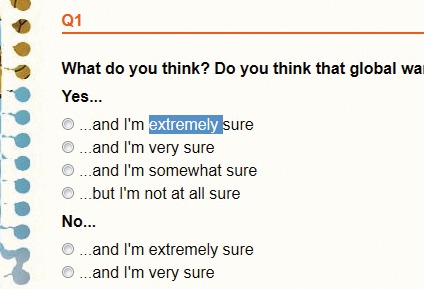
<h2>First Form</h2>Add a block element (p, li, th or td) to contain each label and field. Remember to include the for attribute when adding a label; without it you can't tap/click a label to focus on the associated field – crucial with hard to click/tap radio buttons and checkboxes. Set an appropriate field size, giving an indication to users of how much you want them to enter. If the field data is going to a database, set the maxlength to the same as the corresponding database field. This is a standard HTML5 input marked with the required attribute:
<p><label for="name">Name</label>
<input type="text" name="name" id="name" size="30" maxlength="100"
required>
</p>
The email field uses the HTML5 type email that triggers Quaid JS's email validation. If you're doing your own email validation, be careful of an overly simple regex - email addresses are more complex than they initially appear:
Daily design news, reviews, how-tos and more, as picked by the editors.
<p><label for="email">Email</label>
<input type="email" name="email" id="email" size="30" maxlength="100"
required>
</p>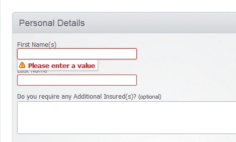
While HTML5 introduces the tel input type, it doesn't provide any way to discriminate between different types of phone numbers when necessary (for example, mobile and fixed line). Quaid simply looks for a class to do the trick.
For some time, the convention for marking required fields has been to add an asterisk somewhere near the field or label. Given that the majority of form fields are required (if not, why are you including them?), it's much more user-friendly to mark optional fields.
Vary the text to explain why the field is optional and, more to the point, why a user may need to fill it in:
<p><label for="mobile">Mobile Phone <small class="hint">(if you have one)</
small></label>
<input type="tel" name="mobile" id="mobile" size="13" maxlength="13"
class="mobile">
</p>
Postcodes fit set patterns, which makes validating them quite simple. Since there's no input type for postcodes, Quaid JS picks up the appropriate class (postcode) to add validation.
Enhance this by validating against a database with a custom Ajax call. However, be careful of relying on the data source and allow users to make corrections beyond the basics.
Australian postcodes give a fairly accurate prediction of the associated state. Using brilliant HTML5 data attributes we can tell Quaid to predict state select fields. As Australian postcodes can only be digits, use the pattern attribute - otherwise best avoided - to trigger a numeric keyboard for iOS visitors. Also, try plugging in some geolocation code to auto-populate address fields:
<p><label for="postcode">Postcode</label>
<input type="text" name="postcode" id="postcode" size="4" maxlength="4"
class="postcode" data-state-field="state" pattern="/d*" required>
</p>
Select fields are generally straightforward. However, it's worth noting that you'll need an empty option to prevent selecting a default value (where this is appropriate):
<p><label for="state">State</label> <select name="state" id="state"
required>
<option></option>
<option value="nsw">New South Wales</option>
<option value="nt">Northern Territory</option>
<option value="qld">Queensland</option>
<option value="sa">South Australia</option>
<option value="tas">Tasmania</option>
<option value="vic">Victoria</option>
<option value="wa">Western Australia</option>
</select></p>
There's a selection of date input types available in HTML5, but at present their implementations are awkward at best. Until a better option presents itself, use a class to mark date fields and leave Quaid to do the validating. Datepicker controls can easily be added by selecting elements that have the same date class.
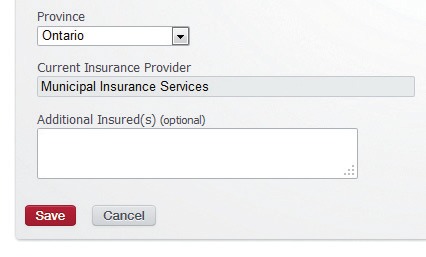
Given that I'm expecting a particular pattern here, I've used a placeholder to give users an indication of what I expect:
<p><label for="date">Date <small class="hint">(if applicable)</small></label>
<input type="text" name="date" id="date" size="12" maxlength="12"
placeholder="dd/mm/yyyy" class="date">
</p>
For those of us who spend far too many hours working with web forms, the maxlength attribute for textareas is one of the best additions to HTML5 Forms. Quaid retrofits the functionality for browsers that don't natively support it:
<p><label for="description">Description <small class="hint">(if known)</small></label>
  <textarea name="description" id="description" rows="3" cols="40" maxlength="200"></textarea>
</p>
Conditionally visible fields are easy to achieve by, once again, using data attributes. The value of variable field, data-visible-field, controls whether the target field is required either by being checked (for radios and checkboxes) or by matching the optional data-visible-value value.
Required fields work the same way using the data-required-field and optional data-required-value attributes accordingly:
<p class="check"><input type="checkbox" name="show" id="show"
value="show">
  <label for="show">Show Me Something</label>
</p>
<fieldset data-visible-field="show">
  <p><label for="conditional">Conditional</label>
    <input type="text" name="conditional" id="conditional" size="30" maxlength="100"
data-required-field="show">
  </p>
</fieldset>
The following visible and required states vary according to the selected value of the state field. In this instance, the fieldset will be visible and the field will be required if the state, Western Australia, has been selected:
<fieldset data-visible-field="state" data-visible-value="wa">
  <p><label for="conditional-value">Conditional Value Field</label>
    <input type="text" name="conditional-value" id="conditional-value" size="30" maxlength="100" data-required-field="state" data-required-value="wa">
  </p>
</fieldset>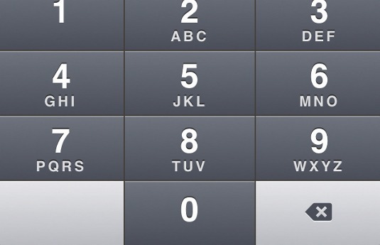
Beyond the validation rules shown above, Quaid JS has the following validation rules, which can be set in a field's class:
- Time
- Year
- (Positive) Numeric
- (Positive) Integer
- (Positive) Currency
- Credit Card
- CSC (Card Security Code or one of its many aliases)
Custom validation
The standard rules shown above will cover most of validation requirements, but you may need to write your own custom validation rules:
<p><label for="custom">Custom <small class="hint">(min. 4 characters)</small></label>
  <input type="text" name="custom" id="custom" size="30" maxlength="100">
</p>
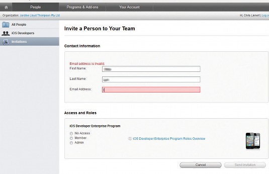
Three custom jQuery methods are offered by Quaid JS: inline, submit and Ajax. Inline lets custom rules fire while users fill out the form, before it's submitted:
$("#custom").addValidation(function(el){
  el.isValid = el.value.length > 3;
  if (!el.isValid) {
    el.errorMessage = "Please enter at least four characters";
  }
});
Submit validation rules are deferred until the form is submitted:
$("#name").addSubmitValidation(function(el){
  el.isValid = el.value !== "Dave";
  if (!el.isValid) {
    el.errorMessage = "Sorry Dave, you're not allowed";
  }
});
Ajax validation offers a straightforward way to hook into server validation. In its simplest form, rules can be added with just the path to the service:
$("#postcode").addServerValidation({
  path: "validation.svc/IsValidPostcode?postcode="
});
The called service needs to send back a JSON object with the error message (empty string designates no error) and ID of the calling field:
validationResponse {
  message: "",//all clear
  caller: "postcode"
}
Internationalisation
Quaid JS's locale-specific parts are wrapped in separate files for each region. Simply inject the locale code as required for instant internationalisation:
Australian:
isPostCode: function (p) {
  return /^\d{4}$/.test(p);
},
...
postcode: "Postcode entered is not valid e.g. 3000",
Canadian:
isPostCode: function (p) {
  return /^[abceghjklmnprstvxyABCEGHJKLMNPRSTVXY][0-9][abceghjklmnprstvwxyzABCEGHJKLMNPRSTVWXYZ]\s{0,1}[0-9][abceghjklmnprstvwxyzABCEGHJKLMNPRSTVWXYZ][0-9]$/.test(p);
},
...
postcode: "Postal code entered is not valid e.g. A9A 9A9",
Styling
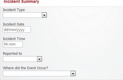
For the most part, styling forms is straightforward since browsers render controls on your behalf. But there are a few tricks worth noting. By default, read-only fields are indistinguishable from normal fields. This is easily fixed:
input[readonly],
textarea[readonly] {
  background-color: #ddd;
  border-color: transparent;
}
Label positioning is vital, to show what a field is supposed to contain. While there are arguments for left, right and vertical alignment, I strongly favour vertical alignment if only from a mobile-friendly point of view. The easiest way to achieve this is to change the display property of the label elements:
label {
display: block;
}
So there ends this tutorial - I hope it's provided a helpful guide to creating clearer, more user-friendly HTML5 forms.
Words: Chris Lienert
This article originally appeared in .net magazine issue 239
Liked this? Read these!
- Check out these amazing Javascript examples
- Our favourite web fonts - and they don't cost a penny
- Pro tips for the perfect website layout
Any questions? Ask away in the comments!

Thank you for reading 5 articles this month* Join now for unlimited access
Enjoy your first month for just £1 / $1 / €1
*Read 5 free articles per month without a subscription

Join now for unlimited access
Try first month for just £1 / $1 / €1

The Creative Bloq team is made up of a group of art and design enthusiasts, and has changed and evolved since Creative Bloq began back in 2012. The current website team consists of eight full-time members of staff: Editor Georgia Coggan, Deputy Editor Rosie Hilder, Ecommerce Editor Beren Neale, Senior News Editor Daniel Piper, Editor, Digital Art and 3D Ian Dean, Tech Reviews Editor Erlingur Einarsson, Ecommerce Writer Beth Nicholls and Staff Writer Natalie Fear, as well as a roster of freelancers from around the world. The ImagineFX magazine team also pitch in, ensuring that content from leading digital art publication ImagineFX is represented on Creative Bloq.
