TV service Freeview unveils new logo
As part of a major new drive, the UK's most watched digital TV service reveals a new logo.
Sign up to Creative Bloq's daily newsletter, which brings you the latest news and inspiration from the worlds of art, design and technology.
You are now subscribed
Your newsletter sign-up was successful
Want to add more newsletters?
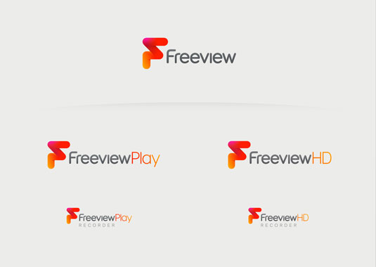
Freeview, the UK's most watched digital TV service, has undergone a major rebrand, led by creative agency DixonBaxi. The move is part of Freeview's strategic drive to bring connected television to a mass UK audience.
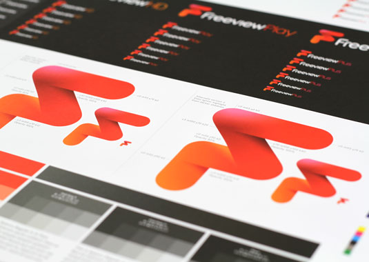
The new logo retains the red heritage of the brand, but has been completely redesigned with added dimension - an angular form that suggests agility, choice and a sense of fun.
"[The new logo's] vibrant colour has a lightness of spirit and innate sense of energy, yet feels human and engaging,” reads a release from DixonBaxi.
Guy North, Freeview Managing Director, said: "The Freeview and Freeview Play logos are bold, contemporary and will stand out in what is a very crowded TV market. Today marks the start of an exciting future for the Freeview brand."


Words: Martin Cooper
Like this? Read this!
- 10 typography tricks every designer should know
- 20 fonts every graphic designer should own
- Will this stunning Mac concept revolutionise your desktop?
Sign up to Creative Bloq's daily newsletter, which brings you the latest news and inspiration from the worlds of art, design and technology.

The Creative Bloq team is made up of a group of art and design enthusiasts, and has changed and evolved since Creative Bloq began back in 2012. The current website team consists of eight full-time members of staff: Editor Georgia Coggan, Deputy Editor Rosie Hilder, Ecommerce Editor Beren Neale, Senior News Editor Daniel Piper, Editor, Digital Art and 3D Ian Dean, Tech Reviews Editor Erlingur Einarsson, Ecommerce Writer Beth Nicholls and Staff Writer Natalie Fear, as well as a roster of freelancers from around the world. The ImagineFX magazine team also pitch in, ensuring that content from leading digital art publication ImagineFX is represented on Creative Bloq.
