
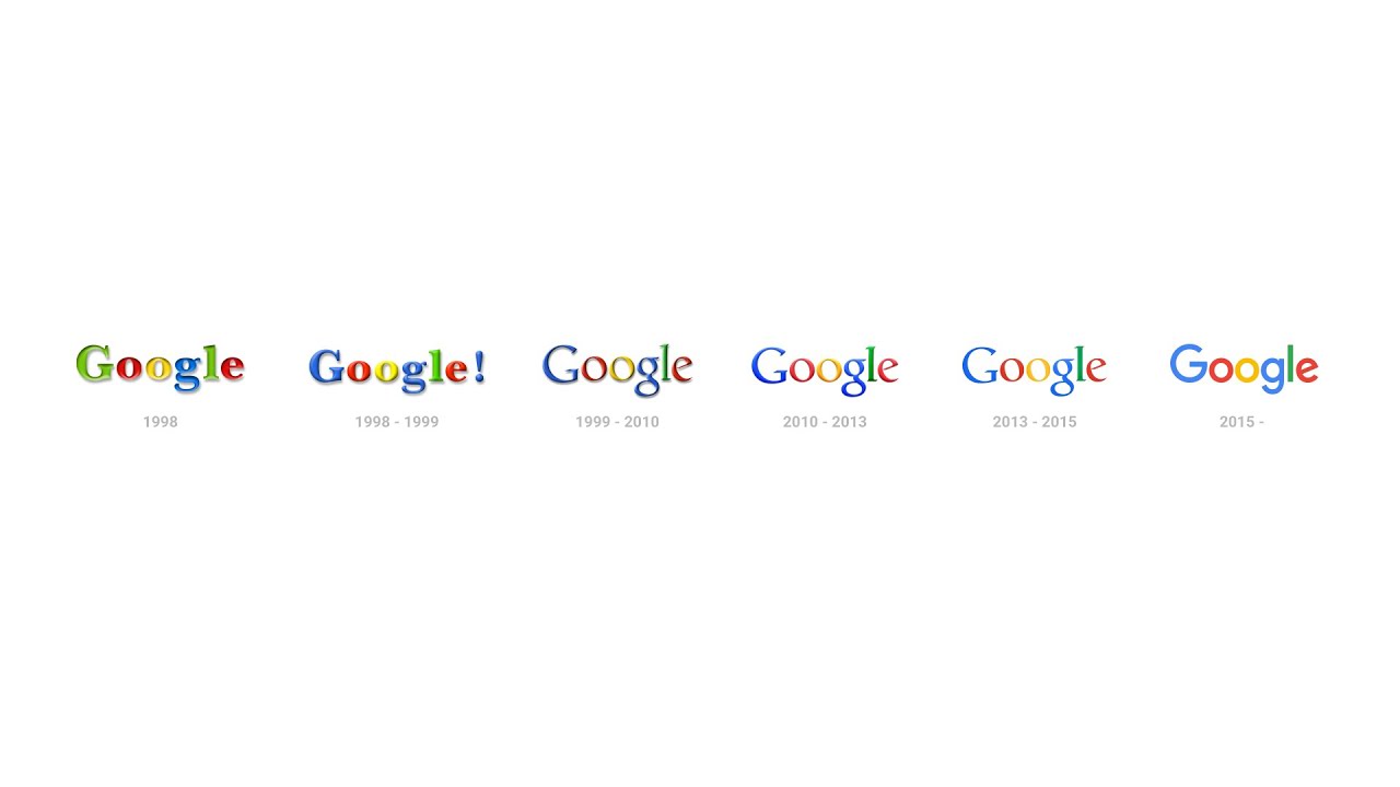
Last month, we mused on whether Google's Alphabet website, in particular its new typeface, dropped hints about a new logo for the search giant. And today Google has announced exactly that, plus a new identity family as the company cements its new corporate position as part of the Alphabet group.
The rounded sans serif letterforms continue Google's playful identity that has been a theme of the company's logo, but the big news is the move from serif and that the lower-case 'g' used in Google's icons becomes upper-case. The colour scheme remains the same instantly-recognisable combination and while the redesign could never be described as radical it is a significant transformation while retaining the key brand identifiers.
An announcement on the Google blog says: "Today we're introducing a new logo and identity family that reflects this reality and shows you when the Google magic is working for you, even on the tiniest screens. As you'll see, we've taken the Google logo and branding, which were originally built for a single desktop browser page, and updated them for a world of seamless computing across an endless number of devices and different kinds of inputs (such as tap, type and talk).
"It doesn't simply tell you that you're using Google, but also shows you how Google is working for you. For example, new elements like a colorful Google mic help you identify and interact with Google whether you’re talking, tapping or typing. Meanwhile, we’re bidding adieu to the little blue 'g' icon and replacing it with a four-color 'G' that matches the logo."
But what do you think? Give us your opinion in the comments.
Liked this? Read these?

