
Google has announced a major restructure to its corporate structure, with Alphabet becoming the search giant's parent company and a new website – abc.xyz – being set up as its home.
The move has surprised many in the industry, but of most interest to us here at Creative Bloq is whether the new typeface used on Alphabet's site provides a clue to a new logo design for Google.

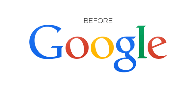
Google's last logo redesign was hardly earth-shattering, with a kerning tweak being all but invisible to everyone but typesetting enthusiasts. The only other major developments in Google's playful logo were adopting flat design in 2013 and adding (then dropping) a Yahoo!-esque exclamation mark – read more about Google's logo evolution here.
However Alphabet, as we must now call it, may be keen to perform a full-on rebrand with Google this time around, to reflect the big changes in company structure. Watch this space…
Liked this? Read these?

