New logo and packaging for Doritos
Hornall Anderson has created a new look for the tortilla chip brand, which launches globally today. What do you think of it?
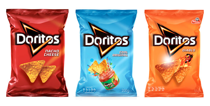
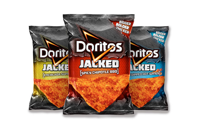
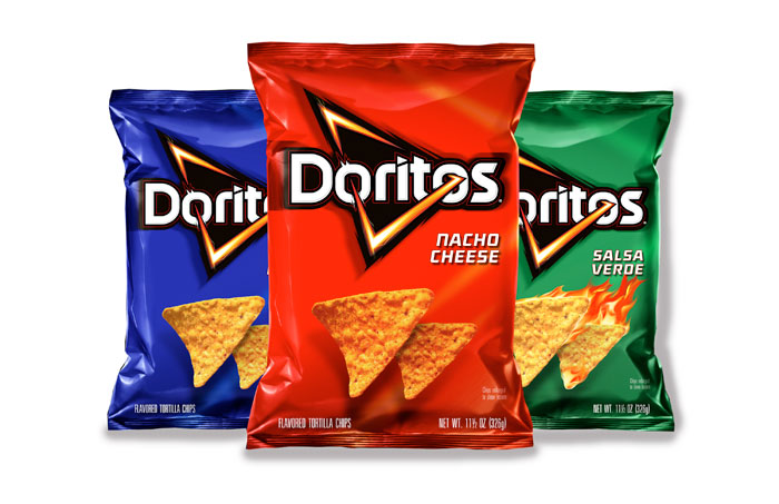
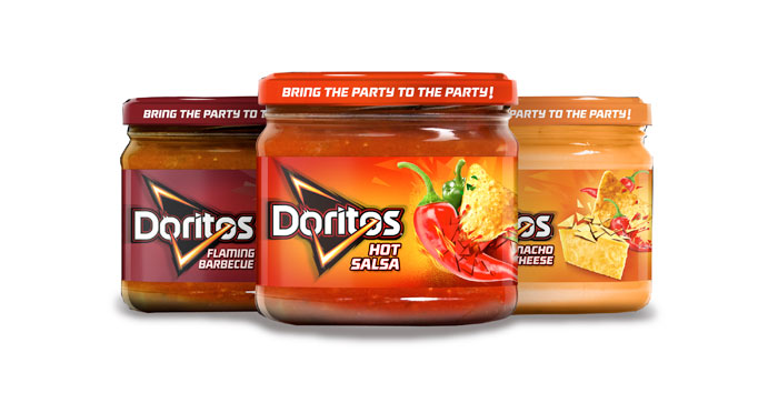
Here's a first look at the new packaging design and logo design for popular tortilla chip brand Doritos.
The new look was designed by PepsiCo’s Frito-Lay division in partnership with Hornall Anderson. The new look for Doritos (which translates as "turned golden" in Spanish) is the first time the brand has had a unified global identity.
Hornall Anderson’s UK team visited cities across the world to see how the product was perceived and to find out how to best achieve an emotional connection with its core demographic of teens and young adults.
Article continues belowDefining each element
"The DORITOS target consumer moves fast, so when it came to the packaging, every element needed to have a valuable well-defined role," said Ali Whitely, Hornall Anderson UK creative director.
"We considered everything from photography, tone of voice and visual personality to create a bold and inspiring look and feel. The new identity and package design brings to life the emotional equities of the DORITOS brand and what it means to the consumer."
Liked this? Read these!
- The ultimate guide to designing the best logos
- The best free web fonts for designers
- Useful and inspiring flyer templates
What do you think of the new logo and packaging? Let us know in the comments below...
Sign up to Creative Bloq's daily newsletter, which brings you the latest news and inspiration from the worlds of art, design and technology.

The Creative Bloq team is made up of a group of art and design enthusiasts, and has changed and evolved since Creative Bloq began back in 2012. The current website team consists of eight full-time members of staff: Editor Georgia Coggan, Deputy Editor Rosie Hilder, Ecommerce Editor Beren Neale, Senior News Editor Daniel Piper, Editor, Digital Art and 3D Ian Dean, Tech Reviews Editor Erlingur Einarsson, Ecommerce Writer Beth Nicholls and Staff Writer Natalie Fear, as well as a roster of freelancers from around the world. The ImagineFX magazine team also pitch in, ensuring that content from leading digital art publication ImagineFX is represented on Creative Bloq.
