Create awesome retro designs with Photoshop and CSS
Vintage fonts and retro designs are all the rage on the web. Illustrator and designer Naomi Atkinson reveals some quirky Photoshop and CSS tricks to give your designs a retrotastic feel
Sign up to Creative Bloq's daily newsletter, which brings you the latest news and inspiration from the worlds of art, design and technology.
You are now subscribed
Your newsletter sign-up was successful
Want to add more newsletters?
This article first appeared in issue 216 of .net magazine - the world's best-selling magazine for web designers and developers.
The word retro derives from the Latin prefix retro-, meaning backwards or in past times. It’s a culturally outdated or aged style that has since become functionally or superficially the norm once again. It generally implies a vintage of at least 15 years.
We can be tempted to use a retro style in our work simply because it feels cool or different, or because it follows a current trend. But before we dive into our sketchbooks or delve into Photoshop, it’s important to examine why we’re contemplating using the style, and whether it really suits the brief.
Article continues belowI suggest you ask yourself the following question: has the brand/product/ service been around for a substantial period of time? When you look into its history, can you find advertising, packaging or branding that feels retro to look at these days? Or, is it simply a service that existed back in the day as well as today, such as a milkman or shoe shiner? If the answer is no, then ask: can the brand/product/service be associated with days gone by? For instance, a chauffeur or maid service, a reproduction of an older product (VW Beetles come to mind), or a trend that’s regained popularity. If the answer to both these questions is no, then a retro style might not be the best choice.
Going retro
I’ve created and coded a very simple design to show off what you can do with just four images and some nifty CSS. The point of this example is to give you some ideas of how to achieve a retro feel simply and quickly, so you can incorporate what you’ve learned into your own designs.
However, there are a few things to consider before you start working. The most important stage before jumping into any designing is to research your intended style. Retro can be taken to mean anything from just 15 years ago right the way back to whenever your mind or research will let you go. A favourite period of mine is the 1920s, because this era saw a huge influx of advertising. The primary factors to note for inspiration are colour palettes, typography, patterns and illustration style.
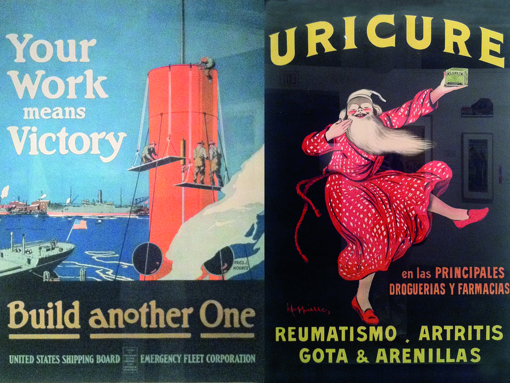
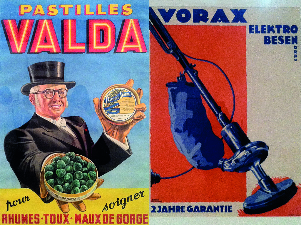
Your choice of font is also very important, because many retro styles rely heavily on the use of strong type. Shop around on a few online font sites. Keep your findings (whether they be screengrabs, cutouts or books) close by, so you can compare your type choices with the style you’re aiming for.
Sign up to Creative Bloq's daily newsletter, which brings you the latest news and inspiration from the worlds of art, design and technology.
Next, I’d suggest you get your design on paper. The best piece of advice I’ve been given is that your computer is a tool. Never be under the impression that you can’t design without it – it should simply help you realise your designs.
Getting into Photoshop
Open the PSD in the example files, and you’ll see just how simple this design really is. When creating it on-screen, the one thing I kept in mind throughout was this: if I can style it with CSS rather than having to use an image, I will.
I was planning to use web fonts, so the only need for images would be for texture. I also wanted to refrain from using any images within the HTML, leaving me with clean markup. Although I would never call myself a coder, I feel it’s important to know and understand the capabilities – and limitations – of CSS. It really does make you a better web designer.
A handy trick when designing with CSS in mind is to know which layer styles in Photoshop best represent the styles created with CSS. Here are some of my suggestions:
Layer style: Stroke
CSS properties: -webkit-text-stroke, border
Layer style: Glow
CSS property: box-shadow (I haven’t used this one in the example, but it’s worth mentioning)
Layer style: Drop shadow
CSS property: text-shadow
Tip – to get that 1px highlight at the base of your type, try these settings:
Layer style: Drop shadow; 90 degrees, Distance 1px, Spread 0, Size 1px
CSS properties: text-shadow: 1px 0 0 #color;
Textures and patterns
You can easily create that worn, old-school feel with a retro design by using a mixture of textures and patterns. In the example PSD, you’ll see I’ve used three images for my texture throughout, kindly provided by Simon Foster at simonfosterdesign.com/blog/my-work/texture-tutorial.
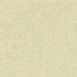
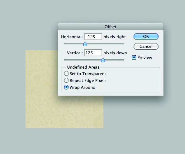
Blending modes and opacities are key when playing with textures, as long as you’re planning on creating images from them, rather than trying to recreate the effects with CSS. Note that I’ve used different blending modes and opacity levels on each of the two image layers. When I was happy with the effect, I selected a part of the background to create a tileable image from. I pulled this into a new file, and used the Offset tool. Select the layer you wish to tile, go to Filter, down to Other and choose Offset. Set the sliders to either plus or minus 50 per cent of your canvas size, and voil! You may need to tweak it slightly (using the Stamp tool, for example).
Once I was happy with my texture (I tested its tileability by defining a pattern in Photoshop; you may prefer just to test it in code), I then saved for web as an optimised JPEG. I used this file to then save out two further versions – a darker one that I could use beneath my striped pattern, and a red version to use within the circle. The only other image I needed to export was the striped pattern used at the top and bottom of the design. To create this, I simply used a pattern fill, which is in the PSD. Take a look at the exported image in the Images folder. Again, we can set it to repeat in the CSS.
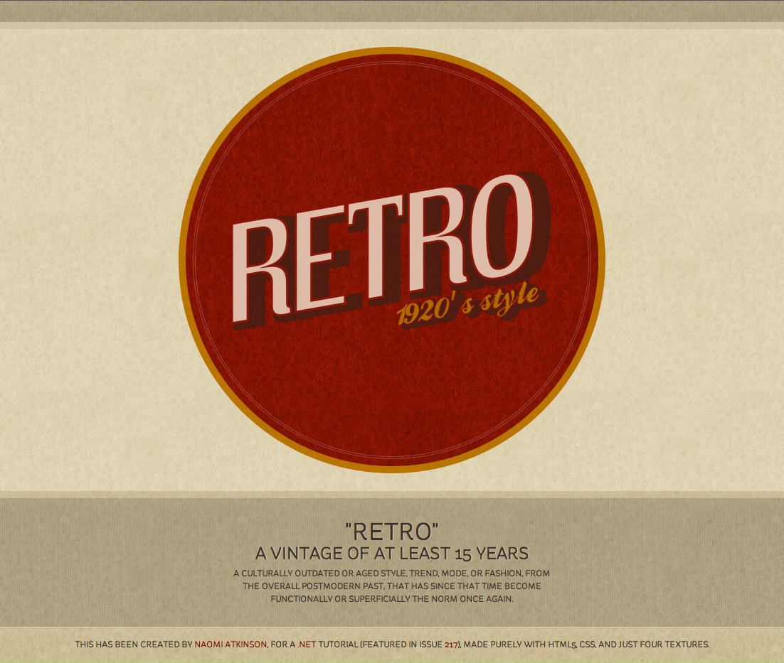
The markup and CSS
The markup is minimal; there’s no need for too many divs or classes. You’ll see in the example files that this only needs three divs for us to have enough hooks to style from. Let’s look at the properties I’ve used:
Border radius
Rather than saving out an image, the circle is created by using border-radius. Just use the same width of your div:
border-radius: 350px;Not compatible with: IE7 & 8
Transform
This is what we’ve done to place our type on a slant:
-webkit-transform:rotate(-10deg) skew(-10deg); -moz-transform: rotate(-10deg) skew(-10deg); -o-transform: rotate(-10deg) skew(-10deg); transform: rotate(-10deg) skew(-10deg);Currently not compatible with: IE7, 8 & 9
Multiple text-shadows
To recreate that chunky offset shadow on the type, I’ve used text-shadow multiple times. This is a neat trick, just as long as you use solid colours on each shadow, rather than RGBA:
text-shadow: 4px 9px 0 #3e2016, opacity: 0.75; 10px 9px 0 #3e2016, 18px 9px 0 #3e2016, 24px 9px 0 #3e2016, 20px 2px 0 #3e2016, 24px 2px 0 #3e2016; /* bottom left blur colour */Currently not compatible with: IE7, 8 & 9, older versions of Mozilla
Text-stroke
In the design we can see that the main text within the circle has an outline before the shadow starts – this is to recreate a style found in my primary research.
To do this, we use text-stroke:
-webkit-text-stroke: 3px #8b150f;/* stroke weight and colour */It’s worth mentioning text-fill-colour here, too. I haven’t used this within the design, but if you were to use:
text-fill-color: transparent;along with text-stroke, you would get transparent type with a border. A lovely effect, especially for that vintage feel.
Current compatibility: Safari and iOS only
Opacity
Although it’s a simple one, it’s worth mentioning. By giving my main type within the circle a little opacity, we get the texture into the type. It’s very subtle, but helps it to feel more realistic:
opacity: 0.75;Not compatible with: IE7 & 8
Know all this stuff already and want more geeky designer tips? Check out W3C’s working draft on text manipulation to see the potential of just how much control we can have over type online at www.w3.org/TR/2011/WD-css3-text-20110215/#transforming.
Finally, what about that awful question people keep asking regarding fall- back for older browsers (or in some cases IE)? The answer is: what they don’t see, they don’t know they’re missing. Let’s think about it. If someone was to view this design in IE8, for example – which is the worst-case scenario along with 7 – they would see a square with some lovely web fonts. All the texture would still be there, but they wouldn’t get any fancy strokes or shadows, and the text would be horizontal rather than on a slant.
As long as you have clean markup, and none of your styles are required for the user to understand its meaning, you have no excuse not to be using CSS to your absolute advantage. IE9 has come on leaps and bounds, and will only get better – this is a truly exciting time for web designers.
Get the latest Photoshop CS6 review from our sister site Creative Bloq.

The Creative Bloq team is made up of a group of art and design enthusiasts, and has changed and evolved since Creative Bloq began back in 2012. The current website team consists of eight full-time members of staff: Editor Georgia Coggan, Deputy Editor Rosie Hilder, Ecommerce Editor Beren Neale, Senior News Editor Daniel Piper, Editor, Digital Art and 3D Ian Dean, Tech Reviews Editor Erlingur Einarsson, Ecommerce Writer Beth Nicholls and Staff Writer Natalie Fear, as well as a roster of freelancers from around the world. The ImagineFX magazine team also pitch in, ensuring that content from leading digital art publication ImagineFX is represented on Creative Bloq.
