Create a responsive HTML wireframe
It's best to transfer design into code as soon as possible. Jared Ponchot shows how to use the Foundation framework to translate a sketch to a HTML prototype.
Sign up to Creative Bloq's daily newsletter, which brings you the latest news and inspiration from the worlds of art, design and technology.
You are now subscribed
Your newsletter sign-up was successful
Want to add more newsletters?
Since the early days of 3D computer modelling, modellers have used a 'wireframe' view of an object to show an object in three dimensions with minimal computer processor cost. Early video games like Battlezone and Tempest showed 3D objects as wireframes because early home computers weren't powerful enough to fully render 3D objects (and early one colour displays couldn't show them even if they could).
Years later, software designers and developers began referring to their sketches of what they were planning to build as wireframes as well. They were trying to accomplish the same thing the 3D modellers were: to show ideas in a low-cost way. They wanted to provide non-designers and developers with a multi-dimensional understanding of what they were designing. As the web moved from being rich text documents to being interfaces designed like software, web designers began wireframing as well (although some in the industry are questioning whether it's now time to ditch wireframes).
For years, I've described my basic philosophy for wireframing using two adjectives: cheap and ugly. Wireframes should be something that you can produce quickly, and you should be able to radically change content, components, priority and layouts with little cost. Wireframes should also be as devoid of style as possible. The last thing you want clients focusing on when reviewing wireframes is the colour palette, textures, typography and imagery. If that's happening, your wireframes aren't ugly enough, or at least not low-fi enough. Wireframes aren't for testing style; they're for testing your content model, architecture, hierarchy and flows. Consider something like style tiles instead if you're looking to test or establish a visual or style language with your client.
Article continues belowBecause they were intended as an inexpensive idea-testing tool, for years, wireframes were simply pencil sketches on paper with quickly rendered boxes and squiggly lines. Eventually some of us found we could make them even faster with the copy-and-paste abilities computers afford, so we began using tools like OmniGraffle or Adobe Fireworks to speed things up even more. Nevertheless, wireframes remained grey boxes and copied-andpasted bits of text placed on a fixed canvas. They were low-fidelity sketches of what a website would be.
As website interactions became more and more complex with the advent of Web 2.0 and technologies like Ajax, as well as advancements in HTML and CSS, there was often a lack of clarity or even a degree of confusion created by these sketches of websites.
Annotations to the rescue! Producing annotated sketches of our websites made a lot of sense as long as the websites themselves were also displayed at a single size on a fixed canvas.
- Download the support files for this tutorial
Brave new world
We've now entered a brave new world where our websites live on a plethora of devices of various screen sizes, resolutions and interaction patterns. The fixed canvas is a thing of the past. So, what's our solution been? For the most part, we choose two to three screen sizes (which typically map to Apple's original two iOS devices and one random desktop size) and repeat the process for each. Sketch everything, annotate everything, profit!
Sign up to Creative Bloq's daily newsletter, which brings you the latest news and inspiration from the worlds of art, design and technology.
Assuming we learn a little from whichever size we start at, we should sometimes be able to do this in less than three times the amount of time as our old wireframes for just desktop devices, right? Wrong. In my experience, annotations and confusion increase with this approach. We also begin spending time creating documents that try to make sense of all the screen sizes and presenting these sketches of our website at different sizes in a way that's easy for clients to understand and digest.
Aside from the fact that we've at least doubled our time investment in wireframing, we've also likely ignored a number of key decisions that will have to be made at some point. At times we even paint ourselves into a corner that's very difficult to develop our way out of with HTML and CSS. If our two end points are 320px wide and 1400px wide, there are 1,080 different possible widths in between at which various content, components, or even interaction types might break. This is, after all, where we get the term 'breakpoint' from. There's an additional cost to wireframing this way, even if we think we can get our three widths wireframed more quickly than other methods.
Enter the responsive HTML wireframe
Many designers have been afraid or unwilling to make the leap to producing responsive HTML wireframes for various reasons. What follows is a short list of some of the most common things I've heard designers say about this, and some thoughts on each. These are each very valid questions and sensible concerns, so I'll respond to each individually. I may not be able to convince you to try something new, but hopefully I can dispel a few misconceptions about what I mean when I say that one of my new deliverables in my design process is responsive HTML wireframes.
- "I've been making static wireframes with my toolset for years and have gotten crazy fast at it, I don't want to give up that speed advantage."Producing HTML wireframes may indeed add time to your process from the time you begin wireframing to the point when you have client approval. However, it may well reduce additional communication and work after your wireframes are approved, since static wireframes often leave a lot of stones unturned. Additionally, as you begin wireframing for an ever-increasing number of screen sizes and interaction types, you'll likely find the need for either more wireframes, or additional annotation, which can quickly get out of hand. Maximising speed isn't the only goal in wireframing.
- "I don't think in HTML and CSS. To create layout and design ideas I need a canvas-based tool."This is one of the more common misconceptions about what many people refer to as 'designing in the browser'. Though my client deliverable has become responsive HTML wireframes, I still sketch as a part of my process, and I think you often should.
- "I know HTML and CSS, but I'm no expert frontend developer. I don't have time to fight with media queries and build responsive screens."The good news here is that you need not be Ethan Marcotte to begin creating responsive HTML wireframes. There are a number of frameworks out there that provide handy, reusable code so you can begin piecing together components and layouts that suit your ideas and sketches.
Enter the framework
Now, assuming I've convinced you to wet your toes in the HTML wireframing waters on your next project, let's talk about frameworks. Frameworks generally offer a built-in grid system, base styles, and pre-made, reusable components (navigation, slideshows, and so on). They also offer a community of helpful people due to their widespread use, documentation, and they've been pre-tested in various browsers. There are several frameworks out there, each with their pros and cons. Here's a list of just a few:
I've chosen Foundation to provide you with a quick walkthrough for creating a responsive HTML wireframe because it's popular, it's mobile-first, it's optionally semantic (meaning you can concern your class-based assignments to being semantic using Sass), it has lots of pre-made templates and components, and it's under active development. Basically, it's one of the simplest frameworks to get your head around that also could be used to turn your wireframes into an end product.

Getting started with Foundation
To create your first wireframe using Foundation you can simply go to http://foundation.zurb.com and click on the download link. You'll arrive at a page that provides an array of options to custom tailor your package, but for the purpose of this example we'll just click the Download Foundation CSS link and away we go. The other useful links are Foundation's documentation page and templates page for ready-made samples you can reuse in your wireframes.
Once the ZIP file has downloaded, unzip it into whatever folder on your system you want to store your wireframes in, and then retitle the folder to something meaningful, for example, acme-project. When you open the folder, inside you should see a help.html file, an index.html file, a humans.txt file, a robots.txt file, and folders for CSS, images and JavaScript. Open the index.html file and use it as your starting point. You can simply delete all the sample content within the body tags. This will give you your basic page structure you need ready to go. The important things to note if you're making your own .html file are listed below:
- Add the normalize.css to your head:
<link rel="stylesheet" href="css/normalize.css" />- Add the foundation.css to your head:
<link rel="stylesheet" href="css/foundation.css" />- Add modernizr.js to your head:
<script src="js/vendor/custom.modernizr.js"></script>- Add the jQuery and various foundation scripts to the end of your document body (see the sample index.html file for these).
The Foundation grid system
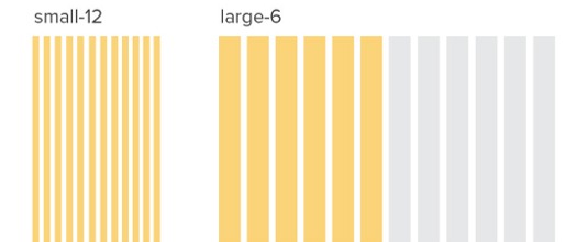
The first and likely most important thing you'll want to understand to begin using Foundation is its grid system. It's a 12-column grid, is completely nestable and fluid, and you can work really fast by assigning grid widths by simply adding a class to an item (for example, class="small-12 large-8 columns").
When using the grid to assign a width to an element, you can assign a width for both small and large screens (the two default 'breakpoints' built into Foundation). x is the number of grid columns assigned. For example, on a small screen, small-x columns or on a large screen, large-x columns. You can create a new instance of the grid by using the row class on a wrapper element. So, in the example below, we have an element that should span the full width on small screens, and only half of the width on large screens.
<div class="row">
<div class="small-12 large-6 columns">...</div>
</div> 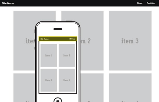
In our example wireframe we've sketched above, we have a legal text area that spans the full width on small screens, but only half on large screens. This would be accomplished as follows:
<div class="row">
<div class="legal small-12 large-6 columns">…</div>
</div>
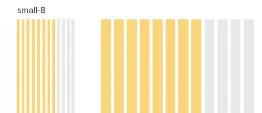
It's also worth noting that, since Foundation's grid is mobile-first, the small grid width is the only one you're required to assign. If you only assign a small width, the large screen size will simply maintain or inherit the small assignment. In the example below, the element would have a width of eight columns on both small and large screen sizes.
<div class="row">
<div class="small-8 columns">...</div>
</div>
Also, by using simple classes, you can do things like offsetting, centering, and pushing or pulling to design against source ordering. In the following example the element would span the full width on small screens, but on large screens it would span 10 columns, but do so for columns 2-11.
<div class="row">
<div class="small-12 large-10 large-offset-1 columns">…</div>
</div>
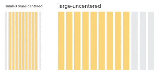
In the following example, the element would span the first nine of 12 columns on small screens. On large screens, it would span the width of nine columns but be centered.
<div class="row">
<div class="small-9 small-centered large-uncentered columns">...</div>
</div>
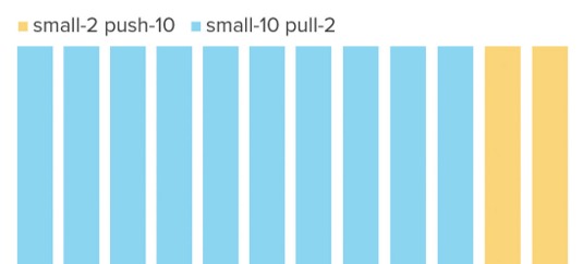
In the following example, the first element would span the last two of 12 columns, while the second element would span the first 10 of 12 columns.
<div class="row">
<div class="small-2 push-10 columns">2</div>
<div class="small-10 pull-2 columns">10, last</div>
</div>
Setting up navigation
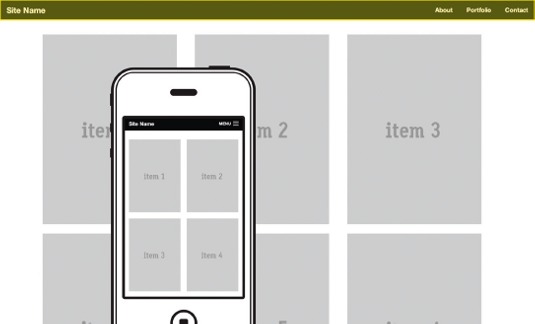
Foundation has a few different navigation patterns already pre-baked for you to use within your wireframes. Our wireframe shows a navigation menu at the top of the screen that contains the site name and shows a simple menu link on small screens. Thankfully, there's a pre-baked navigation component that matches that description in Foundation. Below is an example of how to achieve this. At the top of our body, we'll add the following.
<nav class="top-bar">
<ul class="title-area">
<li class="name">
<h1><a href="#">Site Name </a></h1>
</li>
<li class="toggle-topbar menu-icon"><a href="#"><span>Menu</span></
a></li>
</ul>
<section class="top-bar-section">
<ul class="right">
<li><a href="#">About</a></li>
<li><a href="#">Portfolio</a></li>
<li><a href="#">Contact</a></li>
</ul>
</section>
</nav>
Let's break down how we achieved the navigation style we had in mind.
- Create a nav element and add the class top-bar to it.
- Create an ul element with the class title-area to contain our site name and the small screen menu toggle.
- Add our site name as a h1 within the first li element in our title-area ul, and add the class name to it.
- Add another li with the class name toggle-topbar to contain the menu toggle link for small screens.
- Add the class menu-icon to the toggle-topbar li so that the menu link on small screens shows the menu icon.
- Create a section element with the class top-bar-section to contain the actual menu ul.
- Within the top-bar-section create a ul with a class of either right or left (depending upon our preferred menu alignment). This ul will contain our list items with menu links.
Creating our block grid
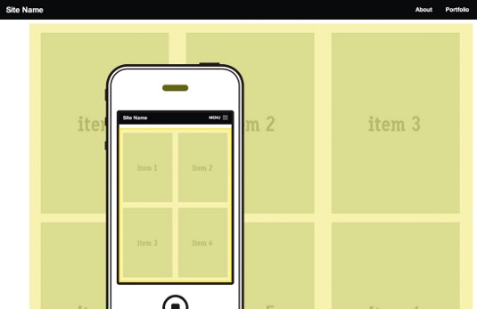
Our wireframe sketch then shows a grid view of portfolio items that is two items wide on small screens and three items wide on large. Foundation makes block grids like this quite simple by providing a pre-baked small-block-grid-x and large-block-grid-x class that can be used on any ul element. To produce our block grid list of portfolio items we'll use the following markup.
<div class="row">
<div class="small-12 columns">
<ul class="small-block-grid-2 large-block-grid-3">
<li><a href="#"><img src="http://placehold.it/290x410&text=item+1"></
a></li>
<li><a href="#"><img src="http://placehold.it/290x410&text=item+2"></
a></li>
<li><a href="#"><img src="http://placehold.it/290x410&text=item+3"></
a></li>
<li><a href="#"><img src="http://placehold.it/290x410&text=item+4"></
a></li>
<li><a href="#"><img src="http://placehold.it/290x410&text=item+5"></
a></li>
<li><a href="#"><img src="http://placehold.it/290x410&text=item+6"></
a></li>
</ul>
</div>
</div>
You'll notice we first defined a row wrapper and then a container set to span all 12 columns. We do this so that the block grid doesn't stretch all the way to the edge of the screen, but rather maintains the same padding and max-width as the rest of our items defined within our grid.
I hope you feel empowered to give HTML wireframing a try. This is a wonderful time to be a web designer. We have lots of tools available to us to make the things we do more elegantly effective and easier to understand.
Words: Jared Ponchot
This article originally appeared in net magazine issue 246.

The Creative Bloq team is made up of a group of art and design enthusiasts, and has changed and evolved since Creative Bloq began back in 2012. The current website team consists of eight full-time members of staff: Editor Georgia Coggan, Deputy Editor Rosie Hilder, Ecommerce Editor Beren Neale, Senior News Editor Daniel Piper, Editor, Digital Art and 3D Ian Dean, Tech Reviews Editor Erlingur Einarsson, Ecommerce Writer Beth Nicholls and Staff Writer Natalie Fear, as well as a roster of freelancers from around the world. The ImagineFX magazine team also pitch in, ensuring that content from leading digital art publication ImagineFX is represented on Creative Bloq.
