How to design for dyslexia
With a few simple changes you can make your website much more accessible. We explain how.
Sign up to Creative Bloq's daily newsletter, which brings you the latest news and inspiration from the worlds of art, design and technology.
You are now subscribed
Your newsletter sign-up was successful
Want to add more newsletters?

Emotional branding, responsive design, simplicity of message... it's well known that simple iterative changes to how a brand presents itself online can have a profound influence on perception - and ultimately buying decisions. So why, when 10 per cent of the population are classified as dyslexic, are so few brands are accommodating for their needs in digital design?
What is dyslexia?
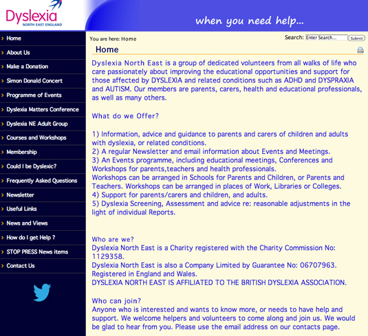
According to the The International Dyslexia Association, someone who is dyslexic has difficulties with accurate word recognition, poor spelling and weaker decoding abilities. This means that for people with dyslexia, letters can become mirrored, rotated, flipped and mixed up.
How designers treat text and content can make a big difference to a dyslexic user's experience of a website.
Article continues belowChoice of typography

The simplest way of improving a site's general readability is by improving the typography. For example, the use of serif fonts with little ticks and tails can distort a letter's symbol; meanwhile, the use of black text on a white background can create a blurred effect. Use of a sans serif font for the body text, such as Arial or Verdana, is a good option.
Comic Sans is often associated with dyslexia but it was never designed with that in mind, and still has issues with letters mirroring. More importantly, the use of it specifically for dyslexic users can be seen as insulting, due to its childish appearance.
Bespoke typefaces

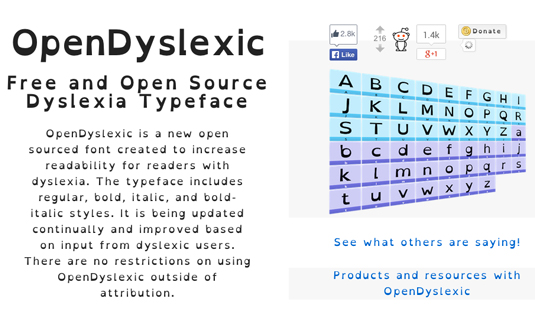
There are typefaces designed especially for dyslexic readers. OpenDyslexic, which is an open-source typeface, focuses on reducing the frequency of letter flipping, swapping and rotating by adopting weighted bottoms.
Creating a set of vertical rhythm rules to help the flow of a site will also help make the content more readable. Increasing the font size, having an appropriate line height, or restricting the line width to between 45 and 75 characters are all viable options for success.
Sign up to Creative Bloq's daily newsletter, which brings you the latest news and inspiration from the worlds of art, design and technology.
Put the user in control
With dyslexia coming in different forms and levels, the best thing to do is to give the user a little bit of control. Simple tools that allow the user to change the font size, line height and colour are all very helpful.
While this isn't a new idea by any stretch we see it less and less, having fallen out of fashion in recent years, as it doesn't fit into modern design trends.
However, just the use of a recognisable cog symbol in a corner near the page header can bring up these tools, while having minimal impact on a design. The user could also be given control over other attributes, such as the background colour and text justification. A choice of typeface would also be useful, and could allow for the use of fonts such as OpenDyslexic.
Text to audio

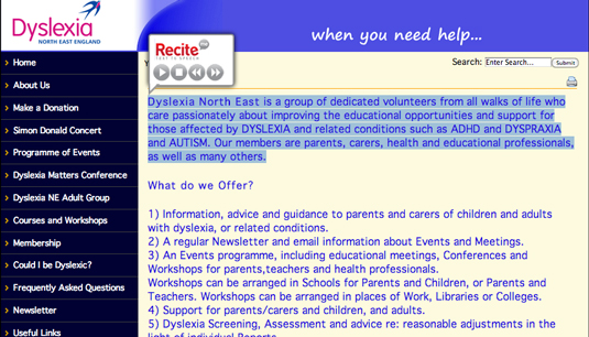
For users whose reading ability is extremely poor, some kind of text-to-audio option could be very beneficial. This could be done with an automated process, or by providing an audio clip of someone reading the article in full.
The use of images and video to support the content reduces the reliance on the user's reading ability; visualising the data with charts or graphs would promote easy analysis. The use of familiar icons for navigation again means there is less reliance on the user's reading ability.
Tweak the writing style and layout
Improving a website's readability for a dyslexic audience need not solely be down to designers.
Copywriters can break up long paragraphs and front-load each one with a summary of what's to come. Visitors can then quickly scan through and instantly understand what the paragraph is about, so they can decide if they want to read the rest.
Justified text creates uneven white spaces causing problems with sequencing and makes it easy for the reader to lose their place, while double spacing after a period can cause similar problems.
Bake it in
Further, developers can help address dyslexic needs by baking these rules into the code: perhaps as part of the same process that ensures a site is readable by assistive technologies. Similarly, testers can give qualitative feedback on readability, which can lead to further improvements.
The effective use of fonts, expanded use of accessibility tools and consideration of dyslexic audiences throughout the design process; simple and subtle changes that can make all the difference.
Words: James Lambert
James Lambert is a web developer at digital agency TH_NK, building the front-end code for a range of clients' websites, including the likes of Drinkaware, Nando's and Blackberry. He formerly worked at The Roundhouse design company based in Newcastle upon Tyne.

The Creative Bloq team is made up of a group of art and design enthusiasts, and has changed and evolved since Creative Bloq began back in 2012. The current website team consists of eight full-time members of staff: Editor Georgia Coggan, Deputy Editor Rosie Hilder, Ecommerce Editor Beren Neale, Senior News Editor Daniel Piper, Editor, Digital Art and 3D Ian Dean, Tech Reviews Editor Erlingur Einarsson, Ecommerce Writer Beth Nicholls and Staff Writer Natalie Fear, as well as a roster of freelancers from around the world. The ImagineFX magazine team also pitch in, ensuring that content from leading digital art publication ImagineFX is represented on Creative Bloq.
