Level up your photo editing with the very best software
Take your photography to new levels with the best photo-editing software covering different platforms and styles.
Sign up to Creative Bloq's daily newsletter, which brings you the latest news and inspiration from the worlds of art, design and technology.
You are now subscribed
Your newsletter sign-up was successful
Want to add more newsletters?
Finding the best photo editing software is vital for any serious photographer. Post-processing workflow is an essential component of digital photography, with modern software enabling powerful and precise adjustments to get your images looking exactly the way you want them.
I've assembled this list based on my experience with these programs, as well as that of our expert review team, who have spent many hours putting them through their paces with real-world photo editing tasks. If you need a machine to power your editing setup, see the best laptops for photo editing, and for pixel-perfect displays, we also have the best monitors for photo editing.
It probably won't surprise you to learn that our top choice is still Adobe Photoshop, but there are plenty of alternatives, many of which are well-suited to specific tasks like noise removal, skin retouching, B&W conversion and more. Read on to see my top recommendations.
The Quick List
Download a free trial for PC, Mac or iPad
Yep, it might seem obvious but Photoshop is still number one! The best photo editing software for pros and beginners, if you haven't tried out Photoshop yet, what are you waiting for? There's no obligation to buy after this free trial, but you can convert later if you like it.
Read more below

Get PhotoDirector for $3.33 / £3.17 a month
CyberLink PhotoDirector 365 offers all the features you'd expect from a top photo editing tool at a low price. A great way to get high-level editing features such as levels and colour adjustment for less.
Read more below

Get Luminar Neo for $79 / £59 per year
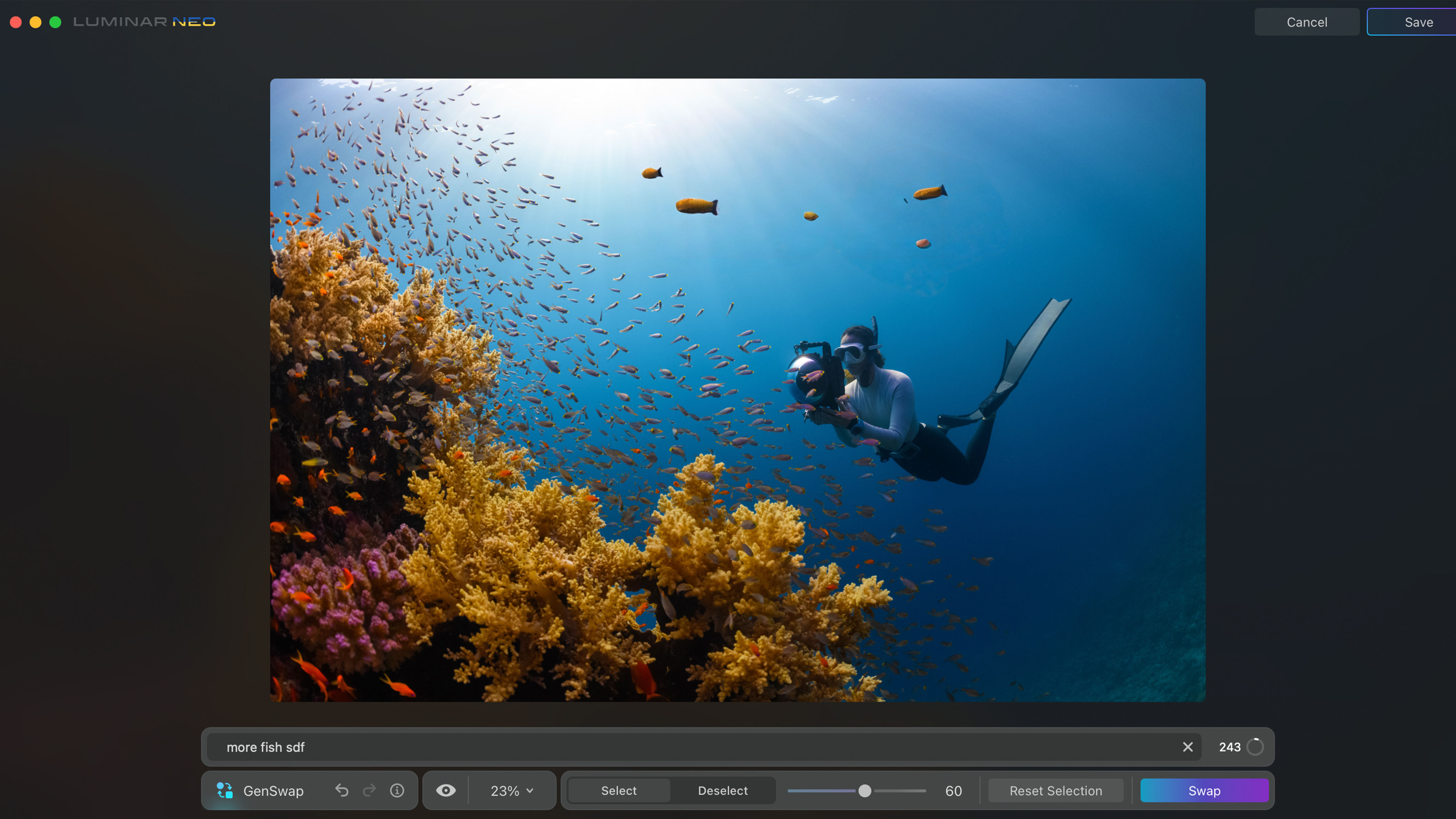
An award-winning photo editor, Luminar Neo works as both a standalone software program or a plug-in extension for Lightroom Classic and Photoshop. With the help of the latest AI tools like GenSwap, GenErase, and GenExpand, you'll be creating your best work in no time with Skylum.
Read more below

Try Capture One Pro for free for 30 days
The software that I currently use, Capture One Pro has never let me down and makes editing simple with its smart adjustments and easy-to-use AI masking tools for accurate selections. You can also use it for tethering during shoots, and if you're an Apple user then there's an iPhone app too.
Read more below

Download Photo AI 3 for $199
Photo AI 3 is a powerful new AI-driven software for photographers with exceptional denoising and upscaling capabilities. And that makes it a great option when you need to rescue and enhance unusable or low-quality images.
Read more below

Get Affinity Photo FREE for six months
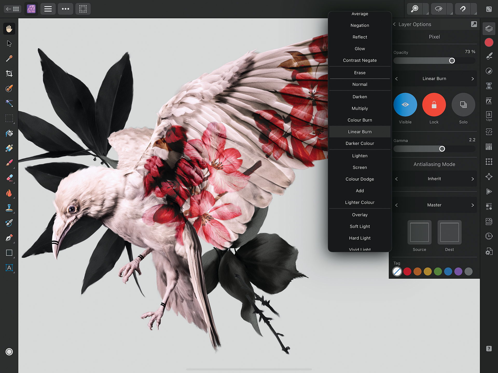
This very capable Photoshop alternative comes at a one-off price; no subscription needed. This photo editing software provides impressive tools for digital painting, raw editing, retouching and more. And the first six months are free!
Read more below
The best photo editing software for photographers
Why you can trust Creative Bloq
The best photo editing software overall
Specifications
Reasons to buy
Reasons to avoid
✅ You want AI tools: Adobe offers some of the best AI tools available.
✅ You want a full, well-rounded feature set: Adobe's tools are near-unparalleled.
❌ You don't like subscriptions: Unfortunately, you need a subscription for Adobe tools.
❌ You're a newbie: Adobe tools (and the many, many menus) take some getting used to.
🔎 Photoshop is the number one editing software not only for photographers but for a whole host of creatives. We find that it's most useful for retouching, quick fixes, and digital artistry than for traditional photo editing. ★★★★
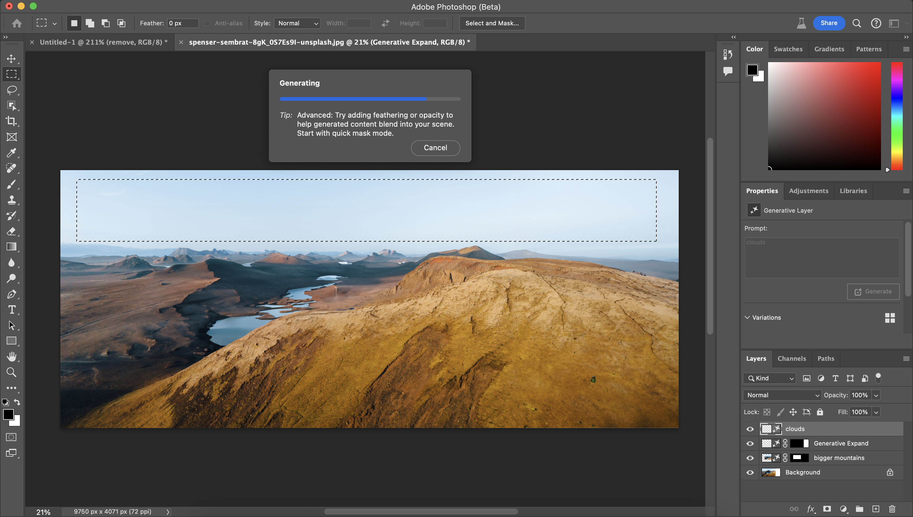
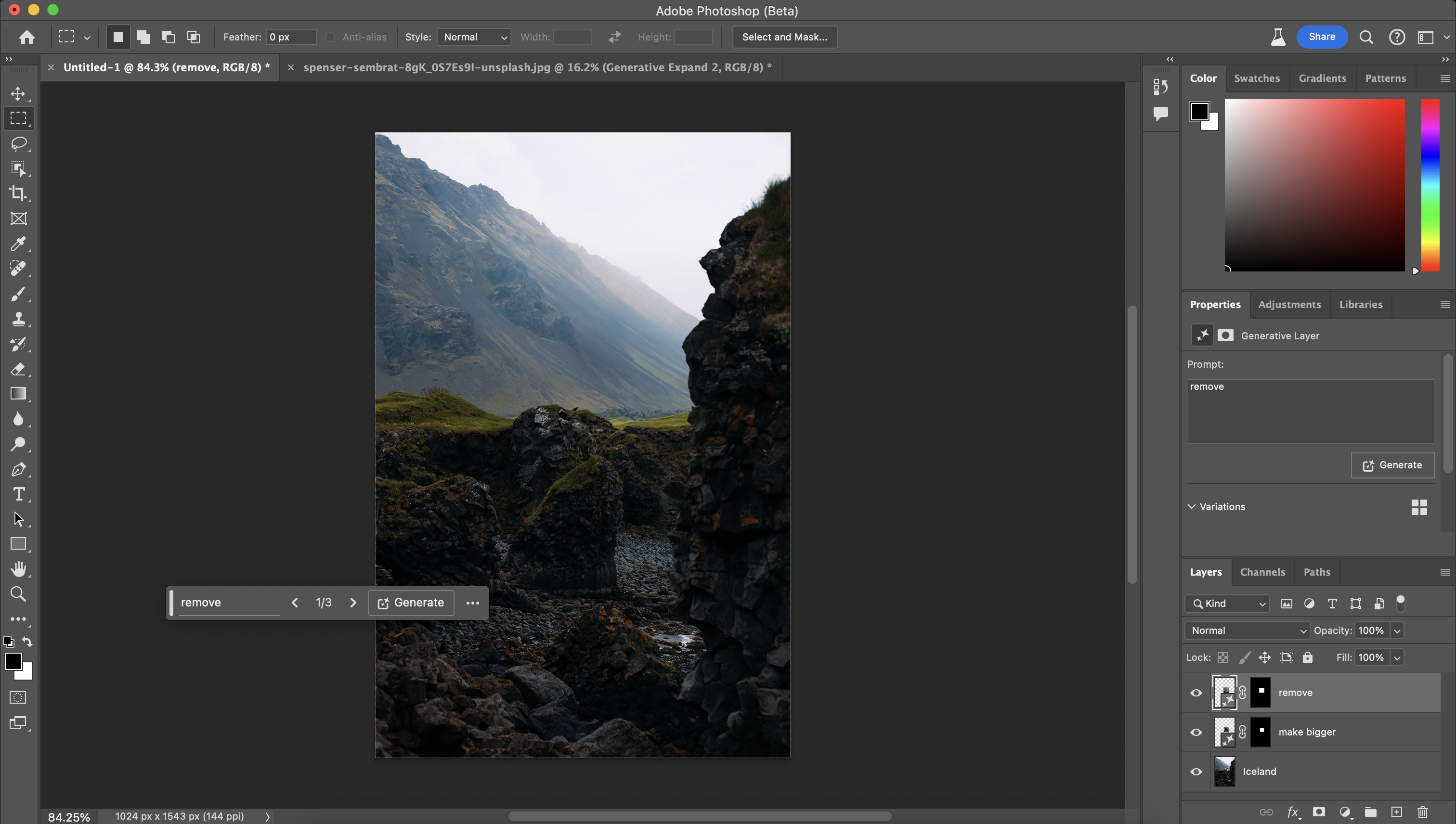
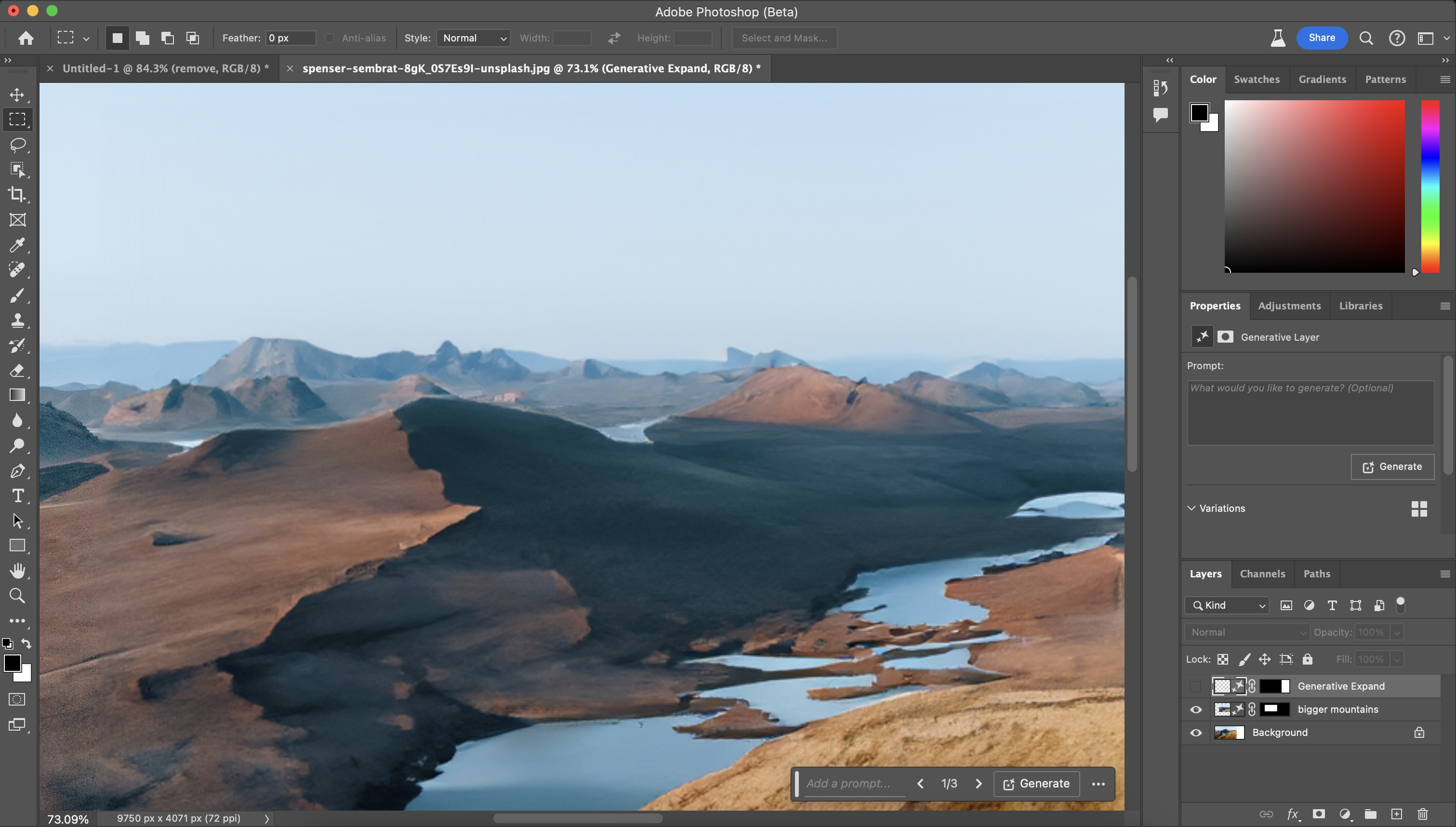
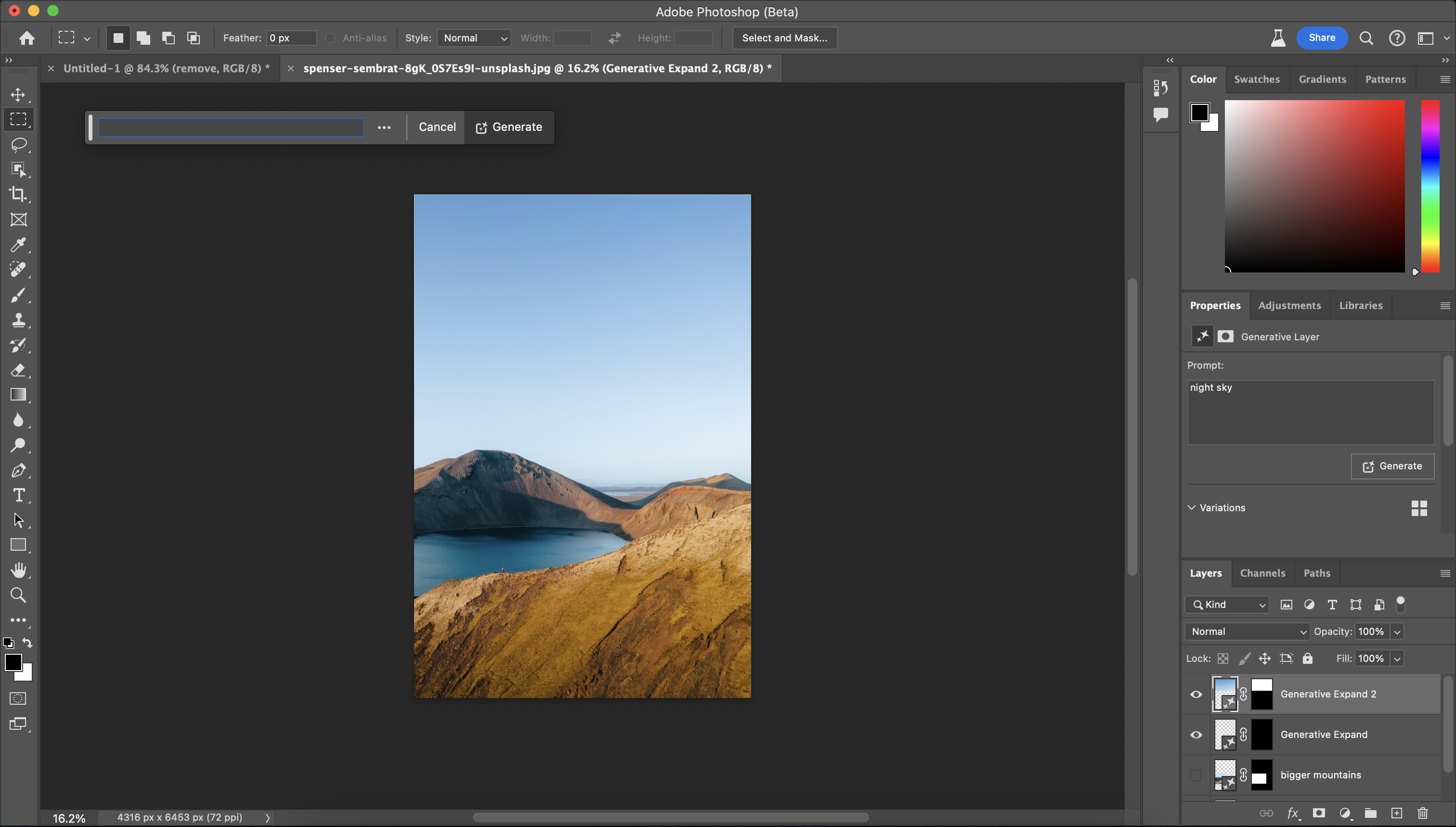
Need to know: Photoshop retains its position as the industry-standard software for image manipulation and Adobe continues to maintain its lead by regularly adding game-changing new features to the software – most recently through the integration of Adobe Firefly-driven AI tools such as Generative Fill and Generative Expand.
Ease of use: Of course, getting to grips with Photoshop comes with a learning curve, so it's not the best choice for beginners. Meanwhile, pros will decry the lack of support native RAW image editing – for that, you need the Adobe Camera RAW plugin, which allows you to edit RAW images in Photoshop itself. (There's also Lightroom, number 7 below, for RAW image editing, which is bundled with Photoshop as part of the Adobe Photography plan.)
Features: For retouching especially, we find Photoshop to be the most comprehensive option out there with its layers approach, allowing all kinds of non-destructive adjustments to be made. You can smooth over skin, remove any blemishes, and even edit facial expressions with the touch of a button using Adobe's neural filters. In our full Photoshop 2025 review, we found the new AI features in particular allowed us to do more work in less time.
And we're going to see more AI features coming in the future – as the latest Adobe MAX 2024 conference made clear, Adobe is all-in on these features. The new Project Clean Machine tool is designed to make it easy to remove unwanted flashes from photos and videos, while Project Perfect Blend is designed to allow you to seamlessly blend your photographic subjects with AI-generated backgrounds. This may or may not be something you actually want – more than a few MAX attendees were wearied by the relentless focus on AI. Regardless, it's coming.
Pricing: As always, you can't buy Photoshop 25 outright; instead, there's a subscription model priced at £19.97 in the UK and $19.99 in the US. There are ways to get it for less, as our Adobe discounts page keeps you updated on.
For more details, see our full Photoshop review.
Attributes | Notes | Rating |
|---|---|---|
Pricing | Subscription model | ★★★★ |
Ease of use | Challenging | ★★★★ |
Features | Full array of fantastic features, including AI | ★★★★★ |

"I would definitely recommend Photoshop's latest upgrade to photo editors. I found it to be stable and the new features will be immediately helpful."
The best budget photo editing software
Specifications
Reasons to buy
Reasons to avoid
✅ You're on a budget: It's by no means cheap, but compared to its competition, PhotoDirector 365 is a solid value option.
✅ You want AI features: We were really impressed by the included AI tools.
❌ You want complex effects: We were let down when trying to achieve these.
❌ You want smart editing tools: There's AI, but CyberLink fails at some of the basics.
🔎 CyberLink PhotoDirector 365 is a solid piece of image-editing software, but it's not perfect. However, it offers good value for money, it's fast and works relaibly. ★★★★
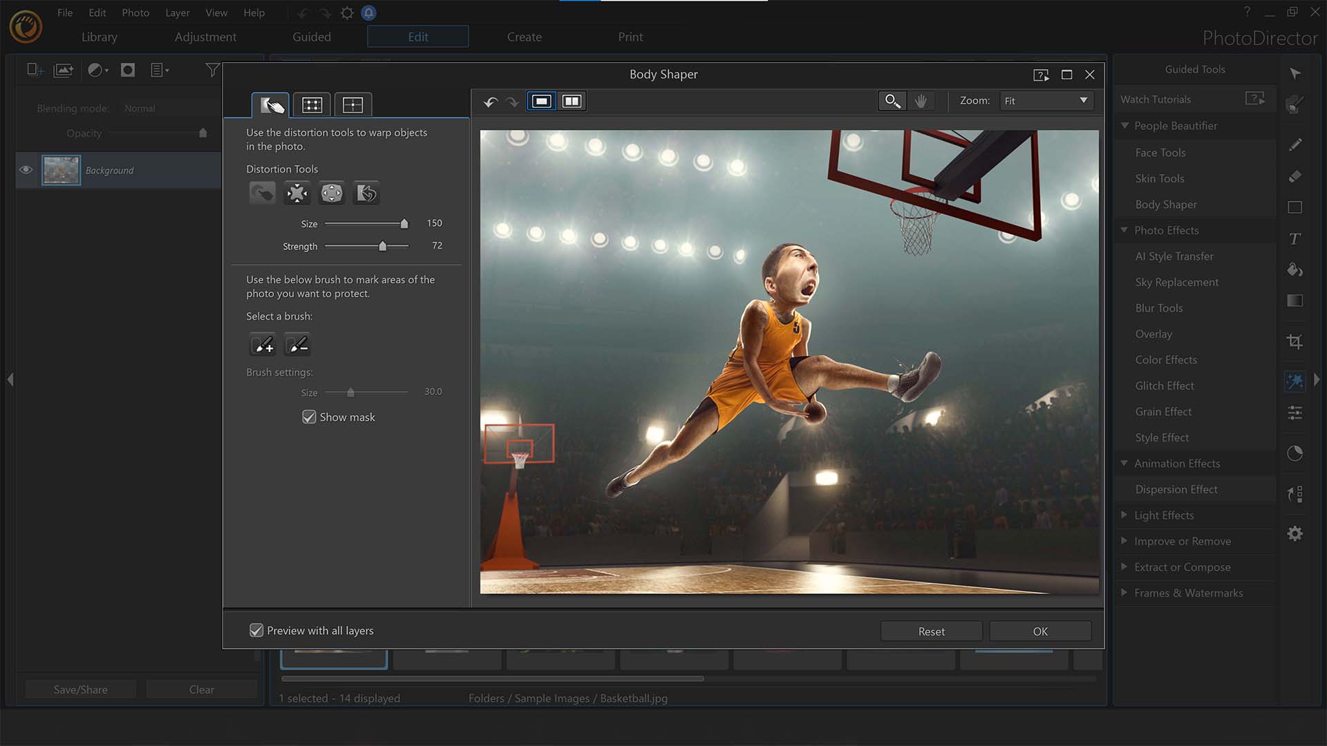
Need to know: While Photoshop is a very powerful image-editing tool, it is quite complex, and has a daunting learning curve. Not everyone needs that – some people just want a simple photo-editing interface that's easy to use, and for such people, we'd recommend checking out CyberLink PhotoDirector 365.
Ease of use: The intuitive interface is easy to get to grips with. It's a little rough around the edges – use it long enough and you'll start to notice little glitches, types and other things that show a slightly lack of polish. But the fundamentals of CyberLink PhotoDirector 365 are strong, and if you want a budget-friendly option for photo editing, this is a great choice.
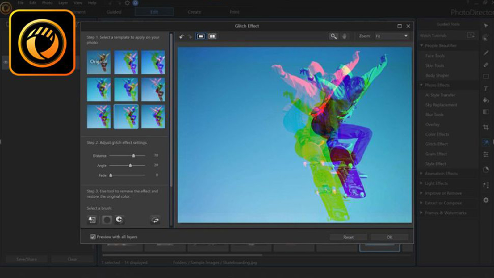
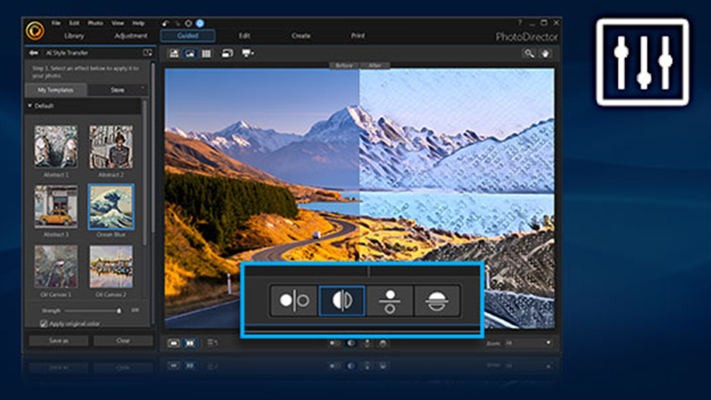
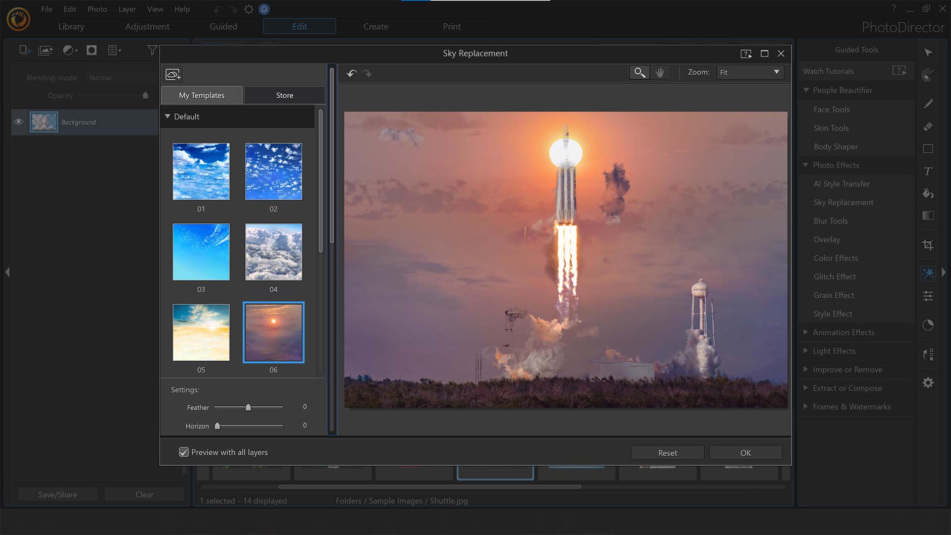
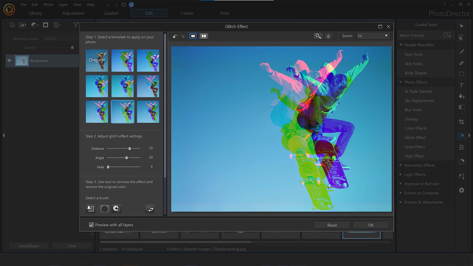
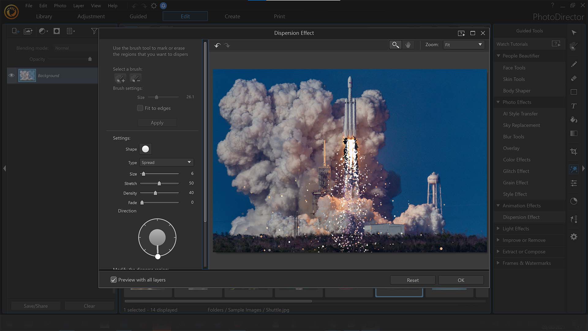
Features: In our full review of CyberLink PhotoDirector 365, we were hugely impressed by the various AI-powered features that have been added into the latest version. Landscape photographers in particular may appreciate the AI sky replacement tool, which lets you seamlessly swap out a drab sky in an image for one with a little more drama to it. There's also automatic body shaping, tools for editing skin and faces, as well as lighting and animation effects.
Pricing: Starting at £13.99 per month, CyberLink PhotoDirector 365 is a fairly affordable subscription model, though higher tiers with more features can reach the lofty heights of £69.99 per month.
For more information, see our CyberLink PhotoDirector 365 review.
Attributes | Notes | Rating |
|---|---|---|
Pricing | Great value option. | ★★★★★ |
Ease of use | Lacks polish, but fine | ★★★ |
Features | Solid AI tools, weak smart tools. | ★★★ |

"As subscription models go PhotoDirector 365 is one of the cheapest around. It's good image-editing software let down by a few issues, but it runs fast and works reliably."
The best photo editing software for AI

Specifications
Reasons to buy
Reasons to avoid
✅ You just want generative AI tools: Erase and add to images with the power of AI at a small added cost.
✅ You already use Luminar tools: If you're invested in the ecosystem, it's a solid choice.
❌ You want the best AI performance: Better tools can be found elsewhere.
❌ You want regular image editing: Other software offers better editing toolkits.
🔎 Skylum Luminar AI is our go-to if we just want AI tools without the frills. Performance is consistent, the price is acceptable and it's a decent all-rounder. ★★★★
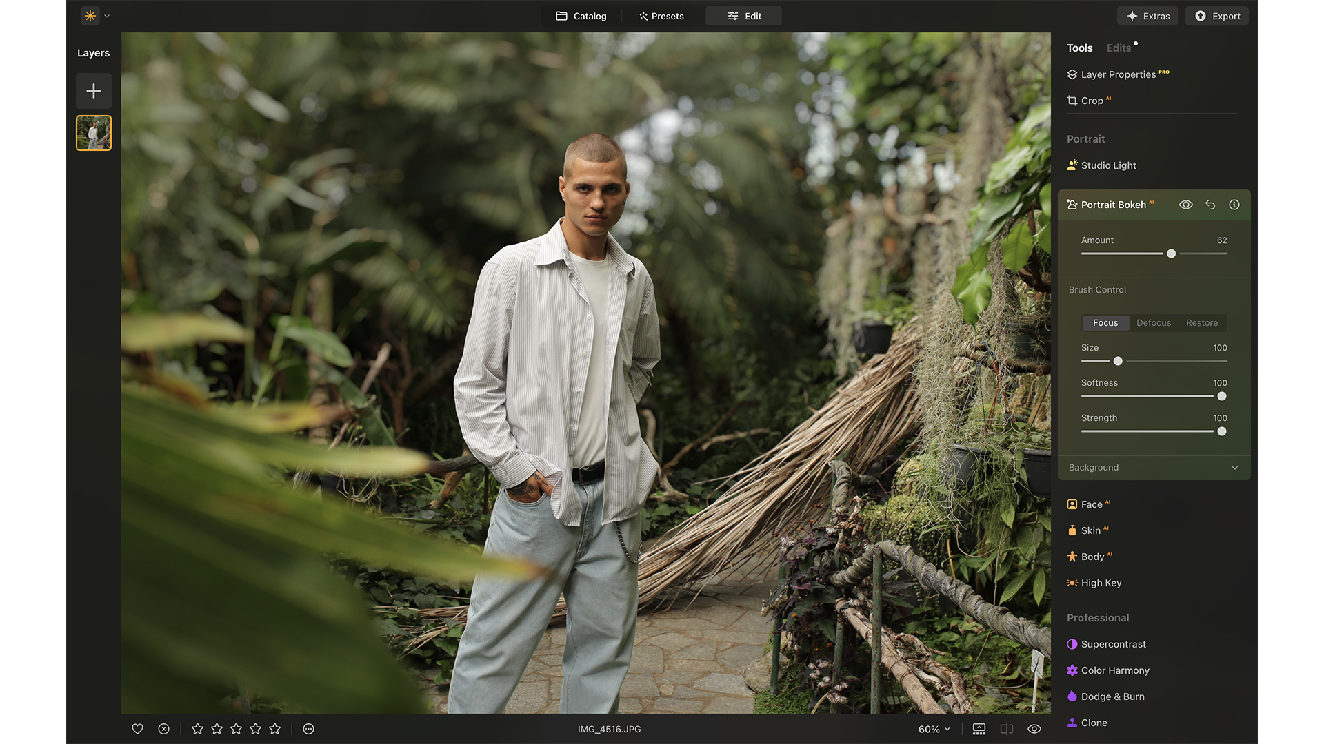
Need to know: I've been using Skylum for a few years now, and this software is as innovative as it gets. The Kyiv-based photography company are always looking for new ways to make life easier for us photographers, and this software delivers in every aspect.
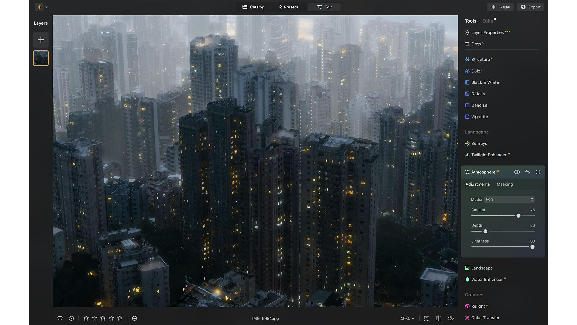
Ease of use: This photo editing software values your time and is firmly focused on speeding up your editing process, so photographers can spend less time editing and more time creating or expanding their business. It removes the guesswork in most cases, offering suggestions for the best templates to improve your images with specific tools for portraiture, landscapes, architecture and grayscale photos.
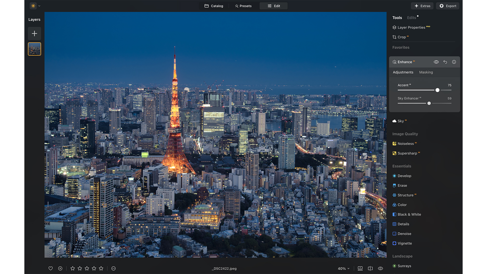
Features: Did you miss the focus on a shot by only a fraction of a second? Subject has their eye a little blurred? Is the sky completely overexposed? You can fix all of these things with Luminar Neo, using tools like SkyAI, Supercontrast, and the SupersharpAI extension with the option for focus stacking.
Pricing: Skylum Luminar Neo is available either as a subscription ($11.95 per month or $99 per year) that's cheaper than Photoshop, or with a one-off purchase of $249. It packages optional features and effects into extensions, which can be bought separately ($49) or altogether for $299.
Read our Skylum Luminar Neo (2023) review for an in-depth look.
Attributes | Notes | Rating |
|---|---|---|
Pricing | Affordable, customizable plans. | ★★★★★ |
Ease of use | Very user-friendly | ★★★★ |
Features | Solid AI tools, decent editing chops. | ★★★½ |

"Skylum Luminar's generative AI tools are are easy to use and integrate seamlessly into the existing toolset."
The best photo editing software for pros
Specifications
Reasons to buy
Reasons to avoid
✅ You want solid workflow tools: This is our top pick for pros for this exact reason.
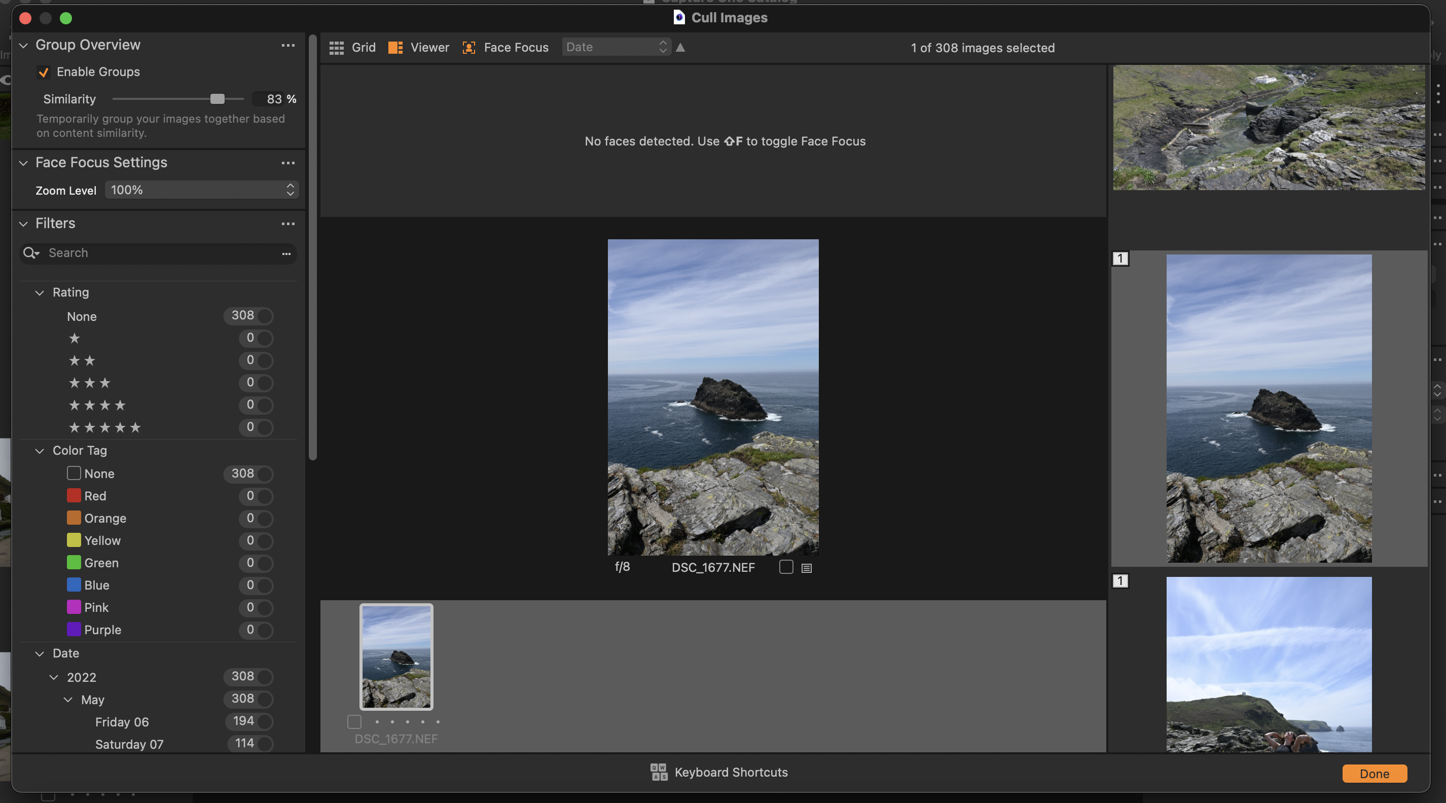
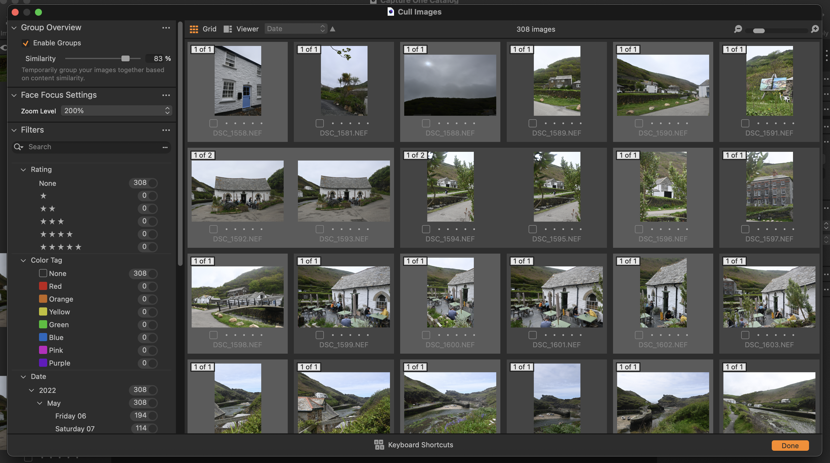
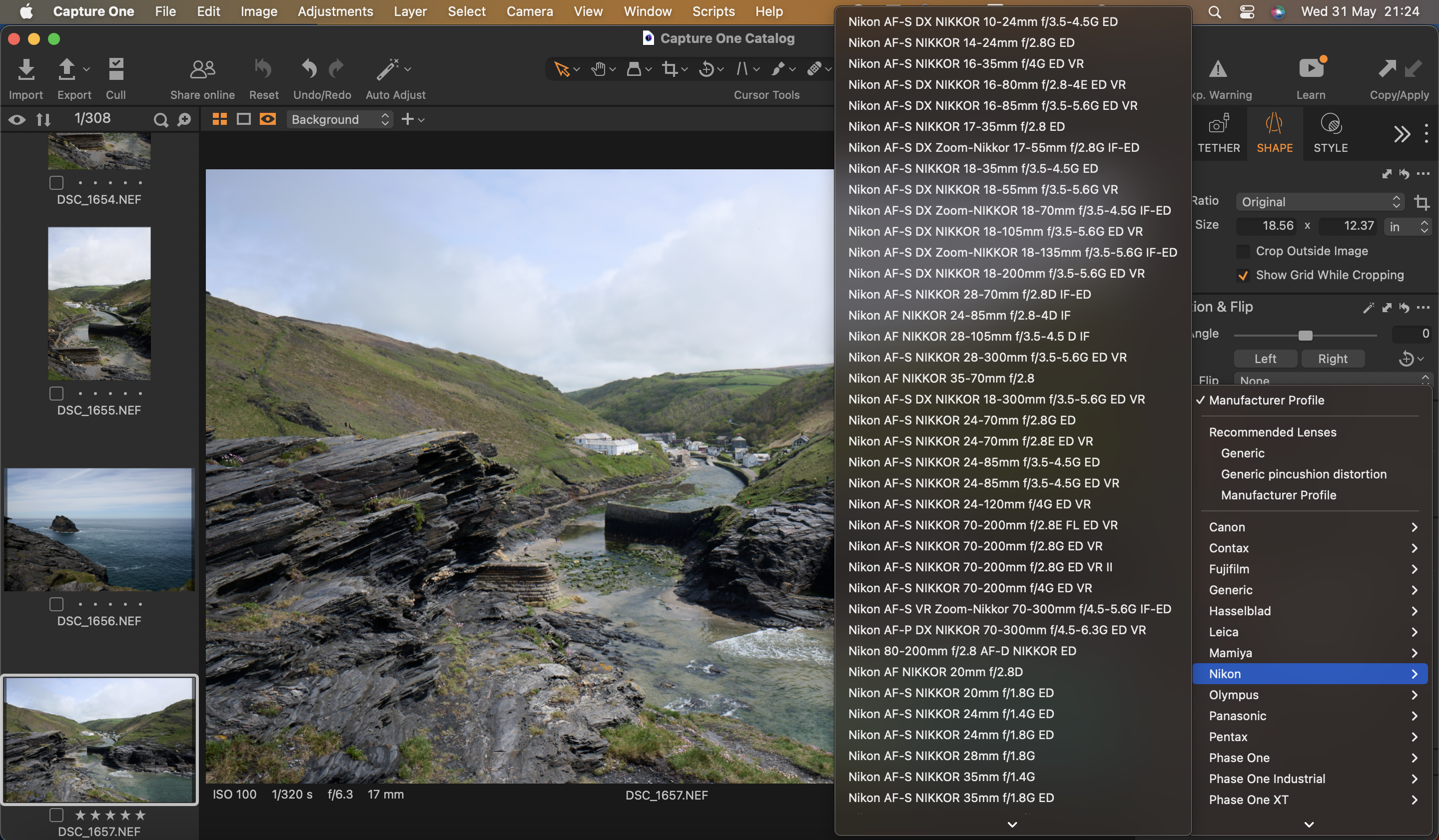
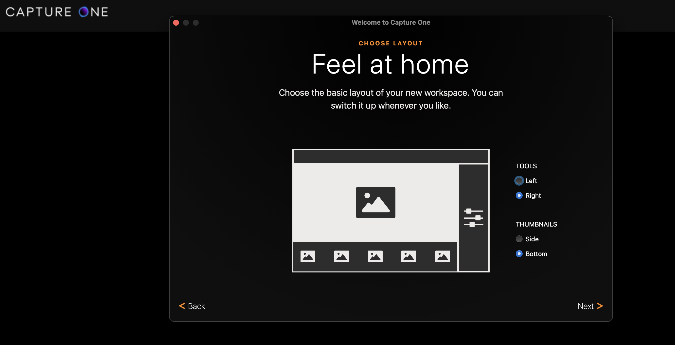
✅ You like a clean interface: Unlike some software, Capture One Pro is intuitive and features a neat user interface.
❌ You're on a budget: This is far from the cheapest tool.
❌ You want all the latest features: Its tools and feature set are a little lacking.
🔎 Capture One Pro is a fantastic piece of software that I would highly recommend, although it's on the premium side. ★★★★
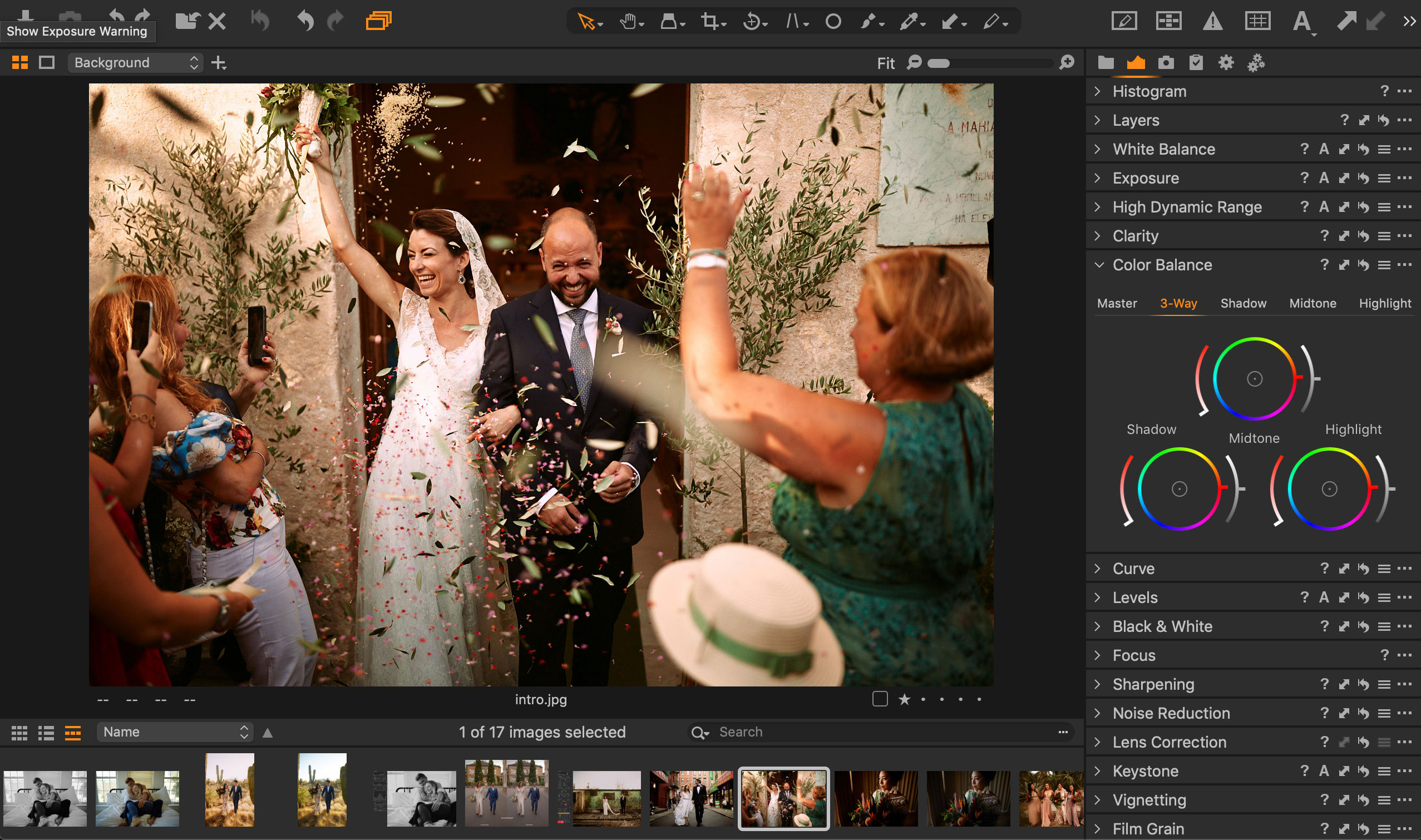
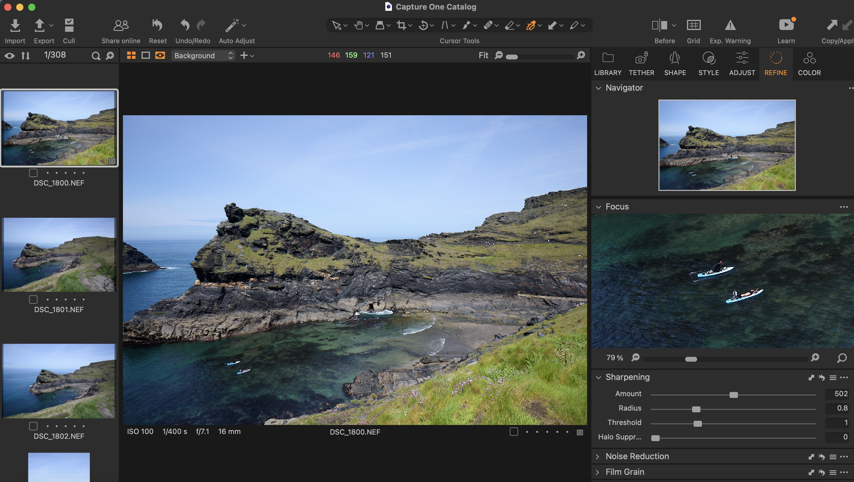
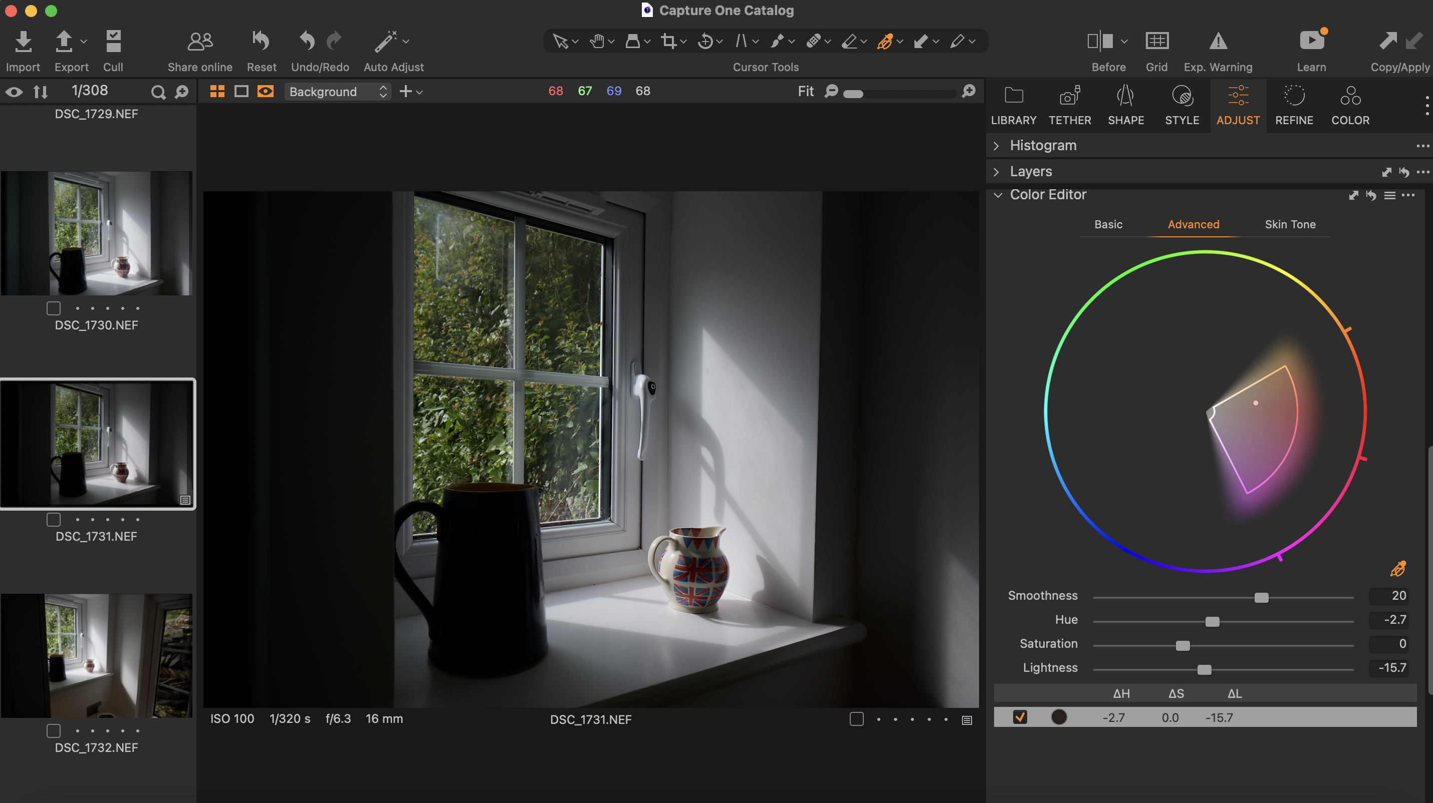
Need to know: Capture One Pro is the professional photo editing software that I use for almost all of my editing needs. I like it because the interface is extremely clean and easy to use without being overwhelming, yet it still has a whole host of great features to help me get my work edited efficiently.
Ease of use: Batch editing with Capture One is a breeze, and I haven't found any other photo software that I rate as much as this one for speedy editing of collections and catalogues. You can simply use the command/ctrl C and V buttons to copy and paste your edits from one image to another, and use the provided presets and editing styles to apply a filter onto your images with ease. I can get 30 images edited in 10 minutes using this software.
Features: In our review, we particularly praised the workflow features of Capture One Pro, which are some of the key reasons why the software is so beloved by professionals. The tethering functionality is also invaluable in studio photography, allowing you to capture and view photos directly through the software. The RAW processing module is also first-rate.
Pricing: While it's pricey at £299, there's a student discount option with 65% off, which sweetens the deal. Lightroom is perhaps a little smoother in use with regard to cataloguing, and DxO Photolab is a better RAW processing specialist – both are featured below. However, on balance Capture One Pro offers a winning feature set for professionals.
Read our full Capture One Pro review for more.
Attributes | Notes | Rating |
|---|---|---|
Pricing | Pricey, but nice student discounts | ★★★★ |
Ease of use | Useful batch editing tool | ★★★★ |
Features | Great workflow features | ★★★★ |

"This is a piece of software going after a different crowd to the likes of Lightroom, and it’s all the better for it. If you’re looking to learn a professional piece of kit as a photographer this year, make it Capture One."
The best photo editing software for denoising and upscaling
Specifications
Reasons to buy
Reasons to avoid
✅ You want a super simple set of tools: With its pared-back interface and simple toolset, this is a great option for a quick fix.
✅ You mostly want denoiser and upscaler tools: These are the areas where Photo AI 3 excels.
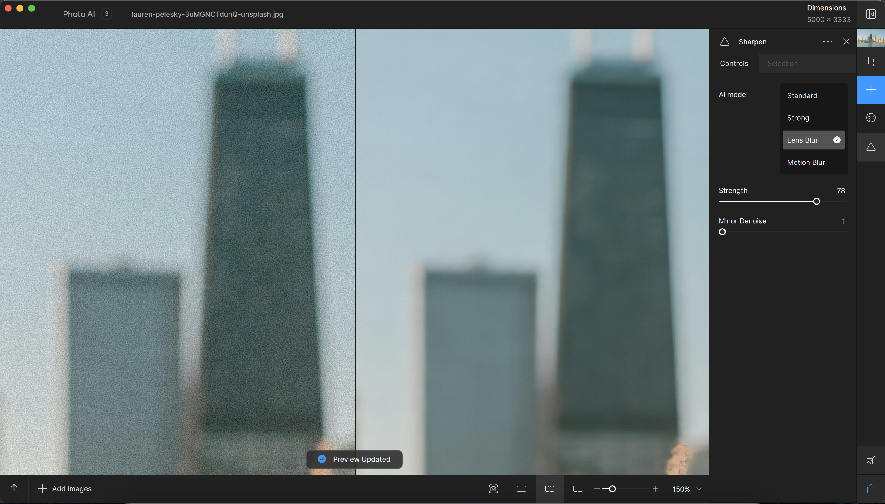
❌ You want sharpening: We were let down by this feature.
❌ You want regular image editing: Other software offers better editing toolkits.
🔎 Photo AI 3 is powerful, offering a neat package of tools to handle your most-needed photo editing functions. ★★★★
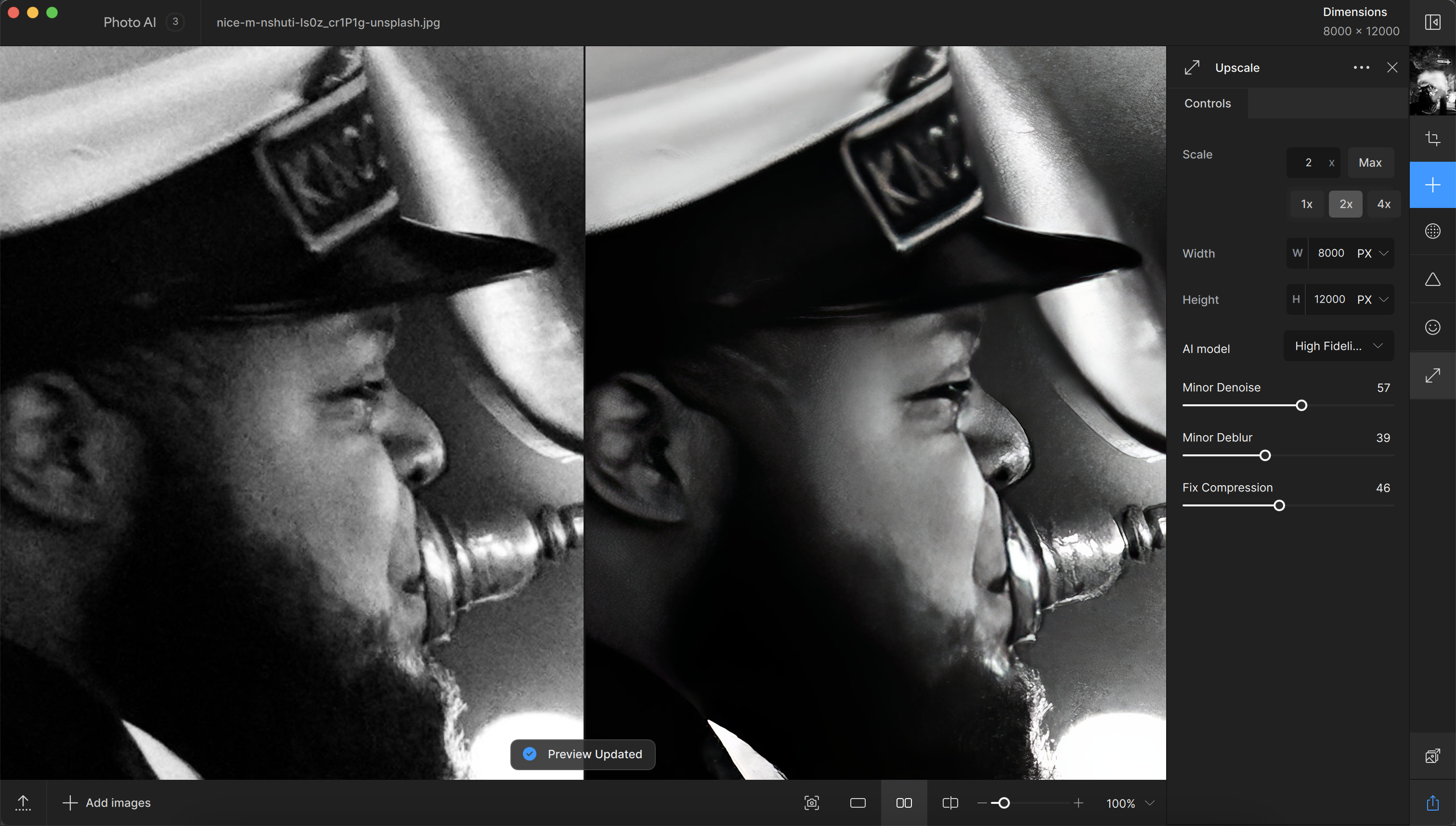
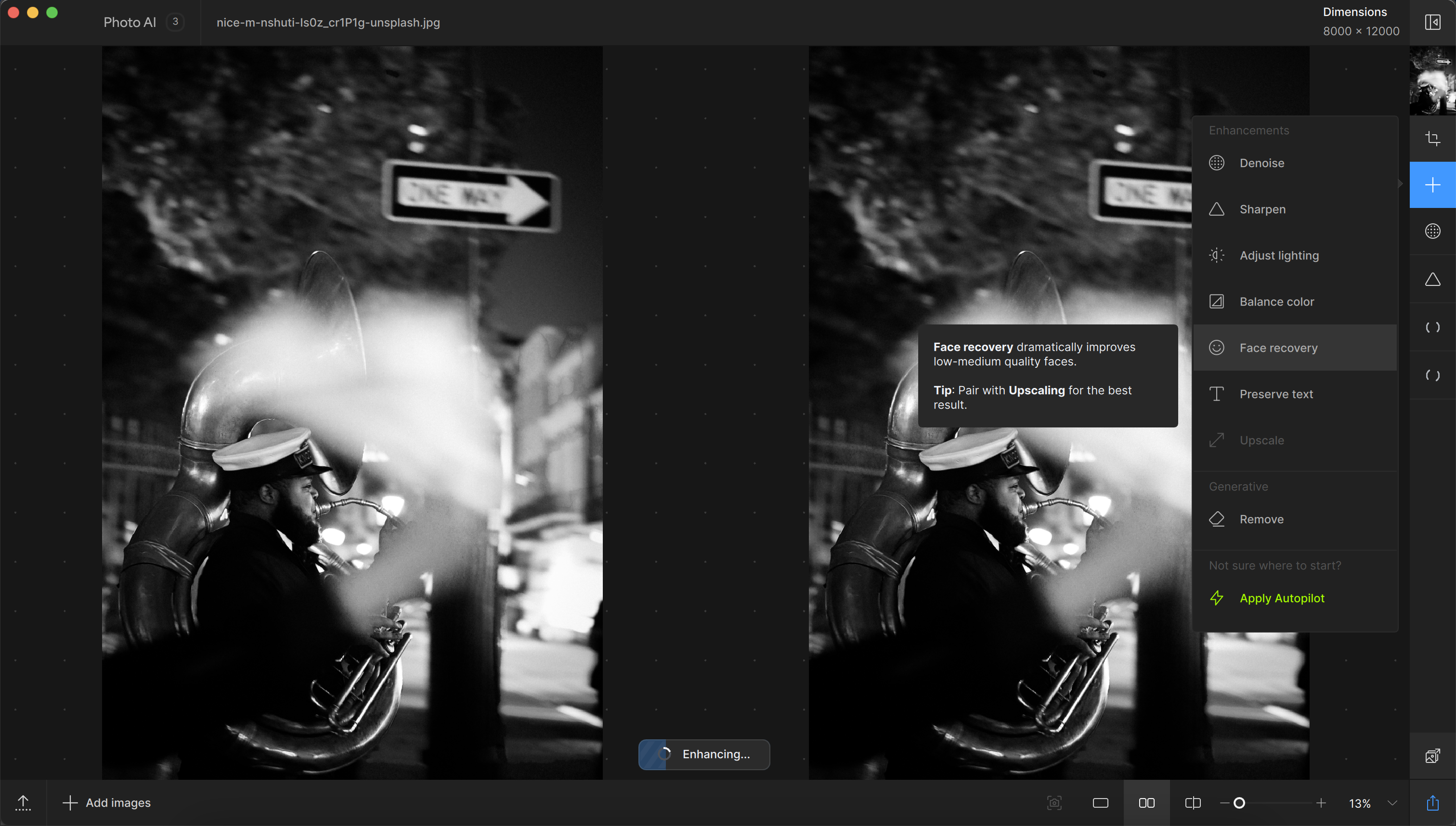
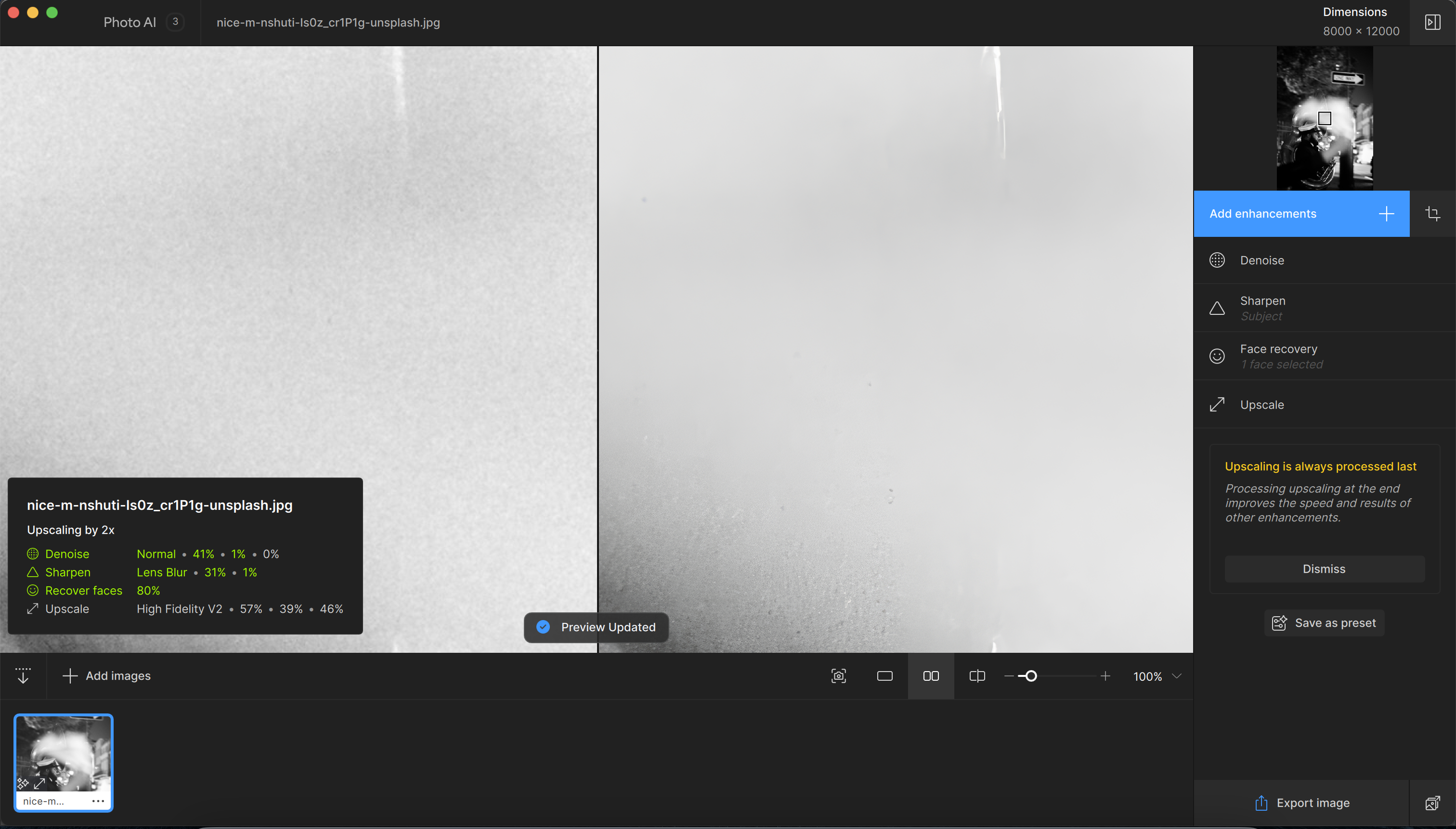
Need to know: Photo AI 3 is a powerful new AI-driven software for photographers with exceptional denoising and upscaling capabilities. And that makes it a great option when you need to rescue and enhance unusable or low-quality images. It's pretty easy to use, too, thanks to its intuitive interface, plus it's optimised for Nvidia RTX graphics cards.
Ease of use: Its super simple interface and tool controls make for the ultimate, easy quick fix edits. It's a little more user-friendly than one of its denoising rivals, DxO PhotoLab, though that software is more powerful.
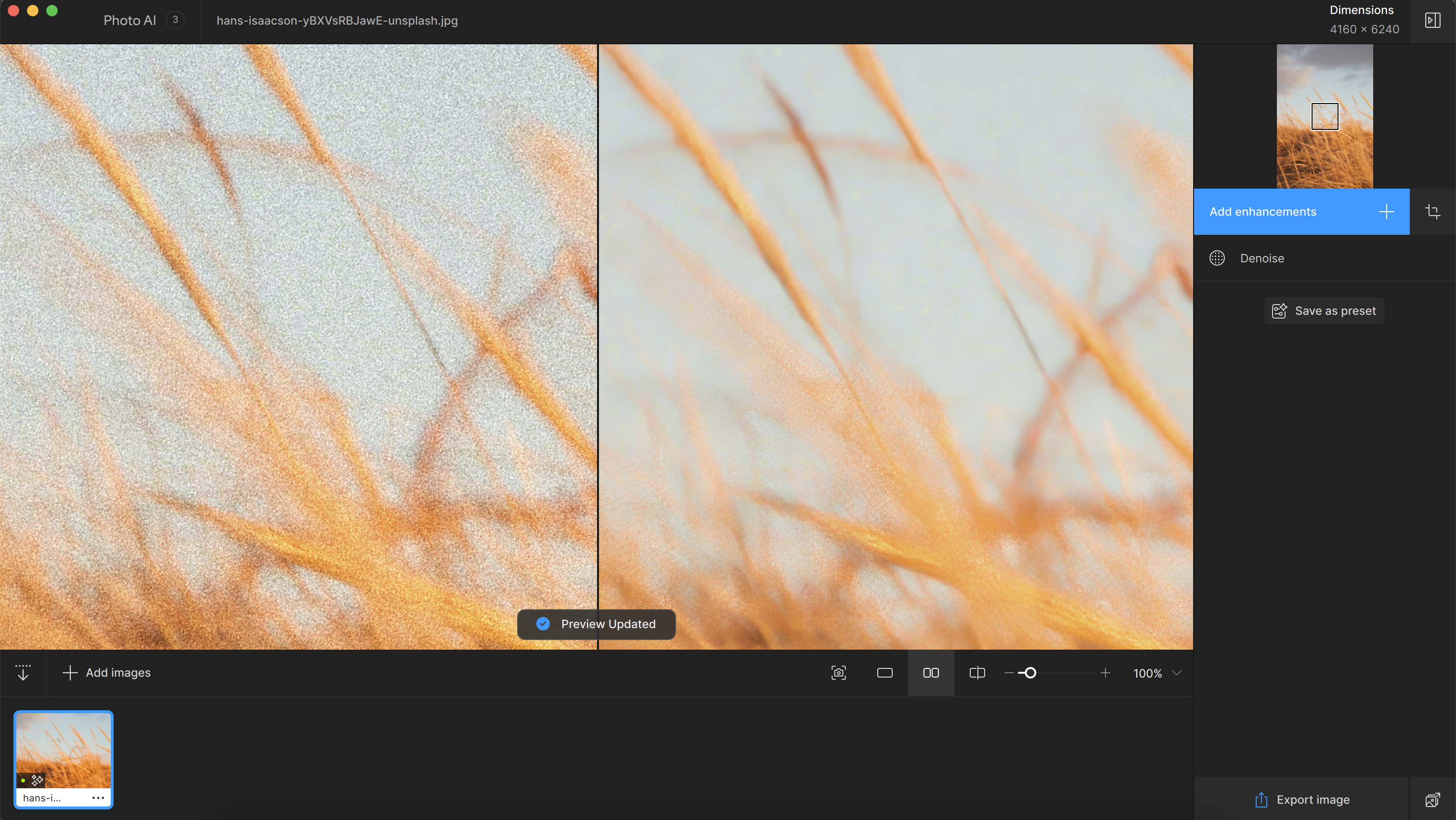
Features: Our reviewer was particularly impressed by its denoising tool, which offering three AI models (Normal, Strong, and Extreme) to tackle various levels of noise. It consistently produced excellent results, though you need to take care to choose the appropriate model to avoid loss of fine details. The upscaling feature matched the denoiser in effectiveness. It can intelligently add pixels to increase image resolution while retaining necessary details, making it valuable for enhancing old or low-resolution photos for printing. The sharpening tools, unfortunately, were less satisfactory but hopefully these will be improved in future.
Photo AI 3 is compatible with both Mac and PC and includes a batch processor for efficient workflows. Despite its high price point, it's unrivalled in value for photographers who frequently need noise removal and upscaling.
Pricing: At £199, this is a fairly expensive toolkit for what it delivers - but the results speak for themselves.
For more details, read our Photo AI 3 review.
Attributes | Notes | Rating |
|---|---|---|
Pricing | Pricey, but good value for the results. | ★★★★ |
Ease of use | Very easy to use and intuitive. | ★★★★ |
Features | Solid feature set with AI tools. | ★★★★ |

"I really like Photo AI 3. It’s got a super simple interface that makes working with it an absolute joy. If you remove noise and upscale images on a regular basis, there's no better tool out there."
The best photoshop alternative software
Specifications
Reasons to buy
Reasons to avoid
✅ You just want to pay once: Hate subscription fees? Affinity Photo 2 is a one-time purchase.
✅ You want iPad accessibility: The updated iPad app is great.
❌ You're a newbie: Be warned, beginners - here's quite a steep learning curve.
❌ You want asset management: Alas, there's no option for this.
🔎 Affinity Photo 2 is a great update to its predecessor, offering broader compatibility and great value-add features, considering it's a single-purchase software. ★★★★
Need to know: Not keen on subscriptions and prefer to pay a one-off price? Affinity Photo is the best single-purchase photo-editing program available today, and a viable alternative to Photoshop that's much more affordable.
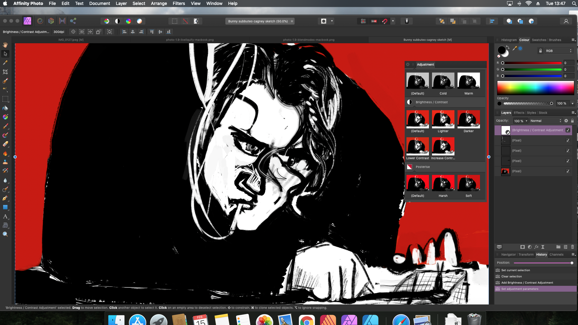
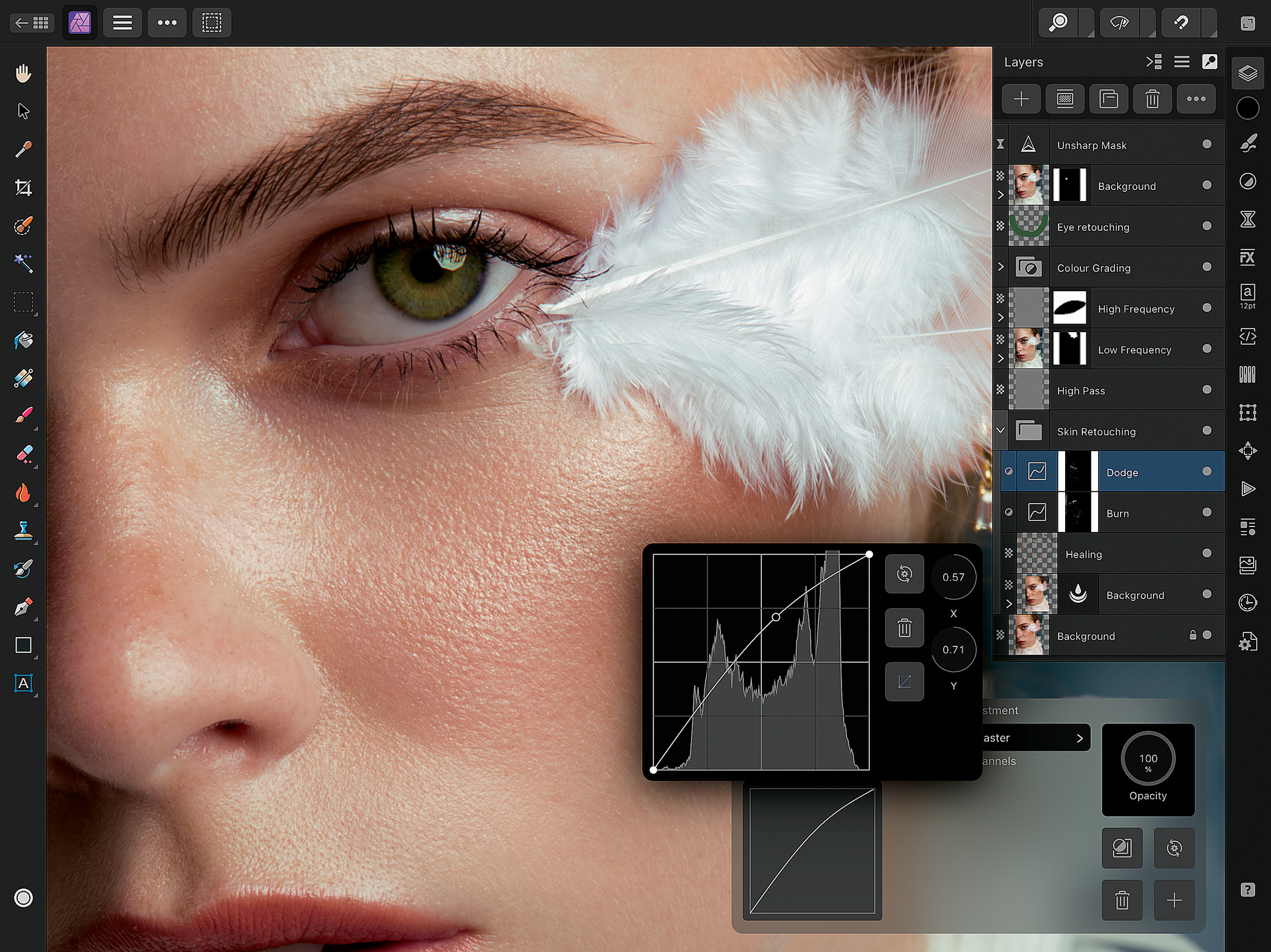
Ease of use: We reviewed the updated version of the software, Affinity Photo 2. While it still has a bit of a learning curve, especially for photo editing newbies, the overhauled Layers palette has made it much easier to get to grips with common editing tasks like masking. We also appreciate the much-improved iPad version for cross-platform editing.
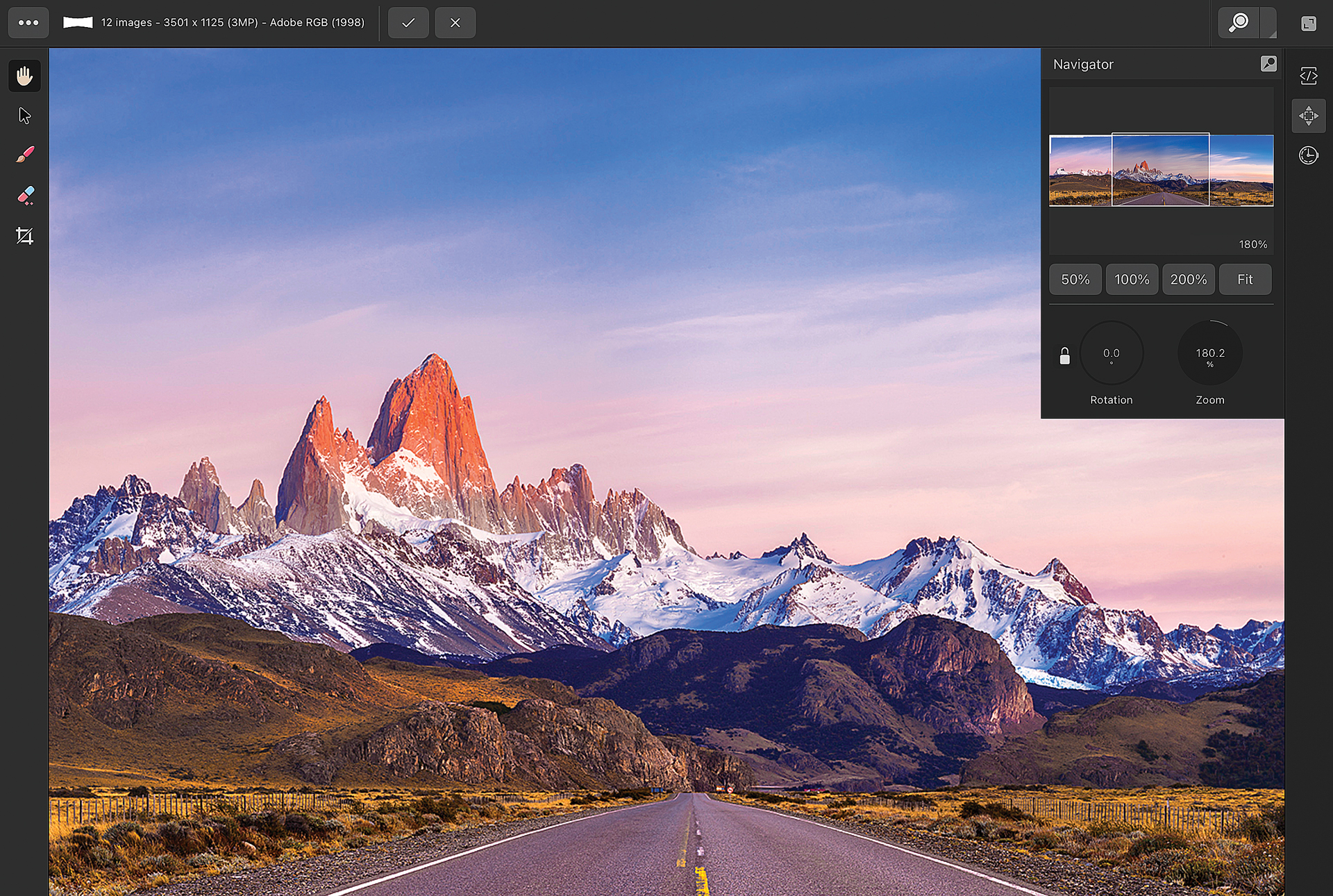
Features: Affinity Photo has professional-standard editing features, and it can handle RAW editing, HDR Merge, panoramic stitching, focus stacking, batch processing, 360-degree image editing, non-destructive layers-based editing and intelligent objects. It can also handle PSD files without an issue, so if you're sick of Photoshop's running costs and want to jump ship, you'll still be able to work with all your in-progress files.
Affinity Photo is available for Windows and Mac and as a dedicated full-featured iPad app, which can all be purchased for a one-off, no subscription price. There's also a sister graphic design package (Affinity Designer) and a desktop publishing app (Affinity Publisher). Like with Adobe's software suite, you can transfer projects between these programs without difficulty, making for a smooth workflow. While it doesn't include an equivalent to every feature in Photoshop, it's pretty close, making it exceptional value.
Pricing: Affinity Photo 2 is available as a one-off purchase for £67.99 on MacOS and Windows, or £17.99 on iPad. This makes it much cheaper than the likes of Photoshop, and even our budget choice CyberLink PhotoDirector 365 is going to run you more than this after a few months' subscription.
For more details, see our Affinity Photo 2 review
Attributes | Notes | Rating |
|---|---|---|
Pricing | One-off purchase, and good value. | ★★★★★ |
Ease of use | Difficult for newbies, but fine. | ★★★★ |
Features | Professional-standard | ★★★ |

"While it's not an app for absolute beginners, being able to dip into Affinity Photo 2 and learn without an ongoing subscription is hugely valuable."
The best photo editing software for compatibility
Specifications
Reasons to buy
Reasons to avoid
✅ You want AI tools: New great AI features with latest updates.
✅ You want file management: Lightroom offers cloud-based file synchronisation.
❌ You're don't like subscriptions: Alas, as per Adobe's modus operandi, it's subscription-only.
❌ You want layers-based editing: This unfortunately isn't an included feature.
🔎 Adobe Lightroom For those who are new to photography and are seeking the best 'modern' organiser we'd recommend Lightroom as it's the best option for multi-device organisation. ★★★★½
Need to know: Adobe Lightroom is one of the most used pieces of software for photo editing, but best of all are its tools for organising images. For that reason, it's an excellent choice for anyone working with large numbers of photos, such as photographers and designers, who typically use it in tandem with Photoshop.
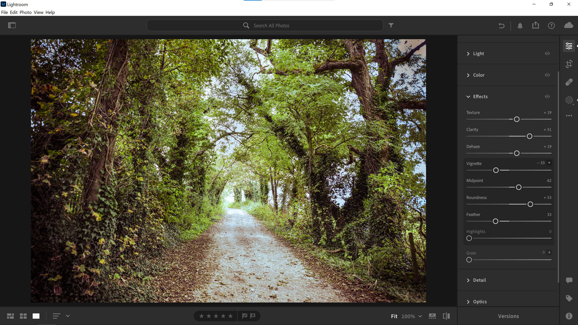
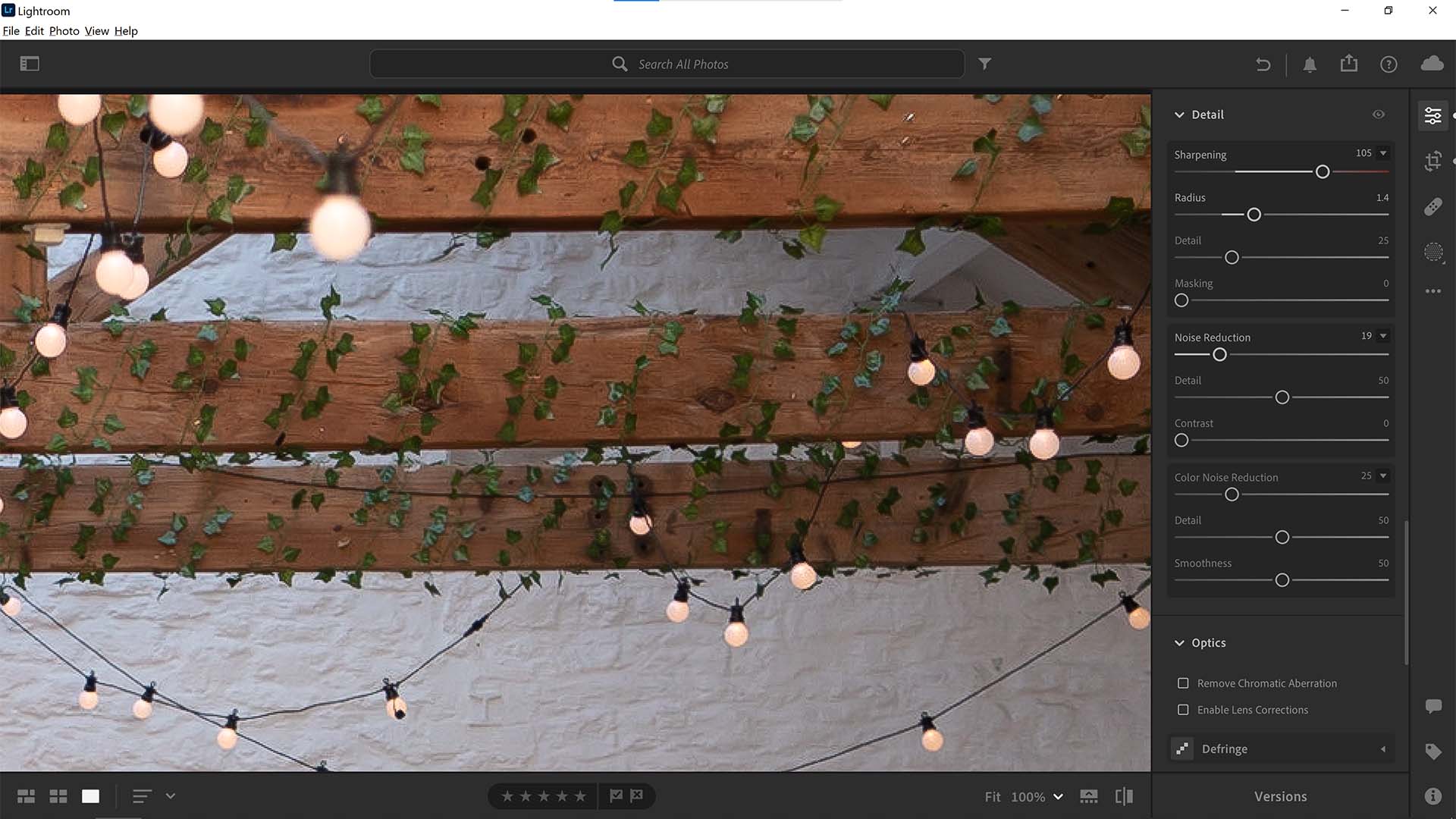
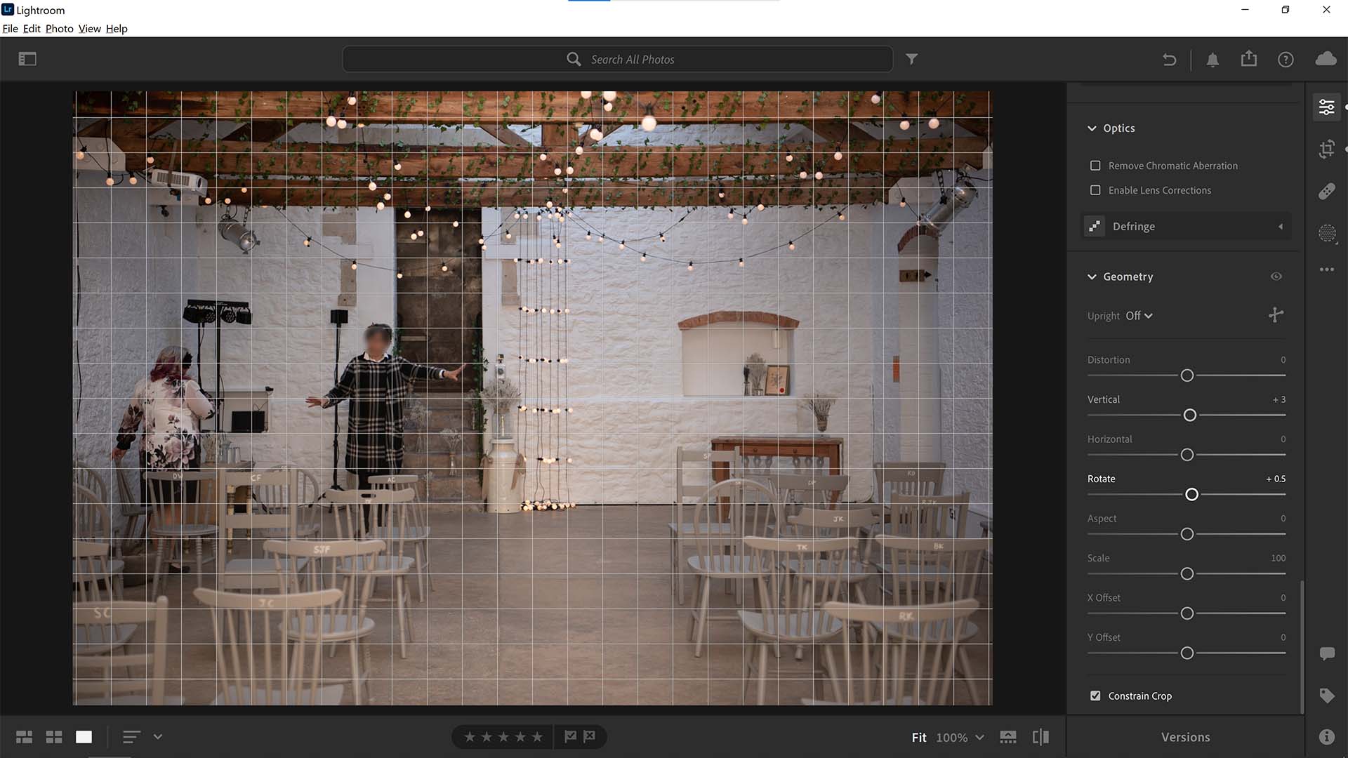
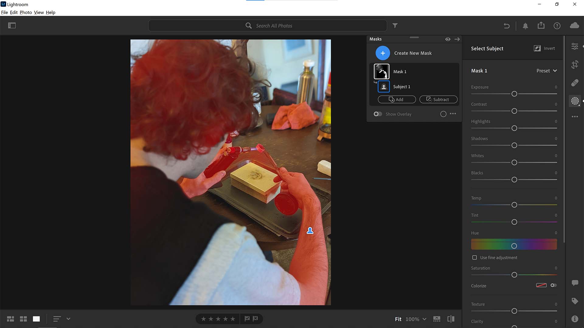
Ease of use: With its unique touchscreen-friendly interface. Lightroom features large, easy-to-use sliders and buttons, which means it's nice and simple to use either with a mouse, trackpad, stylus or fingers.
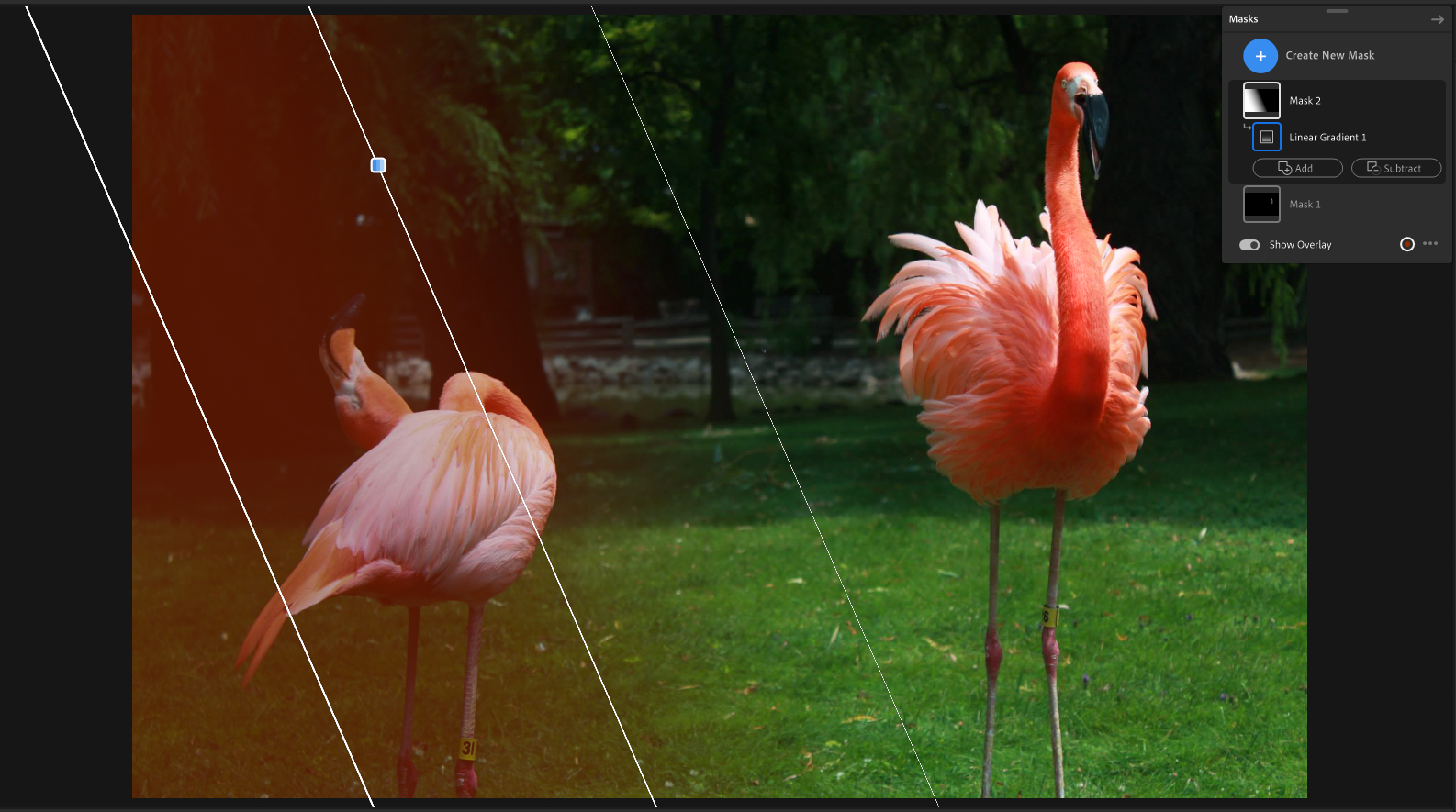
Features: Lightroom helps you to organise your work by letting you keep all of your photography in one place, edit it and share it from anywhere. You can store images on your computer, iPad, iPhone or Android device and even transfer photos automatically from your phone into Lightroom as you take them.
And that's not all. It can also handle complicated image management jobs that Photoshop isn't designed for. For example, it makes light work of day-to-day enhancements and RAW files. Syncing is automatic, so when you make an edit or flag an image as a favourite in one place, it updates everywhere else, too. Capture One Pro offers similar functionality, though overall I'd say Lightroom is more approachable for the casual user.
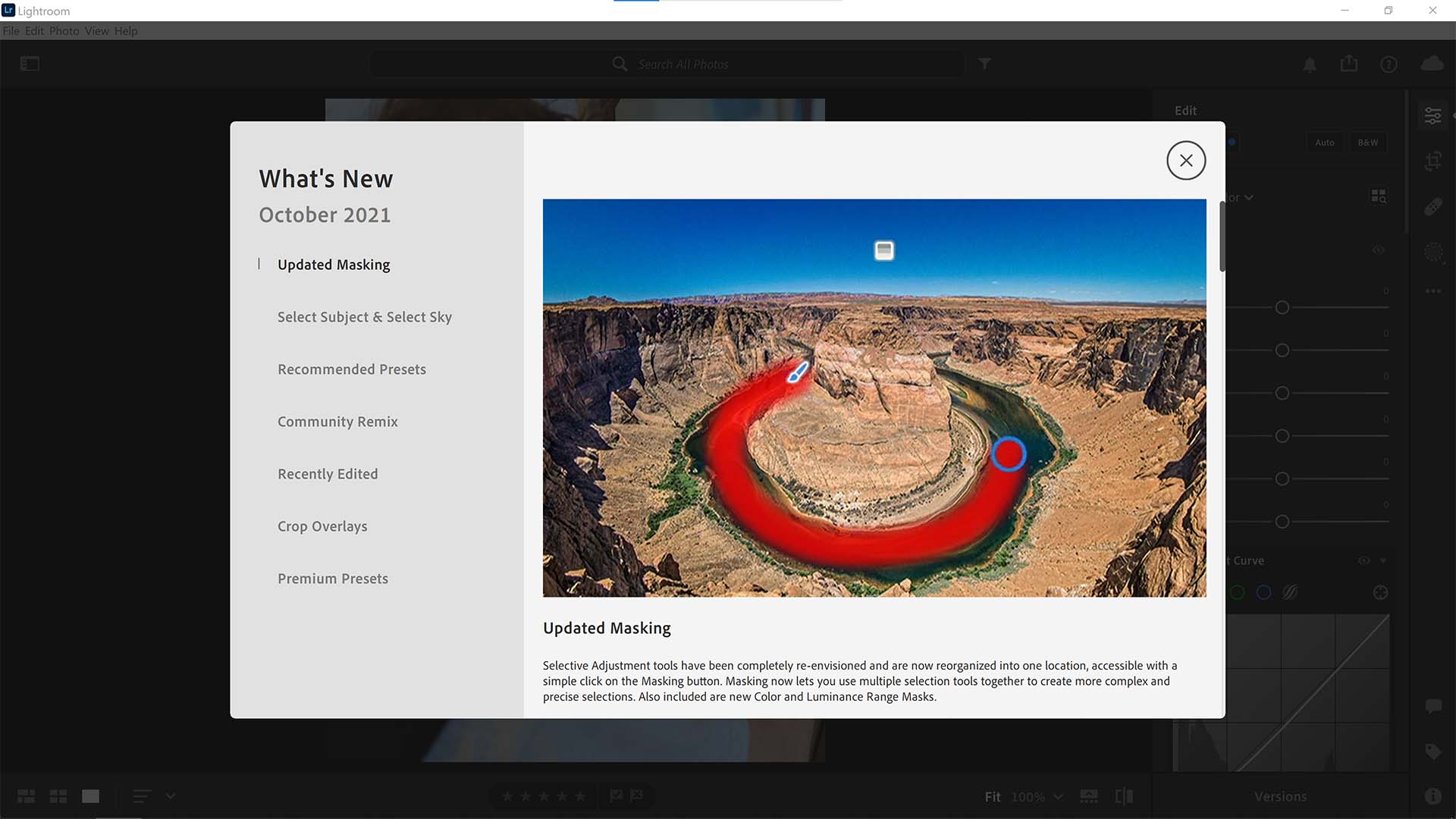
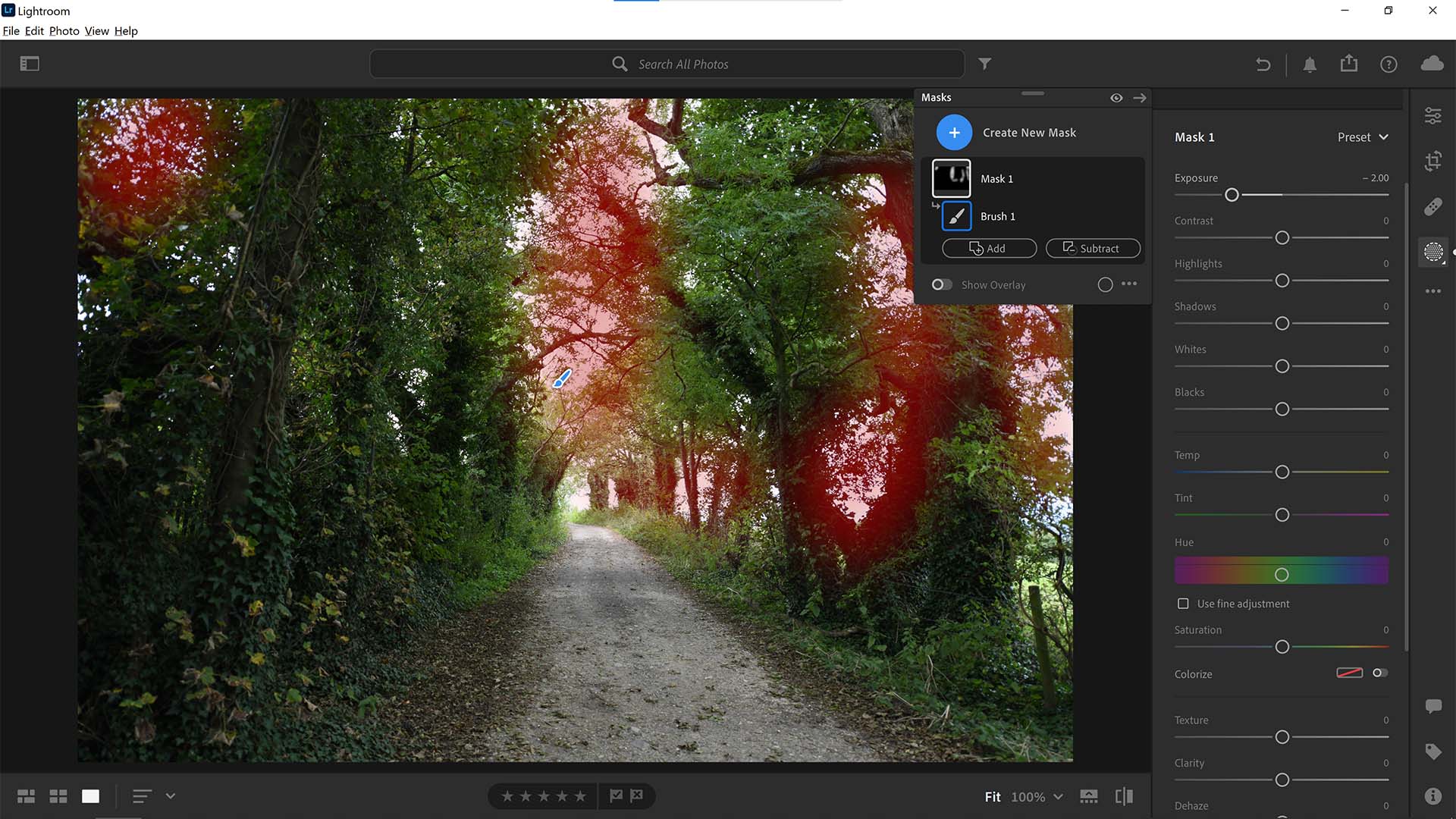
Lightroom also offers excellent photo editing features, especially the desktop-based Adobe Lightroom Classic, which, confusingly is still getting updated by Adobe and receives many of the latest features, such as AI Denoise. If you need some help getting your head around the difference between the two, check out our rundown of Lightroom vs Lightroom Classic.
Pricing: Offering a 7-day free trial, Lightroom's subscription is relatively well-priced subscription of £9.98/mo - but we'd instead recommend the Adobe Photography Plan which includes Lightroom, Lightroom Classic and Photoshop for the same price, albeit with only 20GB of cloud storage, versus the Lightroom-only 1TB.
Check out our Adobe Lightroom review to learn more about the software.
Attributes | Notes | Rating |
|---|---|---|
Pricing | Decent value, but subscription-based | ★★★★ |
Ease of use | A learning curve, but intuitive. | ★★★★ |
Features | Great for multi-device use. | ★★★★★ |

"Yes, you should get Lightroom. That is, if you’re looking for powerful image editing tools that flexibly control tone and colour as well as sharpening and image noise. It’s hard to find image editing software better than this."
The best RAW photo editing software
Specifications
Reasons to buy
Reasons to avoid
✅ You want a Lightroom alternative: DxO Photolab is the next-best thing if you don't like Lightroom's subscription model.
✅ You want an intuitive interface: We loved how user-friendly DxO's latest software is.
❌ You're on a budget: Sometimes, subscriptions do make the cost of software more palateable.
🔎 DxO Photolab is an excellent photo-editing and management tool providing high-level RAW and denoising technologies. ★★★★½
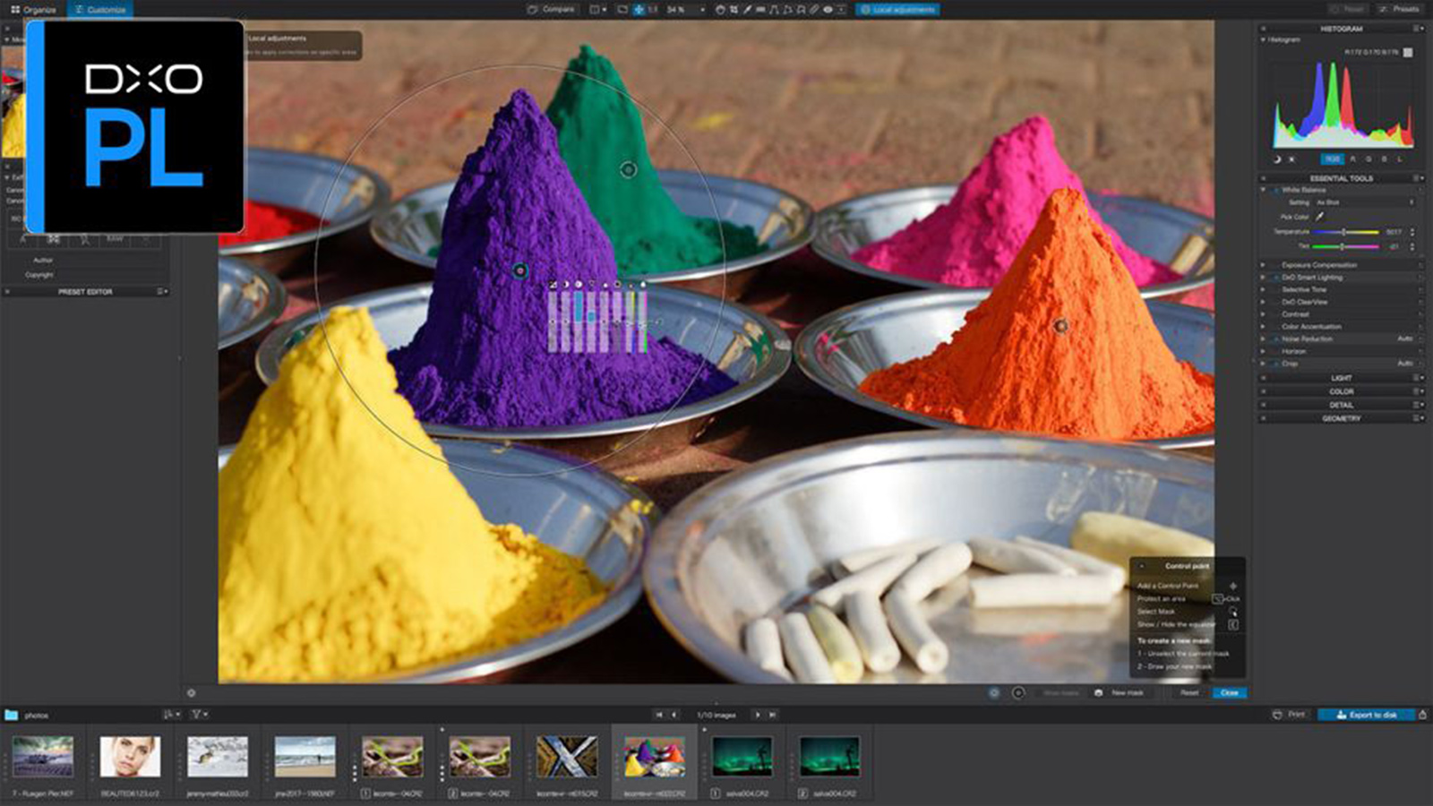
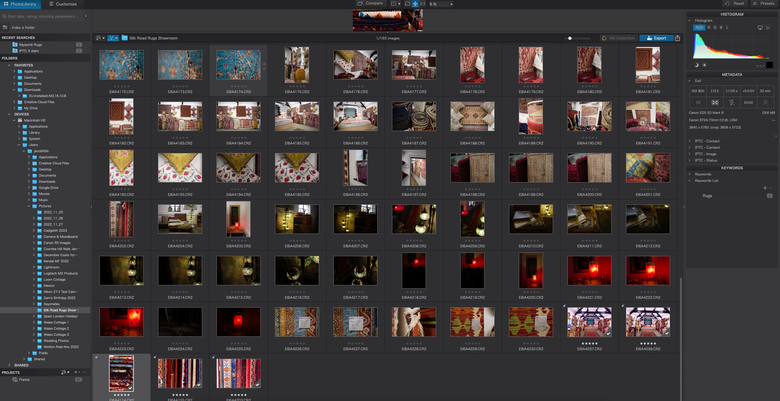
Need to know: Looking to convert RAW files? DxO PhotoLabis is the best in the business. It's a slightly complex tool to use, but we think it achieves impeccable results. You can browse images on your computer folder by folder, and then select an image and choose from the default conversion/correction setting or a range of presets.
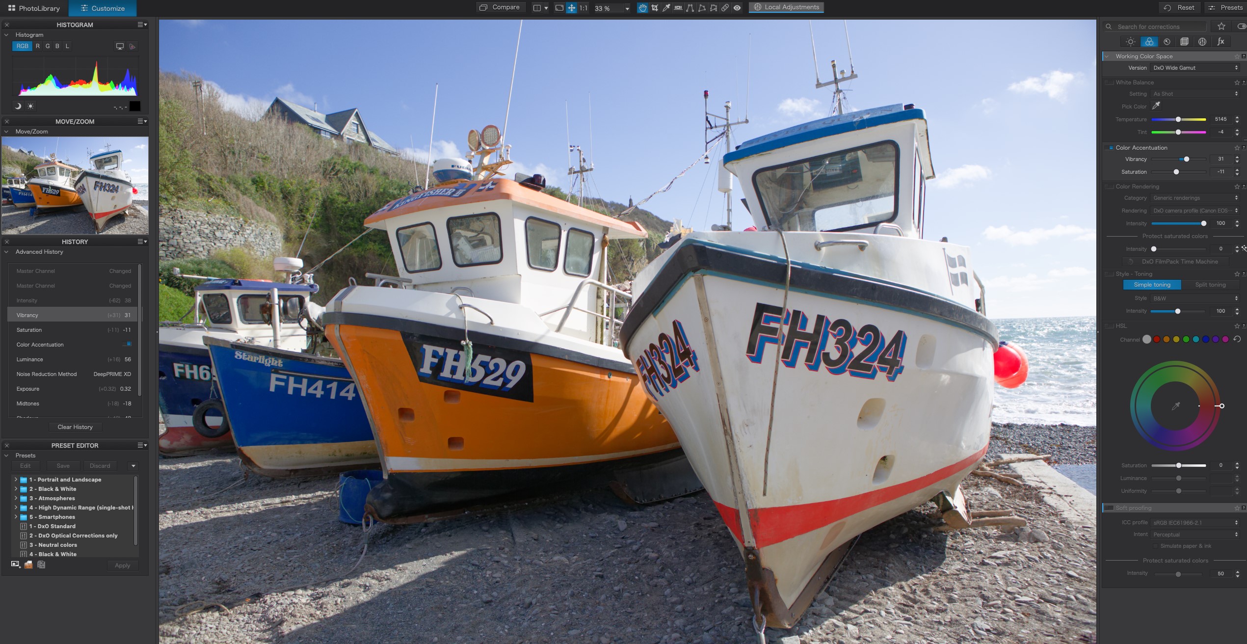
Ease of use: If you're familiar with Adobe's software design, DxO PhotoLab 6 will feel like home; but it's not just a re-skin. Other useful features like easy toggling for specific pieces of image manipulation and a more intuitive layout make it a great tool though it's still not best for beginners.
Features: DxO also has top-class software and plugins (like the popular Nik Collection) available for specific purposes, like its PureRAW editor that can assist with lens softness, demosaicing, vignetting rectification, and distortion correction. There's also the DxO DeepPRIME technology which delivers finer details and impeccable noise reduction. This is especially great if you're a music photographer working in low-light conditions like me.
We reviewed DxO PhotoLab in its sixth generation, testing out its much-touted denoising capabilities, which we found to be exceptional. Of course, this has been the case for a long time, but a welcome improvements have been made to PhotoLab's other tools like retouching and cloning. This makes it much more viable as a holistic photo editor, as opposed to just being the tool you use for denoising before switching to a different program.
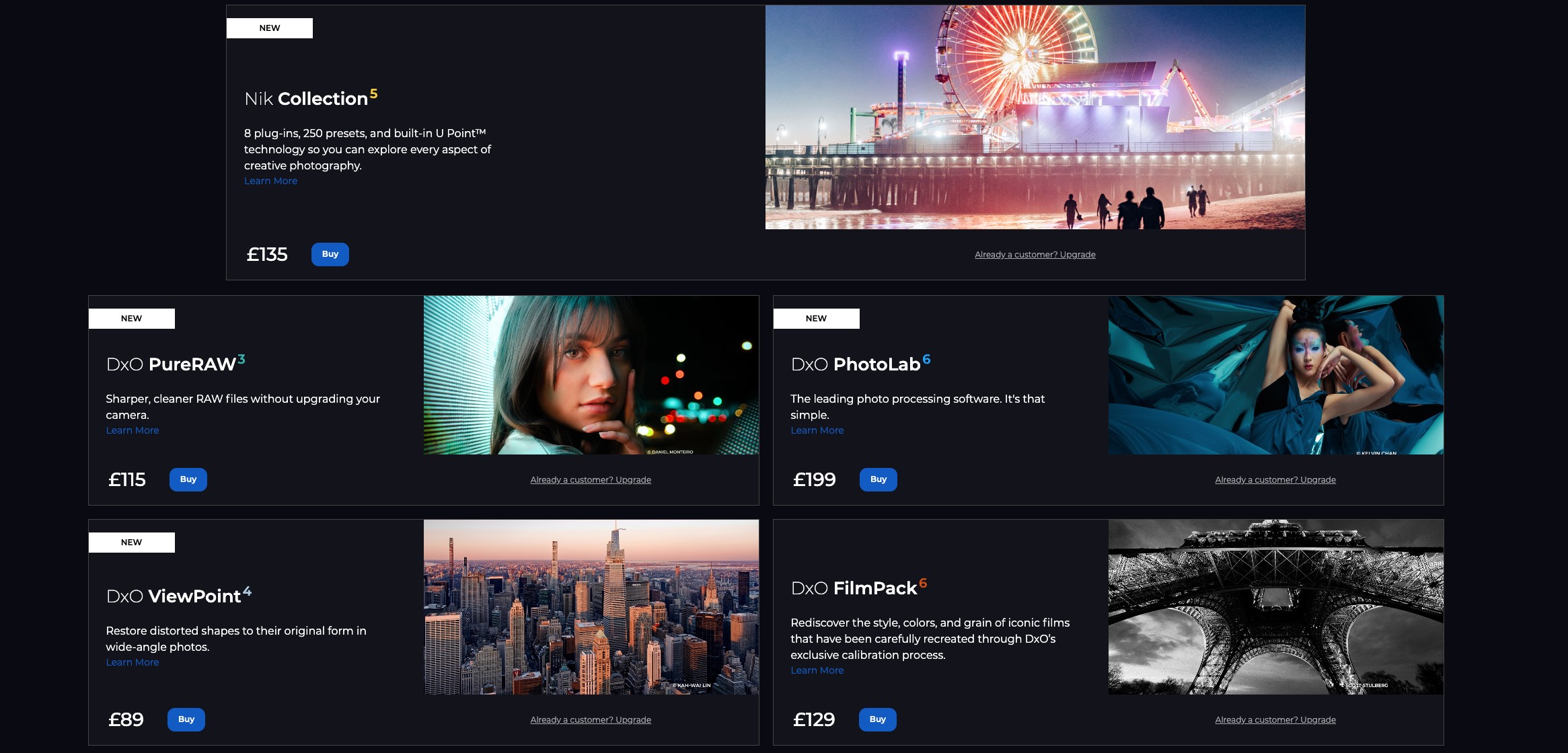
Pricing: There's a £199 one-off fee for PhotoLab6, a £115 one-off fee for PureRaw3, and a further £89 one-off fee for ViewPoint4. This may sound like a lot, but it'll work out cheaper than Lightroom if you use it for a few years.
Read our DxO PhotoLab review for more detail.
Attributes | Notes | Rating |
|---|---|---|
Pricing | Expensive, but pays for itself thanks to subscription-free model | ★★★★ |
Ease of use | Still not for newbies, but Adobe-esque. | ★★★★ |
Features | Great set of features, but some go overboard. | ★★★★ |

"I was very impressed with DxO PhotoLab's intuitive layout and operation, a competent set of features which often I thought provided better outputs than Lightroom in many situations."
The best photo editing software for portraiture
Specifications
Reasons to buy
Reasons to avoid
✅ You mostly want to do retouching: PortraitPro's tools enable a wide range of retouching tasks.
✅ You're on a budget: This is a nice, affordable option compared to others on this list.
❌ You need advanced features: Its lower price point means less advanced features, naturally.
🔎 PortraitPro 24 is a piece of AI-powered retouching software that includes a few handy, albeit basic photography editing tools. ★★★★½
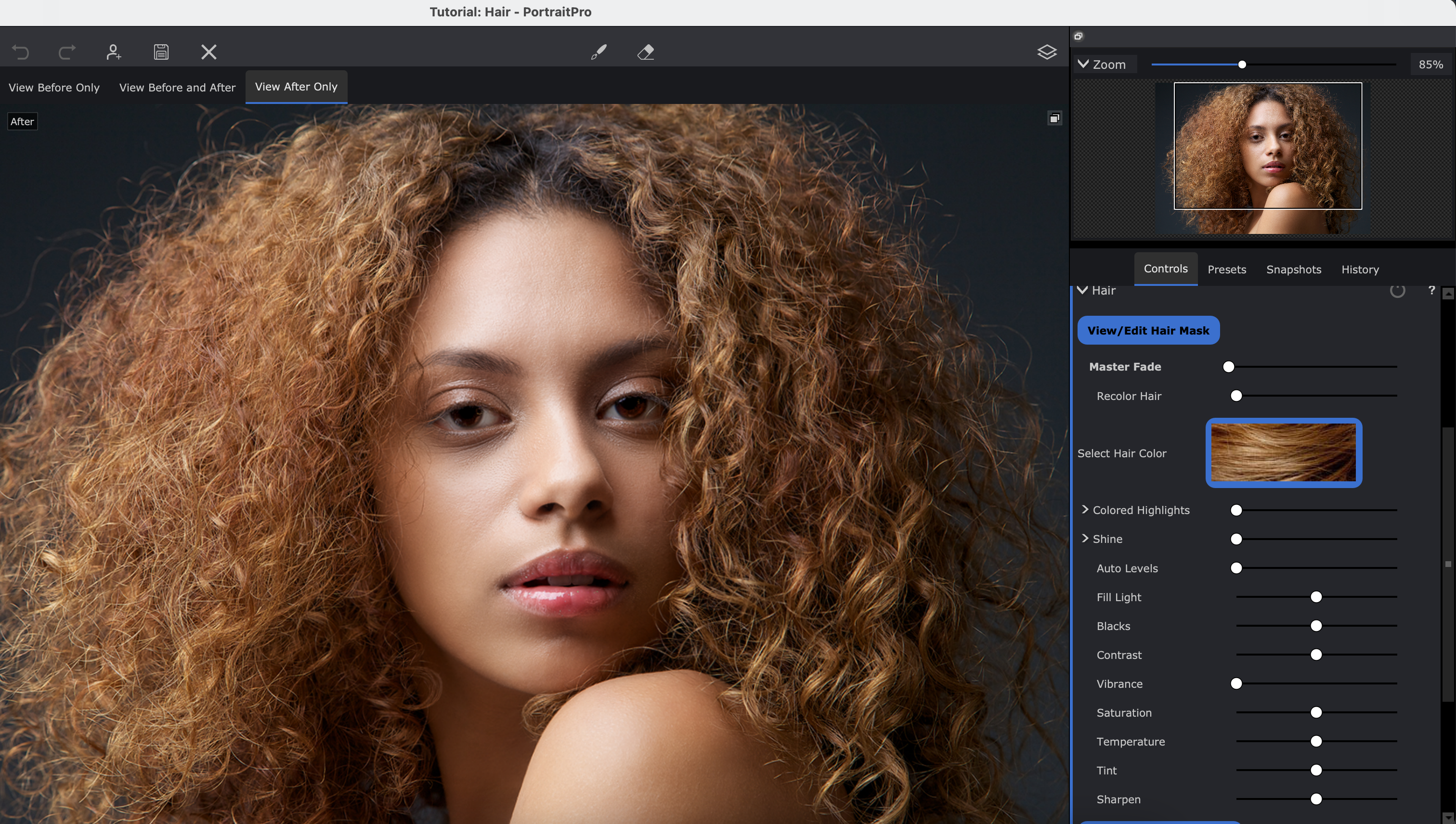
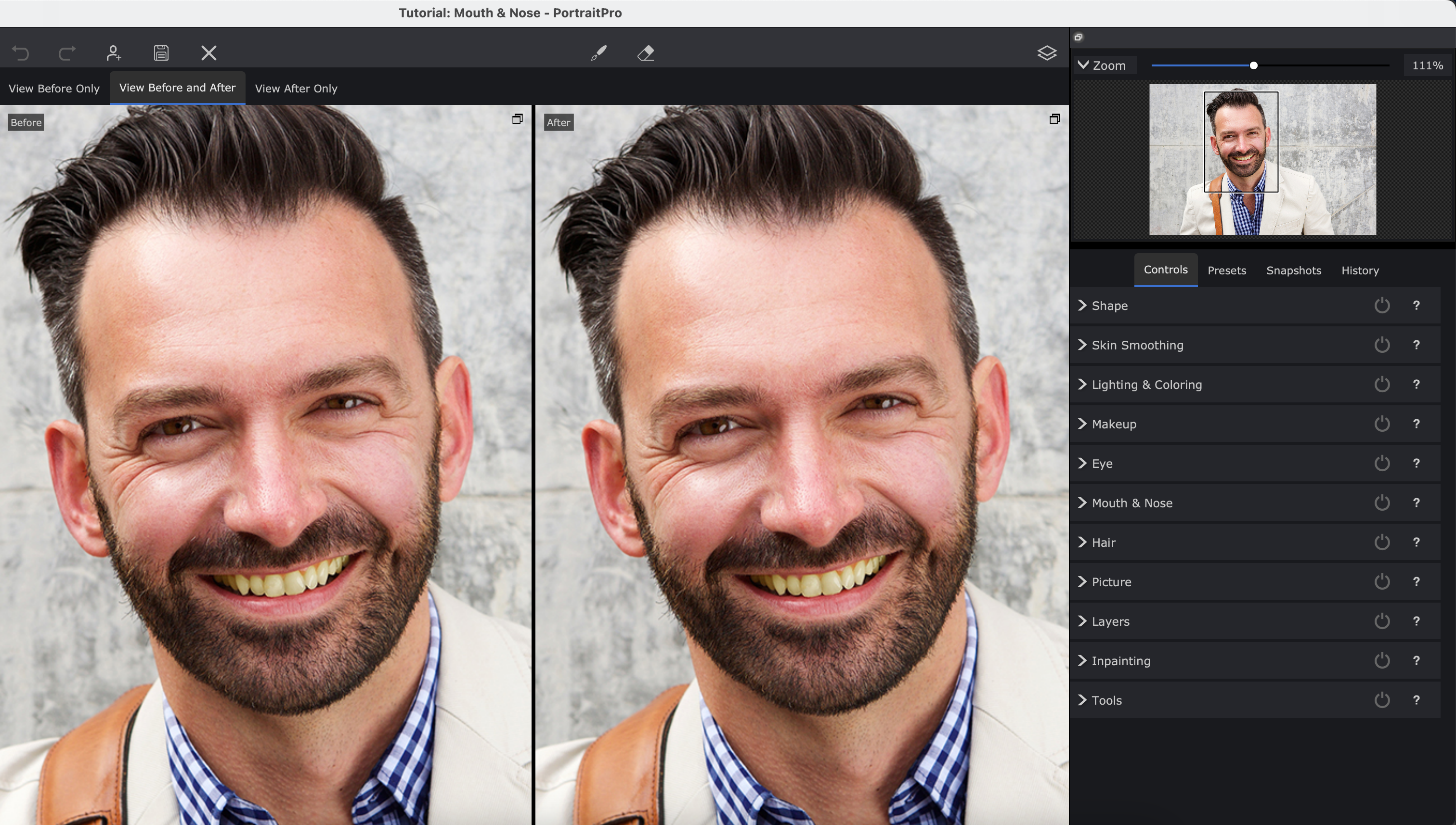
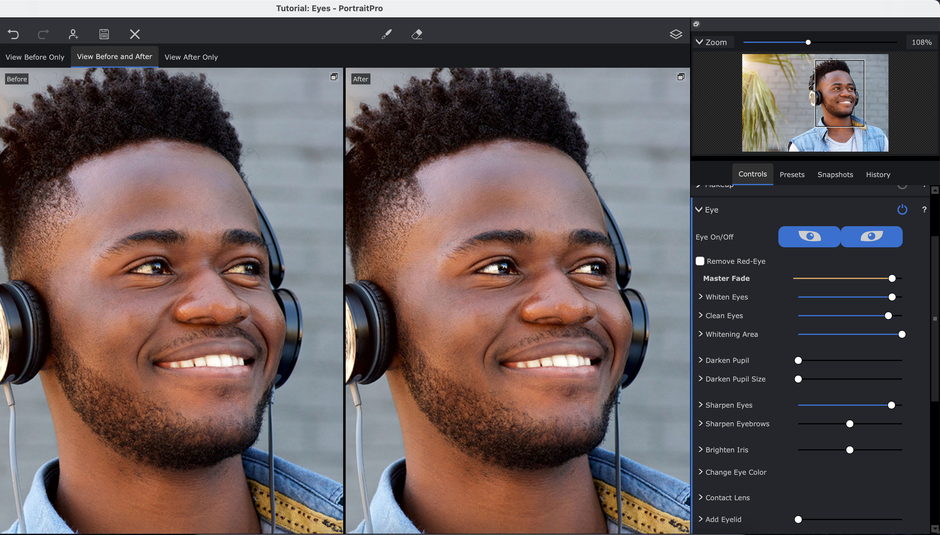
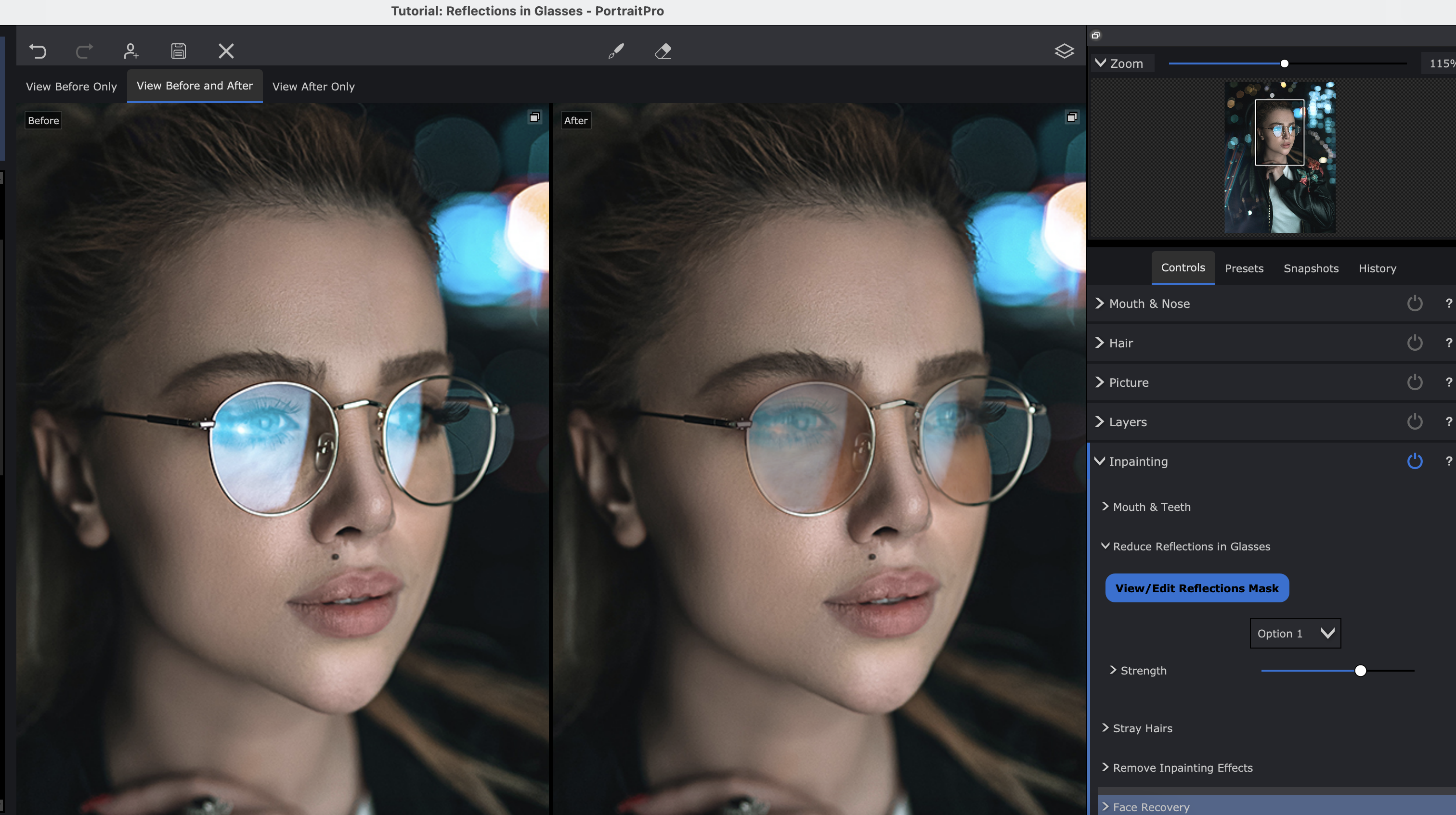
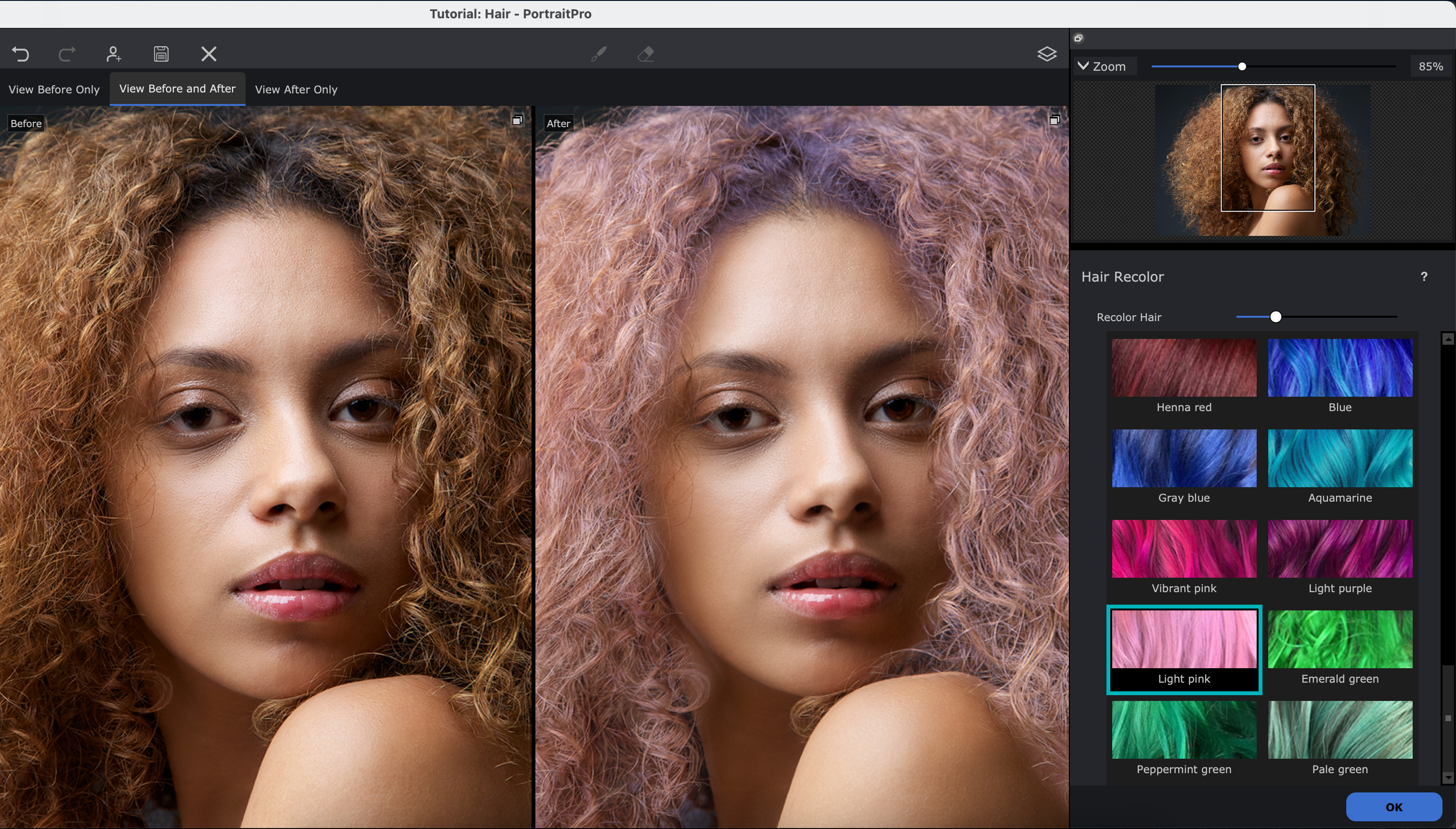
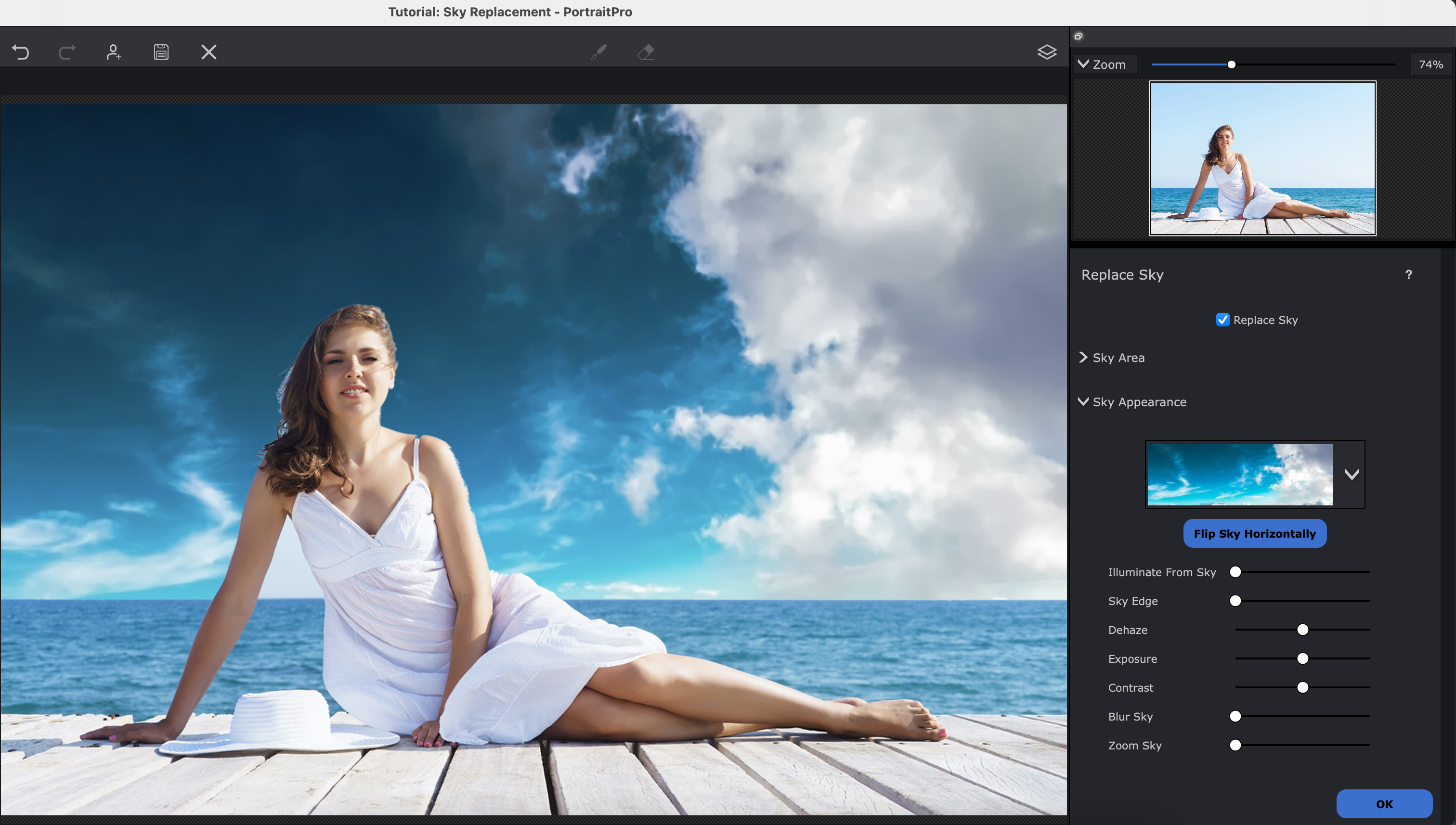
Need to know: I've only briefly used this photo editing software from Anthropics, but PortraitPro 24 has some pretty great features for portrait retouching, making it another Photoshop competitor. It can locate facial features, as well as skin, hair, and backgrounds and automatically apply smart adjustments using AI.
Ease of use: We've explored this program more fully our review. While some of those smart-adjustment tools proved a bit hit-and-miss in practice, the general fundamentals of the software are solid. We particularly appreciated the intuitive slider-based interface, and found smoothing out skin blemishes and similar imperfections in portraits to be a breeze.
Features: Since I first tried out the software, it has adapted newer AI tools and features such as facial recovery, reduced reflections in glasses, and what it calls 'inpaint mouth and teeth' which can guarantee the perfect smile for your subject and can even digitally apply a full face of makeup to your model should you choose.
Pricing: This software is available for both Windows and macOS devices, it can also process RAW files, and is reasonably priced too for a one-off payment of $120, or you can get a basic edition of PortraitPro for as low as $59.95.
Read our PortraitPro review for more.
Attributes | Notes | Rating |
|---|---|---|
Pricing | Great, approachable price point. | ★★★★★ |
Ease of use | Broadly intuitive and responsive | ★★★★ |
Features | Limited feature set, but great retouching. | ★★★★ |

"This application will appeal for all types of portrait photography, including wedding photographers and studio portraiture. Those wanting maximum flexibility in post will be drawn to PortraitPro."
The best free photo editing software
Specifications
Reasons to buy
Reasons to avoid
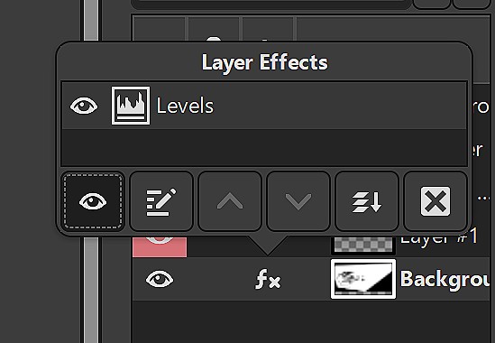
✅ You want free software: GIMP is open-source and completely free, to the joy of photo editors on a budget everywhere.
✅ You like being part of a community: There's a sprawling and helpful community at your fingertips.
❌ You need advanced features: It's free, but that means less advanced features, naturally.
❌ You need an easy-to-use interface: GIMP isn't best known for being intuitive, but it has improved.
🔎 GIMP is free and open-source, though that does come at the expense of advanced modern tools and easy user interface. ★★★★½
Need to know: Possibly the most famous and popular free photo editing program, GIMP is a complex but powerful tool designed and maintained by a community of volunteers So while you don't get the swish user interface of Photoshop or the smart next-gen AI features of other programs, you also don't get locked into a hard-to-cancel subscription.
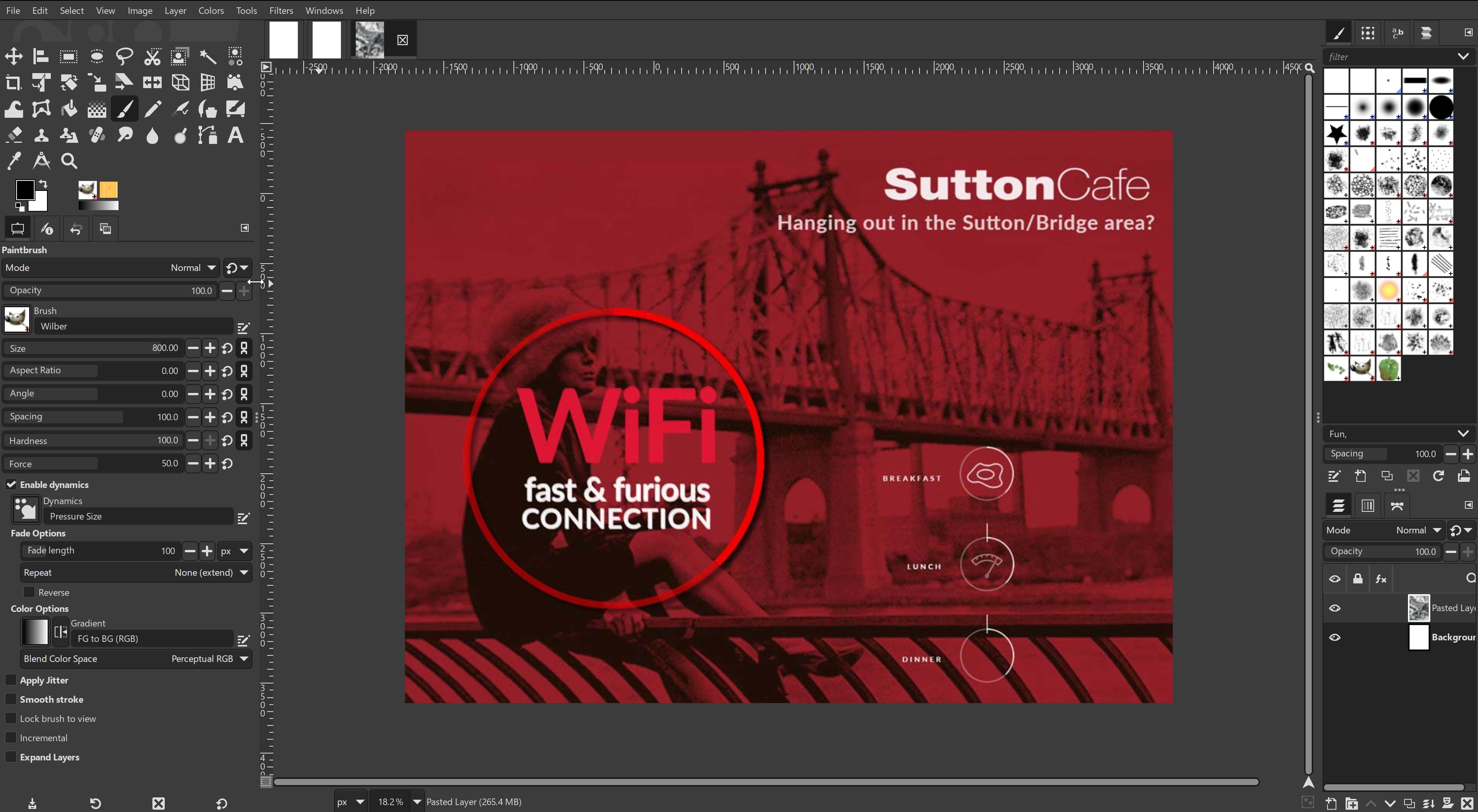
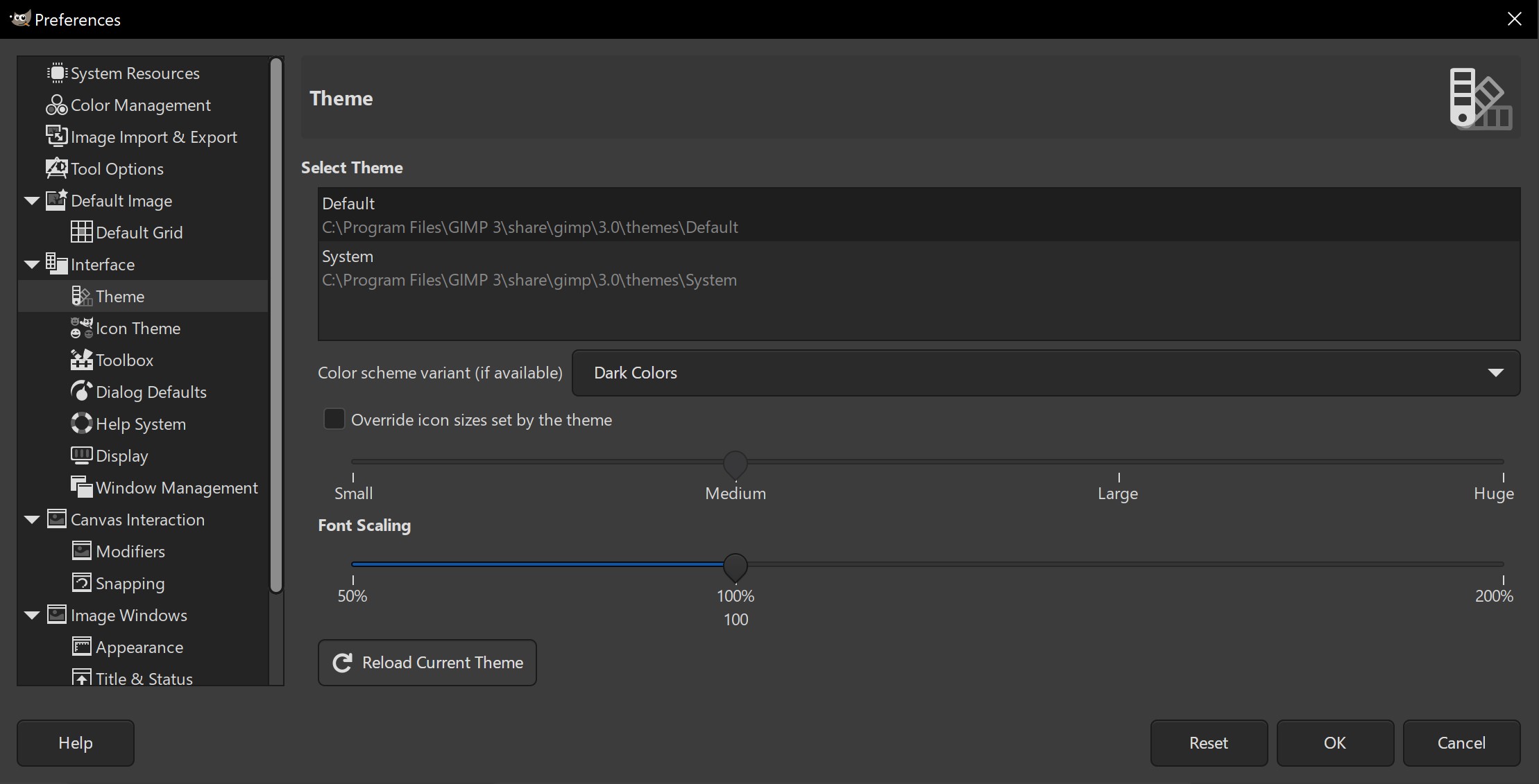
Ease of use: Being free, open-source software, the user interface suffers somewhat. There's absolutely no hand-holding here; you'll need to wade through lots of menus and, inevitably, make lots of mistakes along the way, but the reward is completely free powerful tools.
Features: The software available for Linux, Windows and Mac, and offers a broad range of tools including painting tools, colour correction, cloning, selection, and enhancement. The team has worked hard to ensure compatibility, so you'll be able to work with all the popular file formats without problems. The software also boasts a very capable file manager built in, similar to Adobe's Bridge.
Pricing: GIMP is another free photo editing tool, but this one is open source. That means it will be free forever, and there's an enthusiastic community of worldwide developers behind it, who are constantly working to improve it. While it requires some work to get used to, I can happily recommend it to anyone who wants a free Photoshop alternative.
Check out our GIMP review to learn more.
Attributes | Notes | Rating |
|---|---|---|
Pricing | Free to use | ★★★★★ |
Ease of use | Difficult user interface, steep learning curve. | ★★★ |
Features | Pretty well-rounded, but lacking advanced tools. | ★★★★ |

"Even with a kludgy interface and slower productivity than Photoshop, GIMP is still worth a bit of your attention. It is vastly capable, and can save you from buying an annual subscription."
The best of the rest
Canva
While Canva isn't one of the heavyweights on our list for photo editing, it has some extremely useful tools. The photo-editor focuses on bringing simplicity to time-consuming tasks, for example the one-click background remover and auto-enhance and retouch. However, you will need the Pro version to access these tools (currently $9.95/£8.99 a month).
Read our 4-star review
Photoshop Elements
If you're just getting started with image editing, full Photoshop may be a bit too much of a learning curve. Instead, you'd be better off with Photoshop Elements; a more basic alternative to Photoshop. Its handy Quick and Guided Edit modes make it great for beginners. The 2024 version includes even more power-up from Adobe's Sensei AI.
Read our 4-star review
Corel PaintShop Pro
Corel PaintShop Pro has been the budget alternative to Photoshop for Windows users for more than two decades. Supporting layers and allowing you to edit in both raster and vector image formats, it apes Photoshop's more advanced capabilities such as content-aware move, gradients, and filters.
Find out more
inPixio Photo Studio
InPixio Photo Studio is another middleweight photo editing software that's easy to use, and features some clever AI. Currently on version 12, its background eraser and cutout tool are particularly well designed, and there's also a cool sky replacement tool, although the results are not always the most realistic.
Find out more
Pixlr X / Pixlr E
Want to make edits right in your web browser? We recommend Pixlr X and its sister app Pixlr E. Both are very easy to use, and there's nothing to download. The free plan is perfect if you just want to use these tools occasionally; alternatively, subscribe to a paid plan and all of the limitations disappear.
Find out more
FAQs
What is the easiest software for photo editing?
If you're new to photo editing, we'd recommend Adobe Photoshop Elements as a good alternative. The great thing about Elements compared to its more complex siblings is that under the hood it is still powered by Adobe's AI system. So although it's easy to use, it's still at the cutting edge of image manipulation.
Do I need to use AI for photo editing?
While AI in photo editing can be useful, it is not necessary. If a photo editor does not have generative AI it should be dismissed out of hand. The basics of traditional photo editing – adjusting tone curves, colour grading and masking for local adjustments remain the same as they have for a long time. And many tools that might not have text-to-image AI have AI-based tools like denoising, which have been around for years before AI suddenly became a buzz word.
Does Windows come with photo editing softwrae?
Yes – Windows PCs come with Microsoft Photos, a basic photo organiser and editor. If you're only needing to do simple tasks like cropping your photos then this might well do the job. However, for any more complex photo editing needs, one of the programs on our list will provide a far superior toolset.
Can I edit photos on an iPad?
Yes – many of the best photo editing programs have sophisticated iPad versions. Photoshop is an obvious choice, but if you don't want to be tied into a subscription, Affinity Photo 2 has an iPad app that really impressed our reviewer.
How to choose the best photo editing software
The easiest way to decide how to choose which is the best photo editing software for you is to think about a few factors. First is what camera you use. If it is just a normal camera on a smartphone, then practically any of our choices will work with the JPEG images that these cameras tend to create.
However, you may have a mirrorless camera that can shoot in RAW format, which is the digital equivalent of a film negative and allows a lot more latitude in the editing capabilities of an image.
Second, how often will you want to make edits? If and will those changes be needed to apply to a batch of images, then a photo editing tool with robust library tools such as Adobe Lightroom may be the best choice.
How we tested the best photo-editing software
We based this selection on our own hands-on reviews in which our experienced writers, who have long worked in photography, spent an extended length of time with each program to be able to compare its capabilities, features, ease of use and value for money. They used each program to edit photos using the range of features provided by each program.
We considered who each program is targeted at, how good it is at what it aims to do and how it compares to other products on the market. Because we know what makes a great photo editor, we are brilliantly placed to make these recommendations and have advised on which software options are best suited for which kind of user.
For most of our choices above, we've included a link to our original, more complete reviews, where you can read more about our hands-on experience with the software. In the few cases where we haven't tested the software ourselves, we've taken on board expert advice from working photographers and consulted thousands of customer reviews (to find out more about our reviewing process, read our article on how we test software).
Sign up to Creative Bloq's daily newsletter, which brings you the latest news and inspiration from the worlds of art, design and technology.

Beren cut his teeth as Staff Writer on the digital art magazine ImagineFX 13 years ago, and has since worked on and edited several creative titles. As Ecom Editor on Creative Bloq, when he's not reviewing the latest audiophile headphones or evaluating the best designed ergonomic office chairs, he’s testing laptops, TVs and monitors, all so he can find the best deals on the best tech for Creative Bloq’s creative professional audience.
- Tom MayFreelance journalist and editor


