Epic viral video reveals the clever colour theory of Disney's Aladdin

Aladdin remains one of Disney's most loved movies. It has adventure, romance, comedy and memorable characters. A lot of elements contributed to the success of this Disney Renaissance hit of 1992, but one artist has impressed fans by pointing out an element that could be overlooked: colour theory.
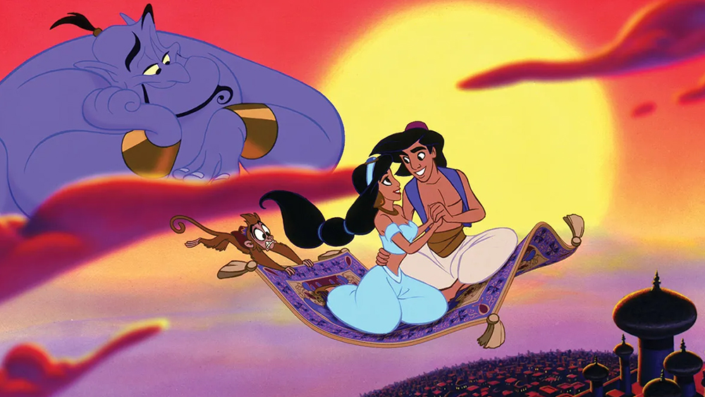
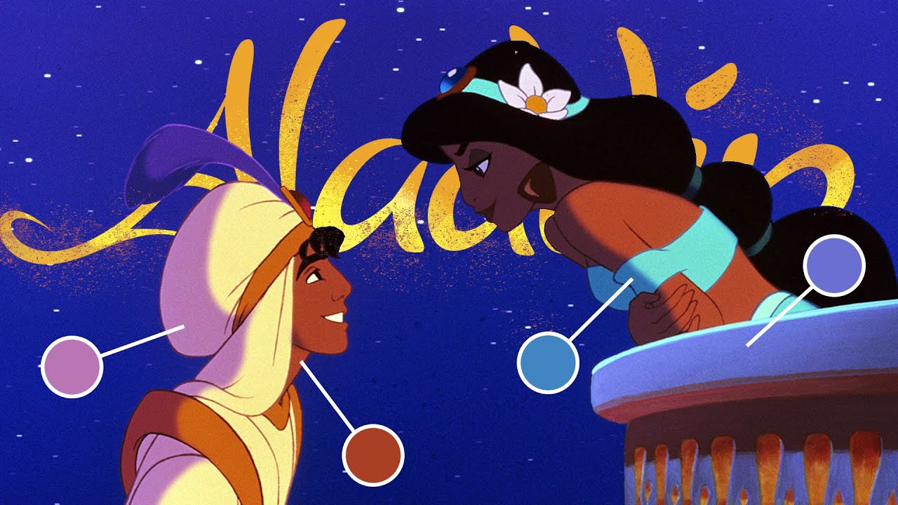
The colour palette of Disney's Aladdin is fairly unusual work since it mainly comprises the three primaries: red, blue and yellow. But Disney not only makes that work, it also uses the colours as a clever storytelling device.
In a wonderfully detailed analysis on YouTube, J. Holt the Illustrator notes that "animators built an entire movie off the most difficult to work with colours, with beautiful results." He shows how almost all scenes contain some or all of the three primary colours in varying proportions, allowing scenes can be divided into red, blue and yellow according to the dominant colour.
Article continues belowThis hierarchy avoids conflict between the three primary colours, amplifying the one that agrees with the light source in each scene. But it's not just about aesthetics. This approach also has a narrative benefit, guiding the viewer through the story by using contrast to lead the eye and through a deliberate control of colour in transition scenes, where changes in colour reflect a changing mood.
Holt notes that Aladdin "not only wrangles the most intense colours into harmony but uses the colours brilliantly to help tell the story" as just one of many variables. He clarifies that this isn't something as simple as each colour having a particular meaning since there's a lot of flexibility depending on the context in which the colour is used. For example, blue is often used for sombre scenes but not exclusively.

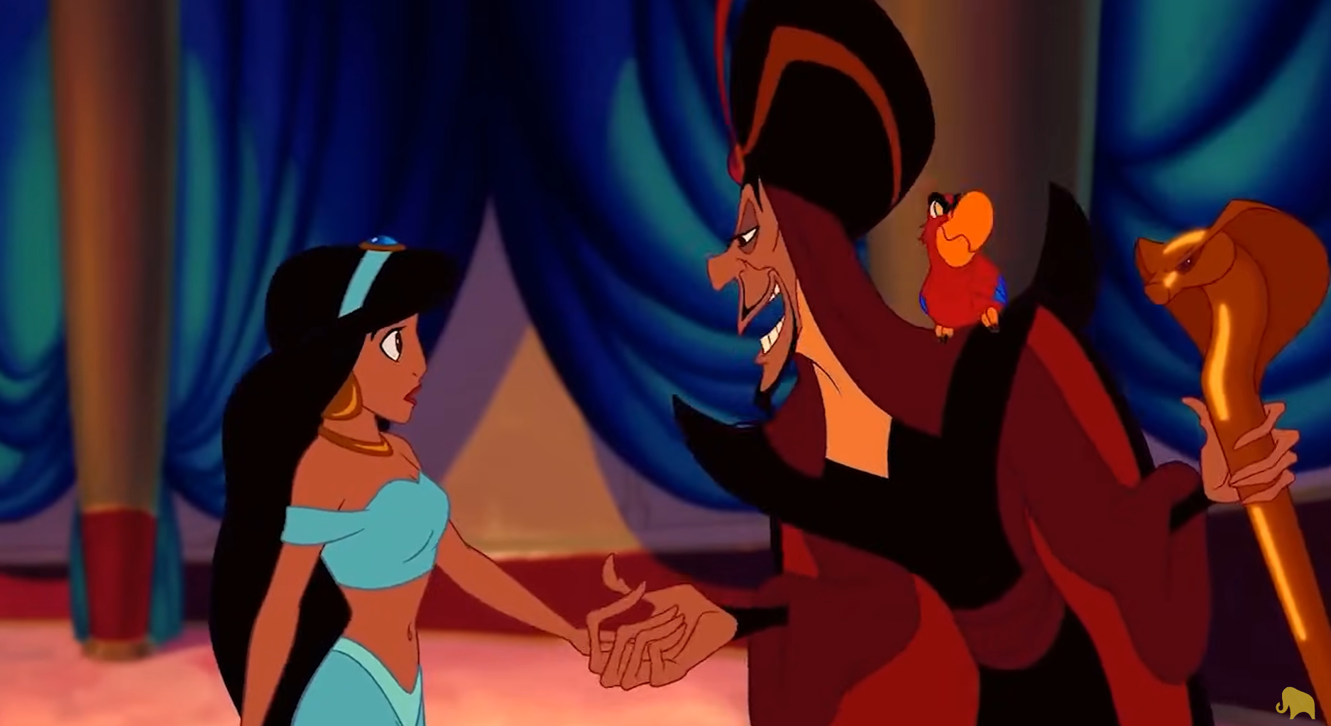
Of course, there are other colours in the film. These are usually peacemaker colours to help separate the more intense colours or "rogue colours" as seasoning, often influencing our interpretation of the tone of a scene. However, Holt does note three exceptions to his theory in which there's a considerable presence of green in the scene.
Two of these he defines as grounding scenes with character exposition that provide a rest from the dramatic colour of the rest of the film and a "normal" against which to reference everything else. However, one turquoise and red scene towards the end of the film leaves him confused since it doesn't seem to fit the rest of the movie.
Sign up to Creative Bloq's daily newsletter, which brings you the latest news and inspiration from the worlds of art, design and technology.
Holt first shared the video on YouTube back in December. He's since posted it on X, where it's picked up over 5 million views and 63,000 likes.
For more Disney news, see our favourite Disney character design conspiracy theories and the new Disney Junior logo.

Joe is a regular freelance journalist and editor at Creative Bloq. He writes news, features and buying guides and keeps track of the best equipment and software for creatives, from video editing programs to monitors and accessories. A veteran news writer and photographer, he now works as a project manager at the London and Buenos Aires-based design, production and branding agency Hermana Creatives. There he manages a team of designers, photographers and video editors who specialise in producing visual content and design assets for the hospitality sector. He also dances Argentine tango.

