BMW reveals the truth behind its logo
Is it a propeller or what? The truth's a bit more complicated.
What does the BMW logo mean to you? Lots of people believe that it symbolises a propeller, but is this really the case? Wonder no longer, as BMW has come clean about what its blue and white logo design is all about.
To many people, of course, the BMW is associated with over-aggressive drivers roaring up behind them on the motorway and flashing their lights as they demand to be let past (although to be fair Audi has stolen BMW's thunder in that regard over the past few years). But next time there's a BMW logo looming far too large in your rear-view mirror, you needn't wonder what it means.

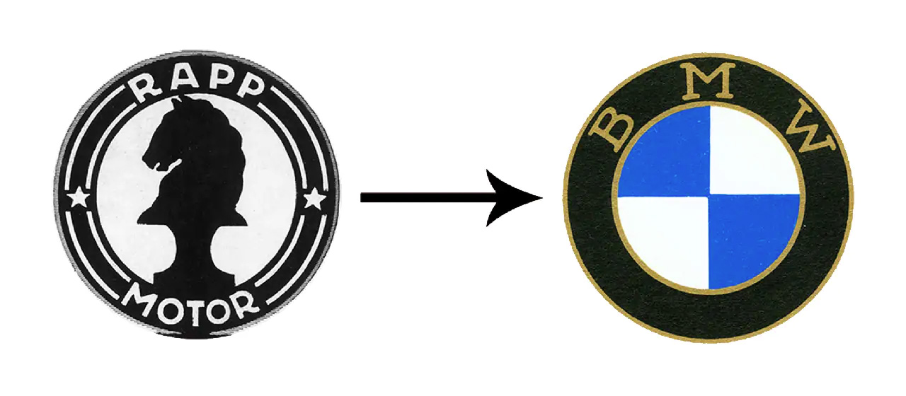
BMW got its name in 1917; it was previously an aircraft engine manufacturer called Rapp, and for the first few years of its existence it mainly produced aircraft engines for the German Air Force, the Luftwaffe. Rapp's company logo had been a silhouette of a knight chess piece surrounded by a black ring bearing the company name, and for its new logo company retained the black ring but added the now-familiar quartered blue and white design.
Article continues belowThe reason for the new design was to display the company's Bavarian heritage; the Bavarian flag also features a chequered blue and white pattern, and at the time of BMW's formation there was a popular movement for Bavarian independence from Germany. The company name – BMW stands for Bayerische Motoren Werke or Bavarian Motor Works – similarly reflects the pro-independence mood.

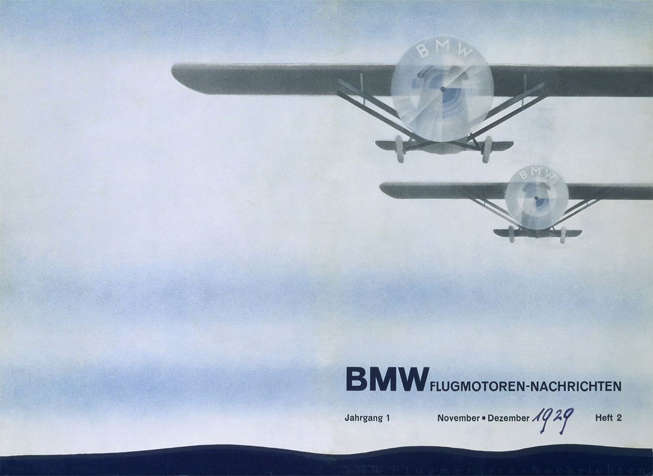
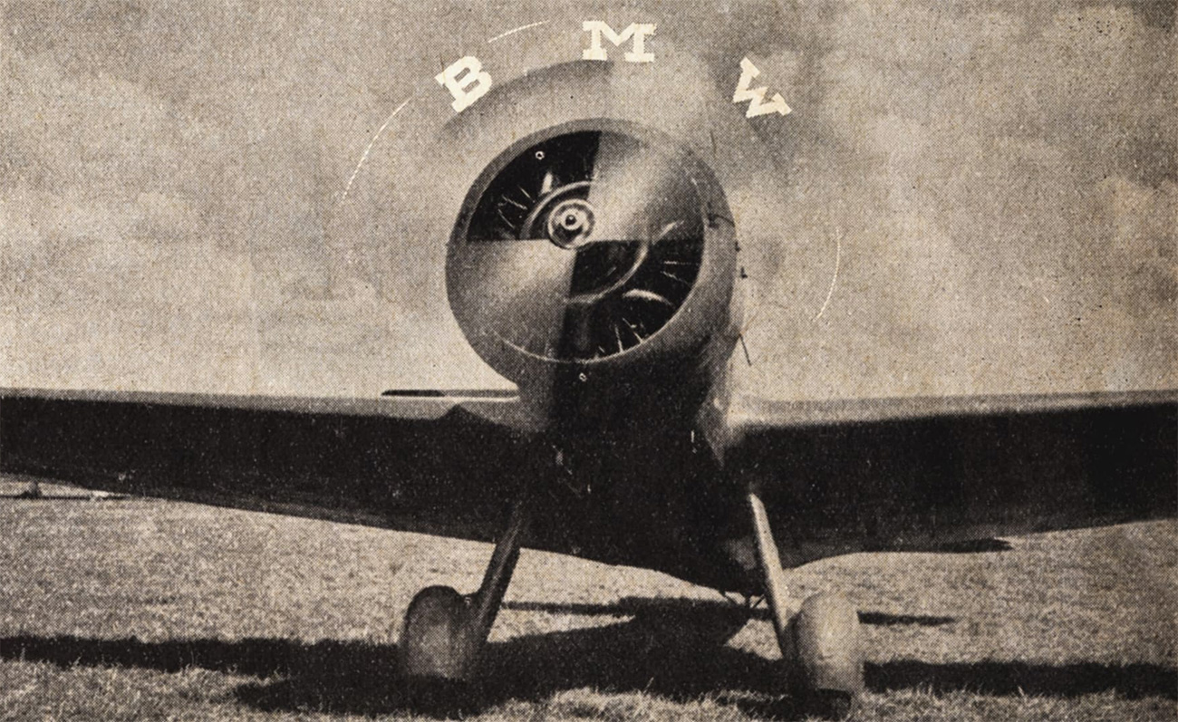
So where does the propeller idea come from? According to BMW, it all stems from an advert published in 1929, when BMW was still producing aircraft engines, depicting an aeroplane with the BMW logo superimposed over the propeller. The association was strengthened by a similar image in a 1942 publication by BMW, and legend has grown from there.
BMW itself admits that it's never really made much effort to correct the myth about its logo - it's a lovely little pub fact that doesn't do any harm and helps propagate the BMW brand, even though it's a long time since the company has had anything to do with the aircraft industry.

It's good to get the full story behind the logo, though; to find out more, and to see how the BMW logo has evolved over the years, head for this article on the company's website.
Sign up to Creative Bloq's daily newsletter, which brings you the latest news and inspiration from the worlds of art, design and technology.
Related articles:

Jim McCauley is a writer, performer and cat-wrangler who started writing professionally way back in 1995 on PC Format magazine, and has been covering technology-related subjects ever since, whether it's hardware, software or videogames. A chance call in 2005 led to Jim taking charge of Computer Arts' website and developing an interest in the world of graphic design, and eventually led to a move over to the freshly-launched Creative Bloq in 2012. Jim now works as a freelance writer for sites including Creative Bloq, T3 and PetsRadar, specialising in design, technology, wellness and cats, while doing the occasional pantomime and street performance in Bath and designing posters for a local drama group on the side.
