5 reliable ways to refresh a tired logo
You don't always have to go back to the drawing board if a logo's past its prime.
Not every logo design stands the test of time. For every classic logo there are hundreds that age less than gracefully, and even the best designs can start to look a little past it after a while.
If a logo design is past its prime – or if it no longer accurately reflects a brand's identity – then the temptation can often be to bin it and start again. This is always a great way to attract attention to a brand – not always the sort of attention you want, to be fair – but it also runs the risk of alienating loyal customers who have grown comfortable with the old logo design. (For more on logos, see our ultimate guide to logo design.)
Rather than start anew, sometimes the best approach is to play it safer and give the logo a thorough refresh, retaining the aspects that still work and getting rid of – or simply changing – what doesn't. Here are five tried and tested approaches you can take, and five brands that have used them to stunning effect.
Article continues below01. Change the palette
Colour and colour theory play a vital part in good logo design; each colour has its own connotations and a well-chosen palette can both communicate a brand's psychology and speak directly to its core market. And once a brand becomes widely recognised, you mess with the palette at your peril. Sometimes, though, the colour scheme that worked in the past might no longer accurately reflect a brand's values – or at least the ones it wishes to focus on – and a shift in palette becomes a viable option.
This most recently paid off for McDonald's; long associated with junk food and wanting to reposition itself as a healthier, more eco-conscious operation, it's pulled back on the brash primary colours of its old branding, and while it retains those iconic golden arches, in many European restaurants it's replaced the vivid red background with a more refined hunter green.
02. Lose the text
Having an instantly recognisable brand identity is a marketing dream, but it can also be a bit of a millstone around a company's neck. When your logo's well-established, changing it becomes almost unthinkable. One option, though, is to use that recognisability to your advantage, focus entirely on your well-known logo and get rid of the text entirely.
It's a high-stakes move that requires a stack of confidence and absolutely depends on having a logo to work with that's already incredibly well-known, but if a brand can get away with it then it scores a huge promotional win, with a mark that provokes an instant reaction and also feels more personal and less corporate. Most recently Mastercard pulled this one off with a Pentagram rebrand that reduced its logo to a simple pair of overlapping circles, and it's also worked for the likes of Apple, Starbucks and Nike.
Sign up to Creative Bloq's daily newsletter, which brings you the latest news and inspiration from the worlds of art, design and technology.
03. Switch the font
While the fundamental rules of design never change, tastes and fashions just keep on moving on, and this is particularly noticeable where typography is concerned. There's a slow but regular shift back and forth between serifs and sans serifs, so while at one point a serif wordmark makes a brand look authoritative and respectable, give it a few years and it just looks stuffy and out of touch.
Every logo designer has to face the fact that sooner or later the fantastic font that they picked for a wordmark is going to look horribly outdated, and while it'll doubtless go back to looking on-point in another few years, right now it needs changing. Google grasped that particular nettle in 2015, ditching its outmoded serif wordmark for a friendlier model using its own Product Sans font, while retaining its colour scheme and the playful tilt on the final 'e', and giving a brand that's ancient by internet standards a fresh, modern look.
04. Play on nostalgia
Any brand that's been around for a while will have accumulated a small pile of discarded logos over the years, and sometimes it pays to have a hunt through the archives to see if anything there's worth digging out and dusting off. A logo designed in the 1960s may have been well past its prime 20 or 30 years later, but today it might look fresh and exciting again once it's been cleaned up and re-rendered in crisp vectors.
And with a repurposed logo from the past there's sometimes an added bonus in that you get to hook into consumers' sense of nostalgia; people love it when a much-loved brand from their childhood makes a comeback, as seen in 2016 when North did away with the Co-operative's overly corporate branding, turning it back into the Co-op and bringing back its caring, sharing clover leaf logo from the 1960s.
05. Simplify
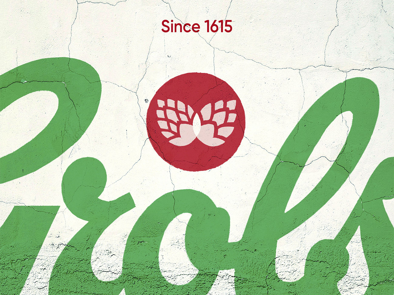
Another thing that can happen to a long-lived logo design is that people can't resist tweaking and refining it over the years. A drop shadow here, a bit of highlighting there, some extra on-trend detailing… it all adds up, and the end result of all these little adjustments can be a massive mess.
Even if a logo's been left largely untouched over the years, it may not be fit for purpose today. Logos need to work a lot harder these days; they need to look good on everything from massive banners down to social profile images and app icons, and older logos weren't necessarily designed with that degree of scaling in mind.
When you're dealing with either case, often the only option is to go back to basics and strip the brand down to its bare essentials, something best exemplified by Dan Lawrence's recent redesign work for Grolsch. Having decided that the brand's originality and story had been lost across many redesigns, he threw out everything in the branding that served no purpose, even recreating its logo in a simplified vector style. The end result is minimal, functional and powerful; still recognisably the same brand but completely reinvigorated.
Related articles:

Jim McCauley is a writer, performer and cat-wrangler who started writing professionally way back in 1995 on PC Format magazine, and has been covering technology-related subjects ever since, whether it's hardware, software or videogames. A chance call in 2005 led to Jim taking charge of Computer Arts' website and developing an interest in the world of graphic design, and eventually led to a move over to the freshly-launched Creative Bloq in 2012. Jim now works as a freelance writer for sites including Creative Bloq, T3 and PetsRadar, specialising in design, technology, wellness and cats, while doing the occasional pantomime and street performance in Bath and designing posters for a local drama group on the side.
