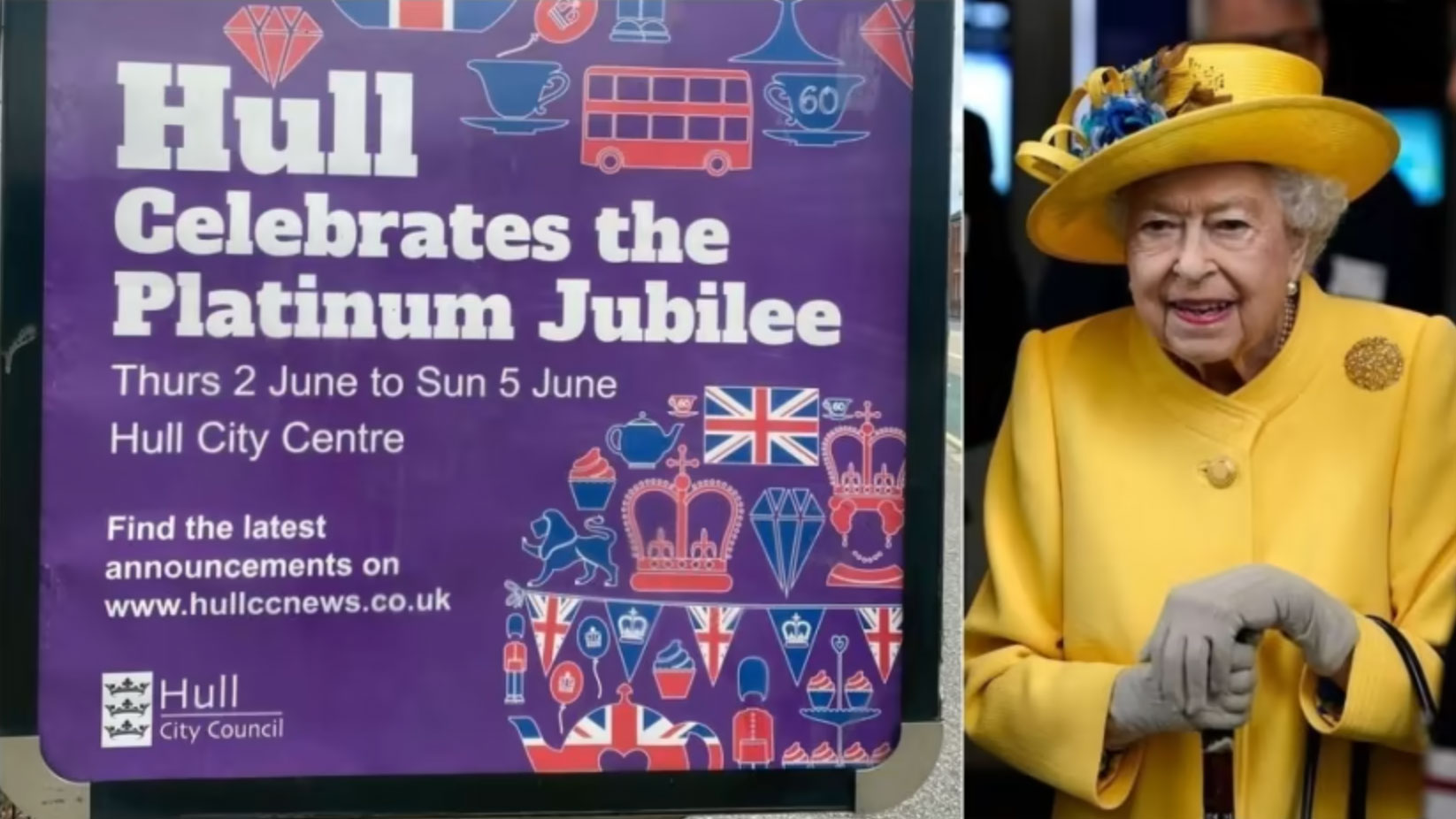
Can you spot the mistake on this Platinum Jubilee poster?
It's a pretty big one!
Poster designers in the UK City of Hull have been left red-faced as a poster advertising merriment for the Queen's Jubilee weekend has been printed and hung containing a somewhat-major mistake. Now, we aren't ones to be pernickety but we do appreciate the chance to hail the importance of proofreading in the creative industries – and this error makes the point splendidly.
With a royal purple background, and some ever-so-fancy iconography, the poster certainly looks the part. But the gaff means it'll never make our poster designs roundup. Can you spot it?

Send your eyes to the right, and look at the teacup, which seems to have been sent here from 10 years ago. Queen Elizabeth has been done a disservice, as she has actually been reigning for 70 years and not 60. Though we love the swirly font, we are beyond surprised this got past the many people on the creative team. It's never a good look when the public have to point out an error like this.
Article continues belowWe realise it's not the biggest mistake of the century (it certainly doesn't rank against these epic design fails), but it serves as a reminder to check, double check and check again when putting a piece of promotional material out. Though, as the producers for this movie found out, a big mistake on the poster certainly serves as a talking point.
Read more:
- Someone's created a Wordle... for posters
- Netflix has a 'new' logo – and it's driving Stranger Things fans wild
- Is this the first great Marvel poster?
Sign up to Creative Bloq's daily newsletter, which brings you the latest news and inspiration from the worlds of art, design and technology.

Georgia has worked on Creative Bloq since 2018, and has been the site's Editor since 2023. With a specialism in branding and design, Georgia is also Programme Director of CB's award scheme – the Brand Impact Awards. As well as immersing herself with the industry through attending events like Adobe Max and the D&AD Awards and steering the site's content streams, Georgia has an eye on new commercial opportunities and ensuring they reflect the needs and interests of creatives.
