Coca-Cola tweaks brand with magical new logo - and it's genius
Can you spot the invisible bottle?
Sign up to Creative Bloq's daily newsletter, which brings you the latest news and inspiration from the worlds of art, design and technology.
You are now subscribed
Your newsletter sign-up was successful
Want to add more newsletters?
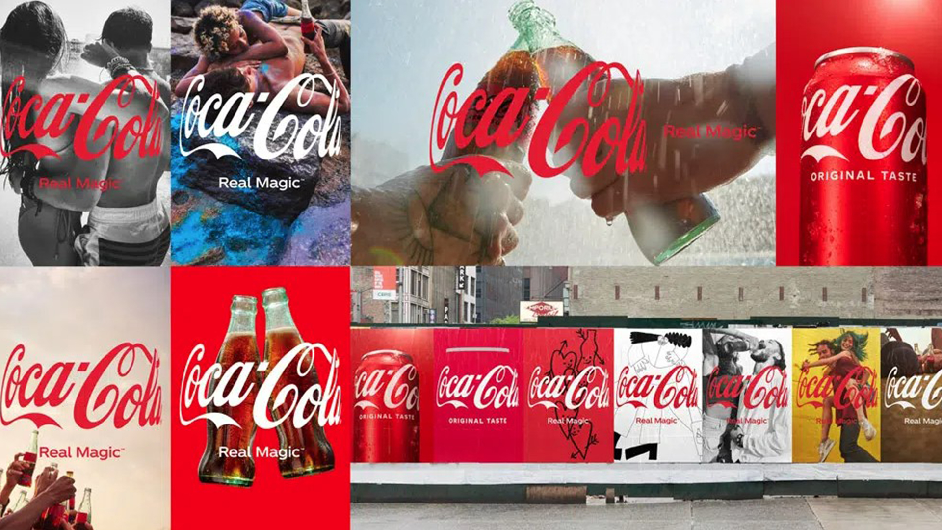
It isn't every day that we see a company as big as Coca-Cola tweak its brand, but the soft drink giant has just revealed its magical new logo. Featuring a fresh wrap-around logo called the 'Hug' and a new tagline, this design is genius.
Coca-Cola has been running the fizzy drink game for decades now, and its logo has become an icon of modern culture. But the famous logo that we all know and love has just had an ingenious makeover – and we love it. If you are hoping to design your own clever logo, make sure you check out our 15 golden rules on logo design.
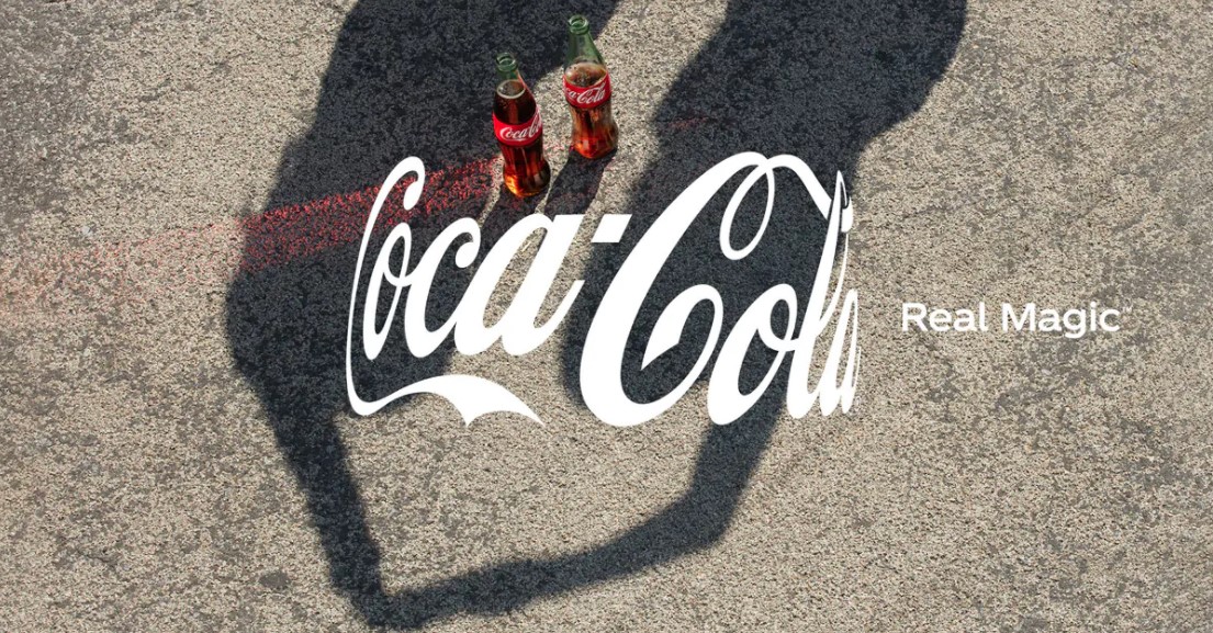
The new logo features the traditional Coca-Cola logo but is slightly wrapped around what we can only presume is an invisible Coke bottle. It's amazing that the brand is so well recognised, that we can decipher the shape of the Coke bottle, despite it not even being there. The new logo is apparently inspired by togetherness, and the actual action of a hug, hence the wrapped around logo imitating that of arms mid-hug.
Article continues belowThe new logo is accompanied by a new campaign and the tagline "Real Magic." In the ad (below) for the branding update, viewers watch as a bottle of Coke sparks peace between players on an online game. And despite this ad feeling oddly similar to the advert when Kendall Jenner controversially solved world peace with a can of Pepsi, we think the new logo and the values behind the "Real Magic" are actually rather endearing.
Chief marketing officer Manolo Arroyo at Coca-Cola has said the "Real Magic" is "not just a tagline" and that it is "a philosophy." According to an article on the Coca-Cola company website, the intentions behind the new campaign are to "increase the Coca-Cola consumer base through an ecosystem of experiences anchored in consumption occasions, such as meals and breaks, and merged with consumer passion points like music and gaming."
The campaign features work from a number of artists and photographers that celebrates togetherness and inclusivity. With vibrancy, happiness and diversity all included in the new campaign, a number of new print ads will feature a range of colourful mediums.
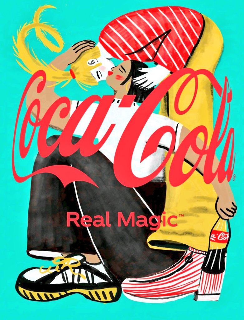
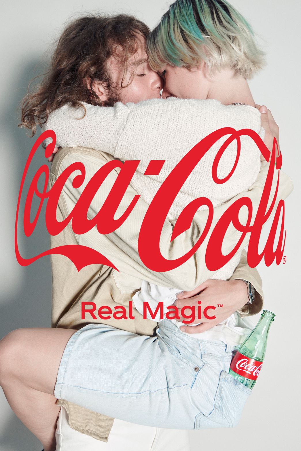
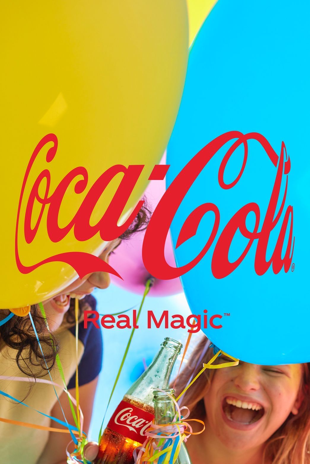
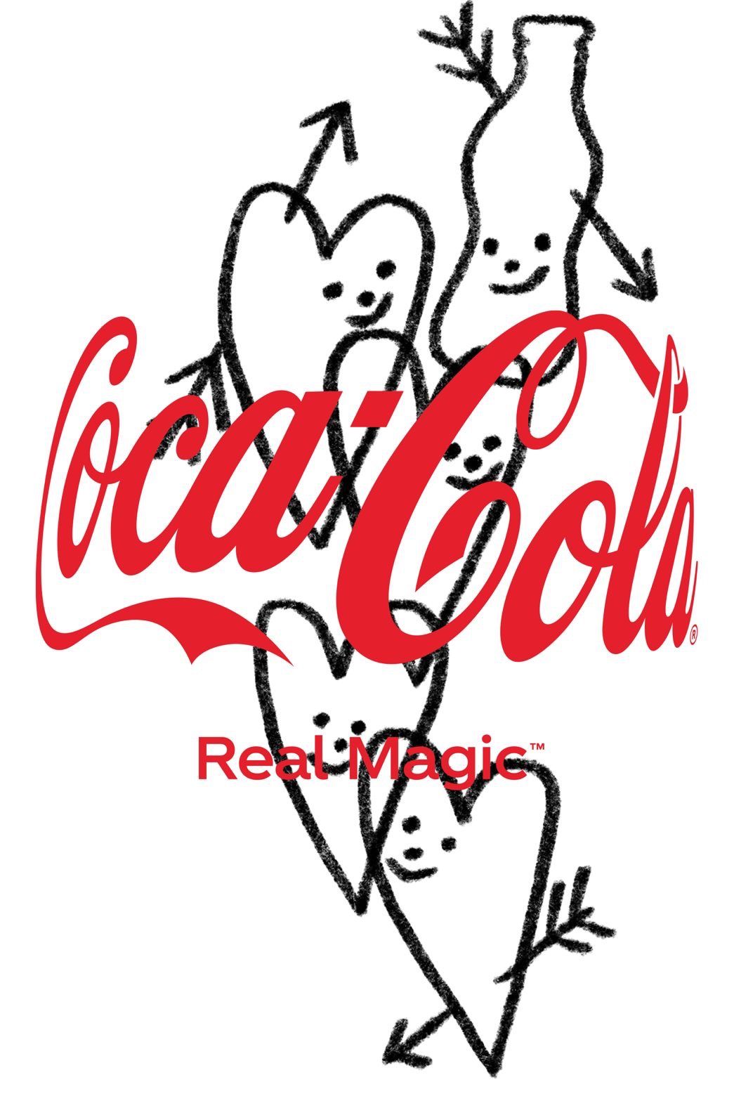
The new logo has been praised online by Twitter users with users dubbing the campaign as "happiness to look at," and another calling the campaign "magic." It's apparent the internet likes the rebrand as much as we do.
Sign up to Creative Bloq's daily newsletter, which brings you the latest news and inspiration from the worlds of art, design and technology.
Coca-Cola’s HUG Icon ❤️ campaign is truly happiness to look at. pic.twitter.com/A8TDgq3ngYOctober 3, 2021
Coca-Cola 's marketing moves are always fascinating . The iconic brand has launched a new global platform Real Magic which will pay odes to humanity. And its logo is taking a curved shape to represent a Hug. From the old Open Happiness to new Hug for humanity. In sync with times! pic.twitter.com/0dnbmvakaYOctober 1, 2021
We love this new friendly rebrand and love the fact that Coca-Cola have chosen to feature a number of different creative mediums. If you want to try your hand at logo design, then why not have a look at our roundup of the best free logo designer.
Read More:
- If Adele really is behind this cryptic ad campaign, it's genius
- Apple October event: 5 things we're expecting to see
- Rumoured new MacBook Pro feature could be a game-changer for creatives
Amelia previously worked as Creative Bloq’s Staff Writer. After completing a degree in Popular Music and a Master’s in Song Writing, Amelia began designing posters, logos, album covers and websites for musicians. She covered a range of topics on Creative Bloq, including posters, optical illusions, logos (she's a particular fan of logo Easter eggs), gaming and illustration. In her free time, she relishes in the likes of art (especially the Pre-Raphaelites), photography and literature. Amelia prides herself on her unorthodox creative methods, her Animal Crossing island and her extensive music library.

