Coca-Cola loses its logo in bold new design
And you can even design your own can.
Sign up to Creative Bloq's daily newsletter, which brings you the latest news and inspiration from the worlds of art, design and technology.
You are now subscribed
Your newsletter sign-up was successful
Want to add more newsletters?
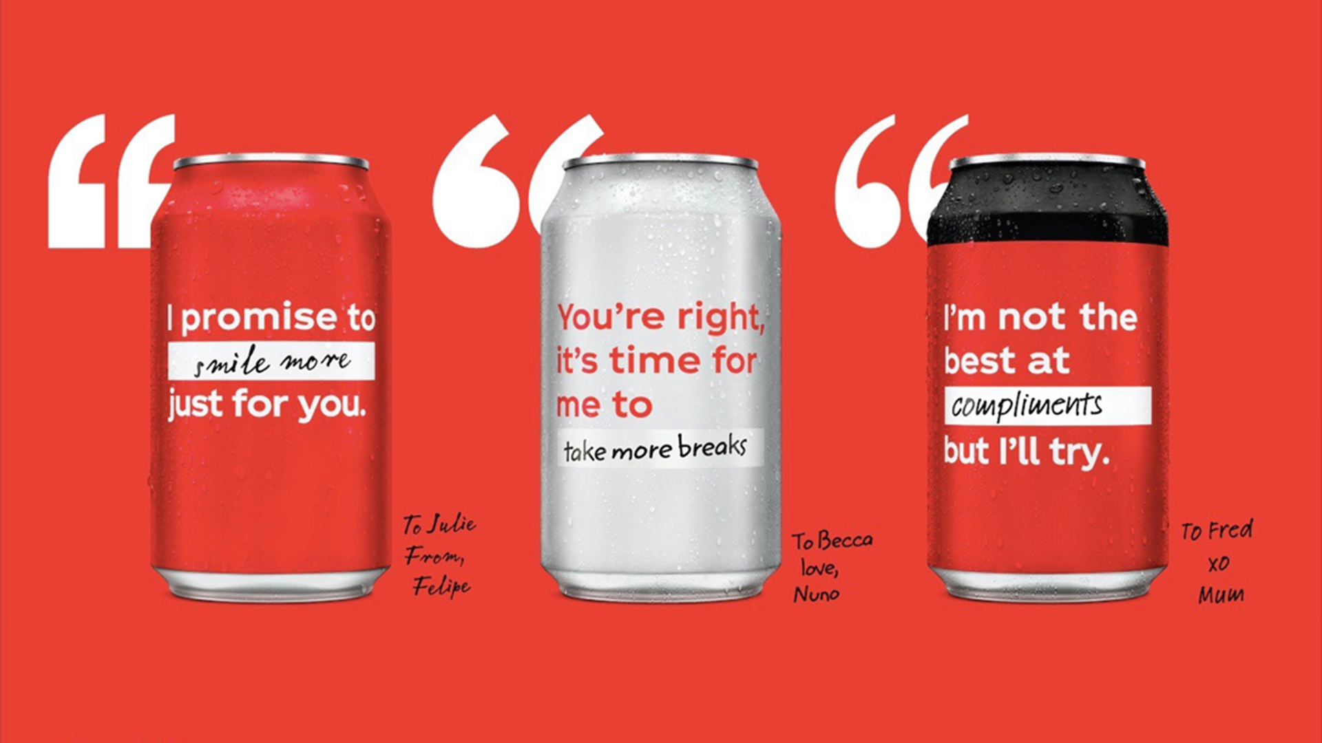
It's one of the most recognisable brand logos in the world, but you won't find the Coca-Cola logo anywhere on the front of the company's new cans. As part of a new marketing campaign designed to inspire positivity and change, the brand has done away with its iconic logo entirely, replacing it with "inspiring" resolutions for 2021.
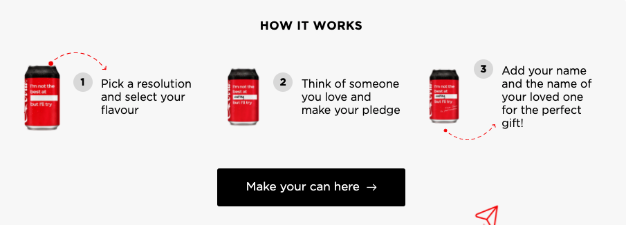
Already on sale in Europe, limited edition cans of the brown stuff feature uplifting messages such as "I promise to smile more just for you," and "I'm not the best at compliments but I'll try," and fans can even customise their own designs online. (Looking for more bold advertising examples? Check out our best print ads).

Created by 72andSunny Amsterdam, the 'Open to Better' campaign is designed to turn the Coke can into a "humble gesture of appreciation." Coca-Cola's GB marketing manager Bryony Lester said in a press release that the company intends to "use the power of our packaging to share resolutions of hope and positivity that we hope fans will enjoy sharing with their friends and family".
Article continues below 
On Coca-Cola's 'Open to Better' web page, users can personalise their own cans with inspirational messages, or indeed buy cans featuring celebrities' resolutions. Katy Perry's, for example, pledges: 'I promise to meditate'. (Fingers crossed for you, Katy).
Coca-Cola says the messages on cans available in-store were "inspired by Coca-Cola fans across Europe". The company put a call out for people to share their most fun or inspiring resolutions, and in return received "a series of light-hearted, authentic and personal stories that show how small acts and gestures can give us all hope for a better future." Some of these stories can be heard in the campaign's accompanying video (below).
While it might take more than a jolly can of Coke to cheer you up after the events of the last year, it's a pleasingly positive campaign from the company – and a testament to the red cans' iconic design that they they remain immediately recognisable sans logo.
But while doing away with the logo might seem like a strikingly bold move, this is by no means the first time we've seen it done. Last year, Kit-Kat removed its logo in an attempt to encourage recycling. And as these 6 times brands temporarily changed their packaging show, shaking up a familiar design can be marketing gold.
Sign up to Creative Bloq's daily newsletter, which brings you the latest news and inspiration from the worlds of art, design and technology.
Read more:

Daniel John is Design Editor at Creative Bloq. He reports on the worlds of design, branding and lifestyle tech, and has covered several industry events including Milan Design Week, OFFF Barcelona and Adobe Max in Los Angeles. He has interviewed leaders and designers at brands including Apple, Microsoft and Adobe. Daniel's debut book of short stories and poems was published in 2018, and his comedy newsletter is a Substack Bestseller.
