Dunkin' Donuts gets a metal makeover
See Donut brand's fierce new look, created by metalheads.

Sign up to Creative Bloq's daily newsletter, which brings you the latest news and inspiration from the worlds of art, design and technology.
You are now subscribed
Your newsletter sign-up was successful
Want to add more newsletters?
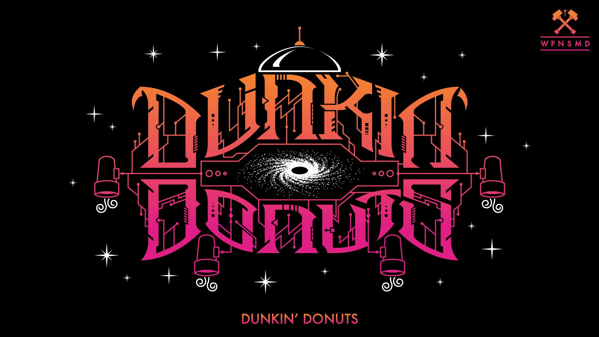
If there's something that's sure to get people talking, it's a logo design competition. And here's one with a unique angle. The Community of Metal Designers has unofficially rebranded Dunkin' Donuts.
The who? We hear you ask. For the uninitiated, The Community of Metal Designers (let's call them COMD) is a Facebook group set up to promote metal designers. Metal being the music genre, and not people crafting things out of steel. It regularly runs (unofficial) logo redesign competitions to showcase the imaginative talents of its members. Past projects stayed within the remit of the group, and included on-brand redesigns of logos for metal bands Signs of the Swam and Melecheshv.
The COMD has now asked its members to focus their talents on the pink, fluffy, sprinkle-topped rings of loveliness that are found at Dunkin'. And it's produced some pretty awesome results. We should also note that Dunkin' Donuts is now officially Dunkin', following a rebrand from JKR, but this rebrand uses Dunkin's previous name.
Article continues below 
Ranging from abstract splatters to more traditional band branding, the designs turn Dunkin' into a convincing metal outfit. There is some incredible skill at play here, transporting Dunkin' from a friendly, wholesome baked goods brand into an angsty, fierce entity with energy that bursts off the page.
Designers have used motifs that are integral to the Dunkin' brand (cups, steam, lights, sprinkles... you get the idea), as well as playing with the colour palette, font and company name itself.

The logos have provoked some insightful comments from page users, ranging from how the logos make them feel, to potential uses for the design. Craig Davis Pinson said the image at the top "perfectly sums up my morning commute". (We feel the angst too.)
Sara Elisabet thinks the image above would be "so cute for a metal pin or badge", whereas the one below is "perfect for a Simpsons Halloween special", according to Even Tan.
Sign up to Creative Bloq's daily newsletter, which brings you the latest news and inspiration from the worlds of art, design and technology.
It's clear from the comments that the page is serving its purpose in giving designers a positive, supportive platform to showcase their work to potential clients.

The designers have also created some new slogans for Dunkin', including 'America Hates on Dunkin' (above), and 'America runs on Dunkin' (below).

Logo reimagining projects reinforce how pivotal the right branding is for a company or music artist. These just-for-fun projects often throw up some surprising results like this logo design swap, or these reimagined logos. We think that the Dunkin' competition is a great example of what can be done by designers coming at a project from a new angle.
Read more:

Georgia has worked on Creative Bloq since 2018, and has been the site's Editor since 2023. With a specialism in branding and design, Georgia is also Programme Director of CB's award scheme – the Brand Impact Awards. As well as immersing herself with the industry through attending events like Adobe Max and the D&AD Awards and steering the site's content streams, Georgia has an eye on new commercial opportunities and ensuring they reflect the needs and interests of creatives.
