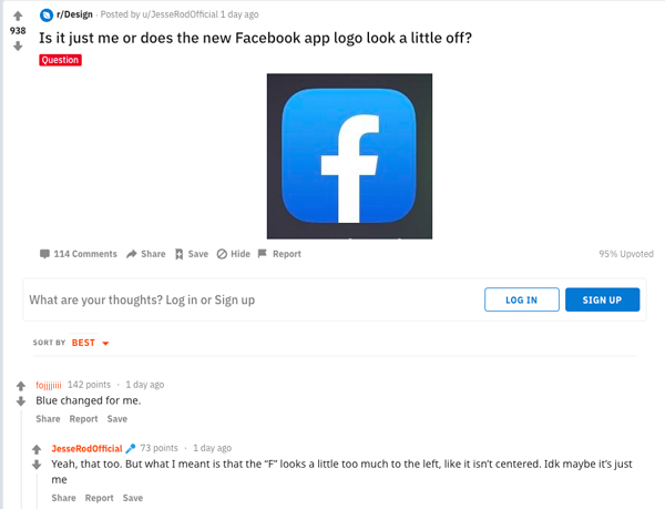
What's up with the new Facebook app logo?
What an f-ing mess.

Sign up to Creative Bloq's daily newsletter, which brings you the latest news and inspiration from the worlds of art, design and technology.
You are now subscribed
Your newsletter sign-up was successful
Want to add more newsletters?
Not so long ago we reported on Facebook's biggest redesign in a decade. The social media platform's iconic blue bar on mobile is long gone, with the company instead opting for a clean, white look. The redesign has rolled out across the globe over the past week, but in that short time a number of users have noticed something a little off with the new app logo.
To start with, the new icon now boasts the same vibrant blue gradient as Facebook's messenger app icon, which looks a whole lot better in our opinion. But it's not the colour people have real issue with, it's the placement of the 'f' that's really, let's say, f-ing people off.
Conversation peaked this weekend when Reddit user JessRodOfficial asked the question: Is it just me or is the Facebook logo a bit off? Cue over a hundred messages (and counting) from other people the new icon design is clearly driving mad.
Article continues below 
So what's up with it? Reddit user combuchan commented: "All the "weight" on the right throws the balance of the glyph off. The slanting on the left side of the crossbar should be the same as the right." And from the discussion thread, this is an opinion many share.
However, others were quick to jump and in point out that the previous app icon design saw the 'f' clearly offset to the right, and that's maybe why new centre alignment seems wrong to so many people. "The problem is that it IS centered, and it used to always be offset slightly to the right," Reddit user HarmlessSnack comments.
The busy discussion also leads to broader comments on Facebook's redesign overall. "The blue having changed in the logo but not in the actual interface throws me off more than anything. It’s inconsistent," says Reddit user le_cynthesizer.
But Facebook isn't in everyone's bad books, with Android/Reddit user ExpectTheUnexpected championing the design. "Actually for the first time the Android icon is the correct one. The new logo is actually a circle, and turned into a rounded square on iOS. The centered 'f' looks better in a circle as intended, in my honest opinion."
Sign up to Creative Bloq's daily newsletter, which brings you the latest news and inspiration from the worlds of art, design and technology.
Upon closer inspection (in Illustrator), we found the stem of the f to be directly centred. But regardless of whether it's in the middle or not, to be so uncomfortable visually for so many would suggest Facebook might not want to wait another decade before its next update.
Read more:

Kerrie Hughes is a frequent contributor to Creative Bloq, and was once its editor. One of the original CB crew, Kerrie joined the team back in 2013 after moving from her role as staff writer on 3D World. Since then she's written regularly for other creative publications such as ImagineFX, Computer Arts and Digital Camera World. After a stint working for the police, Kerrie is back reviewing creative tech for creative professionals.
