FatFace launches new wordmark logo
The clothing shop changes into something more grown up.
Sign up to Creative Bloq's daily newsletter, which brings you the latest news and inspiration from the worlds of art, design and technology.
You are now subscribed
Your newsletter sign-up was successful
Want to add more newsletters?
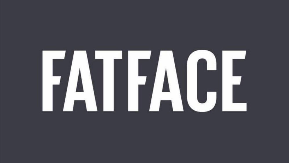
Set up in 1988 by a pair of British skiers trying to avoid work, FatFace has become a recognisable high street brand thanks to its distinctive logo design and typography. Over the years though, the clothing and accessories retailer has been edging away from its funky surfer aesthetic in pursuit of a more sophisticated look. This all came to a head recently as FatFace followed a pretty ubiquitous trend by rolling out a new wordmark logo.
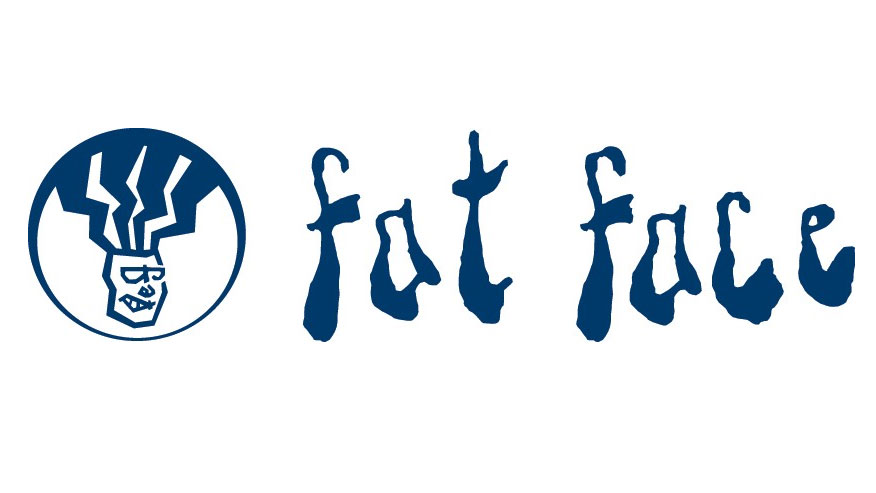
The stand-out feature of the new chunky sans serif wordmark is the slanted terminals on the letters 'f' and 'e'. The previous FatFace branding, which was made up of a dreadlocked head and a sloppy yet uniform typeface, had started to look dated and out of step with the company, but we're not sure if the shop has lost its essence with this new iteration.
See for yourself how the two brand identities compare by clicking left to right in the gallery below.
Article continues below

Details about the new identity are scarce, so there's no clue yet as to who is behind the rebrand. Given that it seems to be a natural progression of the type-lead shop fronts that FatFace have been sporting for a while now, we wouldn't be surprised if this was an in-house job.
The old brand hasn't completely died a death though. On the FatFace website you can still find the dreadlocked icon on the home button. Over on the site you can also find the FatFace story, which explains how the company takes its name from the founder's favourite black mountain run in Val d’Isère, La Face.
We can't help but think that this entrepreneurial background and scenic story could've provided a great basis for a brand, but with FatFace looking to crack America by opening more and more stores, perhaps it's decided to play it safe to lure in shoppers.
Related articles:
Sign up to Creative Bloq's daily newsletter, which brings you the latest news and inspiration from the worlds of art, design and technology.

Dom Carter is a freelance writer who specialises in art and design. Formerly a staff writer for Creative Bloq, his work has also appeared on Creative Boom and in the pages of ImagineFX, Computer Arts, 3D World, and .net. He has been a D&AD New Blood judge, and has a particular interest in picture books.
