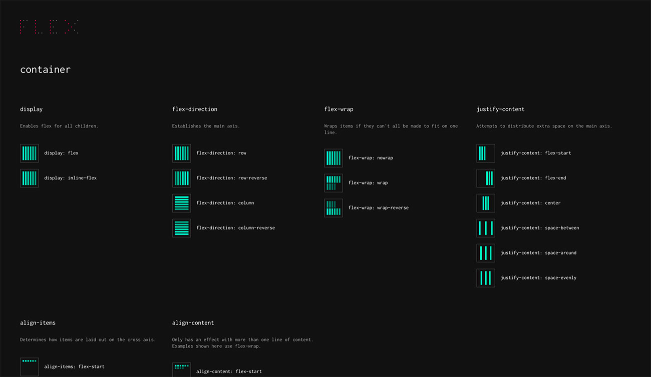
The ultimate Flexbox cheat sheet
Struggling with Flexbox? This cheat sheet will help you figure it out.
Sign up to Creative Bloq's daily newsletter, which brings you the latest news and inspiration from the worlds of art, design and technology.
You are now subscribed
Your newsletter sign-up was successful
Want to add more newsletters?
If you're a web designer then we really shouldn't need to be telling you about Flexbox by now. Even non-web people have got the idea that it's a powerful responsive web design tool for creating pages that arrange page layouts in a predictable way to look good in any viewport.
Knowing it's good, however, isn't the same as being able to actually use it, and while there's not actually great deal to the Flexbox specification, figuring out how it all fits together can feel like a bit of an uphill struggle.
Our web designer's guide to Flexbox is the perfect way to get to grips with it, but if you're having trouble getting all the various elements to stick in your head, we've found lovely Flexbox cheat sheet that you'll want to keep bookmarked.
Article continues belowSo if you're having trouble telling your flex-grow from your stretch, head over to FLEX. It's the work of Chris Malven at Malven Co., an interactive design and development studio based in Iowa, and it contains all the most important Flexbox properties you're going to need, presented in a simple visual manner that doesn't bog you down in wordy explanations.

Instead, it shows what each property does via a wonderfully minimal image; simply find the property you want to use and click on it, and FLEX will copy the code you need straight to your clipboard. Easy!
Malven explains that while many Flexbox resources are brilliant for learning the details of how things work, there's too much going on for them to serve as quick references. "I wanted something that was as visually condensed as possible," he says, "and easy to scan visually. I need to see what elements styled using each properly will look like."
And so he built FLEX as a visual Flexbox cheat sheet; he says he uses it all the time and that it's helped him to become truly comfortable with the Flexbox syntax.
Sign up to Creative Bloq's daily newsletter, which brings you the latest news and inspiration from the worlds of art, design and technology.
You can find FLEX here; if you find it useful and wish there was a similar resource for CSS Grid Layout, then guess what? You're in luck; Malven has built that very thing in the form of GRID, which lays out all the CSS Grid properties in a similarly digestible format.
Related articles:

Jim McCauley is a writer, performer and cat-wrangler who started writing professionally way back in 1995 on PC Format magazine, and has been covering technology-related subjects ever since, whether it's hardware, software or videogames. A chance call in 2005 led to Jim taking charge of Computer Arts' website and developing an interest in the world of graphic design, and eventually led to a move over to the freshly-launched Creative Bloq in 2012. Jim now works as a freelance writer for sites including Creative Bloq, T3 and PetsRadar, specialising in design, technology, wellness and cats, while doing the occasional pantomime and street performance in Bath and designing posters for a local drama group on the side.
