We love a nice hidden logo design secret here at Creative Bloq. But of course, we're using the words 'hidden' and 'secret' rather flexibly. Most logo's don't really have hidden secrets because their aim is to communicate an identity not hide it.
But some logos do feature little Easter eggs that take just the right amount of time to detect. Enough time for it to raise a smile and add additional meaning to the design when we recognise it. But attempts to create logos with a deeper meaning than the obvious don't always work, and the internet is calling out the Four Seasons logo as an example (see our pick of timeless logo secrets for more.)
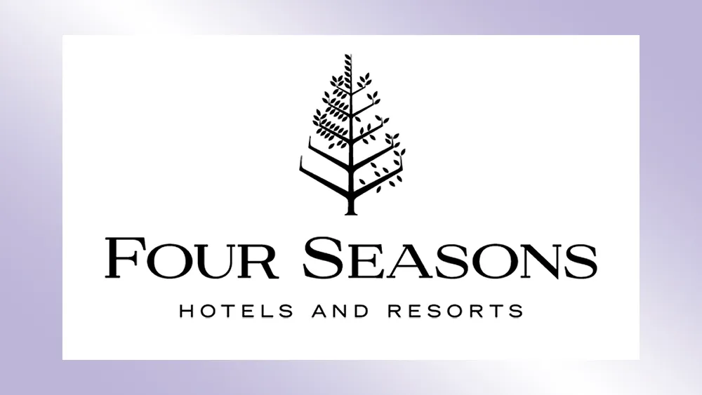
The Four Seasons Logo from r/DesignPorn
Some people are just realising that the Four Seasons logo actually attempts to represent all four seasons typical temperate regions. No it's not just a tree. It's a tree depicted in spring, summer, autumn and winter all at once. That's why some of the branches have more leaves than others, and some have none at all.
The problem is that the design is so busy that people that don't tend to pay attention to that level of detail to see it, and in small applications the detail is lost. But most problematic of all, even when viewed at closely, it's not immediately clear what order the seasons are supposed to be in or which is being represented by which part of the tree.
The part with no leaves is presumably winter, and the part with most leaves summer... maybe. But that means there's no way to view the logo in which the seasons appear in the right order.
"I can't tell fall or spring... and it should be sequential," one person wrote on Reddit. "Just looks like 3 seasons," someone else commented. Someone else thinks the tree looks ill and needs the urgent attention of an arborist. "It looks like the tree is dying," someone wrote. "When you forget to export all layers, someone else suggested.

To be fair the current Four Seasons logo is an improvement on the previous logo design, which was used from 1978 to 1989. The old logo was even more complicated and made it even harder to interpret the seasons because it appeared to have snowflakes falling in autumn mixed in with the leaves. The logo redesign also shortened the branches and softened edges to make the mark look less like a pyramid, and the placement of the leaves was made more organic.
Either way, this isn't a design that's going to make it into our pick of the best logos. See our pick of the best subtle logo changes for examples of small changes that made a big impact. Also see our roundups of the best big-brand logos and the best new logos.

