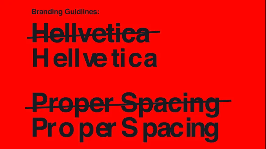
Bad kerning can have the ability to fill even the calmest of designers with rage. Kerning's a fundamental part of typography design, so there's simply no excuse for disproportionate space between characters in a font. Until now.
Hellvetica is a new project from designer Zach Roif that makes us want to both laugh, gouge our eyes out and immediately revisit some typography tutorials at the same time. It's described by Roif as being "Like Helvetica, but with like, much shittier kerning for Halloween."
He's not lying.
However, despite defying every principle of good kerning, designers across the globe have fully embraced the fun side of Hellvetica. And the responses to it on Twitter are nothing short of brilliant.
My copywriter has already downloaded this and sent me stuff with it so thank you for that. pic.twitter.com/hPdsOyHAaeOctober 28, 2019
*drunk frank sinatra voice* come fly with me, let's fly let's fly away pic.twitter.com/sBQFtsLLs9October 28, 2019
The rage-inducing-but-also-hilarious free font design (see more free fonts here) has already been downloaded by hundreds of creatives, who have used it for everything including sending emails to other poor unsuspecting individuals, setting it as their system font and applying it to some of the world's most recognisable logos and signage.
While Hellvetica is obviously tongue-in-cheek, Twitter user Adam Tenhouse was quick to point out its potential, saying: "Slap this on a horror movie poster, absolutely no photography, just pure typographic threat, truly you'd go places." We think he's got a point.
We have no idea what motivated Roif to creative Hellvetica, much like we have no idea why we love it so much. But we do. Check it out here.
Looking for more spooky designs? Take a look at our pick of the best free Halloween fonts available now.
Read more:

