Finally! A logotype that people actually like
Concept logo highlights the best of the design world.
Sign up to Creative Bloq's daily newsletter, which brings you the latest news and inspiration from the worlds of art, design and technology.
You are now subscribed
Your newsletter sign-up was successful
Want to add more newsletters?
The internet can be a dark place. Even within the relatively friendly world of design, sometimes it feels as if all anyone is doing is saying mean things about other people's work. Just look at the roasting the Paris 2024 logo got if you don't believe us (and yes, we're fully aware that we're complicit too).
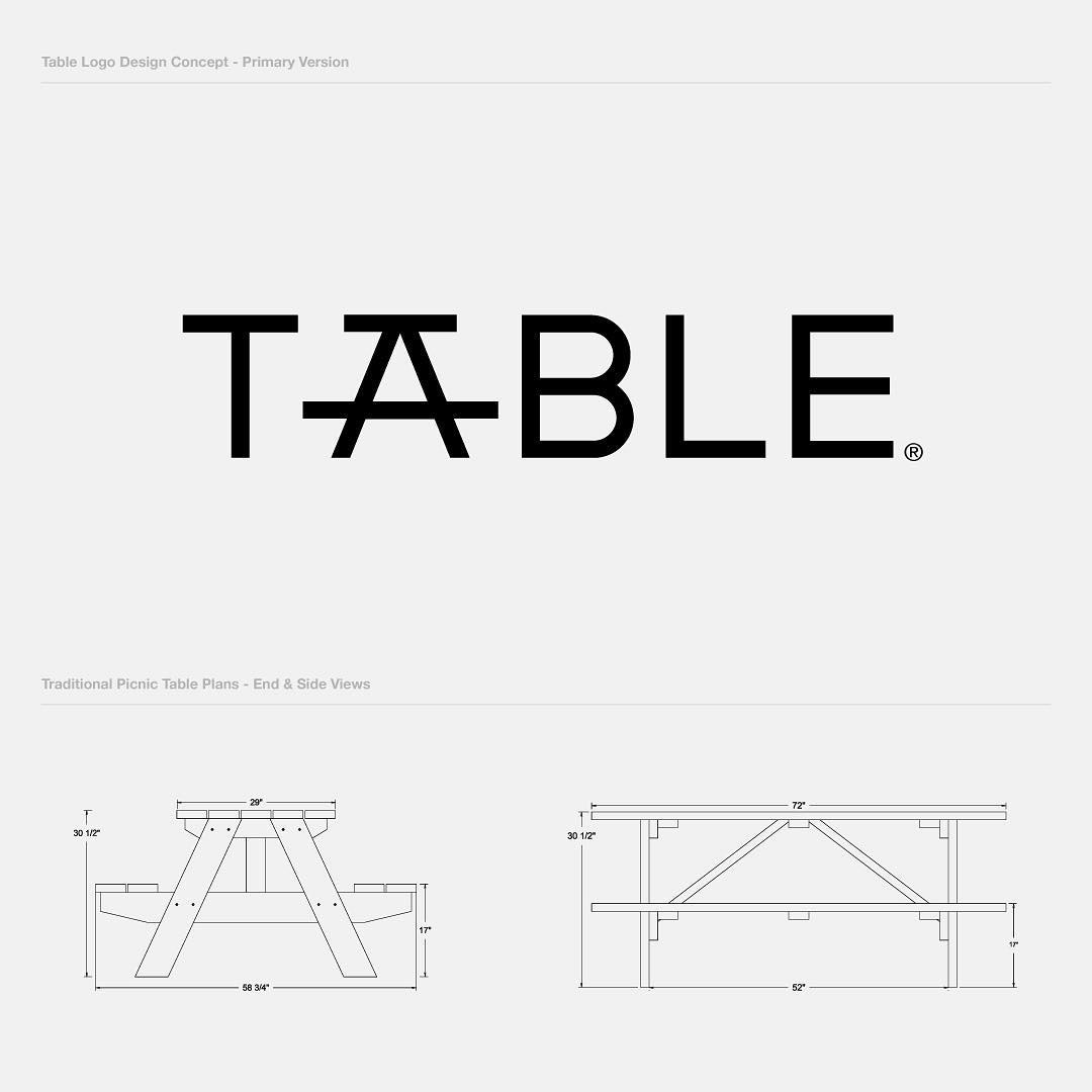
That's why it's even more heartwarming when we stumble across something that draws mostly positive attention, such as this logotype using the word 'table' shared by Reddit user r/logopaul (aka Paulius Kairevicius).
What makes this design so appealing is that it uses the form of a picnic table to create the 'A' – this small touch is a good example of how simplicity can lead to effective design, as we discuss in our logo design guide.
Article continues below 
The design, which is presumably a concept and not for a real company, has been overall well received by the people of r/design. One user comments it was "sturdy," another says "this is beautiful!" while Lamenameuser (who is getting namechecked for well... their great name) says: "Clever. I see what you did there."
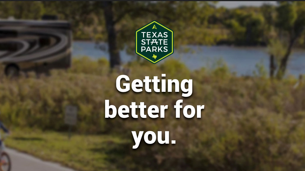
r/rickcubs points out that the design is similar to that of Texas State Parks, and we can't really argue with that. Check out the Texas State Parks branding as seen on its website below:

This Texas State Parks branding has also been analysed on the forum. "I like how they didn't go overboard and make all three As into table," says r/sprogger. "It works especially well since it's in the dead centre of the logo. Really well designed," adds r/jagoman.
This, people is what design forums should be for. No one has raged at r/logopaul for creating (or sharing) something similar to someone else, no one has talked about how much they hate an idea or how anyone needs to revert to an old logo (it helps that there isn't one). This just a bunch of nice constructive and helpful comments from a group of people who really care about design. The sort of thing that happens in design studios the world over, but doesn't always quite translate once people are able to hide behind a username and password.
Sign up to Creative Bloq's daily newsletter, which brings you the latest news and inspiration from the worlds of art, design and technology.
And that's why we think this design is the nicest thing you'll see today. You can check out the Reddit thread here. And cross your fingers that things haven't got all negative by the time you read this post.
Read more:

Rosie Hilder is Creative Bloq's Deputy Editor. After beginning her career in journalism in Argentina – where she worked as Deputy Editor of Time Out Buenos Aires – she moved back to the UK and joined Future Plc in 2016. Since then, she's worked as Operations Editor on magazines including Computer Arts, 3D World and Paint & Draw and Mac|Life. In 2018, she joined Creative Bloq, where she now assists with the daily management of the site, including growing the site's reach, getting involved in events, such as judging the Brand Impact Awards, and helping make sure our content serves the reader as best it can.
