You've probably been writing the letter 'g' wrong for years
Think it sounds simple? Think again.
Sign up to Creative Bloq's daily newsletter, which brings you the latest news and inspiration from the worlds of art, design and technology.
You are now subscribed
Your newsletter sign-up was successful
Want to add more newsletters?
At first glance, there's nothing particularly unusual about the letter 'g' – you've read it millions of times, and would have no problem writing it from memory, right? There are two standard ways of writing a lowercase 'g', and as a recent study has revealed, hardly anyone is able to spot one version in a lineup, let alone write it down.
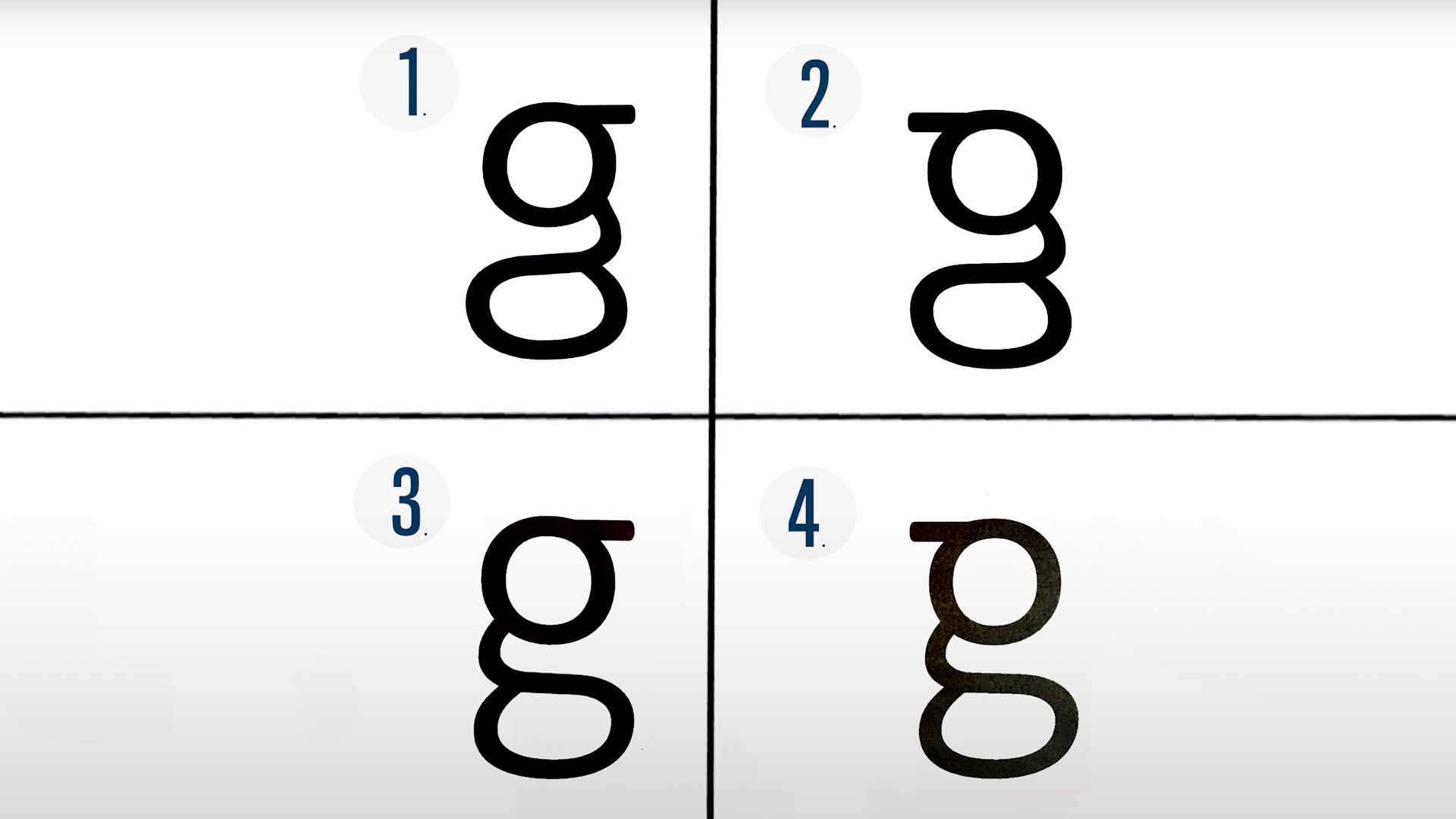
Most of us are probably used to writing the open tail version (below), but there's also a looped tail version that's more often found in print and digital text. And that's the one that Jon Hopkins University has discovered (in its ingeniously titled study, The Devil is in the g-tails) that only one in 38 people can draw. The other 37 would do well to check out our typography tutorials.

The participants didn't fare much better when it came to identifying the correct 'g' in the lineup below – only seven got it right. It's hardly surprising though, considering just two of the 38 listed it as a letter with multiple lowercase versions at the start of the test. Poor, misunderstood, lowercase 'g'.
Article continues below 
It's always fun to see people try to draw something from memory (such as these logo memory challenge attempts), so here are some of the incorrect 'g's from the study for your viewing pleasure (below). That said, there's a decent excuse for the inaccuracy. "We learn the shapes of most letters in part because we have to write them in school," cognitive scientist Michael McCloskey explains in the study. "Looptail 'g' is something we're never taught to write, so we may not learn its shape as well."

So, as well as offering a fun and fascinating insight into our handwriting habits, the study contributes to our understanding of how letter shapes are learned, and the importance of writing as well as reading. Just because we see something every day, it doesn't mean we're paying super-close attention – as these hilarious car logos drawn from memory will attest. And if you fancy studying various 'g's in more detail, we've got plenty of free fonts for you.
Related articles:
- Kellogg's redesigns Fruit Loops mascot Toucan Sam – and people are NOT happy
- Sun-Maid tries raisin' its profile with subtle logo tweak
- This logo contains a delightful hidden surprise
Sign up to Creative Bloq's daily newsletter, which brings you the latest news and inspiration from the worlds of art, design and technology.

Daniel John is Design Editor at Creative Bloq. He reports on the worlds of design, branding and lifestyle tech, and has covered several industry events including Milan Design Week, OFFF Barcelona and Adobe Max in Los Angeles. He has interviewed leaders and designers at brands including Apple, Microsoft and Adobe. Daniel's debut book of short stories and poems was published in 2018, and his comedy newsletter is a Substack Bestseller.
