“It had to be a joyful identity”: InnTravel’s rebrand is masterfully simple
Consider me converted to walking holidays.

Sign up to Creative Bloq's daily newsletter, which brings you the latest news and inspiration from the worlds of art, design and technology.
You are now subscribed
Your newsletter sign-up was successful
Want to add more newsletters?
Walking holiday brand InnTravel is shaking up design in the industry after unveiling a new brand identity with life's simple pleasures at its core. With stunning illustrations, a cosy colour palette and a passion for exploration, InnTravel's new identity is a refreshing take on the typical holiday brand, embracing nature over garish indulgence.
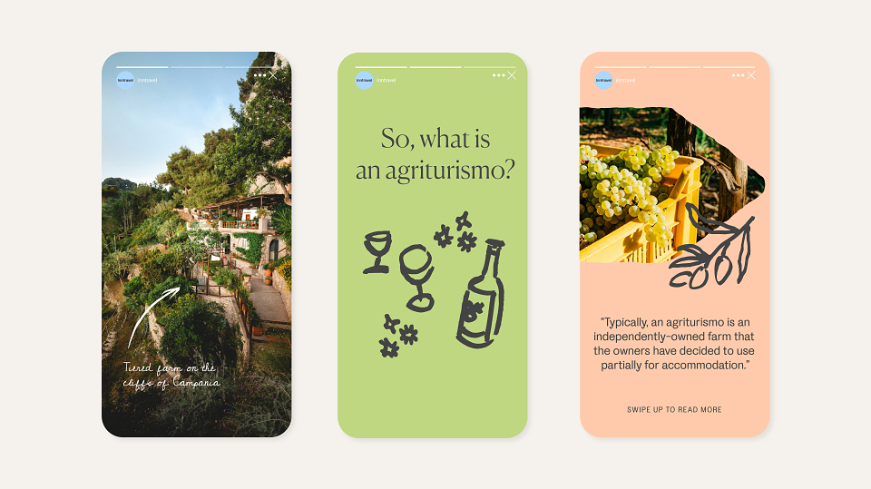
InnTravel's grounded and comforting feel makes it one of the best rebrands I've seen in recent times. Increasingly, travel sector branding has been a sea of oversaturated blue-skied beaches accompanied by cheesy pop songs and even cheesier taglines. With its simple yet stunning visuals, InnTravel's rebrand is brimming with class, character and a delightful dose of escapism.
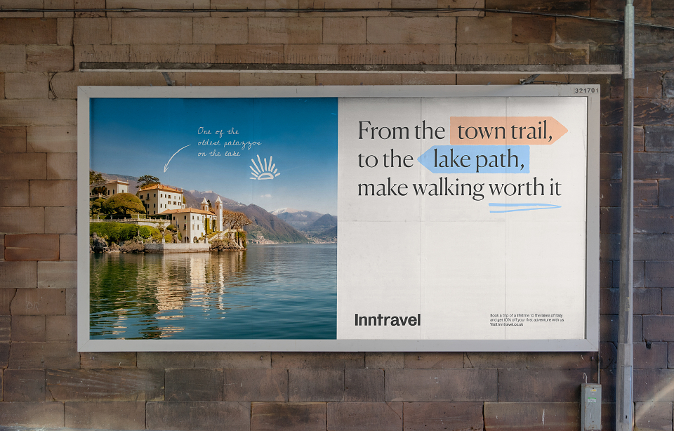
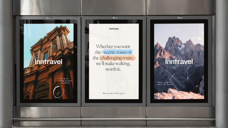
Created by design agency SomeOne, InnTravel's rebrand is shaped around the motif of the fingerpost sign – a classic symbol connected to walking and the wider theme of travel. The sign acts as a highlighter within the design, guiding customers to important information while creating a charming visual motif across the brand's graphics.
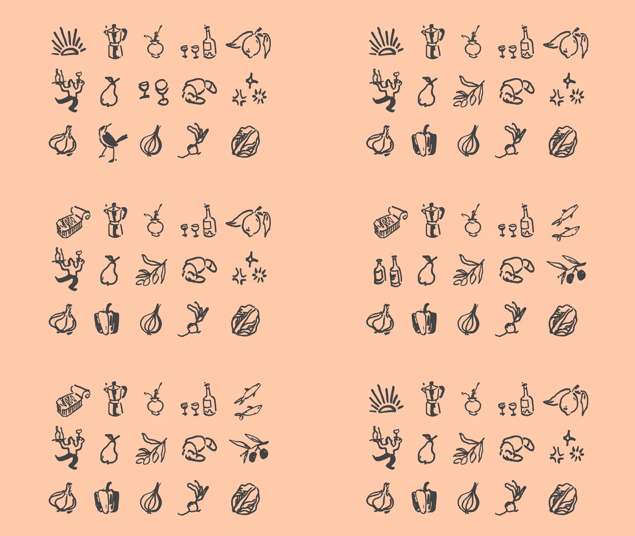
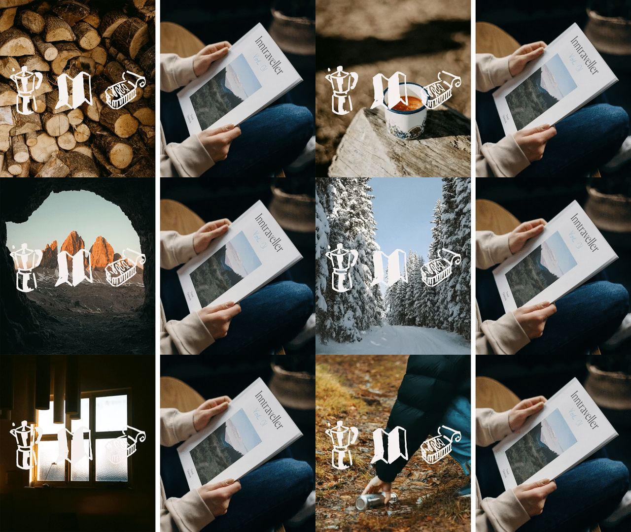
Article continues belowThis motif continues in the logo, which features a cleverly integrated signpost design within the letter 't'. The stripped-back design is accentuated by a series of stylish illustrations created by the InnTravel Curator, embellishing the rebrand with a delightful bespoke appeal in line with the brand's tailored approach to travel.
"The personal touches of the script font, illustrations and signposts provide so much character and individuality," says lead designer Flo Campbell. "Travelling is such a joyful thing to do – it had to be a joyful identity," she adds. InnTravel's rebrand is a stunning gem amongst competitors, bringing a unique and personal feel to the travel sector. It exemplifies the power of style through simplicity, making it a rebrand that feels poignant, purposeful and unpretentious.
If you're after more stunning nature-inspired design, take a look at the National Landscapes rebrand created by design agency Nice and Serious. For more design inspiration, check out the recent Sweaty Betty rebrand that's truthfully authentic and delightfully joyful.
Sign up to Creative Bloq's daily newsletter, which brings you the latest news and inspiration from the worlds of art, design and technology.

Natalie Fear is Creative Bloq's staff writer. With an eye for trending topics and a passion for internet culture, she brings you the latest in art and design news. Natalie also runs Creative Bloq’s 5 Questions series, spotlighting diverse talent across the creative industries. Outside of work, she loves all things literature and music (although she’s partial to a spot of TikTok brain rot).
