The National Landscapes rebrand is delightfully imperfect
It's a masterclass in modern nature-inspired design.

Sign up to Creative Bloq's daily newsletter, which brings you the latest news and inspiration from the worlds of art, design and technology.
You are now subscribed
Your newsletter sign-up was successful
Want to add more newsletters?
Here in the UK our conservation areas are highly important but often overlooked. The 'Area of Outstanding Natural Beauty' (AONB) brand has been long forgotten, suspended in a loose natural theme that felt unconnected and a little bland, but after a recent rebrand, the natural collective has undergone a delightfully colourful metamorphosis.
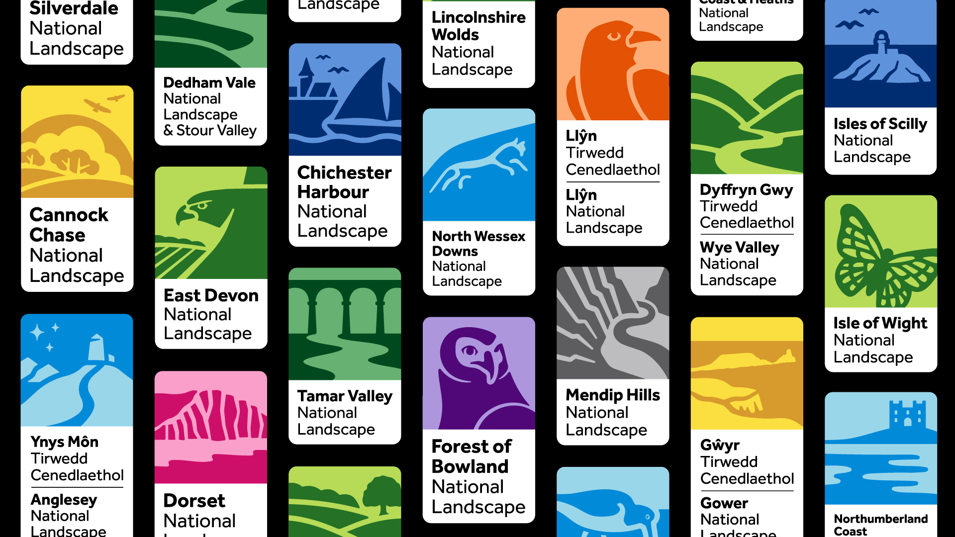
The modern refresh comes as an effort to update and unify the 39 separate identities, making the brand feel like a contemporary and inclusive space for everyone to experience nature. (For more inspiration, check out our collection of the best logos of all time).

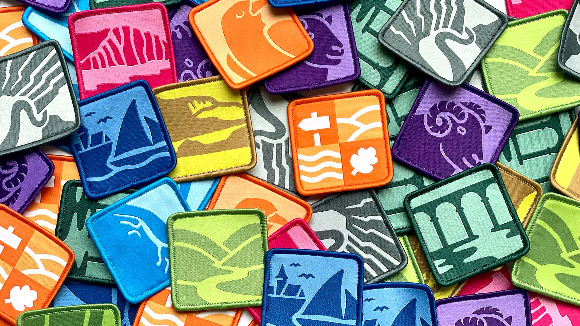
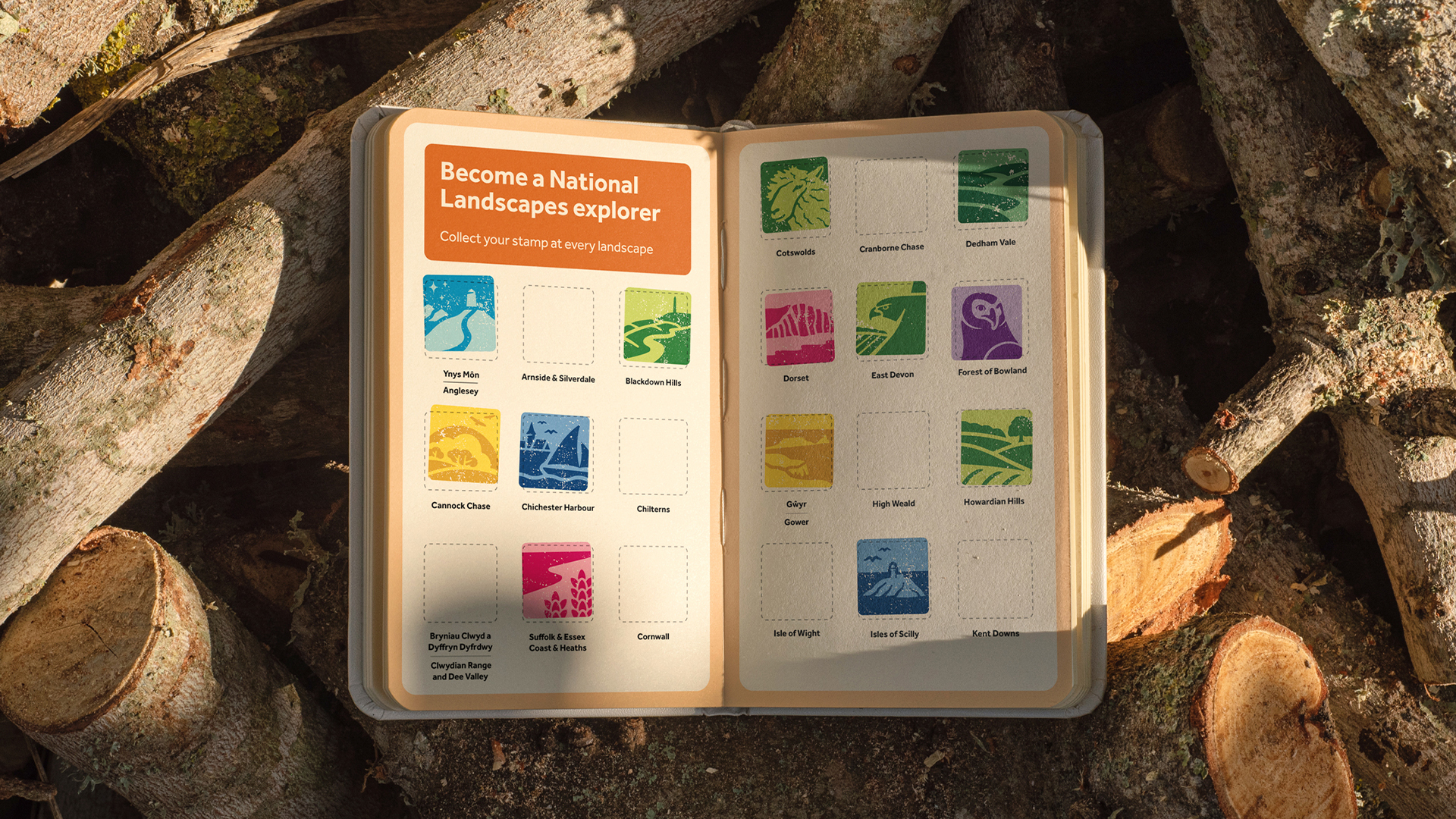
The stylish rebrand is the work of B Corp-certified creative agency Nice and Serious, which aimed to create a harmonised identity that speaks to welcome and engage with "traditionally underserved audiences." Renamed from AONB to "National Landscapes," each area's new logo features a simple illustration that represents an element of its identity. From castles to cliff faces, each has its own monochromatic colour identity, selected by the National Landscapes teams to best represent their areas.
Article continues belowCollectively the new logos create a unified and stylishly updated brand identity that honours nature, without the homogenised blur of green and khaki typically used in natural branding. According to a press release, the rebrand was inspired by the idea of a "living patchwork, where each square is as essential and unique as each of us" and was meticulously shaped by a diverse creative council that helped to ensure an inclusive rebrand approach.

"We developed an imperfect illustration style, inspired by the natural imperfections in the landscapes themselves," says Peter Larkin, Creative Director at Nice and Serious. "The colour system was influenced by the defining colours of the nation’s landscapes. Ranging from sandy dunes and rolling grasslands through to deep and vibrant moors and heathlands," he adds.
"Up close, these individual patches represent one part of the landscape’s story, but step back and they thread together to form our nation’s fabric," Larkin says. I adore the idea of a patchworked identity that embraces its natural imperfections as it feels like a more human approach to nature-inspired branding. It's refreshing to see a typically traditional brand breaking out into bold and colourful branding – something that I feel will speak to a diverse audience and welcome a new generation to enjoy nature.

For more brilliant rebrands, take a look at Marshmallow's stylish new identity, or check out Deezer's rebrand that hits all the right notes.
Sign up to Creative Bloq's daily newsletter, which brings you the latest news and inspiration from the worlds of art, design and technology.

Natalie Fear is Creative Bloq's staff writer. With an eye for trending topics and a passion for internet culture, she brings you the latest in art and design news. Natalie also runs Creative Bloq’s 5 Questions series, spotlighting diverse talent across the creative industries. Outside of work, she loves all things literature and music (although she’s partial to a spot of TikTok brain rot).
