They say imitation is the sincerest form of flattery, right? Well if that's true, there's a couple of design teams around the world right now that should be feeling pretty flattered following the unveiling of Microsoft's new Edge browser logo this weekend.
Already under heavy criticism, the logo has been compared to the Firefox logo, and, even more embarrassingly, the swirling blue-and-green design of Tide Pods laundry detergent packs. And when you see them side-by-side (below), it's hard to argue otherwise. Maybe the design team should have referred to our guide to logo design for some pointers?
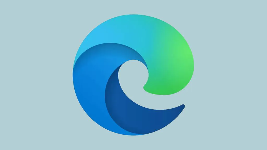
The new design (above) combines the lowercase 'e' icon that dates back to Microsoft's Internet Explorer years, and morphs it into the shape of a swirling wave, which is presumably representative of surfing the web. Below are some of the early reactions.
How do you like our new #Edge logo?? #comingsoon! pic.twitter.com/EgL6n5xqRINovember 2, 2019
And we are calling it...Microsoft TidePods! here's the new Microsoft Edge logo: https://t.co/NpyW2ni8FS pic.twitter.com/leVjxk3nmlNovember 2, 2019
New Microsoft Edge Logo looks a lot like Firefox, inverted and rotated 180°. Well done, designers. pic.twitter.com/gEkmw1g0olNovember 2, 2019
The new Microsoft Edge logo looks more like the logo for something I’d toss in the dryer to make my clothes softer and smell like perfumey palm trees. pic.twitter.com/Y6h46aWOOSNovember 2, 2019
It's nothing new to see such harsh reactions in the early days of a logo, and, who knows, maybe in time people will appreciate the freshness of the new design (sorry, we couldn't resist). You can compare it to the old Edge logo below.

Whatever you make of the new Edge logo, one thing is for sure, the ocean wave-inspired design bears precious little resemblance to Microsoft's original IE icon, which the company is so well known for. Moving away from such an iconic design is a brave move, so we'll be interested to read more on why the decision for a much more fluent design was made.
Read more:

