Microsoft wants YOU to choose its new default font
Which of these five is your favourite?
Sign up to Creative Bloq's daily newsletter, which brings you the latest news and inspiration from the worlds of art, design and technology.
You are now subscribed
Your newsletter sign-up was successful
Want to add more newsletters?
Microsoft is getting a facelift in the form of a brand new default font, and it wants your help to choose one. But, before you envision the typographical equivalent of Boaty McBoatface (i.e. a public vote for Comic Sans), Microsoft has limited the options to a specially designed selection of five fonts.
In case you haven't been paying close attention, the current font is Calibri – a clear yet blend-into-the-background font, which is neither going to set the world alight nor be visually offensive. If it's your favourite, you don't need to panic though, as it'll still be available to use in Microsoft's Office apps. Do you want to give a project a new look? Try our list of free fonts.
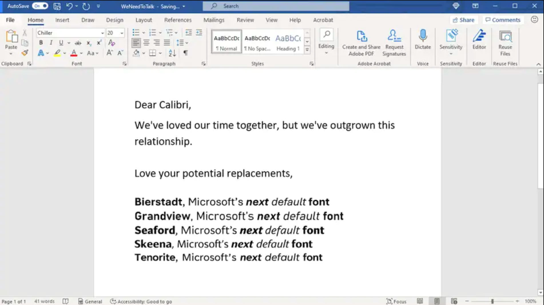
So, what are the five fonts on the shortlist? Named Tenorite, Bierstadt, Skeena, Seaford, and Grandview, they range from warm and friendly to blocky, precise and retro. See a quick comparison above, and learn more about them below. Then decide which one you like the best.
Article continues below 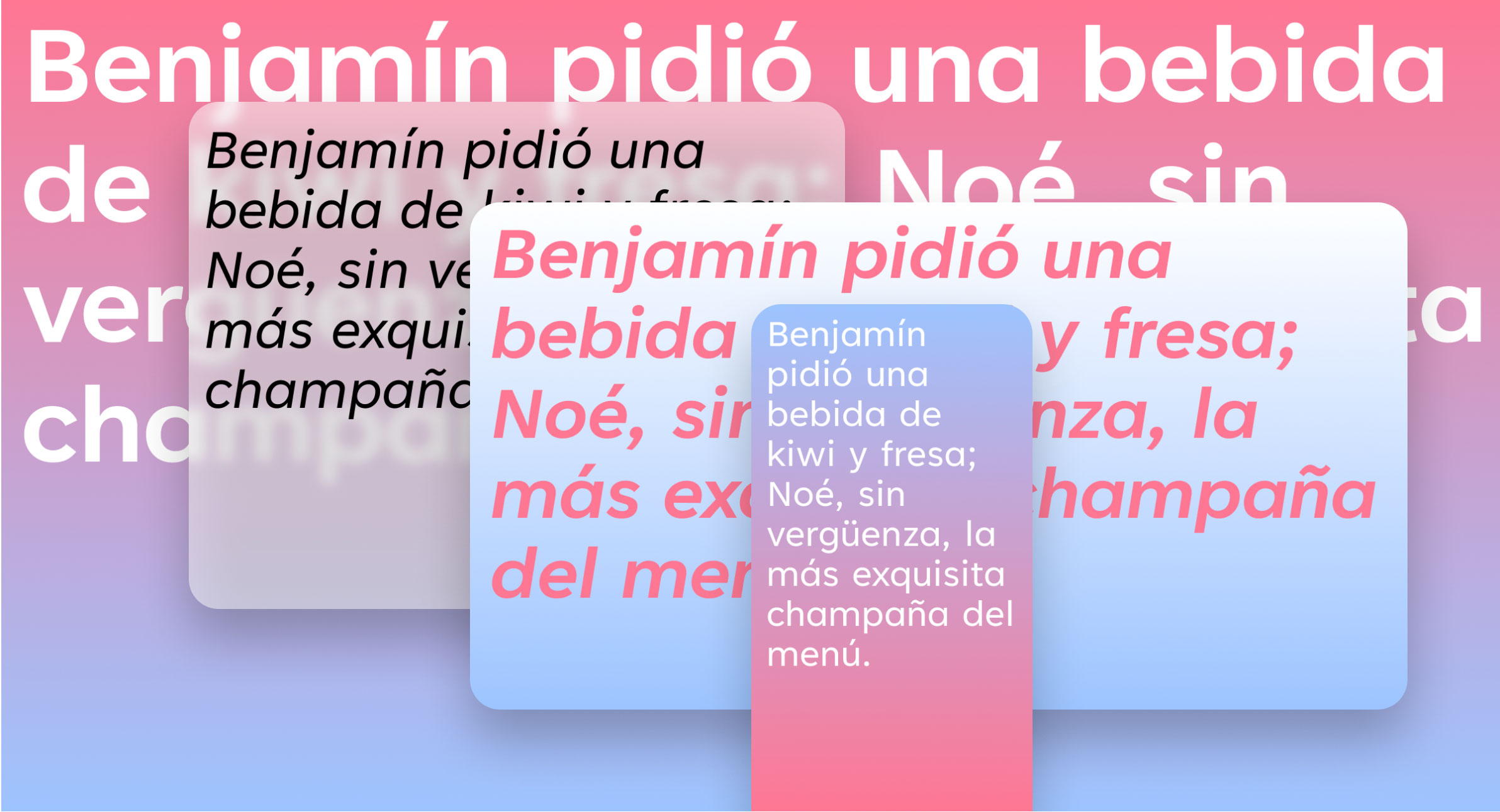
Tenorite (above) is nicely rounded, with wide characters and ample spacing that make it excellent for accessibility. Created by Erin McLaughlin and Wei Huang, this font has tighter fitting in display styles – so more words will fit in a line. It feels delightfully friendly, if a little safe.
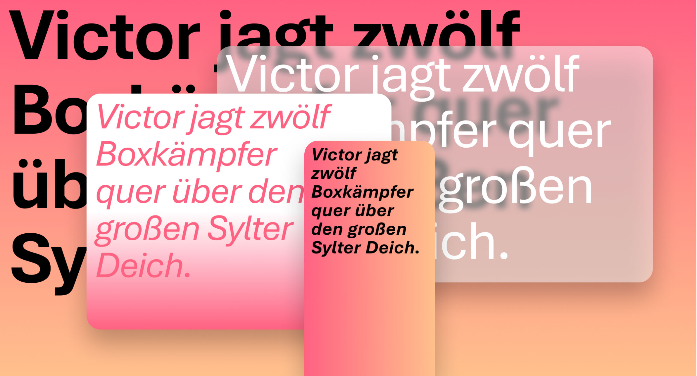
Bierstadt is less traditional, more precise and inspired by mid-20th century Swiss typography. The font, designed by Steve Matteson, expresses simplicity and rationality' and fits into the "grotesque sans serif" genre (as requested by Microsoft). It's meant to be in sharp contrast to stalwart Arial, and the retro vibe certainly fits the bill (see more vintage and retro fonts here).
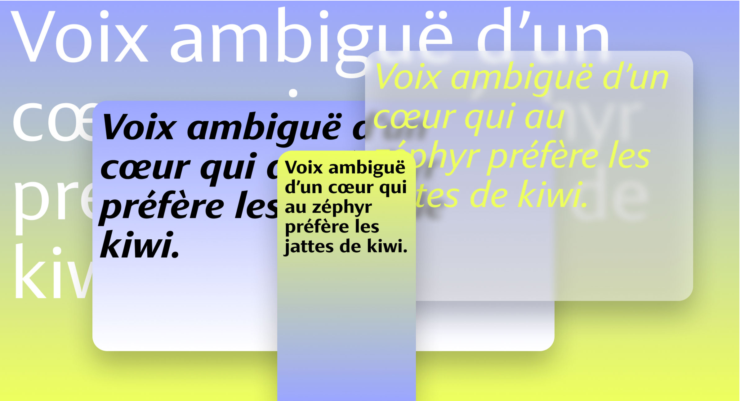
Next up is Skeena. It sure is distinctive, we'll say that, with stark contrast between a mix of thick and thin strokes. John Hudson and Paul Hanslow wanted to create a 'humanist sans serif', and have included diagonally sheared terminals and a curves on entry and exit strokes. It's a mish-mash of different typographic eras and has quirks that would be a bit of a departure for Microsoft.
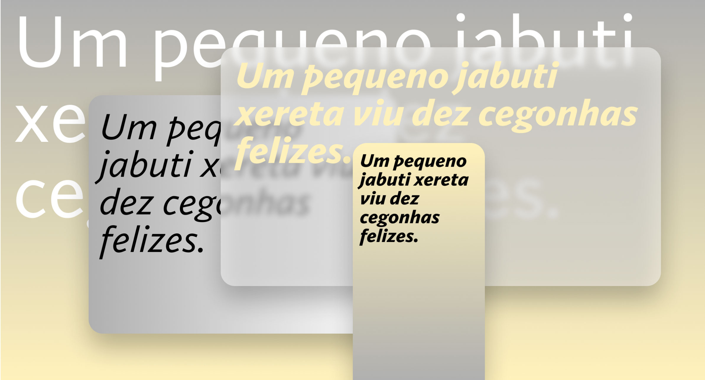
Apparently, Seaford calls on the 'comfortable familiarity of old-style serif text typefaces'. It was created by Tobias Frere-Jones, Nina Stössinger, and Fred Shallcrass, and we think it certainly feels familiar, cosy and inviting.
Sign up to Creative Bloq's daily newsletter, which brings you the latest news and inspiration from the worlds of art, design and technology.
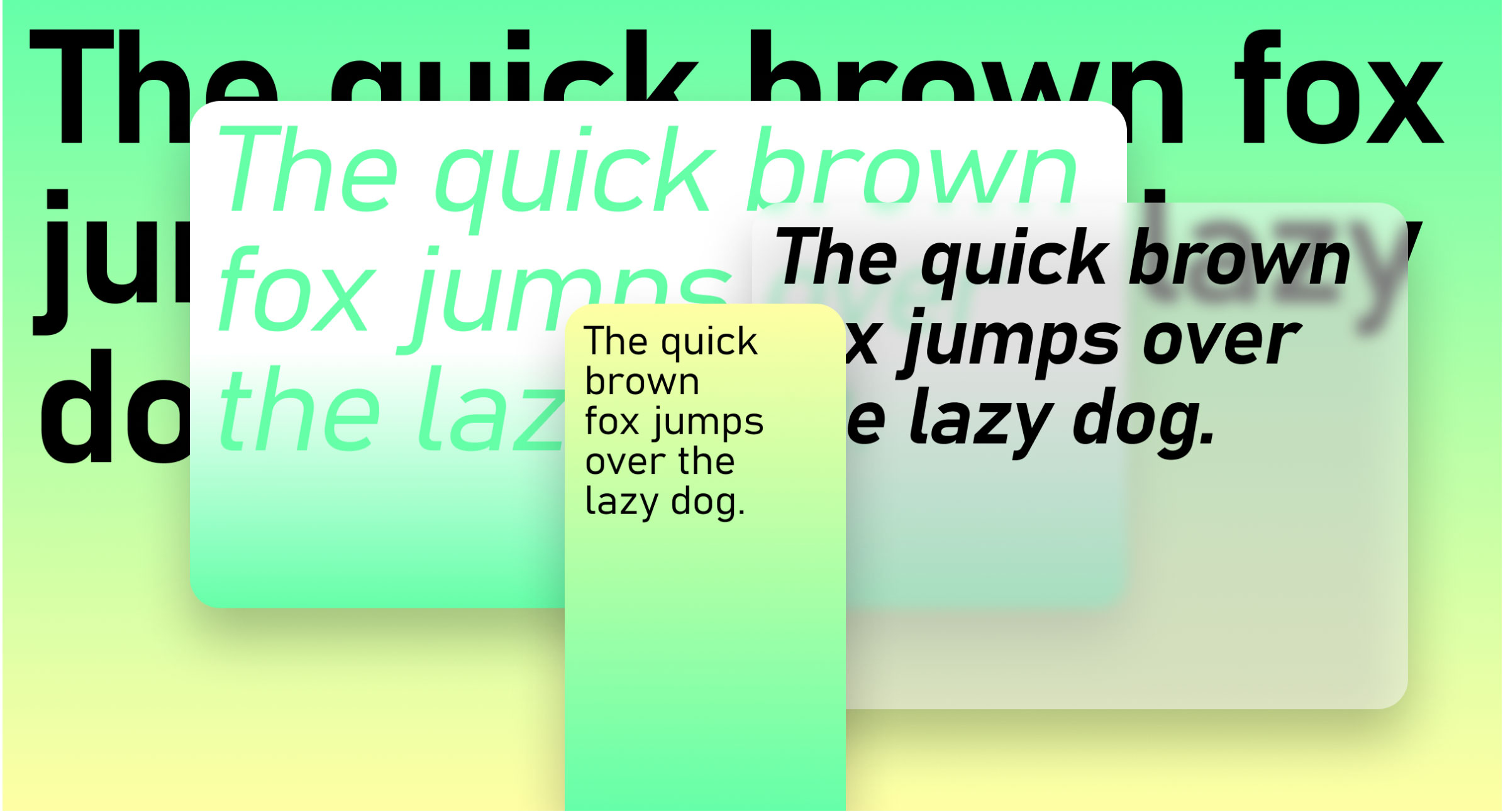
Grandview by Aaron Bell is tall and super-legible (even from a distance, says Microsoft). Based on old German railway and road signage, it works well across a range of applications, with Bell working with the mechanical style of German Industrial Standard (DIN) to create a balanced, accessible font.
So, which one do you prefer? You can read more about them on Microsoft's blog and the new fonts have also been added to the cloud so you can explore them on Microsoft's Office apps. Then be sure to let Microsoft know how you feel about them on Microsoft's Twitter page.
Microsoft has been a busy bee this week, with the tech giant also sharing some of its old logos. Check them out to remind yourself of why you love graphic design).
Read more:

Georgia has worked on Creative Bloq since 2018, and has been the site's Editor since 2023. With a specialism in branding and design, Georgia is also Programme Director of CB's award scheme – the Brand Impact Awards. As well as immersing herself with the industry through attending events like Adobe Max and the D&AD Awards and steering the site's content streams, Georgia has an eye on new commercial opportunities and ensuring they reflect the needs and interests of creatives.
