The new Eurostar logo isn't as bad as everyone thinks
Sign up to Creative Bloq's daily newsletter, which brings you the latest news and inspiration from the worlds of art, design and technology.
You are now subscribed
Your newsletter sign-up was successful
Want to add more newsletters?
Logos for railway operators might not usually make the headlines, but the new Eurostar logo is getting so much flak that we have to make an exception. The international train operator, which runs Channel Tunnel trains from the UK to France, Belgium and the Netherlands is merging with French-Belgian operator Thalys and has revealed new branding to make the occasion.
But what could be a clever logo design that references the brand's name and history has fallen kind of flat, receiving a tepid response online. For some it's too '1991'. For others, it looks like a white goods manufacturer more than a train operator. But while it seems clear it's not going to make it to our pick of the best logos, people have been perhaps too quick to dismiss the design.
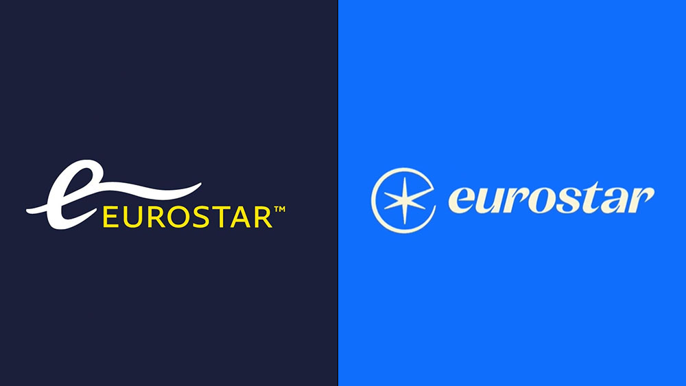
The new Eurostar logo design does away with the strange tentacle-sprouting 'e' of the previous effort and brings back "the iconic star" of the operator's first logo, incorporating it inside a Pacman-esque 'e' shape. The star was originally used for the Étoile du Nord train service – the first train to link Paris, Brussels and the Netherlands – so its reappearance is a nod to European railway heritage as well as to the 'star' in Eurostar.
🆕 Discover our new logo. “It sees the return of the iconic star, inspired by Étoile du Nord, the original train service linking Paris, Brussels and the Netherlands and Eurostar’s very first logo”, says a clearly proud Gwendoline Cazenave. pic.twitter.com/NjV2AkA7IQJanuary 24, 2023
Now we love the combination of a nod to the past combined with a modern flat design, but some people feel that the result here is a bit... bland. Some feel it looks dated despite the simplicity of the design. Others think it looks like the logo of a white goods manufacturer. "Could be copy-pasted from a bank, hotel or fridge maker," one person wrote on Twitter, while for someone else, "it screams NATO."
"The fashion for simplified logos must stop. The original Eurostar logo is the best," one person complained. Of course, for Eurostar, having a star in the logo makes sense, but it's also difficult to create a star that looks original when so many other brands have stars in their logos. Some people even think it looks like something very different.
Did you get your inspiration for the new logo from British TV in the 1970s? pic.twitter.com/A8VZYLG9YLJanuary 24, 2023
“I now know that this is not a symbol for the crossroad of ideas. I know it’s a butt.” pic.twitter.com/FsOvwd8MKFJanuary 24, 2023
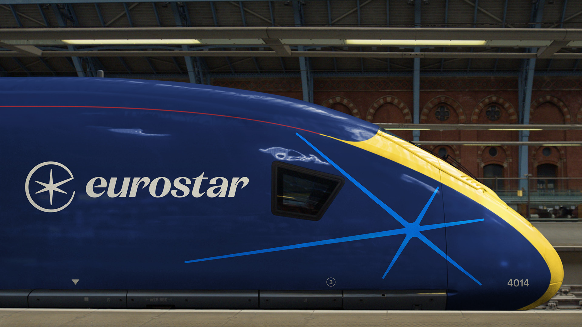
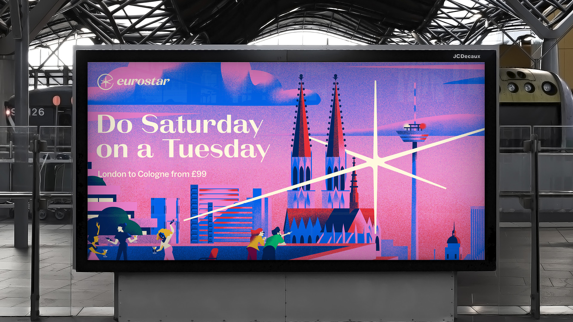
But people have perhaps been quick to dismiss the new logo. Devised by London's DesignStudio, there's more to the rebranding, with the logo forming part of a broader design system that makes more use of the star motive for the train livery and for 3D digital pieces. The logo design looks a lot better in situ on trains than it does in a jpeg on Twitter too, as you can see below.
And we love the colour palette and style of the new posters – and how the star design is reflected in the sky (below).
Sign up to Creative Bloq's daily newsletter, which brings you the latest news and inspiration from the worlds of art, design and technology.
Play the below clip, and you'll also hear the sonic logo – a key part of modern rebranding.
A post shared by DesignStudio (@__designstudio__)
A photo posted by on
While it's not yet setting people's world on fire, the new Eurostar logo is by no means one of the worst logos. For tips on getting things right see our guide to how to design a logo and our pick of the best graphic design books.
Read more:

Joe is a regular freelance journalist and editor at Creative Bloq. He writes news, features and buying guides and keeps track of the best equipment and software for creatives, from video editing programs to monitors and accessories. A veteran news writer and photographer, he now works as a project manager at the London and Buenos Aires-based design, production and branding agency Hermana Creatives. There he manages a team of designers, photographers and video editors who specialise in producing visual content and design assets for the hospitality sector. He also dances Argentine tango.
