The new Firefox logos have officially arrived
The set includes the design that leaked last week.
![New Firefox logo [Image: Firefox]](https://cdn.mos.cms.futurecdn.net/f9xTLGTvzaieuVjWNA2g66.jpeg)
Sign up to Creative Bloq's daily newsletter, which brings you the latest news and inspiration from the worlds of art, design and technology.
You are now subscribed
Your newsletter sign-up was successful
Want to add more newsletters?
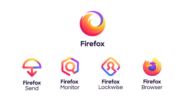
Mozilla has officially revealed its new Firefox logo, part of a new icon family for the browser. The launch of the designs, which have been more than 18 months in the making, coincides with a shift in brand positioning for Mozilla. Whereas before Firefox was often used to refer the browser, Mozilla wants to reposition the word to cover the entire family of Firefox apps and services.
The road to these logos has been a long one. Mozilla previously invited the public to share their thoughts on potential ideas as part of the logo design process. We got a tantalising sneak peek of the designs last week, when Firefox's communication design leader Sean Martell tweeted a picture of a box of stickers that appeared to leak one of the final designs.
This design appears in the new branding system (below) as the logo for the Firefox browser. Alongside this logo are three line-based graphics for other services including Send, Monitor, and Lockwise. The whole system comes under a general Firefox logo umbrella, which relies on the motif of a circular, swooshing fox tail.
Article continues below 
In a video that traces the evolution of the Firefox brand (below), the creative team reveals how the umbrella logo for Firefox was a major step away from what has gone before.
Having run two design systems by audiences, they concluded that "we got a very clear signal that we didn't actually have to show a fox for people to know that it was Firefox".
In a blog post announcing the designs, Mozilla also says that the new brand "is about more than logos". To be specific, it's based on four key word pillars, namely 'Radical', 'Kind', 'Open' and 'Opinionated'.
This also ties into Mozilla's aim to create a design design system that has what it takes to last long into the future. Included in this system is a new and expanded colour palette that makes it possible to use gradients. A modern and rounded typeface that reflects the logos completes the rebrand.
Sign up to Creative Bloq's daily newsletter, which brings you the latest news and inspiration from the worlds of art, design and technology.
And seeing as all of these elements were developed with an emphasis on accessible standards in mind, it looks like the new Firefox is set to deliver user friendly products. The brand's focus on privacy only sweetens the deal.
Notable designers have been linked to the development of these logos. Michael Johnson provided early inspiration, while the designer of the original Firefox logo, Jon Hicks, was on hand to give advice. Meanwhile Ramotion's Michael Chu has been credited as a driving force behind the new brand.
Mozilla also adds that we can expect more from the rebrand: "We have to stretch our brand guidelines even further in the months ahead, so we’re interested in hearing your reaction to what we’ve done so far."
Related articles:

Dom Carter is a freelance writer who specialises in art and design. Formerly a staff writer for Creative Bloq, his work has also appeared on Creative Boom and in the pages of ImagineFX, Computer Arts, 3D World, and .net. He has been a D&AD New Blood judge, and has a particular interest in picture books.

