New League of Legends logo is universally slated
Will Riot Games give in and revert to the old logo?

Sign up to Creative Bloq's daily newsletter, which brings you the latest news and inspiration from the worlds of art, design and technology.
You are now subscribed
Your newsletter sign-up was successful
Want to add more newsletters?
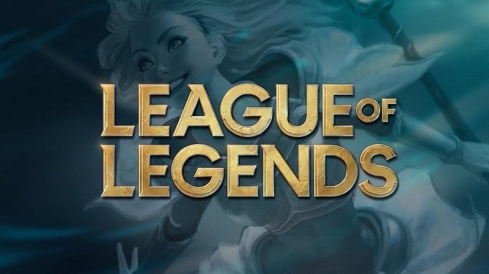
League of Legends has a new logo to accompany its 10th anniversary this month, and it seems that no one is happy about it (or else the happy people are keeping their joy very quiet). The action-strategy game, owned by Riot Games, is the biggest PC game in the world, and has a maximum of eight million players playing at the same time every single day. That's a lot of users, and therefore a lot of angry people.
What are people complaining about? Our logo design guide discusses the importance of striving for difference. And some people aren't so sure this new look helps League of Legends stand out from the crowd. Plus, as usual, they don't like change.

Let's compare the two logos. The old League of Legends (LoL) logo had a definite feel to it. You can have no clue what the game is about, yet look at the logo and you are transported to a world of warriors, treasure, deadly battles and eerie landscapes. Saying that, that feel is quite similar to other gaming or fantasy logos, so perhaps it wasn't the best in terms of standout.
Article continues belowWhat about the new logo? It conjures up... well... something gold. And a bit distressed. It looks a little Indiana Jones, if we're honest. It does look more contemporary, but we wouldn't exactly say it wins on striving for difference, either.
In its official announcement blog talking about the game's anniversary, Riot Games said: "We think this is the perfect time to set the stage for the next ten years by modernising the official League of Legends logo."
But users were not convinced. The comments are pretty brutal. See below for the most popular one:

Ryan Rigney, communications lead on LoL posted this tweet in response to some of the Reddit hate.
Sign up to Creative Bloq's daily newsletter, which brings you the latest news and inspiration from the worlds of art, design and technology.
LEAGUE OF LEGENDS SUBREDDIT: ayyy lmao this new logo is trash we know all about good logos good logos is all we knowALSO LEAGUE OF LEGENDS SUBREDDIT: *cuts off the bottom of the new logo when they upload it—not a single person notices for a full week* pic.twitter.com/GEhtgWYJDfOctober 3, 2019
When BrandNew recently posted about the logo, designers weighed in to share their dislike of the new look.
Tom Neish said: "Another piece of interesting type bites the dust." Sandy34 said it was "Boring as hell."
While Vincent Biss said: "Feels like a Guardians of the Galaxy logo, but without any soul or energy. A least it doesn't feel like a D&D old kitsch logo like the old one. There must be a perfect proposition between those two?"
A few weeks after the official launch of the new logo, we're interested to see that Riot Games has not updated the logo on the official League of Legends site. Although when you go on the site to play the game, you do get the new branding. And actually, in context, it doesn't look too bad.
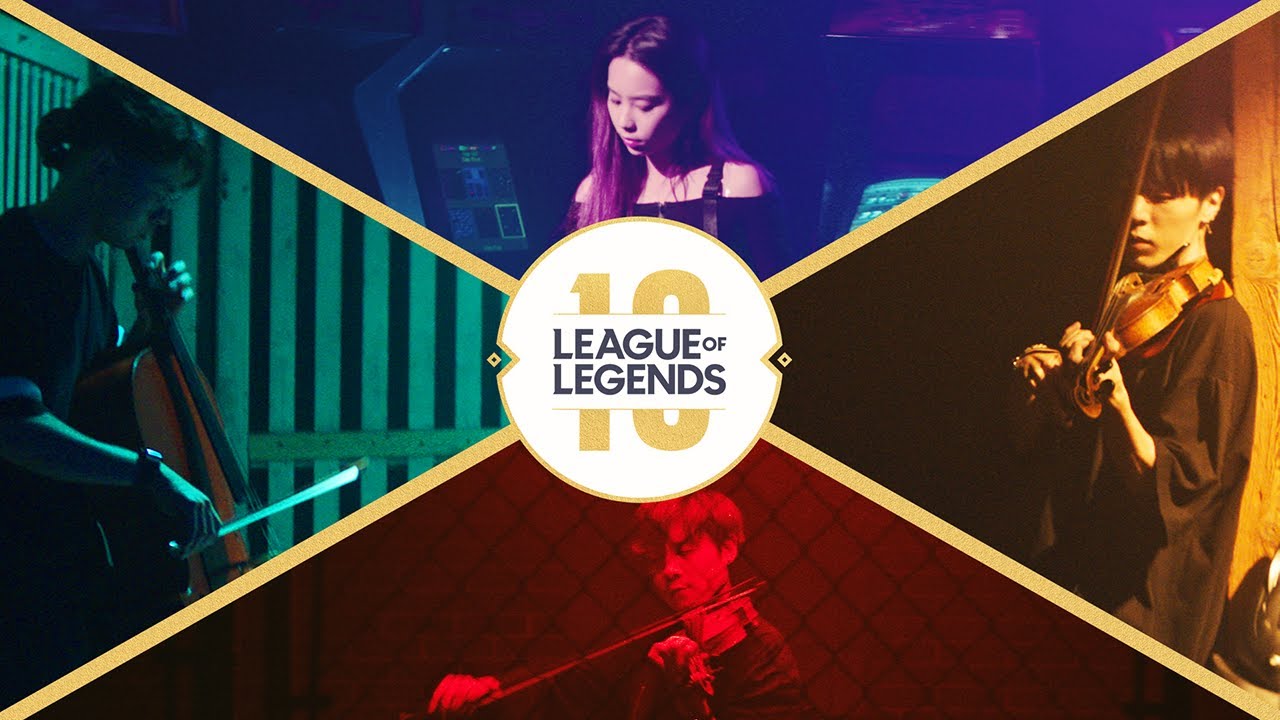
A video compiling 10 years of LoL music has been doing the rounds over the past few days (see below), and has been receiving a lot of love. Which just goes to show that people are fickle (and that the music is very cool).
As for the new logo, will gamers get used to it? Will designers ever stop moaning about new logos? Will Riot Games give in and revert back to the old logo? Only time will tell.
Read more:

Rosie Hilder is Creative Bloq's Deputy Editor. After beginning her career in journalism in Argentina – where she worked as Deputy Editor of Time Out Buenos Aires – she moved back to the UK and joined Future Plc in 2016. Since then, she's worked as Operations Editor on magazines including Computer Arts, 3D World and Paint & Draw and Mac|Life. In 2018, she joined Creative Bloq, where she now assists with the daily management of the site, including growing the site's reach, getting involved in events, such as judging the Brand Impact Awards, and helping make sure our content serves the reader as best it can.

