New Paralympics logo is cleverer than you think
International Paralympics Committee rebrand strikes gold.
Sign up to Creative Bloq's daily newsletter, which brings you the latest news and inspiration from the worlds of art, design and technology.
You are now subscribed
Your newsletter sign-up was successful
Want to add more newsletters?
The International Paralympics Committee (IPC), which organises the Paralympic Games, previously had a symbol, but no broader visual identity. To remedy this, North was brought in, with the aim of building a system that unifies the IPC's visual output and helps challenge perceptions around disability. And just in time for Tokyo 2020, too, which is expected to be the biggest year in the IPC's history.
First up, the Paralympics logo, the Agitos, was refreshed. On the face of it, the two designs (shown below) look very similar, but there's more to the refresh than meets the eye (sometimes a subtle change can make all the difference, as our logo design guide notes).
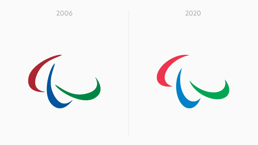
In the previous design, all three shapes were different, which led to inconsistencies when the logo was used in situ – it was apparently, sometimes even used backwards. In the redesigned logo, all three shapes are the same, and all are based on strict geometry.
Article continues below 
Another tweak, which seems like a no-brainer, was to shift the colours so they're now in line with the blue, red and green of the Olympic rings. Together, these changes create a more purposeful logo, and also help create a visual consistency between the Olympic and Paralympic branding. When the symbols are seen side-by-side, "it helps to imply equal standing and a unified goal," North's Josef Clinch tells Creative Bloq.
Based on this revised symbol, North also created a set of patterns as an alternative to photography, because, as the studio puts it, "nobody wants to be on the front cover of the Anti Doping Guidelines". Quite.
A new typeface, aptly named New Hero, helps the energetic feel come to life across a range of brand assets.
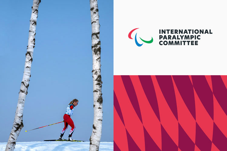
The new identity was announced in October 2019 and is slowly being rolled out over the next year. It applies to everything from style guidelines to the IPC's video channels.
Sign up to Creative Bloq's daily newsletter, which brings you the latest news and inspiration from the worlds of art, design and technology.
"We look at Para Sports and we see determination, positivity and dynamism," says Clinch. "We hope that the tonality of the new identity will help to continue the wave of energy and enthusiasm from Tokyo 2020 into all of the IPC’s other events and initiatives, so that the next Paralympic Games can be even bigger."
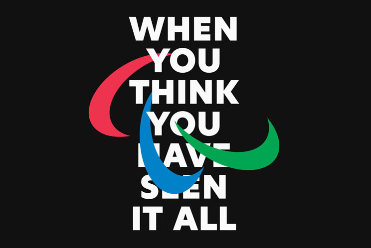
With the identities of the Olympics and the Paralympics being brought more closely together, you might be wondering whether they'll merge into one in future. "There is certainly no reason to believe that the two will always be separate, but for the time being there are practical benefits to having separate, related identities," explains Clinch.
"There is a risk that by combining the two more closely, the pre-existing popularity of the Olympic movement might somehow obscure (or even perhaps inhibit) the increasing popularity of some of the Para Sports. The Paralympic movement has benefitted from having the space and time to develop its own unique voice."
And with all eyes on Tokyo this summer, and this striking new identity for the Paralympics, it looks like this year's games will be more memorable than ever. To get you in the mood, why not check out these Olympic posters? Or if you're feeling a little more catty towards Olympic branding, then see how the Paris 2024 logo was mercilessly mocked.
Read more:

Rosie Hilder is Creative Bloq's Deputy Editor. After beginning her career in journalism in Argentina – where she worked as Deputy Editor of Time Out Buenos Aires – she moved back to the UK and joined Future Plc in 2016. Since then, she's worked as Operations Editor on magazines including Computer Arts, 3D World and Paint & Draw and Mac|Life. In 2018, she joined Creative Bloq, where she now assists with the daily management of the site, including growing the site's reach, getting involved in events, such as judging the Brand Impact Awards, and helping make sure our content serves the reader as best it can.
