
In May last year, US department store Sears updated its logo. At the time, we wondered if we were getting design déjà vu, as the logo looked not unlike the Airbnb symbol. And we're getting that same feeling again, as Sears has unveiled yet another update to its logo, just nine short months after the initial rebrand.
Instead of scrapping the whole thing and going back to the drawing board, Sears has stuck to its guns, sort of, and just updated the symbol. What previously looked like a a candle or an igloo or just a bit of a mess, depending which way you viewed it, now looks like a little house, a bishop's hat or the nib of a fountain pen. It may be marginally less messy, but is it any better? (Spoiler: We don't think it'll make it into our list of the world's best logos anytime soon.)
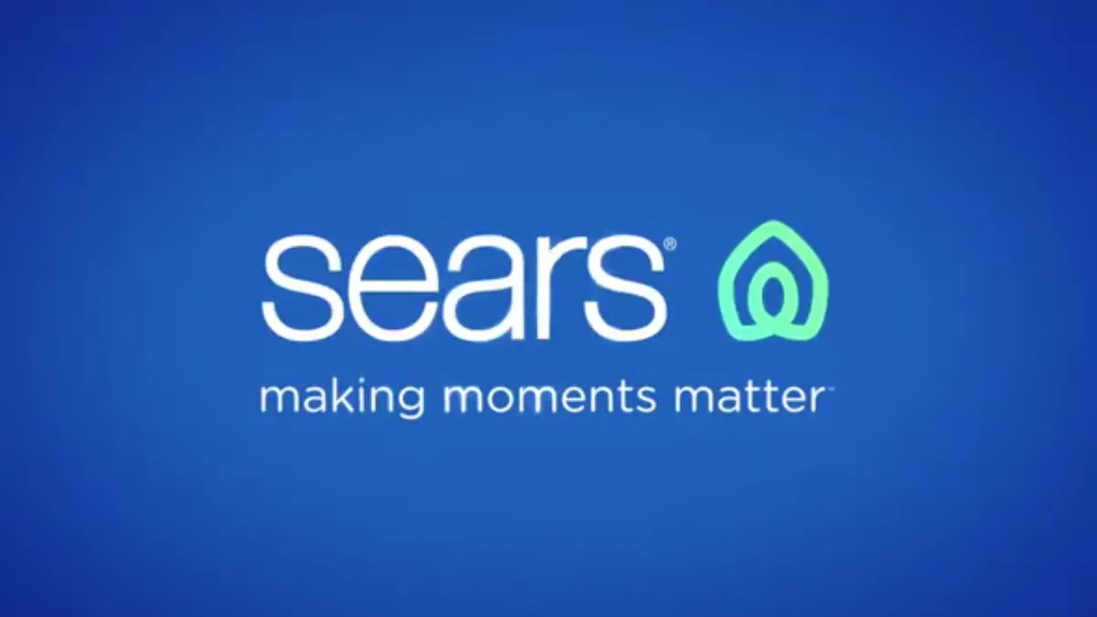
We really want to like this update, but it's hard to get that excited about it. Especially bearing in mind that one survey showed that 79 per cent of people preferred the previous Sears logo to the 2019 version. We can't imagine this 2020 version will fare much better, mostly because we're simply not convinced this new little house is an improvement – although we do see how it could help Sears wiggle its way out of a legal battle with Airbnb (all comments on this are purely speculative).
Over on Brand New, the comments were pretty brutal. JustJoeDesign said: "It looks like a home a troll would live in." Tom Swinnen said: "Seariously?" (10 out of 10 for the pun) and Eligio Jose Rosa said: "This a good representation of Sears right now. Undecided, Outdated and extremely lame."
So if Sears was looking to win back customers with its new logo, it looks like its efforts have fallen flat. We'll look forward to next year's update. We're expecting a top hat, or maybe a bit of roof.
Read more:

