We all know consumers hate change, and they also love to complain about rebrands on the internet. But usually, people get used to a new logo after a while. So now that the dust has settled and we've entered a whole new decade, how do people feel about 2019's most controversial rebrands?
To find out, Visual Objects surveyed 1,000 consumers in the States to get their views on some of 2019's most biggest rebrands. (See our logo design post for some expert advice on crafting logos.) Of course, 1,000 people isn't exactly the biggest survey ever created, but the results are still surprising.
01. Facebook
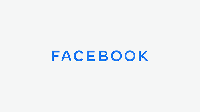
Facebook got a makeover in 2019, although the familiar blue and white logo is still there on the app itself. This new logo was designed to unify Facebook's various brands, such as Instagram and WhatsApp, and the eagle eyed will have noticed this new logo appears on the bottom of the loading screen on these apps.
The new look is basically an all-caps font in different colours (read more about what we said at the time here), and wasn't exactly a huge risk for the company.

Perhaps not surprisingly, 80 per cent of people surveyed preferred Facebook's old logo to the redesign. The question is, how many of those people had even noticed that Facebook had had a corporate rebrand in the first place?
02. Slack

The Slack rebrand was pretty controversial at the time: people were very angry about the switch from a hashtag (below) to a pinwheel (above). Just for the record, we called out the haters pretty quickly.

The thing about redesigns is that sometimes all it takes is a few months of using something before people get used to it. And that seems to be exactly what happened with this rebrand. Roughly a year later, 73 per cent said they preferred Slack's new logo. The lesson? When you've really thought through your designs, people will often come round after a period of adjustment.
03. Yahoo
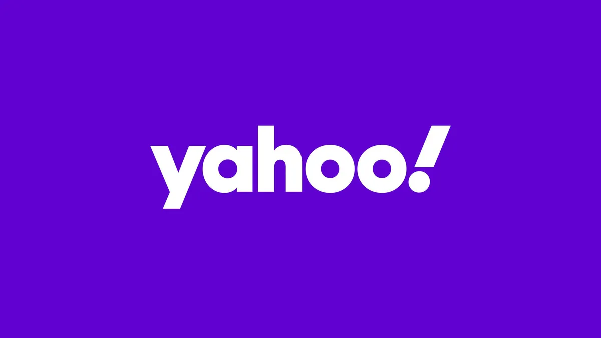
Yahoo's redesign wasn't one we were particularly expecting. We'll admit that we may have almost forgotten about Yahoo entirely. But its update by Pentagram was a welcome change – it fleshed out the letterforms, went lower-case and added a jaunty exclamation mark that suggests fun.

The survey shows that people were divided on this logo. Just over half of them – 58 per cent – preferred the old logo, leaving 42 per cent who liked the new one better. It seems the jury is still out on this one.
04. Zara

When Zara rebranded in January of last year, people got very upset (we may have said that it had been kerned into oblivion). In layman's terms, the letters are packed much more closely together in the new logo.

This is another one that split people almost down the middle. Fifty six per cent prefer the old logo, and 44 per cent prefer the redesign. We actually think the new logo has grown on us. Those letterforms seem to look more elegant over time.
05. Sears
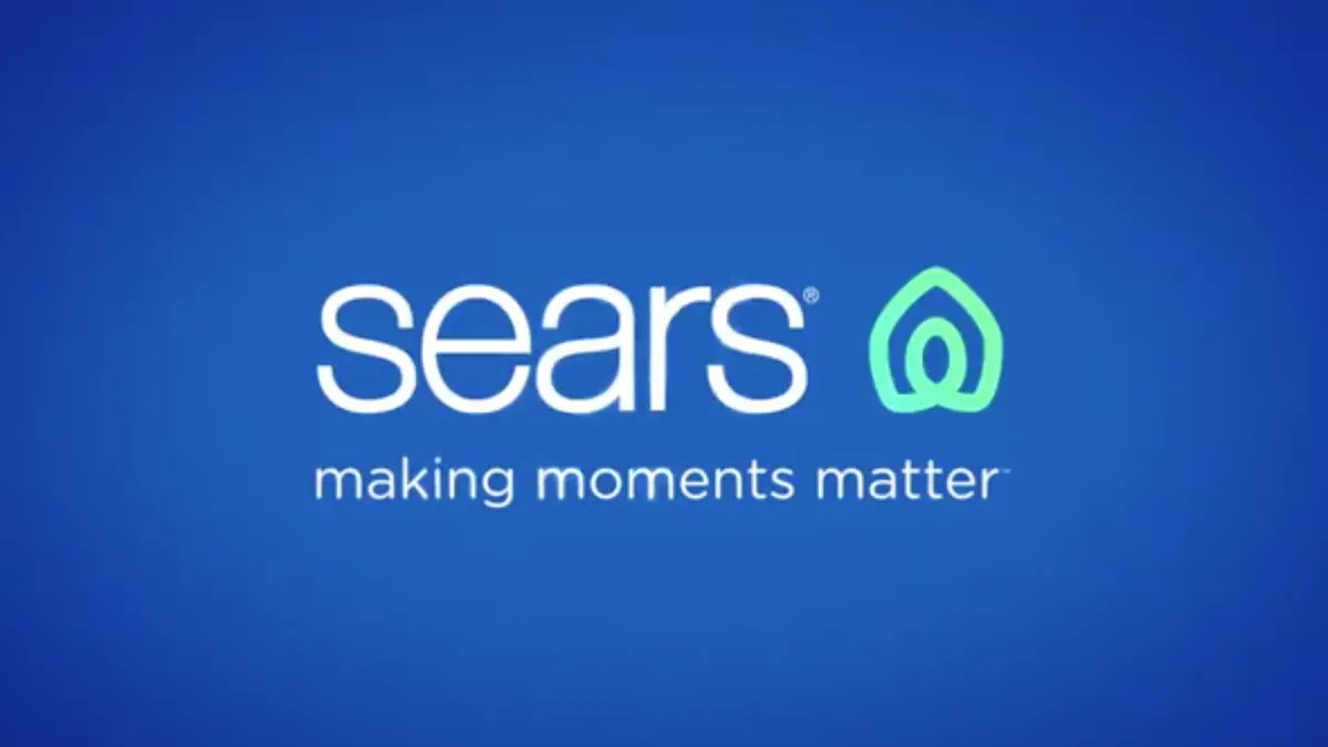
Sears' new logo was criticised on launch for appearing very similar to the Airbnb marque. And it seems that consumers haven't quite shaken that disquiet, because more than three quarters of them (79 per cent to be exact) prefer the old Sears logo to the new one. To be honest, we can kind of see why. The old one was kind of great.

To read more about the survey, as well as see how people reacted to the Lord & Taylor rebrand, see the Visual Objects website.
You can also read more about last year's most talked about rebrands in our roundup of last year's biggest logo redesigns.
Read more:

