Improved Visit Malaysia 2020 logo still has a glaring error
Improved design is undermined by a confusing slogan.

Sign up to Creative Bloq's daily newsletter, which brings you the latest news and inspiration from the worlds of art, design and technology.
You are now subscribed
Your newsletter sign-up was successful
Want to add more newsletters?
If you design something on the cheap, chances are it isn't going to go down well. That's just what happened with the Malaysian tourism ministry, whose zero budget Visit Malaysia 2020 logo was slammed online for its amateurish look.
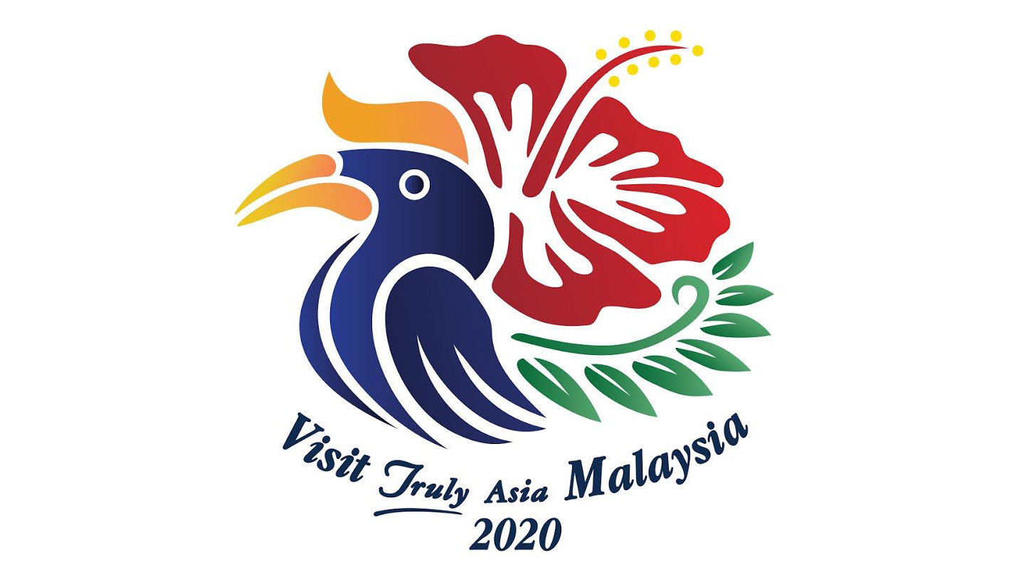
To fix this, the country has recently unveiled a new and altogether more sophisticated logo (above), which is the winner of a government competition. And despite being mocked for having a logo that's difficult to read, the design elements are a definite improvement.
In our guide to logo design we point out the importance of listening to public criticism, and it looks like the Malaysian tourism ministry has done that here. Its new graphic includes distinctive features of the country, such as a hornbill, a hibiscus flower, and a wild fern.
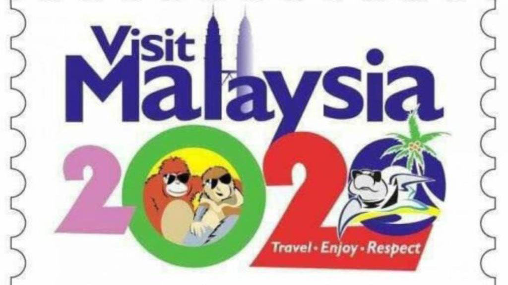
Article continues belowEach has been depicted in a stylised way that looks like the region's famous wax-resist dyeing technique, batik. It's still not perfect, but it's unarguably a more elegant and well realised logo than the previous Visit Malaysia 2020 effort (below), which featured cartoony graphics of the region's native wildlife wearing sunglasses.

It's fair to say that this logo didn't go down well on social media. Twitter user Aven Fauzi summarised a lot of feelings by saying that due to the logo, the country was going to "be a joke for another 2 years and beyondddd."
The hunt for a new logo was organised by the newly elected Malaysian government, Pakatan Harapan, which ran a competition calling for ideas. Graphic designer Alfred Phua Hong Fook's logo was chosen as the winning design out of hundreds of entries. Malaysian prime minister Dr Mahathir Mohamad officially unveiled it in a tweet on Monday.
The launch of the logo is a significant way to usher the much-awaited Visit Malaysia Year 2020. We truly hope that we will witness more tourist arrivals, be they by air, land or sea.It is indeed with much pleasure I officially launch the #VisitMalaysia2020 campaign logo. pic.twitter.com/O2apMpwErnJuly 22, 2019
And, by and large, it looks like the new logo has gone down well. Twitter user jasmin has given the design her seal of approval by saying it's superior to the 'stoner orangutans' of the old logo. Meanwhile Eskentirka says that it represents a logo where the client values the designer's input.
Sign up to Creative Bloq's daily newsletter, which brings you the latest news and inspiration from the worlds of art, design and technology.
The new logo is so cool... And wayyy better than those stoner orangutans 😂 https://t.co/wfzzFVC3hAJuly 23, 2019
Pretty sure many of you can relate. 🤭🤭#VisitMalaysia2020 pic.twitter.com/kuqO3U9gcrJuly 22, 2019
You can't please everyone though. And given that people can see the finalists that didn't make the cut, some Twitter users were quick to jump in and point out which ones they would have preferred.
These are better @MyMOTAC #VisitMalaysia2020 pic.twitter.com/vN08l7wFP3July 23, 2019
On a more serious note, some users speculated that the logo was made from assets found on Shutterstock, which had then been hastily copied and edited.
1. Search hornbill, hibiscus, wildfern on shutterstock2. Copy and edit3. Voila#VisitMalaysia2020 pic.twitter.com/Nvqv3AcmiXJuly 23, 2019
If there's one complaint we can agree with though, it's that the slogan is difficult to read. When read from left to right, the message appears to be "Visit Truly Asia Malaysia". However when you take into account that the logo uses two different fonts, it suddenly clicks in place to read: "Visit Malaysia, Truly Asia".
We'll be honest, we didn't realise this until Twitter user Hamka pointed it out.
Guys I got it. It makes sense now. the word 'Visit' and 'Malaysia' is in the same font. So that's one sentence. 'Truly' and 'Asia' also in the same font. So the right way to read it is 'Visit Malaysia Truly Asia'. pheww such a visionary design #VisitMalaysia2020 pic.twitter.com/Ap8TwJ4VoUJuly 23, 2019
As far as copywriting goes, this is a bit of a swing and a miss on behalf of the Malaysian tourism ministry. Its Twitter profile uses a version of the slogan "Malaysia Truly Asia" for its account name, but what happened to the "Visit"?
Nitpicks aside, this is a vast improvement on the previous Visit Malaysia 2020 logo. But its real test will be whether or not it attracts more travellers.
Think you could do better? You'll need some logo design tools. And luckily for you we've rounded up the best free logo design tools to help you on your way.
Related articles:

Dom Carter is a freelance writer who specialises in art and design. Formerly a staff writer for Creative Bloq, his work has also appeared on Creative Boom and in the pages of ImagineFX, Computer Arts, 3D World, and .net. He has been a D&AD New Blood judge, and has a particular interest in picture books.
