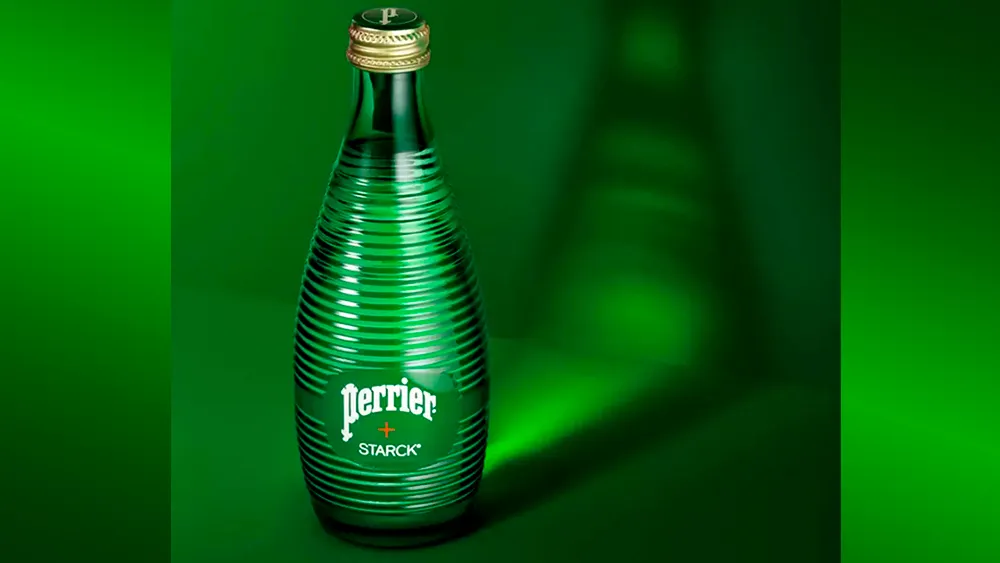
The French sparkling water brand Perrier is already easily recognisable thanks to the shape of its green bottle, but the design has just become even more iconic. To mark its 160th anniversary, it brought in one of France's best-known industrial designers to rebrand the bottle.
The overall shape of the bottle remains the same, ensuring that's it's still immediately recognisable as Perrier. But Philippe Starck's took inspiration from Fresnel lenses to add thin horizontal streaks to the glass, playing with how it defracts light while adding texture to the bottle. This isn't one of those weird brand collaborations that makes no sense. The combination is inspired.
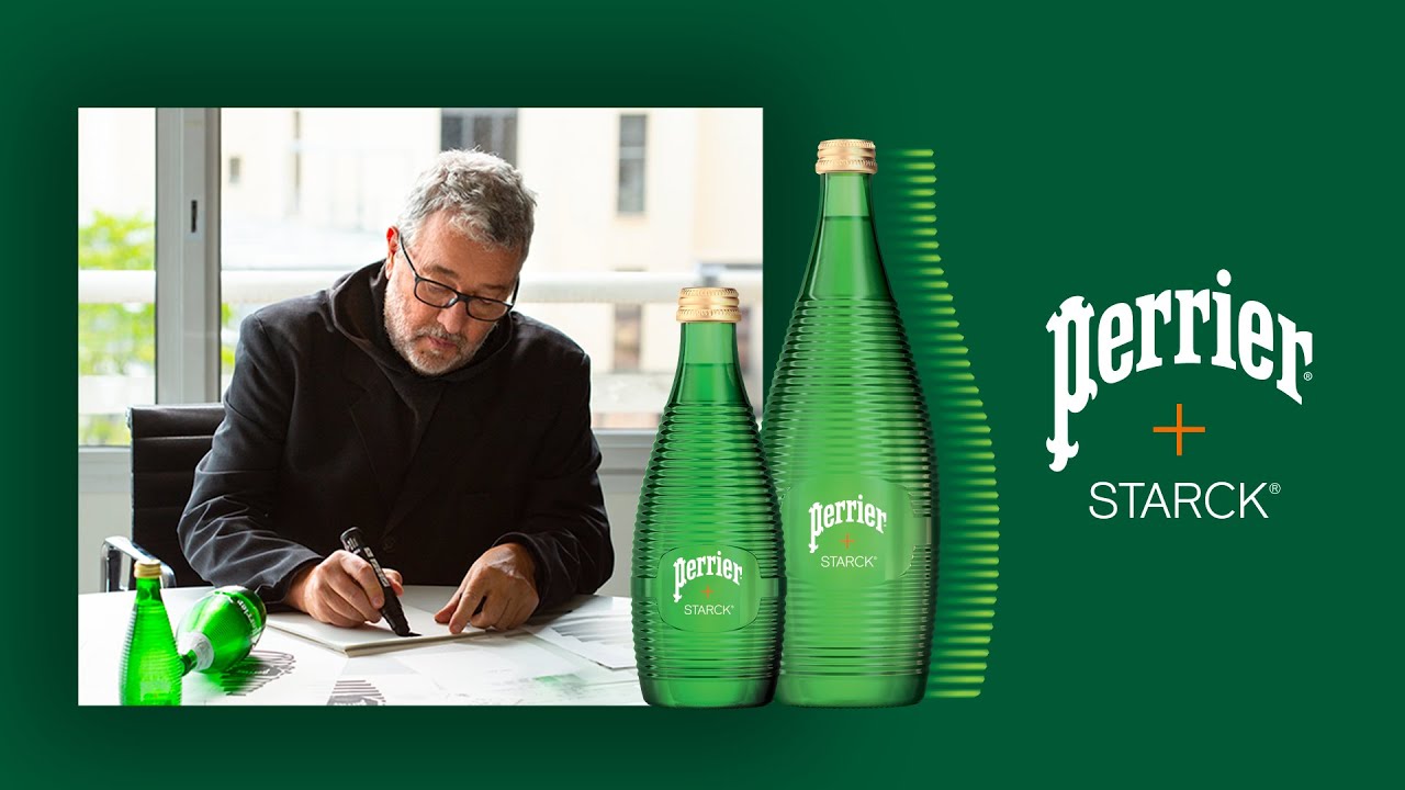
Starck, perhaps most famous for his iconic Juicy Salif juicer for Alessi, described Perrier as a "globally recognised symbol and a monument of French heritage." He said: "Keeping the essence of an icon unaltered, it’s possible to distort and play with the shape to apply current parameters to a timeless form. This is what I did with the addition of this highly technical horizontal grooving, which creates a natural rigidity."
“But it’s not just about technique," he added "It’s also about exploring the Unknown. In my project, the Unknown is encapsulated in the notion that each bubble is a magnifying glass and that by using the structure to shape a Fresnel lens, I could create an optical surprise, bringing intrigue and a spark of fantasy.”

It's not the first time that Perrier has sought new creative input for its packaging. Several artists, including Takashi Murakami and the street artists JonOne, Kobra and Sasu, have designed labels for the brand in the past. But this is the first time a creative has been invited to redesign the bottle itself.

The PERRIER + STARCK bottles are due to be launched internationally this month. for more inspiration, see our round up of inspiring packaging designs.

