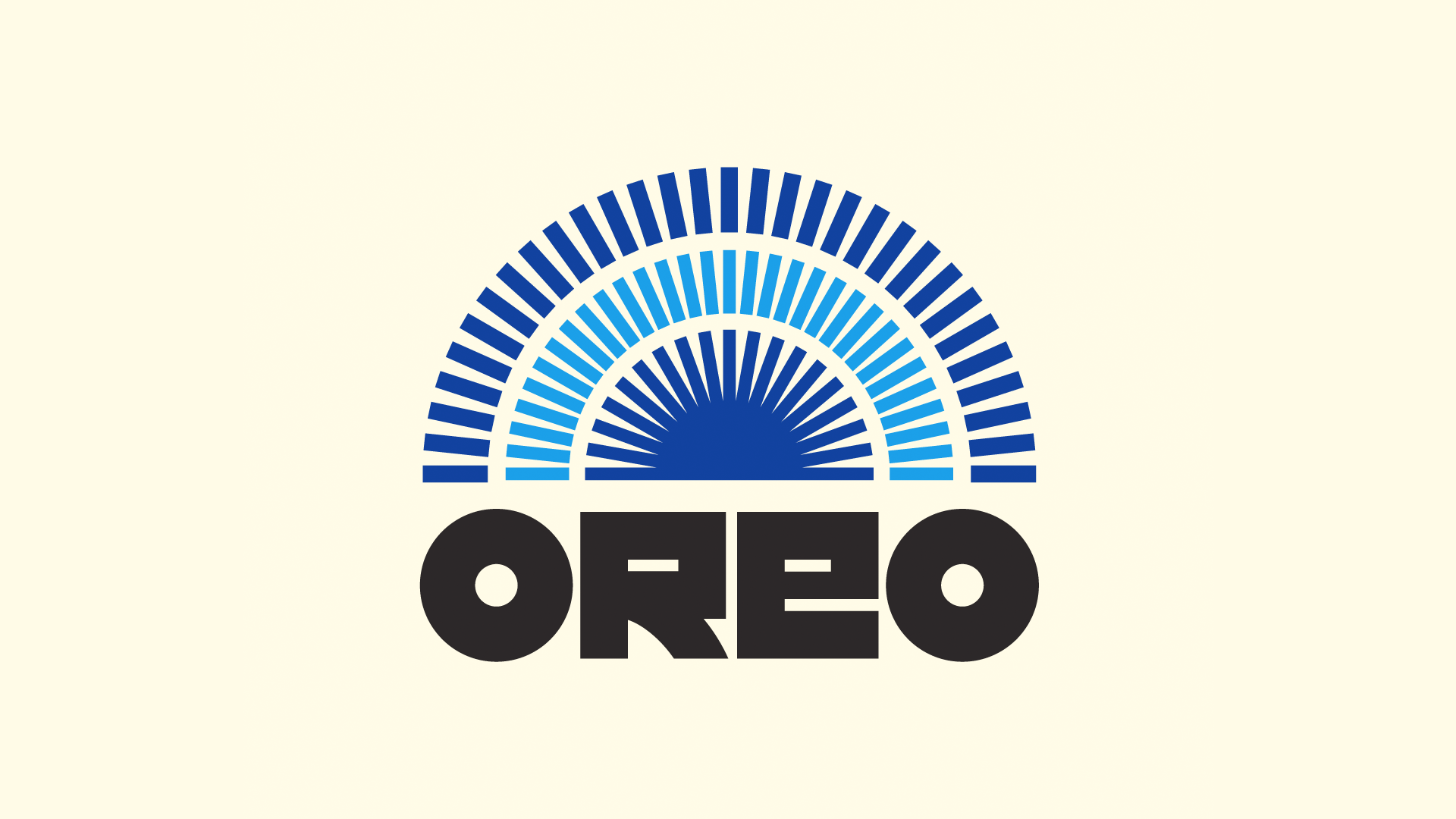
We’re still obsessed with these vintage logo redesigns
Why can’t all logos look like this?

Sign up to Creative Bloq's daily newsletter, which brings you the latest news and inspiration from the worlds of art, design and technology.
You are now subscribed
Your newsletter sign-up was successful
Want to add more newsletters?
Have you ever been looking at a famous logo and thought to yourself, I wonder how that would look if it had a retro makeover? No, us neither, but that hasn't stopped one artist from giving all your favourite logos a stunning new vintage look.
Last year we covered the work of Rafael Serra, who reimagines iconic logos as retro designs. Since then, Serra has been continuing to churn out even more magical makeovers, and we can't get enough of them. If you'd like to have a go at transforming some of your favourite logos, then check out our guide on how to download Photoshop and get creating.
A post shared by Rafael Serra (@faelpt)
A photo posted by on
According to his website, Rafael Serra is a type designer and lettering artist. From Spotify to Guinness, Serra takes iconic elements from certain logos, like the colour palettes or shapes, and turns the modern looks on their heads. The bold colours and innovative typefaces in his designs give the new logos a mid-century feel.
Article continues belowSerra has gathered up plenty of attention online with his designs, with users flooding his Instagram pages with compliments. One user commented on one of the designs (see above), "Very '80s VHS," and another replied to a Nike redesign (see below), "Please dude. Save some skill for the rest of us". And if you're feeling a similar way and would like to perfect your craft like Serra has, then check out our roundup of Adobe Illustrator Tutorials.
A post shared by Rafael Serra (@faelpt)
A photo posted by on
I love these designs, and most of them are good enough to frame and hang on your wall. If all logos were as aesthetically pleasing then I'd probably end up spending all my money in a matter of days. I would love to see Serra take on some more logos like, say, Converse – can you imagine how cool a fresh pair of high tops with one of Serra's designs on would be?
If you're feeling inspired by all this logo makeover talk, then perhaps you'd like to have a go at designing your own? In which case, make sure you check out our guide on how to design a logo. Or you can continue gathering up some more inspo by checking out our roundup of the best logos of all time.
Read More:
Sign up to Creative Bloq's daily newsletter, which brings you the latest news and inspiration from the worlds of art, design and technology.

Amelia previously worked as Creative Bloq’s Staff Writer. After completing a degree in Popular Music and a Master’s in Song Writing, Amelia began designing posters, logos, album covers and websites for musicians. She covered a range of topics on Creative Bloq, including posters, optical illusions, logos (she's a particular fan of logo Easter eggs), gaming and illustration. In her free time, she relishes in the likes of art (especially the Pre-Raphaelites), photography and literature. Amelia prides herself on her unorthodox creative methods, her Animal Crossing island and her extensive music library.
