The Rolling Stones have a new logo – and it’s a trippy treat
But it’s not my favourite logo from the band.

Sign up to Creative Bloq's daily newsletter, which brings you the latest news and inspiration from the worlds of art, design and technology.
You are now subscribed
Your newsletter sign-up was successful
Want to add more newsletters?
Ah, The Rolling Stones. The band has become a staple of the British music scene and the rock genre. And even if you haven't listened to a lot of their music, you probably recognise the band's iconic tongue and lips logo designed by John Pasche. But as the rock legends celebrate their 60th anniversary, the iconic logo has had a redesign.
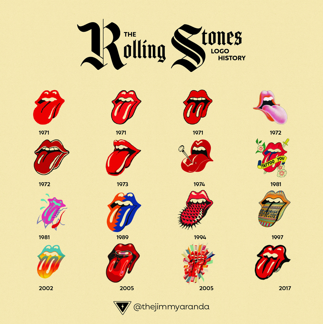
The tongue and lips have received plenty of makeovers since it was created back in 1971. But to celebrate the upcoming 60th anniversary tour, the iconic logo has received a vibrant new design. If you're designing your own logo and are on the hunt for some inspiration then make sure you check out our roundup of the best logos of all time.

The new logo features a colourful trippy redesign of the famous mouth. The new logo has been designed by British artist Mark Norton, who previously contributed to six of the band's projects over the years. The new design is to help promote the upcoming European tour that the Stones have aptly named SIXTY (how original).
Article continues belowI like the new logo design with its exciting and bright colour palette, but it's not my favourite redesign of the logo I've seen. There have been several interesting variations of the design over the years. Out of all the logo makeovers, I most like the Dali-esque design from 1972, or the dual-colour logo from 1989 (see below) as they're both instantly recognisable but still differ from the original design.

For fans of the Stones, then the announcement of the tour must be pretty exciting, but you'll have to wait until summer to see the legends in action again. If you'd like to have a go at creating your own version of the logo, then make sure to download Photoshop and get creating.
Read More:
- I’m furious that this Pixar-inspired Porsche doesn’t have a face
- The new Women’s Network logo looks, err, suggestive?
- I'm not sure what's going on in this cat optical illusion
Sign up to Creative Bloq's daily newsletter, which brings you the latest news and inspiration from the worlds of art, design and technology.

Amelia previously worked as Creative Bloq’s Staff Writer. After completing a degree in Popular Music and a Master’s in Song Writing, Amelia began designing posters, logos, album covers and websites for musicians. She covered a range of topics on Creative Bloq, including posters, optical illusions, logos (she's a particular fan of logo Easter eggs), gaming and illustration. In her free time, she relishes in the likes of art (especially the Pre-Raphaelites), photography and literature. Amelia prides herself on her unorthodox creative methods, her Animal Crossing island and her extensive music library.
