Selena Gomez releases worst single cover ever
But is this terrible design intentional or not?

Sign up to Creative Bloq's daily newsletter, which brings you the latest news and inspiration from the worlds of art, design and technology.
You are now subscribed
Your newsletter sign-up was successful
Want to add more newsletters?
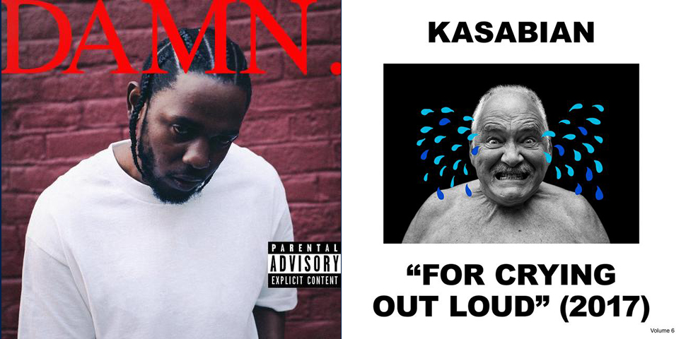
There's something odd going on in graphic design at the moment. In April, Kendrick Lamar released his Damn album, and with it a cover that was... well, pretty damn rubbish. Kasabian followed suit in May by adorning its latest musical offering with a semi-naked old man and some drawn-on tears.
The internet exploded with memes and left the aesthetically conscious among us seriously asking: have we entered the era of bad graphic design?

The argument goes that we're so saturated with visuals, what might traditionally be considered 'good' graphic design just gets lost. To stand out (and gain kudos with the millennial market), brands are opting for designs so bad that they're impossible to ignore.
Article continues belowWell, Kasabian and Kendrick's efforts look like masterpieces when compared to the latest single cover from Selena Gomez. Wolves, the former Disney child star's collaboration with Marshmello, looks like it has been made by a teenager just taking their first lesson in Photoshop. The 'O' of the title has been turned into a moon, for crying out loud. It's so bad it must be intentional – right?
Gomez's Tweet announcing the single offered no clues:
I've been running through the jungle, I've been crying with the wolves. 10.25. pic.twitter.com/ZN9vZTcPnZOctober 23, 2017
In the 'it's just bad' camp, we have several convincing arguments. We've already seen movie posters descend into their own design crisis this year. The weirdly proportioned, very obviously cut-out, unrelated floating elements on this latest cover seem to be from the same school of thought. Perhaps this is the horrible result of design by committee at a record company?
Then there's the picture of Gomez herself – why is it so grainy and blurry? Surely the star's not lacking in hi-res portrait snaps. And if it's an aesthetic decision, why is the wolf beside her so clear?
Sign up to Creative Bloq's daily newsletter, which brings you the latest news and inspiration from the worlds of art, design and technology.

However, Marshmello seems like the kind of chap to embrace cheesy design in an ironic way. For those who don't know, that smiley white thing on the cover is the headgear he wears to hide his identity. Surely someone with such a tightly controlled public persona wouldn't let a high-profile single design pass by unchecked.
A look through the 'mello's discography reveals he does indeed have a bit of a thing for tacky design. Although it's still not quite of the same calibre as the Wolves cover. And Gomez's back catalogue favours glossy over gaudy every time.

So is the Wolves cover the latest example of the trend for wilfully subverting what we consider 'good' design – or is it just rubbish? The jury's still out. Let us know what you think on our Facebook and Twitter pages.
Related articles:

Ruth spent a couple of years as Deputy Editor of Creative Bloq, and has also either worked on or written for almost all of the site's former and current design print titles, from Computer Arts to ImagineFX. She now spends her days reviewing small appliances as the Homes Editor at TechRadar, but still occasionally writes about design on a freelance basis in her spare time.
