All the world's a stage and the letterforms merely players. Typography designers often delve back into the annals of history for inspiration, but this project makes its historic influences the star of the show. A new custom-made typeface for Shakespeare's The Globe features a "peculiar cast of characters" inspired by the first published collection of the playwright's work on its 400th anniversary.
Designers took original woodcut illustrations from the famed First Folio and adapted them to create a series of unique letterforms for the theatre's summer season. The resulting fonts are a type designer's Midsummer Night's Dream (see our guide to typography design for tips for your own projects).

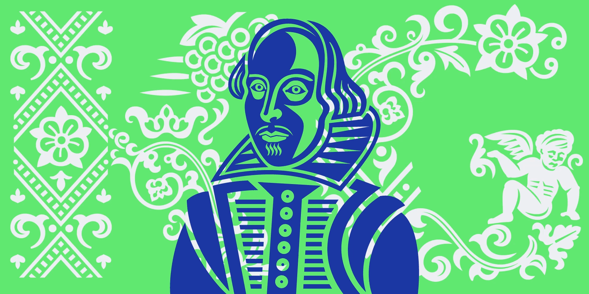
Named Amifer Folio, The Globe's new bespoke layer font was developed with design studio Typeland. The Globe had been using the studio's existing Amifer since last year. This updated variation of the typeface takes direct inspiration from the First Folio, which was published in 1623, seven years after Shakespeare died.
The entirely uppercase typeface is based on digitally enhanced woodcut illustrations including angels and demons, gargoyles, flowers and animals. There's even a glyph designed with the likeness of the bard himself. It's been designed so that it can be used with or without letter outlines behind the letters, which creates opportunities to set words apart even when used at the same size.

The design team at The Globe provided input on what elements they wanted to include, reflecting the season's plays that needed decorative initials. For example, a wavy top on the 'T' for The Tempest and a sense of menace and danger in the M for Macbeth (two 'M' variations were designed, one with an arrow through it for A Midsummer Night's Dream). The studio then worked through the Folio’s pages, drawing a set of elements to form the basis for the thematic treatment.
They wanted to create decorative features that could work with Amifer’s Black weight, rather than relying on separate illustrations that would need to be adjusted for every use. "The challenge was to pick up specific elements from the original patterns and illustrations that appear in the First Folio, but also to interpret them cleanly as vector shapes relevant to and usable in a font format," Typeland says.


The studio notes that some of the original illustrations in the Folio could be hard to interpret since they were printed to work only at a specific scale. They had to adapt the forms to create a digital font that can be used at different point sizes.
In the end, it was decided to go for two separate fonts: Amifer Folio Big, which includes more motifs to make a bigger visual impact at larger sizes, and a simplified Amifer Folio Small for smaller applications. The results are a lovingly created ode to one of the most important publications in the history of English literature, without which many of Shakespeare's plays could have been lost. With the floral motifs, the typeface also creates a perfect feel for the Globe's summer season.
Read more:

