Does the Subway logo really have multiple hidden meanings?
Food for thought.

Sign up to Creative Bloq's daily newsletter, which brings you the latest news and inspiration from the worlds of art, design and technology.
You are now subscribed
Your newsletter sign-up was successful
Want to add more newsletters?
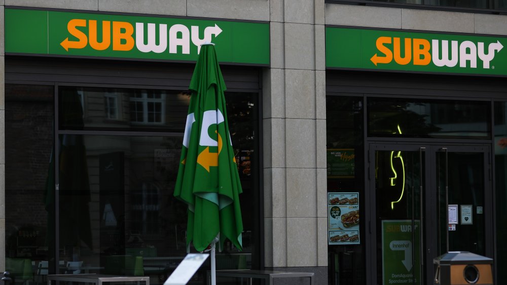
Everyone knows the Subway logo with its iconic yellow and green typeface. But what if we told you that the famous design has a deeper meaning? That's right, surprisingly enough, the sandwich shop logo has a little more to it than just promoting subs.
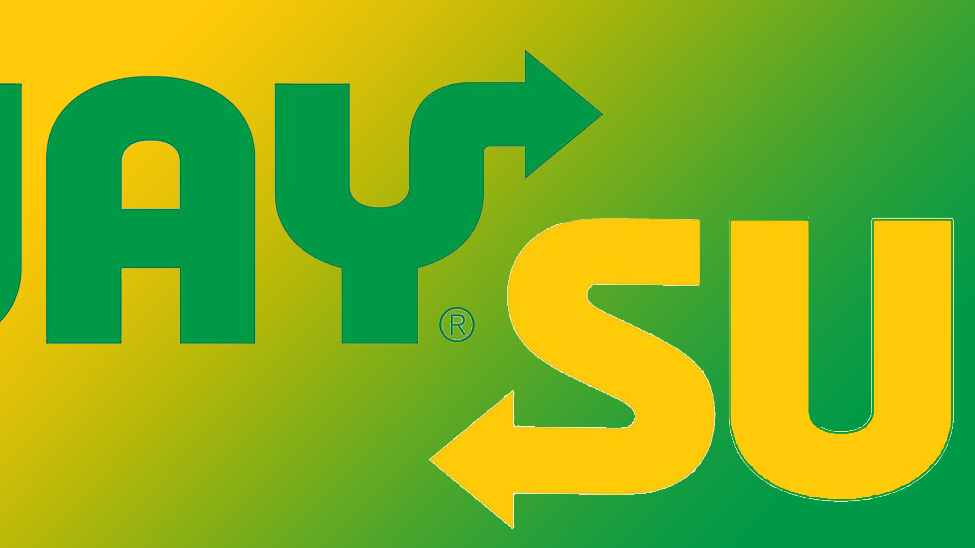
The two arrows on the S and Y of the logo are more than just a fancy embellishment – they have a hidden meaning related to the name of the company. However, we're not totally convinced by the secret connotations. (If you're currently in the middle of creating a logo, then make sure you follow our 15 golden rules of logo design.)

According to The US Sun, those arrows have two secret meanings. They supposedly represent the speed at which customers enter and leave a Subway shop, and secondly, according to the Logomyway blog, the arrows convey motion and movement to appeal to "active individuals who choose Subway over other, less-healthy fast food alternatives".
Article continues belowDespite the claims, we're not convinced by any of the logo's secret meanings. We think they're a little far-fetched – do those two little arrows really contain such subtle connotations? Or do they just look nice? With no mention of the 'speed' connection on the company's official history of Subwaypage, we can't help but wonder if people are letting their imaginations run wild.
This isn't the first logo we've seen with a supposed design secret. Just last week we discovered that the Walmart logo is actually a spark that's meant to represent the founder's "spark of inspiration". Who knew?
We'll have to wait and see whether Subway ever decides to confirm if the 'secret' is true or not, but in the meantime, why not look at our roundup of the best free logo makers and create your own? Or if you were searching for some more logo inspiration, why not check out our list of the best logos of all time?
Read more:
Sign up to Creative Bloq's daily newsletter, which brings you the latest news and inspiration from the worlds of art, design and technology.
- The Steam Deck and Nintendo Switch screens look surprisingly different
- Turn your selfies into da Vinci paintings with this brilliant AI tool
- Bored of the PS5 design? Here's how to spice up the logo

Amelia previously worked as Creative Bloq’s Staff Writer. After completing a degree in Popular Music and a Master’s in Song Writing, Amelia began designing posters, logos, album covers and websites for musicians. She covered a range of topics on Creative Bloq, including posters, optical illusions, logos (she's a particular fan of logo Easter eggs), gaming and illustration. In her free time, she relishes in the likes of art (especially the Pre-Raphaelites), photography and literature. Amelia prides herself on her unorthodox creative methods, her Animal Crossing island and her extensive music library.
