The latest hashtag craze to sweep the internet is the 10 year challenge. If you're not familiar, allow us to enlighten you. Participants post a photo of themselves today, alongside a snap of them from a decade ago.
Designer Arun Venkatesan has given the trend a twist by gathering together some of the biggest websites around and comparing them to their 2009 selves. Let us tell you, if you were shocked to see how bad your friends' eyebrows were in the noughties, it's nothing to what you're about to feel when you see these homepage screengrabs side by side. It's like we'd never even heard of content hierarchy. Or white space.
Let's take a look the most impressive glow ups of our time: use the arrow icons to compare these 2019 website layouts to their 2009 equivalent.
For a closer look at how interfaces are changing, read our post on the key UI trends for 2019.
Image 1 of 2
Click the right arrow to see Twitter in 2009
2019's Twitter homepage gets straight to the point. There's a login section, succinct, three-point explanation of the platform's main goals, and not much else.
Click the left arrow to see Twitter in 2019
2009 was a world in which people still weren't quite sure what Twitter was for. Its designers addressed the issue with a lengthy explanation, accessed via three different tabs at the top of the page. Or of course, you could watch the video version. Did someone say overkill?
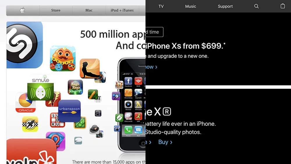
Image 1 of 2
Click the right arrow to see Apple in 2009
Today, Apple is known for its super slick, pared back design aesthetic – and its website is no exception. Large, lush hero images let the tech shine.
Click the left arrow to see Apple in 2019
'Pared back' is not the phrase that could be applied to Apple.com in the noughties. Fun fact: the App Store now has more than 260 times the number of apps it was celebrating at the time of this screengrab.
Image 1 of 2
Click the right arrow to see The New York Times in 2009
There's a lot of content on the New York Times homepage, but the current homepage creates a clear hierarchy within a layout that takes its cues from print newspaper design.
Click the left arrow to see The New York Times in 2019
We don't quite know where to look in The New York Times' jam-packed 2009 website. When considering what to include, the designers seem to have decided on 'everything'.
Take a look at the full set on Arun Venkatesan's 10 year challenge website to see how more of your favourite sites have evolved over the years.
Ruth spent a couple of years as Deputy Editor of Creative Bloq, and has also either worked on or written for almost all of the site's former and current design print titles, from Computer Arts to ImagineFX. She now spends her days reviewing small appliances as the Homes Editor at TechRadar, but still occasionally writes about design on a freelance basis in her spare time.