Music legend Sir Elton John is famous for his dazzling stage costumes and performances, so it comes as a bit of a surprise that his new visual identity plays it safe and follows in the footsteps of 2017's biggest logo design trend.
The rebrand, created by graphic designer George Adams and launched yesterday, aims to be a timeless piece of design that captures Sir Elton John's musical gravitas, energy and playful visual style.
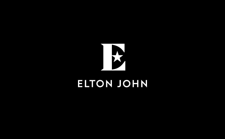
As far as the capital 'E' wordmark at the heart of the project goes, we have to say: mission accomplished. The star shape in place of the central arm is an instantly recognisable piece of design that effectively acts as a substitute for his name. (Think of Prince's famous 'Love Symbol' and David Bowie's Blackstar album cover.)

Speaking to It's Nice That, Adams says that the distinctive wordmark references the musician's star-shaped glasses. "Elton always makes a big impact through his costumes, stage design and album covers," he explains, "so for a designer it provided a wealth of iconic images and associations to explore."
He goes on to add that the black and white colour palette was inspired by Sir Elton's piano. Other colours such as a sparkling gold and bright magenta act as an eye-catching contrast to give the branding some variety.
There's more to the star symbol than meets the eye, though. Its angles were used for grid layouts on posters and other promotional material (see the image above), giving the colours and textures the perfect reason to slice through the page in a dynamic way.

As for the typography for the rest of the identity, Adams worked closely with typographer Miles Newlyn to develop a bespoke wordmark based on the font Verlag.
The sans-serif font is hammered onto the design in uppercase, just as we've seen with plenty of other brands this year. From Fanta to Calvin Klein, and many more besides, it seems that all-caps typography is now the industry standard if you want to make an impact and get your name seen.
Fortunately for this rebrand, Verlag is described as a crisp and 'fairminded' font that doesn't come across as too shouty in uppercase. Although, considering that Sir Elton has built a career on being bold, this in-your-face typography style appears to be a perfect fit.
Expect to see the new identity on Sir Elton's new world tour, adorning everything from T-shirts to merch and more.

[Via It's Nice That]
Related articles:

