Why the new Toblerone logo isn't as controversial as it sounds
Making a Swiss mountain out of a molehill.

Sign up to Creative Bloq's daily newsletter, which brings you the latest news and inspiration from the worlds of art, design and technology.
You are now subscribed
Your newsletter sign-up was successful
Want to add more newsletters?
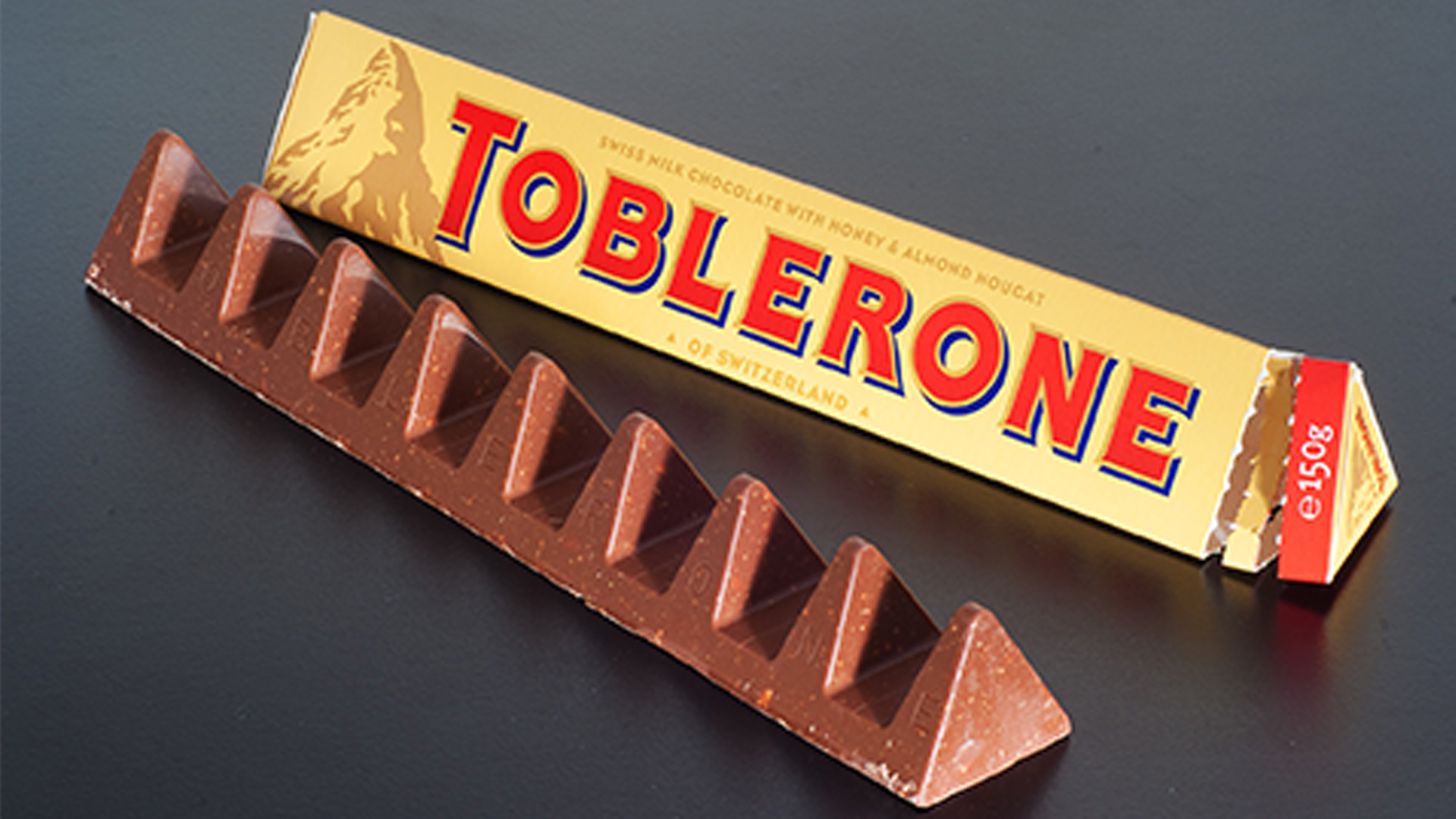
Famous logo redesigns are guaranteed to get the internet riled up, but when that logo belongs to a beloved chocolate brand, prepare for carnage (aka a few miffed tweets). The news that Toblerone is set to change its iconic mountain logo has got people talking this week, but it probably isn't as big a deal as it sounds.
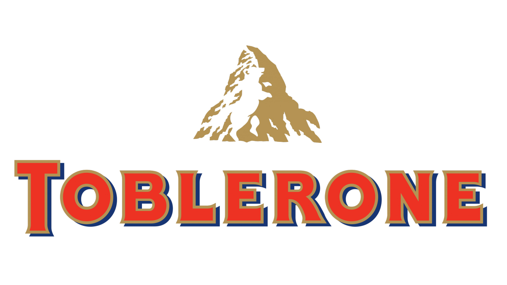
With Toblerone's production moving from Switzerland to Slovakia, the brand has announced it will be removing the likeness of the Swiss Matterhorn mountain thanks to strict rules surrounding authentic "Swissness". But are we really going to forget Toblerone's roots? (Check out the best logos of all time if you're looking for design inspiration.)

While Toblerone hasn't yet revealed the new design, it has announced that its new packaging "introduces a modernised and streamlined mountain logo that aligns with the geometric and triangular aesthetic.” The packaging will also be changed to read: "Established in Switzerland,” rather than “of Switzerland."
But as 99designs by Vista CEO Patrick Llewellyn tells Creative Bloq, the brand's heritage isn't all about Switzerland. "A triangle in a world of squares, Toblerone has become an iconic, instantly recognisable global brand: one that’s strong enough to stand alone, irrespective of its Swissness," he says. "While it has undoubtedly benefited from the fiercely protected halo of Switzerland’s high-quality and authentic value proposition, the fact remains that Toblerone itself - established in 1908 - has the kind of heritage that brands around the world would kill for."
He also believes consumers are unlikely to forget about the brand's Swiss provenance: "The risks associated with the change are low: after 114 years, Toblerone will remain symbolically Swiss in the minds of consumers, even when the provenance of the product itself is a little more international."
Indeed, Toblerone has been leaning away from national iconography and more towards its own distinctive geometry lately. It's most recent rebrand last year led with the slogan "Be more triangle," and featured a slightly tweaked wordmark.
Time will tell whether Toblerone is planning another comprehensive rebrand, or simply a subtle update to its mountain icon. The real question, of course, is whether the new logo will still feature Toblerone's mind-blowing design secret.
Sign up to Creative Bloq's daily newsletter, which brings you the latest news and inspiration from the worlds of art, design and technology.
Read more:

Daniel John is Design Editor at Creative Bloq. He reports on the worlds of design, branding and lifestyle tech, and has covered several industry events including Milan Design Week, OFFF Barcelona and Adobe Max in Los Angeles. He has interviewed leaders and designers at brands including Apple, Microsoft and Adobe. Daniel's debut book of short stories and poems was published in 2018, and his comedy newsletter is a Substack Bestseller.
