There's nothing quite like a famous logo rebrand to kickstart your day, is there? Today's logo update has come all the way from Switzerland from none other than Toblerone. The famous chocolatier has given its logo a little makeover – and I'm a fan.
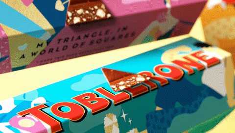
At first glance, the brand makeover doesn't look that exciting with its new wordmark, typeface and colour palette but the more you learn about the design, the cooler it gets. The brand identity focuses in on the triangular shape of the chocolate against an industry of square-shaped bars. While the brand has a fresh new look, it has kept its iconic logo that's fully equipped with a fascinating design secret. If Toblerone's new look has left you feeling inspired, then make sure you check out our roundup on the best free logo makers and have a go at creating one yourself.
Toblerone's fresh branding focuses on the slogan 'Be more triangle'. Bulletproof, the agency behind Toblerone's new look, says that its new identity allows the company "to do things in a more progressive premium way, encouraging uniqueness and celebrating all things triangle".
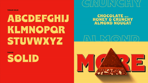
According to Bulletproof, the new brand identity takes influence from the Toblerone archives. The new wordmark reintroduces some of the lovely quirks from the original Toblerone logo (see below for a comparison), with its off-centre 'O' and thickened 'E' letter. The new cursive typeface that accompanies the wordmark is inspired by Mr Tobler's original signature, meaning that the whole new look is heavily focused on the chocolate's roots – which I personally think is a nice touch.

The branding also features a vibrant new colour palette that truly pops in comparison to its previous colour scheme. The new red and gold is brimming with confidence and pizzazz. Not to mention the fact that the brand still features its famous logo that hides a bear in plain sight (see below) as an ode to the 'City of Bears' where the chocolate originates from.

I love the new look and especially enjoy its particularly art nouveau-esque wordmark design. Its nod to the chocolate's past gives the branding character and allows consumers a nice insight into the brand's history. I also think that the red, gold and blue colour palette featured on the promotional graphics and the Toblerone website is aesthetically pleasing.
If you're loving all this logo talk and fancy sinking your teeth into some more brilliant designs, then you'll love our roundup of the best logo designs. And if you'd like to try your hand at creating your own, then why not download Illustrator, and follow our guide on how to design a logo?
Read More:

